Series & DataFrame 的方法
1 reindex
2 reset_index
3 value_counts --> series
4 sort_index / sort_values
5 pd.cut / pd.qcut
6 np.newaxis 插入新的纬度。在 线性回归模型 model.fit( x[:,np.newaxis]) 用到了
7 np.dot(A,B)
矩阵相乘
eg np.dot(df,[3,4,5]) df.shape 为 (4,3)

8 array[ : ,0] 理解这样写的含义
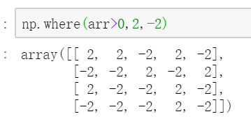
9 np.where() 有两种以上的用法,第一种类似三元表达式,条件为true时,
10 np.random.uniform() 生成随机值,可以是单个值,可以是一维数组,可以是多维数组。
11 pd.set_option('display.float_format')
显示方面的一些设置,比如 默认显示是科学计数法,可以用这个方法改掉
12 np.random.normal() 返回符合正态分布的值,可以返回一个值,可以返回一个一维数组,可以返回多维数组
13 pd.Grouper
A Grouper allows the user to specify a groupby instruction for a target object
14 pd.concat(df1,df2)
15 df1.join(df2)
16 df1.dropna()
17 np.unique(ar,return_index=False,return_inverse=False,return_counts=False,axis=None)
有这几个参数,return_index,return_counts 可能用到的频率比较高。知道有这几参数就行。
当指定axis后,对多维数组可以使用,不会返回惟一值,而是对指定轴进行排序。

18 np.insert()
19
Array的方法
1 .sort()
2 arr.flatten( order = 'C'/'F') 将多维 数组变为一维数组,C是按行顺序,F是按列顺序
series/pandas 数据的保存
3 arr.tolist() 转换为列表类型
4 arr.astype(np.int64) 转换元素类型
writer = pd.ExcelWriter('output.xlsx')
res.to_excel(writer,'sheet1')
writer.save()
使用系统配好的样式
import matplotlib.style as psl
print(plt.style.available)
# 查看样式列表
psl.use('ggplot')
设置轴相关
plt.xlim([0,12])  # x轴边界
plt.ylim([0,1.5])  # y轴边界
plt.xticks(range(10))  # 设置x刻度
plt.yticks([0,0.2,0.4,0.6,0.8,1.0,1.2])  # 设置y刻度
fig.set_xticklabels("%.1f" %i for i in range(10))  # x轴刻度标签
fig.set_yticklabels("%.2f" %i for i in [0,0.2,0.4,0.6,0.8,1.0,1.2])  # y轴刻度标签
# 范围只限定图表的长度,刻度则是决定显示的标尺 → 这里x轴范围是0-12,但刻度只是0-9,刻度标签使得其显示1位小数
# 轴标签则是显示刻度的标签
plt的方法
plt.xlim 设置轴的范围,图的显示也随之改变
plt.xlabel 设置轴标签
plt.xticks 设置轴刻度和轴刻度标签
ax.set_xticklabels
plt.gca() 获取当前图表对象。 ax = plt.gca() ax.spines['top'].set_color('none') 设置坐标轴的颜色 ax.spines['left'].set_position((data,0)) 移动坐标轴 用的比较少
plt.plot
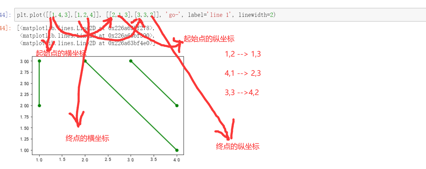
plt.plot([s1,s2],[y1,y2],color='r',alpha=0.7)

plt.plot(s1,y1)

plt.grid()
plt.legend()
plt.show
plt.scatter
plt.hist
plt.text(ha='center/bottom',va='center/bottom') 有两个参数注意下,ha,va。ha='center', va= 'bottom'代表horizontalalignment(水平对齐)、verticalalignment(垂直对齐)的方式
plt.gca
plt.savefig
plt.axis('equal')
plt.axvline()/plt.axhline
plt.bar(x,y,bottom=None) 条形图,可以手动绘制堆叠图,y是一组数据,bottom是另一组数据,只不过是需要两此plt.bar
plt.fill() 填图
plt.fill_between()
plt.figure
fig.add_subplot
这个子图的使用,好像是ax1,ax2 ,等在同一个cell下执行,大方向如此。
plt.add_subplots
series,dataframe的方法
s/df.plot(kind=,style=,alpha=,title,label,legend,subplots=,colormap=,)
柱状图和堆叠图
堆叠图有个很明显的视觉效果,单一索引下的每列的数据进行对比

外嵌图标
不是那么重要,或许和后面的 plt.style 有交集?
# 外嵌图表plt.table()
# table(cellText=None, cellColours=None,cellLoc='right', colWidths=None,rowLabels=None, rowColours=None, rowLoc='left',
# colLabels=None, colColours=None, colLoc='center',loc='bottom', bbox=None)

data = [[ 66386, 174296,  75131, 577908,  32015],
        [ 58230, 381139,  78045,  99308, 160454],
        [ 89135,  80552, 152558, 497981, 603535],
        [ 78415,  81858, 150656, 193263,  69638],
        [139361, 331509, 343164, 781380,  52269]]
columns = ('Freeze', 'Wind', 'Flood', 'Quake', 'Hail')
rows = ['%d year' % x for x in (100, 50, 20, 10, 5)]
df = pd.DataFrame(data,columns = ('Freeze', 'Wind', 'Flood', 'Quake', 'Hail'),
                 index = ['%d year' % x for x in (100, 50, 20, 10, 5)])
print(df)

df.plot(kind='bar',grid = True,colormap='Blues_r',stacked=True,figsize=(8,3))
# 创建堆叠图

plt.table(cellText = data,
          cellLoc='center',
          cellColours = None,
          rowLabels = rows,
          rowColours = plt.cm.BuPu(np.linspace(0, 0.5,5))[::-1],  # BuPu可替换成其他colormap
          colLabels = columns,
          colColours = plt.cm.Reds(np.linspace(0, 0.5,5))[::-1],
          rowLoc='right',
          loc='bottom')
# cellText:表格文本
# cellLoc:cell内文本对齐位置
# rowLabels:行标签
# colLabels:列标签
# rowLoc:行标签对齐位置
# loc:表格位置 → left,right,top,bottom

plt.xticks([])
# 不显示x轴标注
面积图,饼图,直方图,密度图,极坐标的柱状图,箱型图
主语是series,或者dataframe
df.plot.area , (更看重各个列作为整体的变化趋势) s.plot.pie
df.plot.hist() == df.plot(kind='hist')
df.plot(kind='kde')
ax1=plt.add_subplot(111,projection='polar')
bar=ax1.bar(theta,data)
df.plot(kind='box')
color = dict(boxes='DarkGreen', whiskers='DarkOrange', medians='DarkBlue', caps='Gray')
df.boxplot()
填图,散点图,雷达图
主语是plt plt.fill() / plt.fill_between()
plt.scatter() 这个有很多参数,可以表示很多维度 ,点的颜色,点的大小
plt.polar(theta,data) & plt.fill(theta,data)
散点矩阵
pd.plotting.scatter_matrix(df) 可以很便捷的看出各个列之前是否有关系
样式相关
1 是pd的方法
2 颜色,背景,%显示,几位小数显示,都只是改变的显示,实际dataframe的数值没有改变
df.style.apply(foo)
foo接收的参数是每一行,或每一列数据,即series
df.style.apply_map(foo)
foo 接收的参数是每个dataframe的值
df.style.format()
可以接字典 {‘b’:' { : .2f} '}
df.style.highlight_null() /highlight_max/highlight_min 高亮
df.style.bar
条形图,值越大,格子内的条形图越长。
df.style.background_gradient
色彩影射,值越高,颜色越深
以上均可嵌套使用。可能,O(∩_∩)O哈哈~