
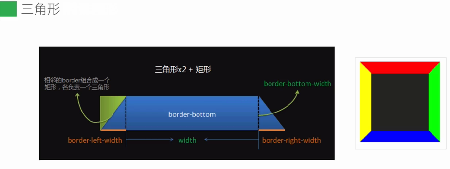
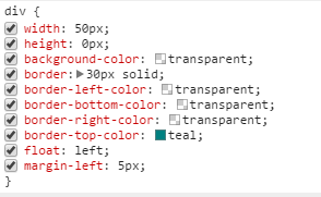
第一步:绘制矩形:

第二步:把宽度设置为0px;

第三步:把高度也设置为0px;
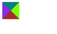

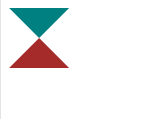
这样就变成了由四个三角形围成的一个div;实质上这个div已经不存在了,因为它的width和height都为0;现在我们就可以来设置各种图形了,如下所示:
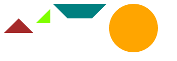
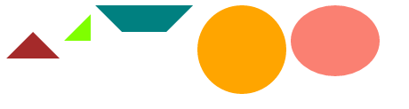
1、透明颜色transparent;
左边设置为透明的;
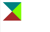

右边也设置为transparent:就变成了漏斗形状;

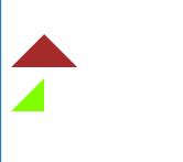
同样的道理,最后绘制了三角形;


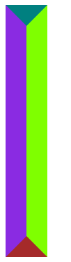
2、下面做一个直角三角形;

3、梯形;

4、绘制一个圆;
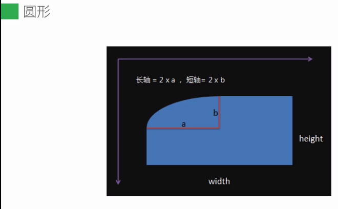

5、绘制一个椭圆:
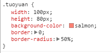
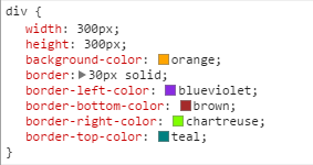
<!DOCTYPE html>
<html lang="en">
<head>
    <meta charset="UTF-8">
    <title>Title</title>
    <style type="text/css">
        div{
             300px;
            height: 300px;
            background-color: orange;
            border: 30px solid;
            border-left-color: blueviolet;
            border-bottom-color: brown;
            border-right-color: chartreuse;
            border-top-color:  teal;
            float: left;
            margin-right: 5px;
        }
        .dengyao{
             0;
            height: 0;
            background-color: transparent;
            border: 30px solid;
            border-left-color: transparent;
            border-bottom-color: brown;
            border-right-color: transparent;
            border-top-color: transparent;
        }
        .zhijiao{
             0;
            height: 0;
            background-color: transparent;
            border: 30px solid;
            border-left-color: blueviolet;
            border-bottom-color: brown;
            border-right-color: chartreuse;
            border-top-color: transparent;
            margin-top: 10px;
            border-bottom: 0;
            border-left: 0;
        }
        .tixing{
             50px;
            height: 0px;
            background-color: transparent;
            border: 30px solid;
            border-left-color: transparent;
            border-bottom-color: transparent;
            border-right-color: transparent;
            border-top-color: teal;
        }
        .circle{
            border: 0;
             100px;
            height: 100px;
            border-radius: 50%;
        }
        .tuoyuan{
             100px;
            height: 80px;
            background-color: salmon;
            border: 0;
            border-radius: 50%;
        }
    </style>
</head>
<body>
    <div class="dengyao"></div>
    <div class="zhijiao"></div>
    <div class="tixing"></div>
    <div class="circle"></div>
    <div class="tuoyuan"></div>
</body>
</html>