less安装
1,首先需要安装node。js 版本8.0以上 node -v 检查版本
2,基于node在线安装less npm i -g less 使用lessc -v 检查版本
--
使用@开头,定义变量名 @color:pink;
less编译
Easy LESS插件用来把less文件编译未css文件
安装完毕插件,重新加载vscode 只要保存一下less文件会自动生成css文件
less嵌套
伪类的嵌套 a{ &:hover{} }
less运算 运算符左右两侧必须加空格 如果两个参与运算的数都有但那位,那么运算结果以第一个的单位为准
200px + 100 82 / 50rem (1.64rem)
rem适配方案 在不同屏幕下 页面元素自动等比例缩放
<meta name="viewport" content="width-device-width,user-scalable=no,
initial-scale=1.0, maximum-scale=1.0, minmum-scale=1.0">
link rel xxxxxx href="caa/normalize.css">
@media screen and (min-320px){html{font-size:21.33px;}} 你如果在320屏幕下字体未21.33
@media screen and (min-750px){html{font-size:50px;}} 你如果在750屏幕下字体大小未50px
div{2rem} 首先选一套标准尺寸例如在750屏幕下来定义尺寸 其他的自动适配
-------------苏宁网页案例制作---------------
新建适配的css文件 ,因为PC端也可以打开我们的网页 默认字体50px 这句话卸载最上面
//设置常见的尺寸,修改html的字体大小
html{font-size:50px};
@no:15;
//320
@media screen and (min-320px){html{font-size:320px/@no;}}
//360
@media screen and (min-360px){html{font-size:360px / @no;}}
//375 ip 678
@media screen and (min-360px){html{font-size:375px / @no;}}
//384
@media screen and (min-384px){html{font-size:384px / @no;}}
//400
@media screen and (min-400px){html{font-size:400px / @no;}}
//414
@media screen and (min-414px){html{font-size:414px / @no;}}
//424
@media screen and (min-424px){html{font-size:424px / @no;}}
//480
@media screen and (min-480px){html{font-size:480px / @no;}}
//540
@media screen and (min-540px){html{font-size:540px / @no;}}
//720
@media screen and (min-720px){html{font-size:720px / @no;}}
//750
@media screen and (min-750px){html{font-size:750px / @no;}}
--在index里导入common.
@import "common"
@import 导入的意思,可把一个样式文件导入到另外一个样式文件里面
link时把一个 样式文件引入到html页面里面 首页里只引入indexcss文件就行,好了适配完成
接下来,给body指定最小宽度
body{
min-width:320px; 最小宽度适配到320px;
15rem; 宽度未15rem
margin:0 auto; 在电脑端居中显示
line-height:1.5; 行高
font-family:Arial,Helvetica 文字;
background:#F2F2F2; 背景颜色
}
@baseFont:50;
导航
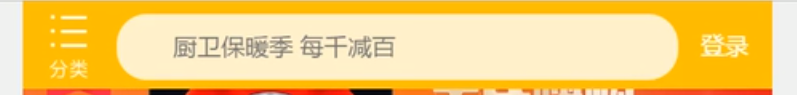
固定,宽,搞固定定位居中,left50% transfrom:translateX(-50%) top 0
导航布局,flex布局,左右a标签rem固定 中间flex:1
左右宽高,margin上右下左距离 (感觉给父元素padding应该也可以,还方便)
左盒子居然时一个背景图片,background:url(../xxxxx.png)no-repewat;
背景缩放 background-size:做盒子的宽度 左盒子的高度
右侧只有两个字,text-aligncenter line-height:右侧的高度 ok
输入框form>input outline:none禁止文字蓝色背景 border:0 默认边框为零,设置字体大小,padding的左边距
轮播图下边的图片分为三个图片 div{display:flex;a{flex:1;img{100%}}}
nav模块 采用固定宽高,浮动的技术来布局
nav{750rem/@baseFont; a{ float:left;150rem/@baseFont;height:140rem/@baseFont;
img:{widht:82rem/50;height:82/50;display:block;margin:10rem/50 auto} } }
a{text-align:center}>span{font-size:25rem/50; }
{额外的--(二倍精灵图的做法)1,把精灵图等比例缩放原来的一半,测量坐标 -81px 0 ;backgound-size:200px auto;}
@media screen and (min-360px){html{font-size:375px / @no;}}