Ant Design Pro 是一个基于 umi、dva 和 ant design 的开箱即用的中台前端/设计解决方案。
一、umi和dva
1.1、什么是umi
umi,中文可发音为乌米,是一个可插拔的企业级 react 应用框架。umi 以路由为基础的,支持类 next.js 的约定式路由,以及各种进阶的路由功能,并以此进行功能扩展,比如支持路由级的按需加载。然后配以完善的插件体系,覆盖从源码到构建产物的每个生命周期,支持各种功能扩展和业务需求,目前内外部加起来已有 50+ 的插件。
上面一段来自umi官网介绍,从上面我们得到一个重要信息,umi的一个重要功能就是路由配置。 此外umi整合了webpack的功能,umi相比webpack增加了运行时的能力,同时帮助我们配置了很多 webpack 的预设。也减少了 webpack 升级导致的问题:
- plugin-access,权限管理
- plugin-analytics,统计管理
- plugin-antd,整合 antd UI 组件
- plugin-initial-state,初始化数据管理
- plugin-layout,配置启用 ant-design-pro 的布局
- plugin-locale,国际化能力
- plugin-model,基于 hooks 的简易数据流
- plugin-request,基于 umi-request 和 umi-hooks 的请求方案
1.2、什么是dva
dva 首先是一个基于 redux 和 redux-saga 的数据流方案,可以和umi完美结合。
1.3、 什么是redux-saga
redux-saga是一个用于管理应用程序 Side Effect(副作用,例如异步获取数据,访问浏览器缓存等)的 library,它的目标是让副作用管理更容易,执行更高效,测试更简单,在处理故障时更容易。
可以想像为,一个 saga 就像是应用程序中一个单独的线程,它独自负责处理副作用。redux-saga是一个 redux 中间件,意味着这个线程可以通过正常的 redux action 从主应用程序启动,暂停和取消,它能访问完整的 redux state,也可以 dispatch redux action。
redux-saga 使用了 ES6 的 Generator 功能,让异步的流程更易于读取,写入和测试。(如果你还不熟悉的话,这里有一些介绍性的链接) 通过这样的方式,这些异步的流程看起来就像是标准同步的 Javascript 代码。(有点像 async/await,但 Generator 还有一些更棒而且我们也需要的功能)。
你可能已经用了 redux-thunk 来处理数据的读取。不同于 redux thunk,你不会再遇到回调地狱了,你可以很容易地测试异步流程并保持你的 action 是干净的。
1.3.1 安装
npm install --save redux-saga
1.3.2 使用示例
假设我们有一个 UI 界面,在单击按钮时从远程服务器获取一些用户数据(为简单起见,我们只列出 action 触发代码)。
class UserComponent extends React.Component {
  ...
  onSomeButtonClicked() {
    const { userId, dispatch } = this.props
    dispatch({type: 'USER_FETCH_REQUESTED', payload: {userId}})
  }
  ...
}
这个组件 dispatch 一个 plain Object 的 action 到 Store。我们将创建一个 Saga 来监听所有的 USER_FETCH_REQUESTED action,并触发一个 API 调用获取用户数据。
sagas.js:
import { call, put, takeEvery, takeLatest } from 'redux-saga/effects'
import Api from '...'

// worker Saga : 将在 USER_FETCH_REQUESTED action 被 dispatch 时调用
function* fetchUser(action) {
   try {
      const user = yield call(Api.fetchUser, action.payload.userId);
      yield put({type: "USER_FETCH_SUCCEEDED", user: user});
   } catch (e) {
      yield put({type: "USER_FETCH_FAILED", message: e.message});
   }
}

/*
  在每个 `USER_FETCH_REQUESTED` action 被 dispatch 时调用 fetchUser
  允许并发(译注:即同时处理多个相同的 action)
*/
function* mySaga() {
  yield takeEvery("USER_FETCH_REQUESTED", fetchUser);
}

/*
  也可以使用 takeLatest

  不允许并发,dispatch 一个 `USER_FETCH_REQUESTED` action 时,
  如果在这之前已经有一个 `USER_FETCH_REQUESTED` action 在处理中,
  那么处理中的 action 会被取消,只会执行当前的
*/
function* mySaga() {
  yield takeLatest("USER_FETCH_REQUESTED", fetchUser);
}

export default mySaga;
为了能跑起 Saga,我们需要使用 redux-saga 中间件将 Saga 与 Redux Store 建立连接。
main.js:
import { createStore, applyMiddleware } from 'redux'
import createSagaMiddleware from 'redux-saga'

import reducer from './reducers'
import mySaga from './sagas'

// create the saga middleware
const sagaMiddleware = createSagaMiddleware()
// mount it on the Store
const store = createStore(
  reducer,
  applyMiddleware(sagaMiddleware)
)

// then run the saga
sagaMiddleware.run(mySaga)

// render the application
更多使用细节请移步官网。
二、脚手架使用
2.1、初始化脚手架
新建一个空的文件夹作为项目目录,并在目录下使用 create umi 来快速的初始化脚手架。
# 使用 npm
npm create umi react-big-screen
如果下载比较慢,可以先配置npm阿里源:
npm config set registry https://registry.npm.taobao.org/
按照 umi 脚手架的引导,第一步先选择 ant-design-pro:
? Select the boilerplate type (Use arrow keys)
> ant-design-pro  - Create project with a layout-only ant-design-pro boilerplate, use together with umi block.
  app             - Create project with a simple boilerplate, support typescript.
  block           - Create a umi block.
  library         - Create a library with umi.
  plugin          - Create a umi plugin.
选择 antd 的版本,4 或者 5,主意V5和V4差别较大,这里我选择了V5。
? Select the boilerplate type ant-design-pro
? � Be the first to experience the new umi@3 ?
> Pro V5
  Pro V4
安装依赖:
cd react-big-screen && cnpm install
2.2、启动脚手架
开启 Umi UI(可选):
npm start
使用admin/ant.design登录系统:
通过npm start我们就可以启动服务,那你可能会好奇执行这个命令为什么就可以启动我们的服务呢?
npm start 运行的是package.json中script块start对应的命令,打开package.json,你会发现我们实际执行的是如下执行:
cross-env是用来解决多环境问题的,你可暂且忽略。重点关注umi dev。
umi 是一个软连接到umi.js的文件:
#!/usr/bin/env node

const resolveCwd = require('resolve-cwd');

const { name, bin } = require('../package.json');
const localCLI = resolveCwd.silent(`${name}/${bin['umi']}`);
if (!process.env.USE_GLOBAL_UMI && localCLI && localCLI !== __filename) {
  const debug = require('@umijs/utils').createDebug('umi:cli');
  debug('Using local install of umi');
  require(localCLI);
} else {
  require('../lib/cli');
}
也就是其实执行的umi/lib/cli.js文件, 关键部分代码:
_asyncToGenerator(function* () {
  try {
    switch (args._[0]) {
      case 'dev':
        const child = (0, _fork.default)({
          scriptPath: require.resolve('./forkedDev')
        }); // ref:
        // http://nodejs.cn/api/process/signal_events.html
        // https://lisk.io/blog/development/why-we-stopped-using-npm-start-child-processes

        process.on('SIGINT', () => {
          child.kill('SIGINT'); // ref:
          // https://github.com/umijs/umi/issues/6009

          process.exit(0);
        });
        process.on('SIGTERM', () => {
          child.kill('SIGTERM');
          process.exit(1);
        });
        break;

      default:
        const name = args._[0];

        if (name === 'build') {
          process.env.NODE_ENV = 'production';
        }

        yield new _ServiceWithBuiltIn.Service({
          cwd: (0, _getCwd.default)(),
          pkg: (0, _getPkg.default)(process.cwd())
        }).run({
          name,
          args
        });
        break;
    }
  } catch (e) {
    console.error(_utils().chalk.red(e.message));
    console.error(e.stack);
    process.exit(1);
  }
})();
三、页面布局调整
运行程序,我们发现菜单默认是位于侧边栏的,如果我们想将菜单是置于顶部的。因此我们需要进行布局的修改。
在修改之前,我们了解到为了降低研发成本,Ant Design Pro将布局通过umi插件 @umijs/plugin-layout 的方式内置,我们只需要通过简单的配置就可以修改Ant Design的Layout,包括导航以及侧边栏。
plugin-layout 插件主要提供了以下功能:
- 默认为 Ant Design 的 Layout @ant-design/pro-layout,支持它全部配置项。
- 侧边栏菜单数据根据路由中的配置自动生成。
- 默认支持对路由的 403/404 处理和 Error Boundary。
- 搭配 @umijs/plugin-access 插件一起使用,可以完成对路由权限的控制。
- 搭配 @umijs/plugin-initial-state 插件和 @umijs/plugin-model 插件一起使用,可以拥有默认用户登陆信息的展示。
3.1、修改config/config.ts
可以通过修改配置文件配置 layout的主题、菜单等样式, 修改config/config.ts:
import { Settings as LayoutSettings } from '@ant-design/pro-layout';
//pro-layout布局配置重写,更多参数配置参考;https://github.com/ant-design/ant-design-pro-layout
const Settings: LayoutSettings & {
pwa?: boolean;
logo?: string;
} = {
navTheme: 'dark', //整体风格设置 light、dark
// 拂晓蓝
primaryColor: '#1890ff', //主题色
layout: 'top', //导航模式 side、top、mix
contentWidth: 'Fluid', //内容区域宽度:流式Fluid、定宽Fixed
fixedHeader: false, //固定header
fixSiderbar: true, //固定侧边测但
colorWeak: false, //色弱模式
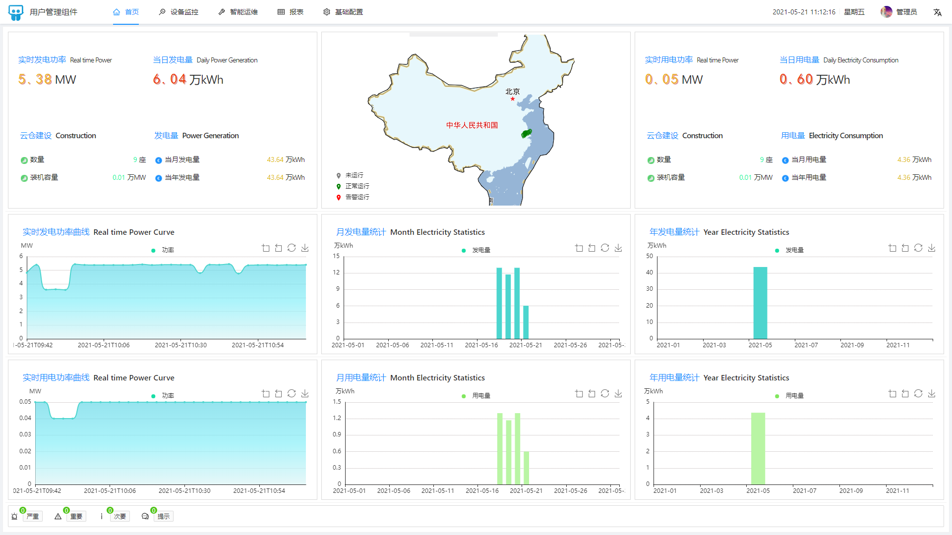
title: '报警管理平台',
pwa: false,
logo: 'https://gw.alipayobjects.com/zos/rmsportal/KDpgvguMpGfqaHPjicRK.svg',
iconfontUrl: '',
};
export default Settings;
此时,页面布局如下:

3.2、pro-components
ant-design/pro-layout 已经迁移至 ant-design/pro-components 仓库进行后续的维护,访问 https://procomponent.ant.design/layout 可以了解更多信息。
ProComponents 是基于 Ant Design 而开发的模板组件,提供了更高级别的抽象支持,开箱即用。其中ProComponets封装了页面布局相关的组件,这些组件来自于ant-design/pro-layout ,主要包括ProLayout、PageContainer、GridContent、FooterToolbar、SettingDrawer、SiderMenu、TopNavHeader等。
而我们配置的config/config.ts这些信息,会被这些布局组件所使用。具体实现可以查看源码。
3.3、SettingDrawer(只针对V5版本,其他把版本查看官方文档)
从官网下载的代码默认是不支持主题切换的,如果想支持主题切换需要安装以下依赖:
cnpm install   umi-plugin-setting-drawer --save-dev
cnpm install   umi-plugin-antd-theme  --save-dev
最新版本如下:
"umi-plugin-antd-theme": "^2.1.2",
"umi-plugin-setting-drawer": "^1.0.3"
同时需要配置主题相关信息config/theme.config.json:
{
  "theme": [
    {
      "key": "dark",
      "fileName": "dark.css",
      "theme": "dark",
      "modifyVars": {
        "dark": true
      }
    },
    {
      "key": "dust",
      "fileName": "dust.css",
      "modifyVars": {
        "@primary-color": "#F5222D"
      }
    },
    {
      "key": "volcano",
      "fileName": "volcano.css",
      "modifyVars": {
        "@primary-color": "#FA541C"
      }
    },
    {
      "key": "sunset",
      "fileName": "sunset.css",
      "modifyVars": {
        "@primary-color": "#FAAD14"
      }
    },
    {
      "key": "cyan",
      "fileName": "cyan.css",
      "modifyVars": {
        "@primary-color": "#13C2C2"
      }
    },
    {
      "key": "green",
      "fileName": "green.css",
      "modifyVars": {
        "@primary-color": "#52C41A"
      }
    },
    {
      "key": "geekblue",
      "fileName": "geekblue.css",
      "modifyVars": {
        "@primary-color": "#2F54EB"
      }
    },
    {
      "key": "purple",
      "fileName": "purple.css",
      "modifyVars": {
        "@primary-color": "#722ED1"
      }
    },
    {
      "key": "dust",
      "theme": "dark",
      "fileName": "dark-dust.css",
      "modifyVars": {
        "@primary-color": "#F5222D",
        "dark": true
      }
    },
    {
      "key": "volcano",
      "theme": "dark",
      "fileName": "dark-volcano.css",
      "modifyVars": {
        "@primary-color": "#FA541C",
        "dark": true
      }
    },
    {
      "key": "sunset",
      "theme": "dark",
      "fileName": "dark-sunset.css",
      "modifyVars": {
        "@primary-color": "#FAAD14",
        "dark": true
      }
    },
    {
      "key": "cyan",
      "theme": "dark",
      "fileName": "dark-cyan.css",
      "modifyVars": {
        "@primary-color": "#13C2C2",
        "dark": true
      }
    },
    {
      "key": "green",
      "theme": "dark",
      "fileName": "dark-green.css",
      "modifyVars": {
        "@primary-color": "#52C41A",
        "dark": true
      }
    },
    {
      "key": "geekblue",
      "theme": "dark",
      "fileName": "dark-geekblue.css",
      "modifyVars": {
        "@primary-color": "#2F54EB",
        "dark": true
      }
    },
    {
      "key": "purple",
      "theme": "dark",
      "fileName": "dark-purple.css",
      "modifyVars": {
        "@primary-color": "#722ED1",
        "dark": true
      }
    }
  ],
  "min": true,
  "isModule": true,
  "ignoreAntd": false,
  "ignoreProLayout": false,
  "cache": true,
  "extraLibraries": [
    "@ant-design/pro-form",
    "@ant-design/pro-descriptions",
    "@ant-design/pro-field",
    "@ant-design/pro-list",
    "@ant-design/pro-card",
    "@ant-design/pro-provider",
    "@ant-design/pro-skeleton",
    "@ant-design/pro-utils"
  ]
}
-
extraLibraries:@antd-design/pro-xxx ; antd-pro-merge-less 在生成样式文件时,会加载该指定包中样式文件(特别需要注意的是antd-pro-merge-less 默认只加载了antd pro组件 @ant-design/pro-table、@ant-design/pro-form的样式);
-
ignoreAntd:在生成样式文件时,是否加载antd样式文件
-
cache:是否开启缓存,通过比较样式和antd-pro-merge-less/.temp/temp.less文件的hash,判断文件是否需要重新生成,这样就不会在每次启动的时候重新生成样式文件
umi-plugin-antd-theme会根据遍历这个配置文件,动态的在node_modules.plugin-theme heme下生成的对应的样式文件。
最终在点击SettingDrawer组件进行样式调整的时候,实际就是给动态body加入样式文件的过程 :
<link type="text/css" rel="stylesheet" id="theme-style" href="/theme/volcano.css">
我们也可以将样式文件复制到/public/theme/下。
如果我们不想使用SettingDrawer组件,需要把package.json devDependencies中的这两个包排除。
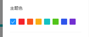
SettingDrawer组件中的主题色ThemeColor 用于展示当前可选的主色,色彩列表themeList由 umi-plugin-antd-theme 插件提供,该插件会将一个色彩列表放到 window.umi_plugin_ant_themeVar 变量上,SettingDrawer 会读取这个变量并给到 ThemeColor。
<ThemeColor
  value={primaryColor}
  colors={
    hideColors
      ? []
      : themeList.colorList[navTheme === 'realDark' ? 'dark' : 'light']
  }
  formatMessage={formatMessage}
  onChange={(color) =>
    changeSetting('primaryColor', color, hideLoading)
  }
/>
3.4、 umi-plugin-antd-theme 插件流程分析
这里只粗略介绍一下具体流程、不做细致的代码分析,感兴趣的请阅读源码。
-
更改 cssLoader 配置,修改 src 目录下 less 文件 CSS Modules 选择器名称
-
加载工程固定路径下主题配置文件 config/theme.config.json覆盖默认配置(配置配置为空,也就是使用组件原始配置样式)
-
设置dev环境临时主题色文件路径为 node_modules/.plugin-theme/theme
-
设置serve-static中间件,允许访问临时主题色文件
-
将主题色配置信息挂载在 window.umi_plugin_ant_themeVar
-
dev环境 onDevCompileDone
如果存在临时文件,则删除
创建 .plugin-theme/theme
遍历config/theme.config.json下每个主题色,使用 antd-pro-merge-less包 buildCss 至 .plugin-theme/theme 每一个主题色,生成一个 css 文件 prod 环境与 dev 环境的差异体现在生产的文件生成在 dist/theme 目录下
3.5、antd-pro-merge-less 插件流程分析
-
设置临时文件目录antd-pro-merge-less/.temp
-
使用 glob 找到 antd-pro-merge-less 项目下所有的 less 文件路径
-
将所有less文件内容写入antd-pro-merge-less/.temp/temp.less以及antd-pro-merge-less/.temp/pro.less
-
如果config/theme.config.json配置"ignoreAntd": false,则还会导入antd模块下的所有less文件(需要注意的是如果没有配置dark:true, 不会加载themes/dark.less,themes/compack.less),到 ./antd.less
-
将@import './antd'导入./components.less文件,同时还会根据extraLibraries配置导入antd design pro组件的样式文件
-
提取import文件的变量,删除 import ,写入antd-pro-merge-less/.temp/pro.less ,并引用 @import './components'
-
将依赖的 antd 相关组件的 less 文件写入./components.less 开始遍历不同的颜色配置,根据不同配置生成 antd less 文件
-
使用 less 将 pro.less 文件转化为 css 文件,并替换变量
常见错误处理:
1、如果运行出现错误 检查node_modules\_antd-pro-merge-less@xxx@antd-pro-merge-lessloopAllLess.js文件,修改文件最后为:
return Promise.resolve(
// prettier.format(content, {
//   parser: 'less',
// }),
content
);
因为prettier.format在格式化less文件时会将 :
@pro-global-footer-prefix-cls: ~'@{ant-prefix}-pro-global-footer'
转为
@pro-global-footer-prefix-cls ~'@{ant-prefix}-pro-global-footer'
2、@ant-deisign/pro-card组件存在Bug _@ant-design_pro-card@1.11.7@@ant-designpro-cardescomponentsStatisticindex.less
.@{ant-prefix}-statistic-title {
color: @text-color;  # 将之前的固定色rgba(00,00,00,0.45)修改成变量
}
3、强制重新生成样式文件
- 如果config/theme.config.json配置中开启了缓存cache,如果想强制重新生成样式文件,删除antd-pro-merge-less.temp emp.less文件,重新运行
- 设置cache为false关闭缓存
直接在V5的Demo页面多次点击菜单来切换路由,会发现样式会有多次覆盖的情况。
https://preview.pro.ant.design/dashboard/analysis?fixSiderbar=true&colorWeak=false&pwa=false
目前是参考 https://umijs.org/zh-CN/config#chainwebpack ,修改了打包规则,config.ts中增加以下配置,解决了这个问题:
chunks: ['vendors', 'umi'],
  chainWebpack: function (config, { webpack }) {
    config.merge({
      optimization: {
        splitChunks: {
          chunks: 'all',
          minChunks: 2,
          automaticNameDelimiter: '.',
          cacheGroups: {
            vendor: {
              name: 'vendors',
              test({ resource }) {
                return /[\/]node_modules[\/]/.test(resource);
              },
              priority: 10,
            },
          },
        },
      },
    });
  },
四、新增页面步骤
这里的『页面』指配置了路由,能够通过链接直接访问的模块,要新建一个页面,通常只需要在脚手架的基础上进行简单的配置。
4.1、新增js、less文件
在src/pages下创建新的js、less文件。如果又多个相关页面,可以创建一个新文件夹来放置相关文件。
config
src
  models
  pages
+   NewPage.js
+   NewPage.less
  ...
...
package.json
为了更好的演示,我们初始化NewPage.js的内容如下:
export default () => {
  return <div>New Page</div>;
};
暂时不向本文档中的样式文件添加内容,您也可以尝试自己添加内容。 样式文件默认使用CSS Modules,如果需要,可以导入antd less 变量 在文件的头部:
@import '~antd/lib/style/themes/default.less';
这样可以轻松获取 antd 样式变量并在文件中使用它们,这可以保持保持页面的一致性,并有助于实现自定义主题。
4.2、将文件加入菜单和路由
加入菜单和路由的方式请参照 路由和菜单 - 添加路由/菜单 中的介绍完成。加好后,访问 http://localhost:8000/#/new 就可以看到新增的页面了。
4.3、新增model、service
布局及路由都配置好之后,回到之前新建的 NewPage.js,可以开始写业务代码了!
如果需要用到 dva 中的数据流,还需要在 src/models src/services 中建立相应的 model 和 service,具体可以参考脚手架内置页面的写法。不过我们更加推荐使用轻量数据流管理数据,并且使用 openAPI 插件来生成 serves。
五、代码下载
5.1、开发计划
接下来我将花一段时间开发一个监控平台: