小叮当简单颜色单一,操作起来也很容易上手。接下来的一个实例就是用css画出一个多啦A梦,首先将其分为头部,和身体。然后,再根据身体各部分细节进行进一步的具体刻画。
由于最近一直在学习JavaWeb方面的东西,所以,我的这个小叮当就是用jsp页面进行映衬。
代码如下:首先是写jsp页面,将其分成多个块,然后再分块操作:


 1 <%@ page language="java" import="java.util.*" pageEncoding="utf-8"%>
 2 <%
 3 String path = request.getContextPath();
 4 String basePath = request.getScheme()+"://"+request.getServerName()+":"+request.getServerPort()+path+"/";
 5 %>
 6
 7 <!DOCTYPE HTML PUBLIC "-//W3C//DTD HTML 4.01 Transitional//EN">
 8 <html>
 9   <head>
10     <base href="<%=basePath%>">
11     <link rel="stylesheet" type="text/css" href="bootstrap-3.3.5-dist/css/bootstrap.min.css">
12     <link rel="stylesheet" type="text/css" href="css/DLAM.css">
13     <title>here</title>
14
15     <meta http-equiv="pragma" content="no-cache">
16     <meta http-equiv="cache-control" content="no-cache">
17     <meta http-equiv="expires" content="0">
18     <meta http-equiv="keywords" content="keyword1,keyword2,keyword3">
19     <meta http-equiv="description" content="This is my page">
20     <!--
21     <link rel="stylesheet" type="text/css" href="styles.css">
22     -->
23
24   </head>
25   <body>
26   <div class="doraemon">
27     <div class="head">
28         <div class="eyes">
29            <div class="eye left"><div class="black bleft"></div></div>
30            <div class="eye right"><div class="black bright"></div></div>
31         </div>
32
33         <div class="face">
34            <div class="white"></div>
35            <div class="nose"><div class="light"></div></div>
36            <div class="nose_line"></div>
37            <div class="mouth"></div>
38            <div class="whiskers">
39                     <div class="whisker rTop r160"></div>
40                     <div class="whisker rt"></div>
41                     <div class="whisker rBottom r20"></div>
42                     <div class="whisker lTop r20"></div>
43                     <div class="whisker lt"></div>
44                     <div class="whisker lBottom r160"></div>
45            </div>
46         </div>
47     </div>
48
49     <div class="choker">
50         <div class="bell">
51             <div class="bell_line"></div>
52             <div class="bell_circle"></div>
53             <div class="bell_under"></div>
54             <div class="bell_light"></div>
55         </div>
56     </div>
57
58     <div class="bodys">
59          <div class="body"></div>
60          <div class="wraps"></div>
61          <div class="pocket"></div>
62          <div class="pocket_mask"></div>
63     </div>
64
65     <div class="hand_right">
66            <div class="arm"></div>
67         <div class="circle"></div>
68          <div class="arm_rewrite"></div>
69     </div>
70
71     <div class="hand_left">
72         <div class="arm"></div>
73         <div class="circle"></div>
74          <div class="arm_rewrite"></div>
75     </div>
76
77     <div class="foot">
78          <div class="left"></div>
79         <div class="right"></div>
80         <div class="foot_rewrite"></div>
81     </div>
82
83   </div>
84
85   </body>
86 </html>
再接下来就是每一个div的细致描写刻画:
  1 @CHARSET "UTF-8";
  2 .CC{
  3       font-size:100px;
  4       font-weight:600;
  5       font-family:"华文楷体";
  6       text-align: center;
  7 }
  8
  9 .doraemon{
 10     position:relative;
 11     margin-top:5px;
 12     margin-left:530px;
 13 }
 14 .doraemon .head{
 15     width:320px;
 16     height:300px;
 17     border-radius:150px;
 18     background:#07bbee;
 19     background:-webkit-radial-gradient(right top,#fff 10%, #07bbee 20%,#10a6ce 75%,#000);
 20     background:-moz-radial-gradient(right top,#fff 10%, #07bbee 20%,#10a6ce 75%,#000);
 21     background:-ms-radial-gradient(right top,#fff 10%, #07bbee 20%,#10a6ce 75%,#000);
 22     border:#555 2px solid;
 23     box-shadow:-5px 10px 15px rgba(0,0,0,0.45);
 24     position:relative;
 25 }
 26
 27 .doraemon .face{
 28     position:relative;
 29     z-index:2;
 30 }
 31 .doraemon .face .white{
 32     border:#000 2px solid;
 33     width:265px;
 34     height:195px;
 35     border-radius:150px 150px;
 36     position:absolute;
 37     top:75px;left:25px;
 38     background:#fff;
 39     background:-webkit-radial-gradient(right top,#fff 75%, #eee 75%,#eee 80%,#999 90%,#444);
 40     background:-moz-radial-gradient(right top,#fff 75%, #eee 75%,#eee 80%,#999 90%,#444);
 41     background:-ms-radial-gradient(right top,#fff 10%, #eee 75%,#eee 80%,#999 90%,#444);
 42 }
 43 .doraemon .face .nose{
 44     border: 2px solid #000;
 45     width:30px;
 46     height:30px;
 47     border-radius:30px;
 48     position:absolute;
 49     background:#c93300;
 50     top:110px;left:140px;
 51     z-index:3;
 52 }
 53 .doraemon .face .nose .light{
 54     border-radius:5px;
 55     box-shadow:19px 8px 5px #FFF;
 56     width:10px;
 57     height:10px;
 58 }
 59 .doraemon .face .nose_line{
 60     background:#333;
 61     width:3px;
 62     height:100px;
 63     top:140px;left:155px;
 64     position:absolute;
 65     z-index:3;
 66 }
 67 .doraemon .face .mouth{
 68     width:220px;
 69     height:400px;
 70     border-radius:120px;
 71     border-bottom:3px solid #333;
 72     position:absolute;
 73     top:-160px;left:45px;
 74 }
 75 .doraemon .eyes{
 76     position:relative;
 77     z-index:3;
 78 }
 79 .doraemon .eyes .eye{
 80     width:72px;
 81     height:82px;
 82     position:absolute;
 83     top:40px;
 84     background:#fff;
 85     border: 2px solid #000;
 86     border-radius:35px 35px;
 87 }
 88 .doraemon .eyes .eye .black{
 89     width:14px;
 90     height:14px;
 91     background:#000;
 92     border-radius:14px;
 93     position:relative;
 94     top:40px;
 95 }
 96 .doraemon .eyes .left{
 97     left:82px;
 98 }
 99 .doraemon .eyes .right{
100     left:156px;
101 }
102 .doraemon .eyes .eye .bleft{
103     left:50px;
104 }
105 .doraemon .eyes .eye .bright{
106     left:7px;
107 }
108 .doraemon .whiskers{
109     width:220px;
110     height:80px;
111     background:#fff;
112     position:relative;
113     border-radius:15px;
114     top:120px;left:45px;
115     z-index:2;
116 }
117 .doraemon .whiskers .whisker{
118     background:#333;
119     width:60px;
120     height:2px;
121     position:absolute;
122     z-index:2;
123 }
124 .doraemon .whiskers .rTop{
125     top:25px;left:165px;
126 }
127 .doraemon .whiskers .rt{
128     top:45px;left:167px;
129 }
130 .doraemon .whiskers .rBottom{
131     top:65px;left:165px;
132 }
133 .doraemon .whiskers .lTop{
134     top:25px;left:0px;
135 }
136 .doraemon .whiskers .lt{
137     top:45px;left:-2px;
138 }
139 .doraemon .whiskers .lBottom{
140     top:65px;left:0px;
141 }
142 .doraemon .whiskers .r160{
143     transform:rotate(160deg);
144     -webkit-transform:rotate(160deg);
145 }
146 .doraemon .whiskers .r20{
147     transform:rotate(20deg);
148     -webkit-transform:rotate(20deg);
149 }
150
151 .doraemon .choker{
152     position:relative;
153     z-index:4;
154     top:-40px;left:45px;
155     background:#c40;
156     background:-webkit-gradient(linear,left top,left bottom,from(#c40),to(#800400));
157     background:-moz-linear-gradient(center top,#c40,#800400);
158     background:-ms-linear-gradient(center top,#c40,#800400);
159     border: 2px solid #000000;
160     border-radius:10px 10px 10px 10px;
161     width:230px;
162     height:20px;
163 }
164 .doraemon .choker .bell{
165     width:40px;
166     height:40px;
167     _overflow:hidden;
168     border-radius:50px;
169     border: 2px solid #000;
170     background:#f9f12a;
171     background:-webkit-gradient(linear,left top,left bottom,from(#f9f12a),color-stop(0.5,#e9e11a),to(#a9a100));
172     background:-moz-linear-gradient(top,#f9f12a,#e9e11a 75%,#a9a100);
173     background:-ms-linear-gradient(top,#f9f12a,#e9e11a 75%,#a9a100);
174     box-shadow:-5px 5px 10px rgba(0,0,0,0.25);
175     position:relative;
176     top:5px;left:90px;
177 }
178 .doraemon .choker .bell_line{
179     background:#c40;
180     border-radius:3px 3px 0px 0px;
181     border:2px solid #333333;
182     height:2px;width:36px;
183     position:relative;
184     top:10px;
185 }
186 .doraemon .choker .bell_circle{
187     background:#000;
188     border-radius:5px;
189     height:10px;width:12px;
190     position:relative;
191     top:10px;
192     left:13px;
193 }
194 .doraemon .choker .bell_circle{
195     background:#000;
196     border-radius:5px;
197     height:10px;width:12px;
198     position:relative;
199     top:10px;
200     left:13px;
201 }
202 .doraemon .choker .bell_under{
203     background:#000;
204     height:15px;width:3px;
205     top:10px;
206     left:18px;
207     position:relative;
208 }
209 .doraemon .choker .bell_light{
210     border-radius:10px;
211     box-shadow:19px 8px 5px #fff;
212     height:11px;width:11px;
213     position:relative;
214     top:-34px;
215     left:4px;
216     opacity:0.7;
217 }
218
219
220 .doraemon .bodys{
221     position:relative;
222     top:-310px;
223 }
224 .doraemon .bodys .body{
225     background:#07beea;
226     background:-webkit-gradient(linear,right top,left top,from(#07beea),color-stop(0.5,#0073b3),color-stop(0.75,#00b0e0),to(#0096be));
227     background:-moz-linear-gradient(right center,#07beea,#0073b3 50%,#00b0e0 75%,#0096be 100%);
228     background:-ms-linear-gradient(right center,#07beea,#0073b3 50%,#00b0e0 75%,#0096be 100%);
229     border: 2px solid #333;
230     height:165px;width:220px;
231     position:absolute;
232     top:265px;
233     left:50px;
234 }
235 .doraemon .bodys .wraps{
236     background:#fff;
237     background:-webkit-gradient(linear,right top,left bottom,from(#fff),color-stop(0.75,#fff),color-stop(0.83,#eee),color-stop(0.90,#999),color-stop(0.95,#444),to(#000));
238     background:-moz-linear-gradient(right top,#fff,#fff 50%,#eee 75%,#eee 83%,#999 90%,#444 95%,#000);
239     background:-ms-linear-gradient(right top,#fff,#fff 50%,#eee 75%,#eee 83%,#999 90%,#444 95%,#000);
240     border: 2px solid #000;
241     border-radius:85px;
242     position:absolute;
243     height:170px;width:170px;
244     top:230px;
245     left:72px;
246 }
247
248 .doraemon .bodys .pocket{
249     position:relative;
250     height:130px;width:130px;
251     border-radius:65px;
252     background:#fff;
253     background:-webkit-gradient(linear,right top,left bottom,from(#fff),color-stop(0.70,#fff),color-stop(0.75,#f8f8f8),color-stop(0.80,#eee),color-stop(0.88,#ddd),to(#fff));
254     background:-moz-linear-gradient(right top,#fff,#fff 70%,#f8f8f8 75%,#eee 80%,#ddd 88%,#fff);
255     background:-ms-linear-gradient(right top,#fff,#fff 70%,#f8f8f8 75%,#eee 80%,#ddd 88%,#fff);
256     border: 2px solid #000;
257     top:250px;
258     left:92px;
259 }
260 .doraemon .bodys .pocket_mask{
261     position:relative;
262     height:60px;width:134px;
263     background:#fff;
264     border-bottom:2px solid #000;
265     top:125px;
266     left:92px;
267 }
268
269 .doraemon .hand_right{
270     height:100px;width:100px;
271     position:absolute;
272     top:272px;
273     left:248px;
274 }
275 .doraemon .hand_left{
276     height:100px;width:100px;
277     position:absolute;
278     top:272px;
279     left:-10px;
280 }
281 .doraemon .arm{
282     background:#07beea;
283     background:-webkit-gradient(linear,left top,left bottom,from(#07beea),color-stop(0.85,#07beea),to(#555));
284     background:-moz-linear-gradient(center top,#07beea,#07beea 85%,#555);
285     background:-ms-linear-gradient(center top,#07beea,#07beea 85%,#555);
286     border: 1px solid #000000;
287     position:relative;
288     height:50px;width:80px;
289     box-shadow:-10px 7px 10px rgba(0,0,0,0.35);
290     z-index:-1;
291 }
292
293 .doraemon .hand_right .arm{
294     top:17px;
295     transform:rotate(35deg);
296     -webkit-transform:rotate(35deg);
297 }
298 .doraemon .hand_left .arm{
299     top:17px;
300     background:#0096be;
301     box-shadow:5px -7px 10px rgba(0,0,0,0.25);
302     transform:rotate(145deg);
303     -webkit-transform:rotate(145deg);
304 }
305 .doraemon .circle{
306     background:#fff;
307     background:-webkit-gradient(linear,right top,left bottom,from(#fff),color-stop(0.5,#fff),color-stop(0.7,#eee),color-stop(0.8,#ddd),to(#999));
308     background:-moz-linear-gradient(right top,#fff,#fff 50%,#eee 70%,#ddd 80%,#999);
309     position:absolute;
310     height:60px;width:60px;
311     border: 2px solid #000;
312     border-radius:30px;
313 }
314
315 .doraemon .hand_right .circle{
316     left:40px;
317     top:32px;
318 }
319 .doraemon .hand_left .circle{
320     left:-20px;
321     top:32px;
322 }
323 .doraemon .arm_rewrite{
324     background:#07beea;
325     position:relative;
326     height:45px;width:5px;
327 }
328 .doraemon .hand_right .arm_rewrite{
329     left:20px;
330     top:-45px;
331 }
332 .doraemon .hand_left .arm_rewrite{
333     left:60px;
334     top:-45px;
335     background:#0096be;
336 }
337 .doraemon .foot{
338     height:40px;
339     left:20px;
340     position:relative;
341     top:-141px;
342     width:280px;
343 }
344 .doraemon .foot .left{
345     background:#fff;
346     background:-webkit-gradient(linear,right top,left bottom,from(#fff),color-stop(0.75,#fff),color-stop(0.85,#eee),to(#999));
347     background:-moz-linear-gradient(right top,#fff,#fff 75%,#eee 85%,#999);
348     background:-ms-linear-gradient(right top,#fff,#fff 75%,#eee 85%,#999);
349     border: 2px solid #333;
350     border-radius:80px 60px 60px 40px;
351     box-shadow:-6px 0 10px rgba(0,0,0,0.35);
352     height:30px;
353     left:14px;
354     position:relative;
355     top:69px;
356     width:125px;
357 }
358 .doraemon .foot .right{
359     background:#fff;
360     background:-webkit-gradient(linear,right top,left bottom,from(#fff),color-stop(0.75,#fff),color-stop(0.85,#eee),to(#999));
361     background:-moz-linear-gradient(right top,#fff,#fff 75%,#eee 85%,#999);
362     background:-ms-linear-gradient(right top,#fff,#fff 75%,#eee 85%,#999);
363     border: 2px solid #333;
364     border-radius:80px 60px 60px 40px;
365     box-shadow:-6px 0 10px rgba(0,0,0,0.35);
366     height:30px;
367     left:141px;
368     position:relative;
369     top:39px;
370     width:125px;
371 }
372 .doraemon .foot .foot_rewrite{
373     position:relative;
374     top:0px;
375     left:132px;
376     _left:127px;
377     width:20px;
378     height:11px;
379     background:#fff;
380     background:-webkit-gradient(linear,right top,left bottom,from(#666),color-stop(0.83,#fff),to(#fff));
381     background:-moz-linear-gradient(right top,#666,#fff 83%,#fff);
382     background:-ms-linear-gradient(right top,#666,#fff 83%,#fff);
383     border-top:2px solid #000;
384     border-right:2px solid #000;
385     border-left:2px solid #000;
386     border-top-right-radius:40px;
387     border-top-left-radius:40px;
388 }
389
390
391
392
393
394
395
396
397
398
399
400
401
402
403
404
405
406
407
408
409
410
411
412
413
414
415
416
417
418
419
420
421
422
423
424
425
426
427
428
这个是整体的描绘,接下来,我来根据自己的理解更加深刻地理解每一个特效的来源。
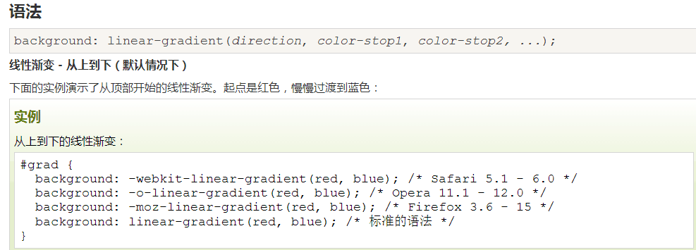
background:-webkit-radial-gradien :这个属性是讲颜色的渐变,比如哆啦A梦的蓝色,从右上再到左下,颜色逐渐加深,线性渐变;
线性渐变实例:
border-radius:转换为圆角; http://www.runoob.com/w3cnote/css3-rounded-picture-2.html 这个链接里面有很多我很喜欢的效果。
z-index:指定该元素的层叠顺序,比如说图片,若z-index为-1,覆盖在图片上面的字就会显示出来。
rgba(0,0,0,0.45):表示透明度的;
—overflow:设置当元素的内容溢出其区域时发生的事情,hidden,隐藏。
transform:转换和旋转;
这里还有一个动画效果,目的是让小叮当的眼睛动起来~
 1 <style type="text/css">
 2     @-webkit-keyframes eyemove{
 3         80%{margin:0; }
 4         85%{margin:-20px 0 0 0;}
 5         90%{margin:0 0 0 0;}
 6         93%{margin:0 0 0 7px;}
 7         96%{margin:0 0 0 0;}
 8     }
 9     @-webkit-keyframes eyemove{
10         80%{margin:0; }
11         85%{margin:-20px 0 0 0;}
12         90%{margin:0 0 0 0;}
13         93%{margin:0 0 0 7px;}
14         96%{margin:0 0 0 0;}
15     }
16     @-webkit-keyframes eyemove{
17         80%{margin:0; }
18         85%{margin:-20px 0 0 0;}
19         90%{margin:0 0 0 0;}
20         93%{margin:0 0 0 7px;}
21         96%{margin:0 0 0 0;}
22     }
23
24     .doraemon .eyes .eye .black{
25         -webkit-animation-name:eyemove;
26         -webkit-animation-duration: 5s;
27         -webkit-animation-timing-function:linear;
28         -webkit-animation-iteration-count: 20000;
29         -webkit-animation-name:eyemove;
30         -webkit-animation-duration: 5s;
31         -webkit-animation-timing-function:linear;
32         -webkit-animation-iteration-count: 20000;
33         -webkit-animation-name:eyemove;
34         -webkit-animation-duration: 5s;
35         -webkit-animation-timing-function:linear;
36         -webkit-animation-iteration-count: 20000;
37     }
38
39
40     </style>
最后再来看一看哆啦A梦的最终效果图。
