CSS3 2D 转换
div
{
    transform: translate(50px,100px);
    -ms-transform: translate(50px,100px);		/* IE 9 */
    -webkit-transform: translate(50px,100px);	/* Safari and Chrome */
    -o-transform: translate(50px,100px);		/* Opera */
    -moz-transform: translate(50px,100px);		/* Firefox */
}
作用:值 translate(50px,100px) 把元素从左侧移动 50 像素,从顶端移动 100 像素。
测试代码
<!DOCTYPE HTML>
<html lang="en">
<head>
<title> 中心对称 </title>
<meta charset="UTF-8">
</head>
<style>
*{
padding: 0;
margin: 0;
}
div{
200px;
height: 200px;
background: red;
position:absolute;
left: 50%;
top: 50%;
/*translate(x,y) 定义 2D 转换,沿着 X 和 Y 轴移动元素。*/
transform: translate(-50%,-50%);/* 2D 转换*/
text-align: center;
}
div h1{
line-height: 200px;
}
</style>
<body>
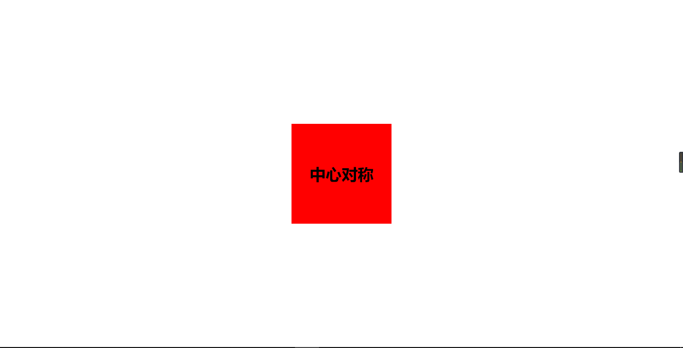
<div><h1>中心对称<h1></div>
</body>
</html>
效果图
总结
position:absolute;
left: 50%;
top: 50%;
/*translate(x,y)	定义 2D 转换,沿着 X 和 Y 轴移动元素。*/
transform: translate(-50%,-50%);/* 2D 转换*/