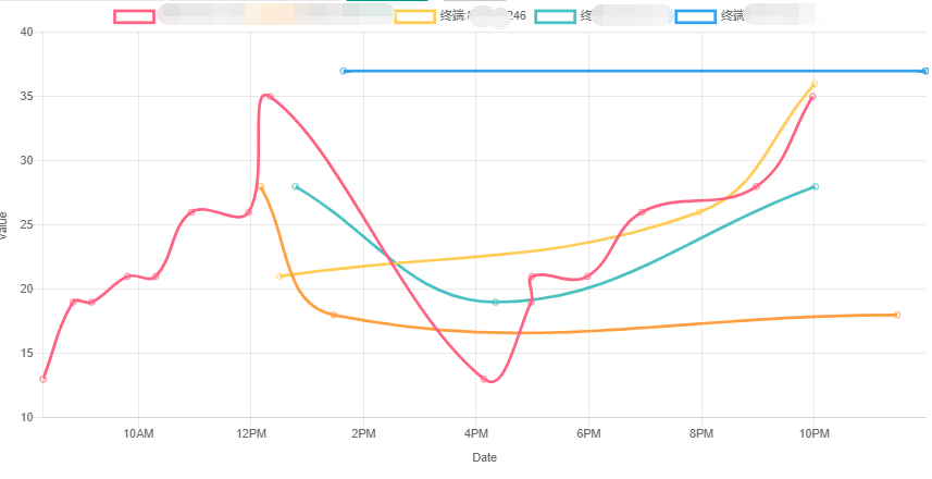
数据采集中各个终端的数据时间是不固定和数量也不固定的,所以不能用统一的x轴 标上固定数量的值区间的方式的 ,我简单发现百度的echart 没有具体的例子.
还是返回使用echarjs 尽管花样组合上可能少了点,但是却也够用
官网:https://www.chartjs.org/
源码是开源的.
1:在html代码中加入这段:
<canvas id="myChart"></canvas>
2: 灰色地方labels 是可以去掉的, 在不固定具体时间的x轴坐标值的情况下,labels 可以去掉, 然后
datasets内的data 需要写成下边红色字体的样式 是一个json 格式的数组,当然data内数值数据多了需要一个一个push进去, 直接用json格式怼上似乎无效
var config = {
            type: 'line',
            data: {
                labels: [ // Date Objects
                    newDate(0),
                    newDate(1),
                    newDate(2),
                    newDate(3),
                    newDate(4),
                    newDate(5),
                    newDate(6)
                ],
                datasets: [{
                    label: 'My First dataset',
                    backgroundColor: color(window.chartColors.red).alpha(0.5).rgbString(),
                    borderColor: window.chartColors.red,
                    fill: false,
                    data: [
                        randomScalingFactor(),
                        randomScalingFactor(),
                        randomScalingFactor(),
                        randomScalingFactor(),
                        randomScalingFactor(),
                        randomScalingFactor(),
                        randomScalingFactor()
                    ],
                }, {
                    label: 'My Second dataset',
                    backgroundColor: color(window.chartColors.blue).alpha(0.5).rgbString(),
                    borderColor: window.chartColors.blue,
                    fill: false,
                    data: [
                        randomScalingFactor(),
                        randomScalingFactor(),
                        randomScalingFactor(),
                        randomScalingFactor(),
                        randomScalingFactor(),
                        randomScalingFactor(),
                        randomScalingFactor()
                    ],
                }, {
                    label: 'Dataset with point data',
                    backgroundColor: color(window.chartColors.green).alpha(0.5).rgbString(),
                    borderColor: window.chartColors.green,
                    fill: false,
                    data: [{
                        x: newDateString(0),
                        y: randomScalingFactor()
                    }, {
                        x: newDateString(5),
                        y: randomScalingFactor()
                    }, {
                        x: newDateString(7),
                        y: randomScalingFactor()
                    }, {
                        x: newDateString(15),
                        y: randomScalingFactor()
                    }],
                }]
            },
            options: {
                title: {
                    text: 'Chart.js Time Scale'
                },
                scales: {
                    x: {
                        type: 'time',
                        time: {
                            parser: timeFormat,
                            // round: 'day'
                            tooltipFormat: 'll HH:mm'
                        },
                        scaleLabel: {
                            display: true,
                            labelString: 'Date'
                        }
                    },
                    y: {
                        scaleLabel: {
                            display: true,
                            labelString: 'value'
                        }
                    }
                },
            }
        };
到这儿会存在一个问题,x 轴的时间值x的格式 问题, 这里的格式chartjs 绑定的moment.js 中设置的格式一样
  var timeFormat = 'YYYY/MM/DD HH:mm:ss';    服务器传过来的数值也要转换成这种格式,我是在服务器上直接把datetime 直接转换成字符串的方式 , 因为不转的话 传到前端就是date(12342423423) 类似这个字样的东西

前端js完整代码
<script>
    var timeFormat = 'YYYY/MM/DD HH:mm:ss';

    function newDate(days) {
      //  console.log(moment().add(days, 'h').toDate())
        return moment().add(days, 'h').toDate();
    }

    function newDateString(days) {
     //   console.log(moment().add(days, 'h').format(timeFormat))
        return moment().add(days, 'h').format(timeFormat);
    }
    var color = Chart.helpers.color;
    var config = {
        type: 'line',
        data: {
           @* labels: [
                newDateString(0),
                newDateString(1),
                newDateString(2),
                 newDateString(3),
                newDateString(4),
                newDateString(5),
                 newDateString(6),
                newDateString(7),
                newDateString(8)
            ],*@
            datasets: [ @*{
                label: '终端1',
                    backgroundColor: color('rgb(75, 192, 192)').alpha(0.5).rgbString(),
                    borderColor: color('rgb(75, 192, 192)').alpha(0.5).rgbString(),
                fill: false,
                data: [{
                    x: newDateString(0),
                    y: 25
                }, {
                    x: newDateString(1),
                    y: 19
                }, {
                    x: newDateString(2),
                    y: 18
                }, {
                    x: newDateString(3),
                    y: 23
                }],
            },
            {
                    label: '终端2',
                    backgroundColor: color('rgb(75, 192, 192)').alpha(0.5).rgbString(),
                    borderColor: color('rgb(75, 192, 192)').alpha(0.5).rgbString(),
                    fill: false,
                    data: [{
                        x: newDateString(0),
                        y: 36
                    }, {
                        x: newDateString(1),
                        y: 25
                    }, {
                        x: newDateString(2),
                        y: 13
                    }, {
                        x: newDateString(3),
                        y: 26
                    }],

                },
                {
                    label: '终端3',
                    backgroundColor: color('rgb(75, 192, 196)').alpha(0.5).rgbString(),
                    borderColor: color('rgb(75, 102, 192)').alpha(0.5).rgbString(),
                    fill: false,
                    data: [{
                        x: newDateString(0),
                        y: 20
                    }, {
                        x: newDateString(1),
                        y: 30
                    }, {
                        x: newDateString(2),
                        y: 40
                    }, {
                        x: newDateString(3),
                        y: 26
                    }],
                }*@

            ]
        },
        options: {
            title: {
                text: 'Chart.js Time Scale'
            },
            scales: {
                xAxes: [{
                    type: 'time',
                    time: {
                        parser: timeFormat,
                     //    round: 'day',
                      //  quarter: 'MMM YYYY'
                        tooltipFormat: 'll h:mm:ss a'
                    },
                    scaleLabel: {
                        display: true,
                        labelString: 'Date'
                    }
                }],
                yAxes: [{
                    scaleLabel: {
                        display: true,
                        labelString: 'value'
                    }
                }]
            },
        }
    };

    window.onload = function () {
        var ctx = document.getElementById('myChart').getContext('2d');
        window.myLine = new Chart(ctx, config);

    };

    var colorNames = Object.keys({
        red: 'rgb(255, 99, 132)',
        orange: 'rgb(255, 159, 64)',
        yellow: 'rgb(255, 205, 86)',
        green: 'rgb(75, 192, 192)',
        blue: 'rgb(54, 162, 235)',
        purple: 'rgb(153, 102, 255)',
        grey: 'rgb(201, 203, 207)',
        SaddleBrown: 'rgb(139 69 19)',
        DarkCyan:'rgb(0 139 139)'
    });
    $('#addDataset').click(function () {
        $.ajax({
            type: "GET",
            url: "/AutoNetwork/ChartsLocations/LocationData",
            //   data: { username: $("#username").val(), content: $("#content").val() },
          //  data: { lastvalue: JsLastDatetime, terminal: jsvalues.terminal },
            dataType: "json",
            success: function (data1) {
           //     console.log(data1);

                //根据数量新建datasets
                var termlist = data1.Terminal_lst;
             //   console.log(termlist);
                for (var i = 0; i < termlist.length; i++) {
                    var colorName = colorNames[config.data.datasets.length % colorNames.length]

                    var newColor = window.chartColors[colorName];
                    var newDataset = {
                        label: '终端:' + termlist[i].DataIMEI,
                        borderColor: newColor,
                        backgroundColor: color(newColor).alpha(0).rgbString(),
                        data: [],
                    };

                    var tvlst = termlist[i].TimeAndValue_lst
                    for (var j = 0; j < tvlst.length; j++) {
                      //  console.log(tvlst[i])
                        newDataset.data.push(tvlst[j]);
                    }
                  //  console.log(da);
                    config.data.datasets.push(newDataset);
                    window.myLine.update();

                }
            }
            , error: function (err) {
               // console.log(err.statusText);
                console.log('异常');
            }
        });
    });
    window.chartColors = {
        red: 'rgb(255, 99, 132)',
        orange: 'rgb(255, 159, 64)',
        yellow: 'rgb(255, 205, 86)',
        green: 'rgb(75, 192, 192)',
        blue: 'rgb(54, 162, 235)',
        purple: 'rgb(153, 102, 255)',
        grey: 'rgb(201, 203, 207)'
    };
</script>