HTML:
 <div class="parent">
       <div class="child"></div>
 </div>
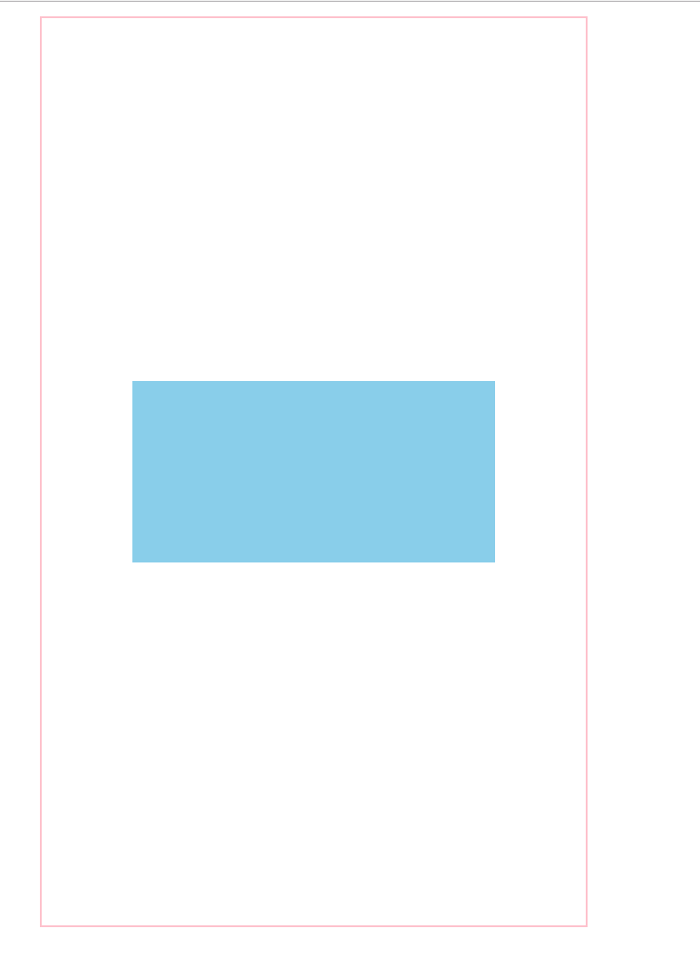
1.固定宽高
/* 利用calc */
.parent{
    position: relative;
    height: 500px;
    width: 300px;
    margin: 0 auto;
    border: 1px solid pink;
}
.child{
    width: 200px;
    height: 100px;
    position: absolute;
    left: -webkit-calc(50% - 100px);
    top: -webkit-calc(50% - 50px);
    background: skyblue;
}
/* 利用margin-left,margin-top */
.child{
    width: 200px;
    height: 100px;
    position: absolute;
    left: 50%;
    top: 50%;
    margin-left: -100px;
    margin-top: -50px;
    background: skyblue;
}
/* 利用margin:auto */
.child{
    width: 200px;
    height: 100px;
    position: absolute;
    left: 0;
    right: 0;
    top: 0;
    bottom: 0;
    margin: auto;
    background: skyblue;
}
2.不固定宽高
/* 子元素的宽高暂时没有去,可以自己去掉测试 */
.parent{
    position: relative;
    height: 500px;
     300px;
    margin: 0 auto;
    border: 1px solid pink;
    /* 使用transform时使用,预防出现0.5px */
    -webkit-transform-style: preserve-3d;
    -moz-transform-style: preserve-3d;
    transform-style: preserve-3d;
}

/* 利用transform */
.child{
     200px;
    height: 100px;
    position: absolute;
    left: 50%;
    top: 50%;
    transform: translate(-50%,-50%);
    background: skyblue;
}
效果图: