一、文档流
运用css布局首先要具备一些概念上的知识,文档流的概念充斥着布局的整个过程。浏览器渲染页面是有先后顺序的,其顺序是至上而下,根据HTML的文档结构进行渲染。
二、div+css
耳熟能详的div+css布局指的是:仅用容器标签div配合css样式进行布局。以往的table布局是不推荐使用的。
三、display: none / block/ inline / inline-block
设置元素的显示方式,以上为常见的取值。这是布局中非常重要的概念
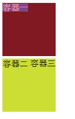
block块元素:独自占据一行的元素,可控制宽高。如 div p h1~h6 ...
inline内联元素:不占据一行,,不能控制宽高,需要内容撑开。如 a span ...
inline-block: 内联的块元素,不占据一整行,但是可以控制宽高
CSS:
    .box1{
        display: block;
         100px;
        height: 100px;
        background-color: #aaa;
    }
    .box2{
        display: inline;
     100px;
        height:100px;
        background-color: #f45;
    }
    .box3{
        display: inline-block;
         100px;
        height: 100px;
        background-color: #567;
    }
HTML:
     <div class="box1">容器一</div>
    <div class="box2">容器二</div>
    <div class="box3">容器三</div>

可以看出,inline和inline-block都不会独自占据一行,且inline无法控制宽高。
好了,以上就是布局需要熟悉掌握的概念,接下来介绍布局的具体方法和需要用到的属性。
四、浮动布局float:浮动的目的是使元素脱离文档流,按照自己的意愿进行布局。
1.取值:none,left,right。浮动只能向左或者向右
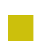
<!doctype html>
<html lang="en">
<head>
    <meta charset="UTF-8">
    <title>Document</title>
    <style>
        div{
            display: block;
            width: 100px;
            height: 100px;
            margin-bottom: 5px;
            background-color: #000;
        }
        div.box2{
            background-color: #f34;
            float: left;
        }
        div.box3{
            background-color: #cd3;
            float: right;
        }
    </style>
</head>
<body>
    <div class="box1">容器一</div>
    <div class="box2">容器二</div>
    <div class="box3">容器三</div>
</body>
</html>
效果展示

可以看到,容器一仍然是不浮动的块元素,独自占据一行,而容器二和容器三分别向左右浮动,并出现在同一行,display:block,说明
2.浮动元素已经脱离文档流。
我们稍微更改上述代码,设置容器一浮动,二和三不浮动。
CSS:
    div{
            display: block;
             100px;
            height: 100px;
            margin-bottom: 5px;
            background-color: #000;
        }
        div.box1{float: left;opacity:0.5;}  /*容器一浮动,并设置了透明度*/
        div.box2{background-color: #f34;}
        div.box3{ackground-color: #cd3;text-align:right}  /*将文本向右对齐*/
结果如下:
可以看到,设置了黑色背景的容器一变成了另外一种颜色,容器只剩下两个,为什么呢??其实原因是容器一设置了浮动,它原本的位置就不占用文档流的空间,后面的元素就会紧接着补上,所以容器二去到了容器一原本的位置,我们看到的容器一背景色实际上是容器一和二层叠所得的颜色,而文字“容器二”则围绕在浮动元素周围,不能补位。
结论:3.标准浏览器中,浮动元素脱离文档流,它后面的元素会占据浮动元素原本的位置。
4.文字内容会围绕在浮动元素周围
<!doctype html>
<html lang="en">
<head>
    <meta charset="UTF-8">
    <title>Document</title>
    <style>
        div{

            width: 100px;
            height: 100px;
            opacity:0.5;
            background-color: #000;
                        float: left;
        }
    </style>
</head>
<body>
    <div class="box1"></div>你好啊你好啊你好啊你好啊你好啊你好啊你好啊你好啊你好啊你好啊你好啊你好啊你好啊你好啊你好啊你好啊你好啊你好啊你好啊你好啊你好啊你好啊你好啊你好啊你好啊你好啊你好啊你好啊你好啊你好啊你好啊你好啊你好啊你好啊你好啊你好啊你好啊你好啊你好啊你好啊你好啊你好啊你好啊你好啊你好啊你好啊你好啊你好啊你好啊你好啊你好啊你好啊你好啊你好啊你好啊你好啊
</body>
</html>
效果演示

五、清除浮动clear
1.取值:left,right,both
其常用方法是添加一个div.clear标签,在需要的清除浮动的地方加入此标签
<!doctype html>
<html lang="en">
<head>
    <meta charset="UTF-8">
    <title>清除浮动</title>
    <style>
        .box{
            width: 50px;
            height: 50px;
            background-color: #f57;
            margin: 5px;
            float: left;
        }
        .clear{
            clear: both;
        }
    </style>
</head>
<body>

    <div class="box"></div>
    <div class="box"></div>

    <div class="clear"></div>  <!-- 清除浮动 -->

    <div class="box"></div>
    <div class="box"></div>
    <div class="box"></div>

    <div class="clear"></div>  <!-- 清除浮动 -->

    <div class="box"></div>
    <div class="box"></div>
    <div class="box"></div>
    <div class="box"></div>

    <div class="clear"></div>  <!-- 清除浮动 -->

    <div class="box"></div>
    <div class="box"></div>
    <div class="box"></div>
</body>
</html>
效果演示

六、position定位
1.取值:static 默认值,无定位
absolute 绝对定位,脱离文档流。若父元素无定位,则以body坐标原点进行定位;若position:relative,则以父元素左上角(原点)进行定位。
relative 相对定位,不脱离文档流。相对自己原来的位置进行定位。
fixed 固定定位,脱离文档流。相对浏览器窗口进行定位。
2.3种定位方式都是用top bottom left right进行定位
<!doctype html>
<html lang="en">
<head>
    <meta charset="UTF-8">
    <title>Document</title>
    <style>
        /*html,
        body{
            height: 100%;
        }
        body{
            background-color: #808;
        }
        .box{
            position:absolute;
             100px;
            height: 100px;
            top: 10px;
            left: 10px;
            background-color: #f5f00c;
        }*/
        .box1{
            width: 100px;
            height: 100px;
            position: relative;
            top:50px;
            left: 30px;
            background-color: #ccc00c;
        }
    </style>
</head>
<body>

    <!-- <div class="box"></div> -->
    <div class="box1"></div>
</body>
</html>
效果演示
<!doctype html>
<html lang="en">
<head>
    <meta charset="UTF-8">
    <title>absolute定位的两种情况</title>
    <style>
        .box,
        .son{
            position:absolute;
            width: 100px;
            height: 100px;
            top: 10px;
            left: 10px;
            background-color: #f5f00c;
        }
        .father{
            width: 150px;
            height: 150px;
            background-color: #ccc;
            position: relative;
            top: 150px;
            left: 20px;
        }
    </style>
</head>
<body>

    <div class="box"></div>
    <div class="father">
        <div class="son"></div>
    </div>
</body>
</html>
演示结果

3.z-index:规定元素的层叠关系 ,即在平面建立一个z轴,数值越大离用户越近,层叠在上,数值越小的层叠在下。元素必须有position属性时z-index才生效
CSS:
    .box{
             100px;
            height: 100px;

        }
        .box:first-child{
            background-color: #5ceb3f;
            position: absolute;
            top: 0px;
            left: 0px;
            z-index:1;
        }
        .box:last-child{
            background-color: #808080;
            position: absolute;
            top: 50px;
            left: 50px;
            z-index:999;
        }
HTML:
    <div class="box"></div>
    <div class="box"></div>
效果演示
z-index:1;
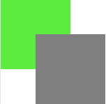
z-index:999;