第一部分: 前言
推荐网站: https://ant.design/docs/spec/introduce-cn
ant.design是基于react开发的一个解放ui和前端的工具,它提供了一致的设计方便我们快速开发和减少不必要的设计与代码,很多实用react框架的开发者都已经在使用ant.design了,且其在github上的star数也早已上万,足见其火热程度。
ant.design的目的也在于提高用户、开发者等多方的体验与幸福感。
ant.design设计很精妙,vue的iview就是模仿ant.design来实现的。
既然要使用ant.design,我们不妨了解其设计原则是否是我们想要的,对于设计,我了解的最多的便是对比、对齐、亲密性、重复性,而ant.design也很好的实现了这些规则,并在此基础山践行了更多的想法。
- 直接了当 『需要在哪里输出,就要允许在哪里输入』。这就是直接操作的原理。eg:不要为了编辑内容而打开另一个页面,应该直接在上下文中实现编辑。
- 足不出户
- 简化交互 --- 如悬停时出现工具,qq在这里做的很好。
- 提供邀请
- 巧用过渡
https://ant.design/docs/spec/colors-cn
第二部分: 使用(引入css不好的方法)
ant.design 使用起来非常简单。
第一步:
npm install antd --save
第二步(选择性的):
将node_modules下面的dist下面的 antd.min.css 取出放在静态文件中,在head中link引入。
第三步,开始使用:
在某个组件的上方:
import {message} from 'antd'
然后在需要的时候使用: message.error('错误'); message.success('登录成功!'); 类似的使用即可。
如果我们仅仅是js,css完全自己写,那么上面的就足够了,但是,如果我们希望使用 ant.design 提供的css,那么我们就需要把css文件取出放在静态文件中,并在html的head中引用了。
注意: 在使用的时候引入的css中还使用了css初始化,如下所示:


 * antd v2.12.3
 *
 * Copyright 2015-present, Alipay, Inc.
 * All rights reserved.
 */
/*! normalize.css v7.0.0 | MIT License | github.com/necolas/normalize.css */
/* Document
   ========================================================================== */
/**
 * 1. Correct the line height in all browsers.
 * 2. Prevent adjustments of font size after orientation changes in
 *    IE on Windows Phone and in iOS.
 */
html {
  line-height: 1.15;
  /* 1 */
  -ms-text-size-adjust: 100%;
  /* 2 */
  -webkit-text-size-adjust: 100%;
  /* 2 */
}
/* Sections
   ========================================================================== */
/**
 * Remove the margin in all browsers (opinionated).
 */
body {
  margin: 0;
}
/**
 * Add the correct display in IE 9-.
 */
article,
aside,
footer,
header,
nav,
section {
  display: block;
}
/**
 * Correct the font size and margin on `h1` elements within `section` and
 * `article` contexts in Chrome, Firefox, and Safari.
 */
h1 {
  font-size: 2em;
  margin: 0.67em 0;
}
/* Grouping content
   ========================================================================== */
/**
 * Add the correct display in IE 9-.
 * 1. Add the correct display in IE.
 */
figcaption,
figure,
main {
  /* 1 */
  display: block;
}
/**
 * Add the correct margin in IE 8.
 */
figure {
  margin: 1em 40px;
}
/**
 * 1. Add the correct box sizing in Firefox.
 * 2. Show the overflow in Edge and IE.
 */
hr {
  box-sizing: content-box;
  /* 1 */
  height: 0;
  /* 1 */
  overflow: visible;
  /* 2 */
}
/**
 * 1. Correct the inheritance and scaling of font size in all browsers.
 * 2. Correct the odd `em` font sizing in all browsers.
 */
pre {
  font-family: monospace, monospace;
  /* 1 */
  /* stylelint-disable-line */
  font-size: 1em;
  /* 2 */
}
/* Text-level semantics
   ========================================================================== */
/**
 * 1. Remove the gray background on active links in IE 10.
 * 2. Remove gaps in links underline in iOS 8+ and Safari 8+.
 */
a {
  background-color: transparent;
  /* 1 */
  -webkit-text-decoration-skip: objects;
  /* 2 */
}
/**
 * 1. Remove the bottom border in Chrome 57- and Firefox 39-.
 * 2. Add the correct text decoration in Chrome, Edge, IE, Opera, and Safari.
 */
abbr[title] {
  border-bottom: none;
  /* 1 */
  text-decoration: underline;
  /* 2 */
  text-decoration: underline dotted;
  /* 2 */
}
/**
 * Prevent the duplicate application of `bolder` by the next rule in Safari 6.
 */
b,
strong {
  font-weight: inherit;
}
/**
 * Add the correct font weight in Chrome, Edge, and Safari.
 */
b,
strong {
  font-weight: bolder;
}
/**
 * 1. Correct the inheritance and scaling of font size in all browsers.
 * 2. Correct the odd `em` font sizing in all browsers.
 */
code,
kbd,
samp {
  font-family: monospace, monospace;
  /* 1 */
  /* stylelint-disable-line */
  font-size: 1em;
  /* 2 */
}
/**
 * Add the correct font style in Android 4.3-.
 */
dfn {
  font-style: italic;
}
/**
 * Add the correct background and color in IE 9-.
 */
mark {
  background-color: #ff0;
  color: #000;
}
/**
 * Add the correct font size in all browsers.
 */
small {
  font-size: 80%;
}
/**
 * Prevent `sub` and `sup` elements from affecting the line height in
 * all browsers.
 */
sub,
sup {
  font-size: 75%;
  line-height: 0;
  position: relative;
  vertical-align: baseline;
}
sub {
  bottom: -0.25em;
}
sup {
  top: -0.5em;
}
/* Embedded content
   ========================================================================== */
/**
 * Add the correct display in IE 9-.
 */
audio,
video {
  display: inline-block;
}
/**
 * Add the correct display in iOS 4-7.
 */
audio:not([controls]) {
  display: none;
  height: 0;
}
/**
 * Remove the border on images inside links in IE 10-.
 */
img {
  border-style: none;
}
/**
 * Hide the overflow in IE.
 */
svg:not(:root) {
  overflow: hidden;
}
/* Forms
   ========================================================================== */
/**
 * 1. Change the font styles in all browsers (opinionated).
 * 2. Remove the margin in Firefox and Safari.
 */
button,
input,
optgroup,
select,
textarea {
  font-family: sans-serif;
  /* 1 */
  font-size: 100%;
  /* 1 */
  line-height: 1.15;
  /* 1 */
  margin: 0;
  /* 2 */
}
/**
 * Show the overflow in IE.
 * 1. Show the overflow in Edge.
 */
button,
input {
  /* 1 */
  overflow: visible;
}
/**
 * Remove the inheritance of text transform in Edge, Firefox, and IE.
 * 1. Remove the inheritance of text transform in Firefox.
 */
button,
select {
  /* 1 */
  text-transform: none;
}
/**
 * 1. Prevent a WebKit bug where (2) destroys native `audio` and `video`
 *    controls in Android 4.
 * 2. Correct the inability to style clickable types in iOS and Safari.
 */
button,
html [type="button"],
[type="reset"],
[type="submit"] {
  -webkit-appearance: button;
  /* 2 */
}
/**
 * Remove the inner border and padding in Firefox.
 */
button::-moz-focus-inner,
[type="button"]::-moz-focus-inner,
[type="reset"]::-moz-focus-inner,
[type="submit"]::-moz-focus-inner {
  border-style: none;
  padding: 0;
}
/**
 * Restore the focus styles unset by the previous rule.
 */
button:-moz-focusring,
[type="button"]:-moz-focusring,
[type="reset"]:-moz-focusring,
[type="submit"]:-moz-focusring {
  outline: 1px dotted ButtonText;
}
/**
 * Correct the padding in Firefox.
 */
fieldset {
  padding: 0.35em 0.75em 0.625em;
}
/**
 * 1. Correct the text wrapping in Edge and IE.
 * 2. Correct the color inheritance from `fieldset` elements in IE.
 * 3. Remove the padding so developers are not caught out when they zero out
 *    `fieldset` elements in all browsers.
 */
legend {
  box-sizing: border-box;
  /* 1 */
  color: inherit;
  /* 2 */
  display: table;
  /* 1 */
  max- 100%;
  /* 1 */
  padding: 0;
  /* 3 */
  white-space: normal;
  /* 1 */
}
/**
 * 1. Add the correct display in IE 9-.
 * 2. Add the correct vertical alignment in Chrome, Firefox, and Opera.
 */
progress {
  display: inline-block;
  /* 1 */
  vertical-align: baseline;
  /* 2 */
}
/**
 * Remove the default vertical scrollbar in IE.
 */
textarea {
  overflow: auto;
}
/**
 * 1. Add the correct box sizing in IE 10-.
 * 2. Remove the padding in IE 10-.
 */
[type="checkbox"],
[type="radio"] {
  box-sizing: border-box;
  /* 1 */
  padding: 0;
  /* 2 */
}
/**
 * Correct the cursor style of increment and decrement buttons in Chrome.
 */
[type="number"]::-webkit-inner-spin-button,
[type="number"]::-webkit-outer-spin-button {
  height: auto;
}
/**
 * 1. Correct the odd appearance in Chrome and Safari.
 * 2. Correct the outline style in Safari.
 */
[type="search"] {
  -webkit-appearance: textfield;
  /* 1 */
  outline-offset: -2px;
  /* 2 */
}
/**
 * Remove the inner padding and cancel buttons in Chrome and Safari on macOS.
 */
[type="search"]::-webkit-search-cancel-button,
[type="search"]::-webkit-search-decoration {
  -webkit-appearance: none;
}
/**
 * 1. Correct the inability to style clickable types in iOS and Safari.
 * 2. Change font properties to `inherit` in Safari.
 */
::-webkit-file-upload-button {
  -webkit-appearance: button;
  /* 1 */
  font: inherit;
  /* 2 */
}
/* Interactive
   ========================================================================== */
/*
 * Add the correct display in IE 9-.
 * 1. Add the correct display in Edge, IE, and Firefox.
 */
details,
menu {
  display: block;
}
/*
 * Add the correct display in all browsers.
 */
summary {
  display: list-item;
}
/* Scripting
   ========================================================================== */
/**
 * Add the correct display in IE 9-.
 */
canvas {
  display: inline-block;
}
/**
 * Add the correct display in IE.
 */
template {
  display: none;
}
/* Hidden
   ========================================================================== */
/**
 * Add the correct display in IE 10-.
 */
[hidden] {
  display: none;
}
@font-face {
  font-family: "Helvetica Neue For Number";
  src: local("Helvetica Neue");
  unicode-range: U+30-39;
}
* {
  box-sizing: border-box;
  -webkit-tap-highlight-color: rgba(0, 0, 0, 0);
}
*:before,
*:after {
  box-sizing: border-box;
}
html,
body {
   100%;
  height: 100%;
}
body {
  font-family: "Helvetica Neue For Number", -apple-system, BlinkMacSystemFont, "Segoe UI", Roboto, "PingFang SC", "Hiragino Sans GB", "Microsoft YaHei", "Helvetica Neue", Helvetica, Arial, sans-serif;
  font-size: 12px;
  line-height: 1.5;
  color: rgba(0, 0, 0, 0.65);
  background-color: #fff;
}
body,
div,
dl,
dt,
dd,
ul,
ol,
li,
h1,
h2,
h3,
h4,
h5,
h6,
pre,
code,
form,
fieldset,
legend,
input,
textarea,
p,
blockquote,
th,
td,
hr,
button,
article,
aside,
details,
figcaption,
figure,
footer,
header,
hgroup,
menu,
nav,
section {
  margin: 0;
  padding: 0;
}
button,
input,
select,
textarea {
  font-family: inherit;
  font-size: inherit;
  line-height: inherit;
  color: inherit;
}
ul,
ol {
  list-style: none;
}
input::-ms-clear,
input::-ms-reveal {
  display: none;
}
::-moz-selection {
  background: #108ee9;
  color: #fff;
}
::selection {
  background: #108ee9;
  color: #fff;
}
h1,
h2,
h3,
h4,
h5,
h6 {
  color: rgba(0, 0, 0, 0.85);
  font-weight: 500;
}
a {
  color: #108ee9;
  background: transparent;
  text-decoration: none;
  outline: none;
  cursor: pointer;
  -webkit-transition: color .3s ease;
  transition: color .3s ease;
}
a:focus {
  text-decoration: underline;
  -webkit-text-decoration-skip: ink;
          text-decoration-skip: ink;
}
a:hover {
  color: #49a9ee;
}
a:active {
  color: #0e77ca;
}
a:active,
a:hover {
  outline: 0;
  text-decoration: none;
}
a[disabled] {
  color: rgba(0, 0, 0, 0.25);
  cursor: not-allowed;
  pointer-events: none;
}
其实,有些时候,使用 ant.design 没有办法满足我们的样式要求,所以,我们就需要使用 !important 来先找到样式然后强制来覆盖,但这绝对不是最佳实践。
下面我们介绍一种比较好用的方法。
第三部分: 使用(引入CSS较好的做法)、解析
之前我们引入css的方式是直接把整个css文件引入,这时一种不好的做法,因为在一个项目中也许我们仅仅是使用其中的几个组件,所以引入所有的css是完全没有必要的。
那么解决办法是什么呢?
拿 message 举例,我们可以在node_modules下的antd下的message中看到如下结构:
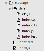
即,这里不仅仅有 index.js 和 index.d.ts 两者构成的js组件,还有一个 style 文件夹,这个文件夹中描述了对组件的样式。我们是可以直接从这里引入的。
比如,我们需要引入 message 的组件和相关的css,可以像下面这样:
import { message } from 'antd';
require('antd/lib/message/style')
当然也可以不用require, 用 import 也是可以的,如下所示:
import { message } from 'antd';
import 'antd/lib/message/style'
对于第一条语句,很容易理解,即引入了message的js组件。
对于第二条语句,由于 style 是一个文件夹,根据规则,是默认寻找其中的 index.js ,我们看看 index.js 中的内容是什么?
'use strict';

require('../../style/index.less');

require('./index.less');
其中的 ../../style/index.less 是ant.design的主题配置,比如,我们可以配置它的整体的颜色、文字大小等等。
另外,就是引入了这个style下面的 index.less, 比如message下的less是这样的:
@import "../../style/themes/default";

@message-prefix-cls: ~"@{ant-prefix}-message";

.@{message-prefix-cls} {
  font-size: 16px;
  position: fixed;
  z-index: @zindex-message;
   100%;
  top: 0px;
  left: 0;
  pointer-events: none;

  &-notice {
    padding: 16px;
    padding-top: 16px;
    text-align: center;
    &:first-child {
      margin-top: -8px;
    }
  }

  &-notice-content {
    padding: 16px 32px;
    border-radius: @border-radius-base;
    box-shadow: @shadow-2;
    background: @component-background;
    display: inline-block;
    pointer-events: all;
  }

  &-success .@{iconfont-css-prefix} {
    color: @success-color;
  }

  &-error .@{iconfont-css-prefix} {
    color: @error-color;
  }

  &-warning .@{iconfont-css-prefix} {
    color: @warning-color;
  }

  &-info .@{iconfont-css-prefix},
  &-loading .@{iconfont-css-prefix} {
    color: @info-color;
  }

  .@{iconfont-css-prefix} {
    margin-right: 8px;
    font-size: @font-size-lg;
    top: 1px;
    position: relative;
  }

  &-notice.move-up-leave.move-up-leave-active {
    animation-name: MessageMoveOut;
    overflow: hidden;
    animation-duration: 0.3s;
  }
}

@keyframes MessageMoveOut {
  0% {
    opacity: 1;
    max-height: 150px;
    padding: 8px;
  }
  100% {
    opacity: 0;
    max-height: 0;
    padding: 0;
  }
}
我们如果觉得样式不合适,只需要在这个less文件中直接修改就可以了。这样就会经过编译在页面上显示出效果。
那么其中的js文件又代表什么呢? 即一个是 index.js, 另外一个是 index.d.js,这两个文件就描述了这个 message 组件。 我们首先来看看 index.js 内容吧,直接在代码中注释解释:'use strict';// 这句声明表示这个文件是一个可以被引入的模块。
Object.defineProperty(exports, "__esModule", {
    value: true
});

// 引入react
var _react = require('react');

var _react2 = _interopRequireDefault(_react);

// 引入 rcNotification
var _rcNotification = require('rc-notification');

var _rcNotification2 = _interopRequireDefault(_rcNotification);

// 引入 icon 组件,即通知正确、错误时的图标icon
var _icon = require('../icon');

var _icon2 = _interopRequireDefault(_icon);

function _interopRequireDefault(obj) { return obj && obj.__esModule ? obj : { 'default': obj }; }

// 通知的toast默认时间设置为3s
var defaultDuration = 3;

// 这里的void后面可以是一个表达式,但是这个表达式的返回结果永远是undefined。
var defaultTop = void 0;
var messageInstance = void 0;
var key = 1;

// 这里应该是组件的前缀
var prefixCls = 'ant-message';
var getContainer = void 0;

// 获取一个 message 实例
function getMessageInstance() {
    messageInstance = messageInstance || _rcNotification2['default'].newInstance({
        prefixCls: prefixCls,
        transitionName: 'move-up',
        style: { top: defaultTop },
        getContainer: getContainer
    });
    return messageInstance;
}


function notice(content) {
    var duration = arguments.length > 1 && arguments[1] !== undefined ? arguments[1] : defaultDuration;
    var type = arguments[2];
    var onClose = arguments[3];

  // 定义icon的样式
    var iconType = {
        info: 'info-circle',
        success: 'check-circle',
        error: 'cross-circle',
        warning: 'exclamation-circle',
        loading: 'loading'
    }[type];

  //  在notice(通知)的时候创建一个实例
var instance = getMessageInstance();
    instance.notice({
        key: key,
        duration: duration,
        style: {},
        content: _react2['default'].createElement(
            'div',
            { className: prefixCls + '-custom-content ' + prefixCls + '-' + type },
            _react2['default'].createElement(_icon2['default'], { type: iconType }),
            _react2['default'].createElement(
                'span',
                null,
                content
            )
        ),
        onClose: onClose
    });
    return function () {
        var target = key++;
        return function () {
            instance.removeNotice(target);
        };
    }();
}

// 关键: 暴露出去的方法,就是我们在组件中引入message时可以直接调用的方法。
exports['default'] = {
    info: function info(content, duration, onClose) {
        return notice(content, duration, 'info', onClose);
    },
    success: function success(content, duration, onClose) {
        return notice(content, duration, 'success', onClose);
    },
    error: function error(content, duration, onClose) {
        return notice(content, duration, 'error', onClose);
    },

    // Departed usage, please use warning()
    warn: function warn(content, duration, onClose) {
        return notice(content, duration, 'warning', onClose);
    },
    warning: function warning(content, duration, onClose) {
        return notice(content, duration, 'warning', onClose);
    },
    loading: function loading(content, duration, onClose) {
        return notice(content, duration, 'loading', onClose);
    },
    config: function config(options) {
        if (options.top !== undefined) {
            defaultTop = options.top;
            messageInstance = null; // delete messageInstance for new defaultTop
        }
        if (options.duration !== undefined) {
              = options.duration;
        }
        if (options.prefixCls !== undefined) {
            prefixCls = options.prefixCls;
        }
        if (options.getContainer !== undefined) {
            getContainer = options.getContainer;
        }
    },
    destroy: function destroy() {
        if (messageInstance) {
            messageInstance.destroy();
            messageInstance = null;
        }
    }
};
module.exports = exports['default'];
可以看到,这些方法,如 message.info() 、message.warning()都可以接收三个参数
- 希望通知的信息
- 这个通知信息所持续的时间
- 当通知结束之后的回调函数
ok!下面我们来看看 index.d.ts 文件:
/// <reference types="react" />
import React from 'react';
export declare type ConfigOnClose = () => void;
export interface ConfigOptions {
    top?: number;
    duration?: number;
    prefixCls?: string;
    getContainer?: () => HTMLElement;
}
declare const _default: {
    info(content: React.ReactNode, duration?: number | undefined, onClose?: ConfigOnClose | undefined): () => void;
    success(content: React.ReactNode, duration?: number | undefined, onClose?: ConfigOnClose | undefined): () => void;
    error(content: React.ReactNode, duration?: number | undefined, onClose?: ConfigOnClose | undefined): () => void;
    warn(content: React.ReactNode, duration?: number | undefined, onClose?: ConfigOnClose | undefined): () => void;
    warning(content: React.ReactNode, duration?: number | undefined, onClose?: ConfigOnClose | undefined): () => void;
    loading(content: React.ReactNode, duration?: number | undefined, onClose?: ConfigOnClose | undefined): () => void;
    config(options: ConfigOptions): void;
    destroy(): void;
};
export default _default;
哈哈 ,看不懂,等看完了ts回来讲解。
第四部分: ant.design的栅格系统
在 ant.design 中,对于栅格系统的设计和bootstrap中的设计是极其类似的,核心概念为: Row一定是最外层的, Col一定是分布在Row中的, 内容一定是在Col里的, 当然,在Col中我们还可以嵌套Row,在antd中, Col被分成了24分(与bootstrap的12份是类似的)。
在Col中,我们可以使用span={number}来制定一个Col的宽度,具体的做法是使用 百分比 来划分, 如 span={4} 的占满,那么每一份就是 16.6667% , 如果 span={12} 占满,那么每一份就是 50%。。。。 依次类推。
另外,在Col中我们还可以使用offset来进行便宜,正值为向右偏移,使用的原理是 margin-left 或者是 margin-right。
我们还可以在Row中设置 gutter={number } 这个值就是栅格的间距,具体实现原理就是对div根据百分比来划分,然后在div内容使用padding,这时content肯定是减小的。
除此之外,还可以在 Col 中设置 push={number} 以及 pull={number},实现原理也非常简单,就是使用元素的 position: relative;值,通过 left=百分比;以及right=百分比; 这样就可以实现pull 和 push 就可以了。
当然,我们还可以使用 Row 的flex进行布局,这种布局方式只需要在 Row 上设置 type="flex",就可以设置竖直和水平对齐方式了。
竖直对齐方式:
- align="top" 向上对齐
- align="middle" 中间对齐
- alegn="bottom" 向下对齐
水平对其方式:
- justify="start" 左对齐
- justify='end' 右对齐
- justify="center" 中间对齐
- justify='space-between' 中间
- jusify="space-around" 中间
这些flex布局的原理也很简单,就是直接使用css3的flex, 如align-items以及 justify-content。
另外, ant.design也是支持响应式布局的 。 和bootstrap一样。
注意点:
- 一般在我们制作表格的时候,可以使用 ant.design 的栅格系统,比如,左边是说明性文字,右边是选择项或者是input框。 整体使用flex布局即可。 左边的给一个固定的宽度,如span={4},右边的就是span={24}了, 并且在右边,如果是input框就比较好解决,如果是几个框,我们需要分开排列,就需要使用一个 <Row>,然后设置flex,其中justify应该是space-between,而能是start、end、center或者是 space-around。 因为对于 start、end、center,会使得几个框都会贴的很紧(除非是我们在其中再添加一个div,然后添加一个padding,这样才能做到分割),那么space-between和space-around的区别是什么?前者是两边贴近然后中间有空位置,而后者是两边的距离为中间padding的一般。
- 另外,我们也是可以用gutter的,但是最好不用,因为,gutter在两边也会有间距,这样对于对齐的控制非常麻烦。