meta
<meta charset="utf-8" />
<meta name="keywords" content="key1,key2" />
<meta name="description" content="" />
- viewport
<meta name="viewport" content="width=device-width, initial-scale=1" />
css
- !important
a{
    color:red !important;  会覆盖a的color
}
body{
    color:red !important;  不会覆盖a的color
}
- a的伪类
// 去掉下划线
a{
    text-decoration:none;
}
// 顺序不能变!
a:link{}  默认
a:visited{}  访问后的
a:hover{}
a:active{}  点击时
-
width=border+padding+width
-
继承
li{
    list-style: inherit;
}
- 文字居中
text-align:center;
inline没有宽高,塌陷
- 浮动清楚
在父级添加:overflow:hidden;
ul中的li居中,
li{inline-block }
ul{
    100%;
    list-style:none;
    margin:0 auto;
    text-align:center;  // 让li居中
    font-size:0;   //去除li间隔
}
li{
    display:inline-block;
    23%;
    height:50px;
    text-align:center;
    background:#eee;
    padding:0; margin:0;
}
li的间距消除:间距消除
使用浮动
使用浮动居中:让ul居中。让li填充ul
浮动无法确定宽度
ul{
    display: inline-block;
     100%;
    list-style: none;
    margin: 0 auto;
    text-align: center;
    font-size: 0;
    background: rgba(100,100,100,0.5);
    overflow: auto;
}
li{
    display: inline-block;
    float: left;
     25%;
    height: 50px;
    text-align: center;
    background: #eee;
    font-size: 24px;
}
.nav-container{
    text-align: center;
}
- table
table属性:
 @     align:设置在浏览器中的位置,left,center、right
      border:设置表单边框的粗细

      height:
      bgcolor:
      cellspacing:
      cellpadding:
      background:设置背景图片
 @     bordercolor:设置边界颜色
 @     bordercolorlight:设置边框明亮部分的颜色,外边框为左上,内为右下
 @     bordercolordark:设置边框阴影部分的颜色,外为右下,内为左上


      tr属性:
 @       align:设置表格行的对其方式 (水平) left,right,center 作用与文字
 ~       valign:设置表格行的对其方式(垂直)  top,Middle,bottom 作用与文字
        bgcolor: 背景颜色
 @       bordercolor:
 @       bordercolorlight:
 @       bordercolordark:

        td属性:
 @         align:设置水平对其方式,left,right,center
 ~         valign:垂直方向对其, top,middle,bottom
          width:
          height:
          colspan:横跨列数
          rowspan:纵跨行数
 @         bgcolor:
          background:背景图片
 @         bordercolor:
 @         bordercolorlight:
 @         bordercolordark:
选择器
属性选择器
	1. div[name] 定义了name属性的元素,div可以省略,表示定义了name属性的所有元素
	2. div[name=''] 定义了name=特定值的div员
	3. div[name~='bar'] 匹配div元素 name属性值是以空格符为分隔符的列表,其中一个列表值为bar 例如:
		a[title~='bar1']--<a title="bar1 bar2 bar3"></a>
	4. div[name|='en'] 匹配div元素,给元素定义了name元素,name元素是一个以连字符为分隔符的列表,值的开头字符为en
	5. div[name^='bar'] 匹配div元素,name属性值的前缀为bar
	6. div[name$='bar'] 匹配div元素,name属性值的后缀为bar
	7. div[name*='bar'] 匹配div元素,name属性中包含bar
伪类选择器
/*
	CSS3共定义了11中UI元素状态伪类选择器:
	  E:hover 鼠标移动
	  E:active
	  E:focus 聚焦
	  E:enabled
	  E:disabled
	  E:read-only
	  E:read-write
	  E:checked 选择时
	  E:default
	  E:indeterminate
	  E:selection
*/
input:enabled#name{ background:#999; }
input{
	-webkit-box-shadow:#06F 10px;
	border:2px solid;
}
#div1[name$=e]{
    200px;
	height:200px;
	background:#9C0;
	-webkit-box-shadow:#09C 20px;
}
结构伪类选择器
/*
	结构伪类选择器:

	兼容性:

	    结构伪类选择器是CSS3定义的,利用文档的树形结构图,通过文档的结构关系来匹配元素。
	  1. E:nth-child(n) 选择所在其父元素中第n个位置的匹配E的子元素。
	      n可以是数字1,2,3... 也可以是关键字odd(奇数)、even(偶数)和公式(2n,2n+1) 索引的起始值为1
	  2. E:nth-last-child(n)  倒数第n个元素

	  3. E:nth-of-type(n)  同类型的第n个元素  注意table下的所有元素都是属于同一类型的元素
	  4. E:nth-last-of-type(n) 同类型的倒数第N的元素
	  5. E:last-child  匹配元素E的父节点(元素)的子节点的最后一个节点(值包含元素类型的节点)
	  6. E:first-of-type 匹配E元素的父元素的 与E同类型的第一个元素
	  7. E:last-of-type 匹配E元素的父元素的 与E同类型的最后一个元素
	  8. E:only-child E的父元素只包含一个元素  <div><p></p></div> 但不匹配<div><h1></h1><p></p></div>
	  9. E:only-of-type 父元素只有一个与E同类型的子元素

*/
p.right{ color:#03F;}
p.left{ color:#9F3;}


tr:nth-child(2n){ color:#03F;}

p:nth-of-type(2){ color:#993;}
伪元素选择器
- ::first-letter,block
- ::first-line,,block
- ::before{content:'内容'}
- ::after{content:''}
注意老版本的浏览器只支持单冒号
:
组合选择器
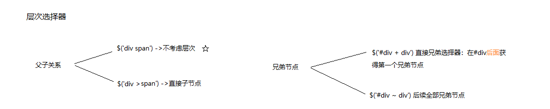
1.层次选择:
- div+p:div后面的紧跟着的p
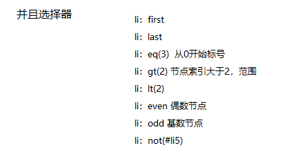
2.并且选择器
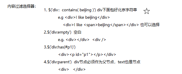
3.内容过滤选择器
样式
- letter-spacing
- word-spacing
- vertical-align
像素
- em:相对于父级元素的大小,如1.1em
- rem:响应式,相对于根元素(body)
盒子模型
- box-sizing,其他的自动撑开
1. border-box
width=width+padding+border
2. content-box
width=width
绝对定位,居中
div{
    100%;
    position:relative;
}
position:absolute;
left:50%;
margin-left:-自身的一半
弹性布局
- flex-grow,分配比例
    .container{
        display: flex;
        flex-direction: row;
        /*justify-content: space-around;*/
         100%;
    }
    .item{
        display: flex;
        flex-grow: 1;
        height: 60px;
        align-items: center;
        justify-content: center;
        background-color: #1b6d85;
    }
2D变形
- transition和animation,transform
1.兼容性:
	transition:渐变属性 渐变时间,渐变属性 渐变时间;
	-webkit-transition:属性 时间 过度模式;
	-moz-transition:属性 时间;
	-o-transition:属性 时间;

2.过度模式:
	  ease:缓慢开始,缓慢结束(默认)
	  linear:匀速
	  ease-in:缓慢开始
	  ease-out:缓慢结束
	  ease-in-out:缓慢开始,缓慢那结束
*/
div{
	200px;
	height:200px;
	background:rgba(100,100,100,.3);

	transition:background 2s;
	-moz-transition:background 2s;
	-webkit-transition:background 2s;
	-o-transition:background 2s;

	border-radius:20px;
}
3D
- 立方体
<style type="text/css">
*{
	padding: 0;margin: 0;list-style: none;border: 0;
}
/*参考面*/
ul{
	transform-style: preserve-3d;
	margin: 100px auto;
	 200px;height: 200px;
	/*border: 1px dashed;*/
	position: relative;
	transition: all 6s;
}
ul:hover{
	transform: rotateX(720deg) ;
}
li{
	 200px;height: 200px;
	border: 1px solid;
	position: absolute;
}
ul li:nth-of-type(1){
	background-color: red;
	transform: rotateY(90deg) translateZ(100px);
}
ul li:nth-of-type(2){
	background-color: green;
	transform: rotateY(90deg) translateZ(-100px);
}
/*上*/
ul li:nth-of-type(3){
	background-color: blue;
	transform: rotateX(90deg) translateZ(100px);
}
/*下*/
ul li:nth-of-type(4){
	background-color: indigo;
	transform: rotateX(90deg) translateZ(-100px);
}

/*前*/
ul li:nth-of-type(5){
	background-color: yellow;
	transform: translateZ(100px);
}
/*后*/
ul li:nth-of-type(6){
	background-color: pink;
	transform: translateZ(-100px);
}
</style>
	</head>
	<body>
		<ul>
			<li></li>
			<li></li>
			<li></li>
			<li></li>
			<li></li>
			<li></li>
		</ul>
	</body>
</html>
演示:
animate
- 定义动画
@keyframes myAni{
    from{

    }
    to{

    }
}
div{
    animation:myAni ease 3s;
}
chrome devtools