1.效果
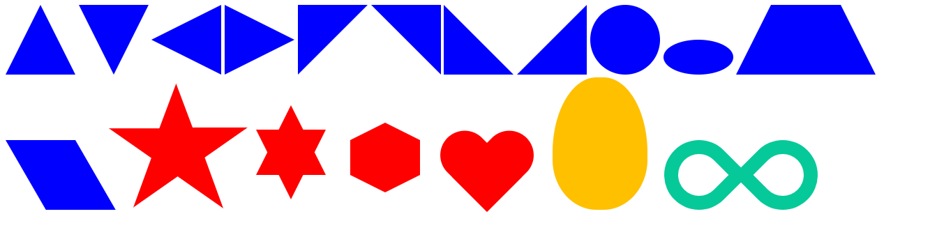
2.源码
<%@ page contentType="text/html;charset=UTF-8" language="java" %>
<html>
<head>
    <style type="text/css">
        #triangle_top{
            display: inline-block;
            width:0;
            height:0;
            border-left:50px solid transparent;
            border-right: 50px solid transparent;
            border-bottom:100px solid blue;
        }
        #triangle_bottom{
            display: inline-block;
            width:0;
            height:0;
            border-left:50px solid transparent;
            border-right:50px solid transparent;
            border-top:100px solid blue;
        }
        #triangle_left{
            display: inline-block;
            width:0;
            height:0;
            border-bottom:50px solid transparent;
            border-top:50px solid transparent;
            border-right:100px solid blue;
        }
        #triangle_right{
            display: inline-block;
            width:0;
            height:0;
            border-bottom:50px solid transparent;
            border-top:50px solid transparent;
            border-left:100px solid blue;
        }
        #right_triangle_top_left{
            display: inline-block;
            width:0;
            height:0;
            border-right:100px solid transparent;
            border-top:100px solid blue;
        }
        #right_triangle_top_right{
            display: inline-block;
            width:0;
            height:0;
            border-left:100px solid transparent;
            border-top:100px solid blue;
        }
        #right_triangle_bottom_left{
            display:inline-block;
            width:0;
            height:0;
            border-right:100px solid transparent;
            border-bottom:100px solid blue;
        }
        #right_triangle_bottom_right{
            display: inline-block;
            width:0;
            height:0;
            border-left:100px solid transparent;
            border-bottom:100px solid blue;
        }
        #circle{
            display: inline-block;
            width: 100px;
            height: 100px;
            background: blue;
            -webkit-border-radius: 50px;
            -moz-border-radius: 50px;
            border-radius: 50px;
        }
        #oval{
            display: inline-block;
            width:100px;
            height:50px;
            background-color: blue;
            -webkit-border-radius:50px/25px;
            -moz-border-radius:50px/25px;
            border-radius:50px/25px;
        }
        #trapezium{
            display: inline-block;
            height: 0;
            width: 100px;
            border-bottom: 100px solid blue;
            border-left: 50px solid transparent;
            border-right: 50px solid transparent;
        }
        #parallelogram{
            display: inline-block;
            height: 100px;
            width: 100px;
            background-color: blue;
            -webkit-transform: skewX(30deg);
            -moz-transform: skewX(30deg);
            -ms-transform: skewX(30deg);
            -o-transform: skewX(30deg);
            transform: skewX(30deg);
            transform-origin: 0 0;
        }
        #star {
            width: 0;
            height: 0;
            display: inline-block;
            border-right: 100px solid transparent;
            border-left: 100px solid transparent;
            border-bottom: 70px solid red;
            -moz-transform: rotate(35deg);
            -webkit-transform: rotate(35deg);
            -ms-transform: rotate(35deg);
            -o-transform: rotate(35deg);
            transform-origin: 80px 120px;
        }
        #star:before {
            content: '';
            height: 0;
            width: 0;
            display: inline-block;
            position: relative;
            top: -45px;
            left: -65px;
            border-left: 30px solid transparent;
            border-right: 30px solid transparent;
            border-bottom: 80px solid red;
            -webkit-transform: rotate(-35deg);
            -moz-transform: rotate(-35deg);
            -ms-transform: rotate(-35deg);
            -o-transform: rotate(-35deg);
            transform: rotate(-35deg);
        }
        #star:after{
            content: '';
            height:0;
            width:0;
            display: inline-block;
            position: relative;
            top: -78px;
            left: -105px;
            border-right: 100px solid transparent;
            border-left: 100px solid transparent;
            border-bottom: 70px solid red;
            -webkit-transform: rotate(-70deg);
            -moz-transform: rotate(-70deg);
            -ms-transform: rotate(-70deg);
            -o-transform: rotate(-70deg);
            transform: rotate(-70deg);
        }
        #star_six_points {
            width: 0;
            height: 0;
            position: relative;
            top: -50px;
            left: 50px;
            display: inline-block;
            border-left: 50px solid transparent;
            border-right: 50px solid transparent;
            border-bottom: 100px solid red;
        }
        #star_six_points:after{
            content: '';
            width:0;
            height:0;
            display: inline-block;
            position: absolute;
            top:35px;
            left:-50px;
            border-left: 50px solid transparent;
            border-right: 50px solid transparent;
            border-top: 100px solid red;
        }
        #hexagon{
            width:100px;
            height:50px;
            display: inline-block;
            position: relative;
            left: 80px;
            top: -50px;
            background-color: red;
        }
        #hexagon:before{
            content: '';
            width:0;
            height:0;
            display: inline-block;
            position: absolute;
            top: -25px;
            left: 0;
            border-left: 50px solid transparent;
            border-right: 50px solid transparent;
            border-bottom: 25px solid red;
        }
        #hexagon:after{
            content: '';
            width:0;
            height:0;
            display: inline-block;
            position: absolute;
            top: 50px;
            left: 0;
            border-left: 50px solid transparent;
            border-right: 50px solid transparent;
            border-top: 25px solid red;
        }
        #heart {
            top:-120px;
            left: 120px;
            position: relative;
            display: inline-block;
        }
        #heart:before,#heart:after {
            content: "";
            width: 70px;
            height: 115px;
            position: absolute;
            background: red;
            display: inline-block;
            -webkit-border-radius: 50px 50px 0 0;
            -moz-border-radius: 50px 50px 0 0;
            border-radius: 50px 50px 0 0;
            -webkit-transform: rotate(-45deg);
            -moz-transform: rotate(-45deg);
            -ms-transform: rotate(-45deg);
            -o-transform: rotate(-45deg);
            transform: rotate(-45deg);
        }
        #heart:after {
            left: 32px;
            -webkit-transform: rotate(45deg);
            -moz-transform: rotate(45deg);
            -ms-transform: rotate(45deg);
            -o-transform: rotate(45deg);
            transform: rotate(45deg);
        }
        #egg{
            width: 136px;
            height: 190px;
            position: relative;
            left: 260px;
            background: #ffc000;
            display: inline-block;
            -webkit-border-radius:63px 63px 63px 63px / 108px 108px 72px 72px;
            -moz-border-radius:63px 63px 63px 63px / 108px 108px 72px 72px;
            border-radius:63px 63px 63px 63px / 108px 108px 72px 72px;
        }
        #infinity{
            width: 220px;
            height: 100px;
            position: relative;
            display: inline-block;
            left: 280px;
        }
        #infinity:before,#infinity:after {
            content: "";
            width: 60px;
            height: 60px;
            position: absolute;
            top: 0;
            left: 0;
            border: 20px solid #06c999;
            -moz-border-radius: 50px 50px 0 50px;
            border-radius: 50px 50px 0 50px;
            -webkit-transform: rotate(-45deg);
            -moz-transform: rotate(-45deg);
            -ms-transform: rotate(-45deg);
            -o-transform: rotate(-45deg);
            transform: rotate(-45deg);
        }
        #infinity:after {
            left: auto;
            right: 0;
            -moz-border-radius: 50px 50px 50px 0;
            border-radius: 50px 50px 50px 0;
            -webkit-transform: rotate(45deg);
            -moz-transform: rotate(45deg);
            -ms-transform: rotate(45deg);
            -o-transform: rotate(45deg);
            transform: rotate(45deg);
        }
    </style>
</head>
<body>
<div id="triangle_top"></div>
<div id="triangle_bottom"></div>
<div id="triangle_left"></div>
<div id="triangle_right"></div>
<div id="right_triangle_top_left"></div>
<div id="right_triangle_top_right"></div>
<div id="right_triangle_bottom_left"></div>
<div id="right_triangle_bottom_right"></div>
<div id="circle"></div>
<div id="oval"></div>
<div id="trapezium"></div>
<div id="parallelogram"></div>
<div id="star"></div>
<div id="star_six_points"></div>
<div id="hexagon"></div>
<div id="heart"></div>
<div id="egg"></div>
<div id="infinity"></div>
</body>
</html>