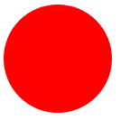
圆形
html
<div class="circle"></div>
css
圆形在设置CSS时要设置宽度和高度相等,然后设置border-radius属性为宽度或高度的一半即可:
.circle{
    width: 120px;
    height: 120px;
    background-color: red;
    border-radius: 60px;
    -webkit-border-radius:60px;
    -moz-border-radius:60px;
}
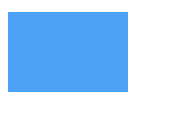
矩形
html
<div class="rectangle"></div>
css
.rectangle{
    width: 120px;
    height: 80px;
    background-color: #4da1f7;
}
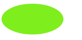
椭圆形
html
<div class="oval"></div>
设置椭圆形的CSS时,高度要设置为宽度的一半,border-radius属性也要做相应的改变:
.oval{
    width: 200px;
    height: 100px;
    background-color: #7fee1d;
    border-radius:100px/50px;
    -webkit-border-radius:100px/50px;
    -moz-border-radius:100px/50px;
}
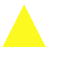
三角形
html
<div class="triangle"></div>
css
要创建一个CSS三角形,需要使用border,通过设置不同边的透明效果,我们可以制作出三角形的现状。另外,在制作三角形时,宽度和高度要设置为0。
.triangle{
    width: 0;
    height: 0;
    border-bottom:140px solid #fcf921;
    border-left:70px solid transparent;
    border-right:70px solid transparent;
}
倒三角形
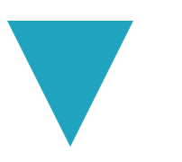
html
<div class="triangle"></div>
css
与正三角形不同的是,倒三角形要设置的是border-top、border-left和border-right三条边的属性:
.triangle{
    width: 0;
    height: 0;
    border-top:140px solid #20a3bf;
    border-left:70px solid transparent;
    border-right:70px solid transparent;
}
左三角形

css
.triangle{
    width: 0;
    height: 0;
    border-right: 140px solid #6bbf20;
    border-top:70px solid transparent;
    border-bottom: 70px solid transparent;
}
右三角形
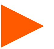
.triangle{
    width: 0;
    height: 0;
    border-left:140px solid #ff5a00;
    border-top:70px solid transparent;
    border-bottom:70px solid transparent;
}
菱形
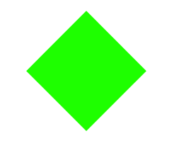
.diamond {
    width: 120px;
    height: 120px;
    background: #1eff00;
/* Rotate */
    -webkit-transform: rotate(-45deg);
    -moz-transform: rotate(-45deg);
    -ms-transform: rotate(-45deg);
    -o-transform: rotate(-45deg);
    transform: rotate(-45deg);
/* Rotate Origin */
    -webkit-transform-origin: 0 100%;
    -moz-transform-origin: 0 100%;
    -ms-transform-origin: 0 100%;
    -o-transform-origin: 0 100%;
    transform-origin: 0 100%;
    margin: 60px 0 10px 310px;
}