最近在做公司的官网,一般官网项目数据交互事极少的动画比较多。
就官网的动画说下,遇到一个线条的动画比较复杂难实现
下图动画效果是三个圆从左到右按顺序依次渐出后线条从左到右画线的效果出现。

实现方式:
1、使用svg在线画图工具按照尺寸自己画线条
2、画好后可以ctrl+s保存成svg格式的图片,然后图片可以用编辑器打开,里面代码内容如下:里面的patn是最关键的这些数字是生成线条的点。
里面的patn是最关键的这些数字是生成线条的点,我们把下面这段代码拷贝到自己的页面中就会看到想要的线条。
        <svg width="1200" height="400.00000000000006">
        <!-- Created with Method Draw - http://github.com/duopixel/Method-Draw/ -->
        <g>
         <title>background</title>
         <rect fill="transparent" id="canvas_background" height="402" width="1202" y="-1" x="-1"/>
         <g display="none" overflow="visible" y="0" x="0" height="100%" width="100%" id="canvasGrid">
          <rect fill="url(#gridpattern)" stroke-width="0" y="0" x="0" height="100%" width="100%"/>
         </g>
        </g>
        <g>
         <path class="path-loop1" d="M 3.603 200.087 C 3.603 200.087 0.858 2.056 200.184 2.056 C 399.51 2.056 401.073 199.037 400.291 199.818 C 399.509 200.599 400.291 396.799 600.399 396.799 C 800.507 396.799 800.506 199.818 800.506 199.818 C 800.506 199.818 802.851 2.056 1000.614 2.056 C 1198.377 2.056 1197.595 199.818 1197.595 199.818" opacity="0.5" fill-opacity="null" stroke-opacity="null" stroke-width="1.5" stroke="url('#orange_red')" fill="transparent"/>
        </g>
        </svg>
3、但是整个线条是黑色的需要把一部的颜色变成橙色,这个时候可以用线条渐变来完成,在svg标签中加入以下代码。
具体原理可以参考此篇文章(https://www.cnblogs.com/lovesong/p/5971781.html)介绍的很详细
        <defs>
            <linearGradient id="orange_red" x1="0%" y1="55.1%" x2="100%" y2="0%">
                 <stop offset="0%" stop-color=" #45474A;"/>
                 <stop offset="52.99%" stop-color=" #45474A;"/>
                 <stop offset="53%" stop-color="#FC6D0B"/>
                 <stop offset="100%" stop-color="#FC6D0B"/>
            </linearGradient>
       </defs>
4、css动画实现引用animejs来实现(http://www.animejs.cc),其中具体的动画可以仿照此块(http://www.animejs.cc/demo/)来实现。
5、最后是动画的实现了,在滚动条滑动此页面显示时并三个圆的动画执行完成后在执行线条的动画,这个也可以自己写js或者引用wow.js
源码即使用可以参照(https://github.com/matthieua/WOW)
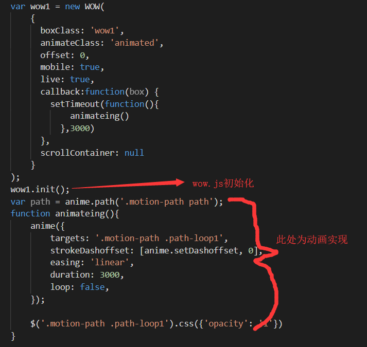
wow.js的使用大概说下

这大概就是此动画完成的整个步骤了。。