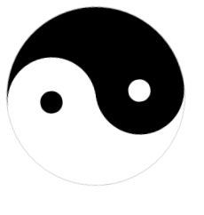
主要使用border-radius属性实现圆,半圆,定位坐标覆盖部分模块。
半圆:
50%; height: 100%;
border-radius:100% 0 0 100% /50% 0 0 50%;
<!DOCTYPE html>
<html>
<head>
    <meta charset="UTF-8">
    <title>太极图</title>
    <style type="text/css">
    .taiji{position: relative; width: 200px; height: 200px; border-radius: 50%; background-color: #fff;border:solid 1px #ccc;    animation: spin 6s linear infinite;/*动画设置*/}
    .tj_1{position: absolute; top: 0px; width: 50%; height: 100%;}
    .tj_big1{left: 0px; border-radius:100% 0 0 100% /50% 0 0 50%; background: #000;}
    .tj_big2{right: 0px; border-radius:0 100% 100% 0 / 0 50% 50% 0; background: #fff;}
    .tj_2{position: absolute; width: 50%; height: 50%; left: 25%; border-radius: 50%;}
    .tj_s1{bottom: 0px; background: #fff;}
    .tj_s2{top: 0px; background: #000;}
    .tj_ss{position: absolute; width: 25%; height: 25%; left: 37.5%;border-radius: 50%;}
    .tj_w{top:37.5%;background: #000;}
    .tj_b{top:37.5%;background: #fff;}
    /*动画方法*/
    @keyframes spin {
    0% {
           transform:rotate(0deg);
     }
     100% {
           transform:rotate(360deg);
     }
    }
    </style>
</head>
<body>

    <div class="taiji">
        <div class="tj_1 tj_big1"></div>
        <div class="tj_1 tj_big2"></div>
        <div class="tj_2 tj_s1">
            <div class="tj_ss tj_w"></div>
        </div>
        <div class="tj_2 tj_s2">
            <div class="tj_ss tj_b"></div>
        </div>

    </div>
</body>
</html>