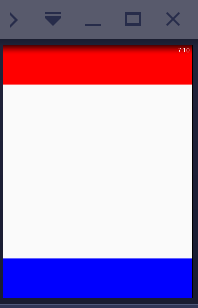
在web移动端通常会有这样的需求,实现上中下三栏布局(上下导航栏位置固定,中间部分内容超出可滚动),如下图所示:

实现方法如下:
HTML结构:
<div class='container'>
    <div class='header'></div>
    <div class='content'></div>
    <div class='footer'></div>
</div>
首先可以利用fixed或者absolute定位,实现简单。
现在介绍另外一种方法——利用-wekkit-box/flex,实现上下两栏固定高度,中间高度自适应的布局。
CSS代码如下:
使用-webkit-box:
.container{
    width: 100%;
    height: 100%;
    display: -webkit-box;
    -webkit-box-orient: vertical;
}
.header{
    height: 200px;
    background-color: red;
}
.content{
    -webkit-box-flex: 1;
    overflow: auto;
}
.footer{
    height: 200px;
    background-color: blue;
}
使用flex:
.container{
    width: 100%;
    height: 100%;
    display: flex;
    flex-direction: column;
}
.header{
    height: 200px;
    background-color: red;
}
.content{
    flex: 1;
    overflow: auto;
}
.footer{
    height: 200px;
    background-color: blue;
}
实际应用中应该将以上两种放在一起写,这里只是为了下文而将新旧两种写法分开。
在react native中,实现样式只是CSS中的一个小子集,其中就使用flex的布局
实现的思路和上面也是相同的,不过由于react native中对于View组件而言,overflow属性只有'visible'和'hidden'两个值( 默认是'hidden' ),并没有可滚动的属性,因此中间内容部分需要使用"ScrollView"滚动容器
组件渲染:
render(){
  return(
    <View style={styles.container}>
        <View style={styles.header}></View>
        <ScrollView style={styles.content}>
        </ScrollView>
        <View style={styles.footer}></View>
    </View>
  );
}
样式:
const styles = StyleSheet.create({
  container: {
    flex: 1,
   flexDirection: 'column'
  },
  header: {
      height: 100,
      backgroundColor: 'red',
  },
  content: {
      flex: 1,
  },
  footer: {
      height: 100,
      backgroundColor: 'blue',
  }
});
效果:
react native最基础的布局就实现了。
由于react native中布局方法基本就这两种: flex和absolute布局,掌握了flex布局,也就基本搞定了。