1 %matplotlib notebook
2
3 import networkx as nx
4 import matplotlib.pyplot as plt
5
6 # 数据读取
7 G = nx.read_gpickle('major_us_cities')
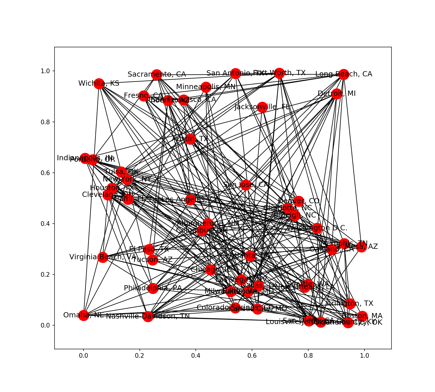
1 # draw the graph using the default spring layout
2 plt.figure(figsize=(10,9))
3 nx.draw_networkx(G)

1 # See what layouts are available in networkX
2 [x for x in nx.__dir__() if x.endswith('_layout')]
['circular_layout',
 'random_layout',
 'shell_layout',
 'spring_layout',
 'spectral_layout',
 'fruchterman_reingold_layout']
1 # Draw the graph using the random layout
2 plt.figure(figsize=(10,9))
3 pos = nx.random_layout(G)
4 nx.draw_networkx(G, pos)
1 # Draw the graph using the circular layout
2 plt.figure(figsize=(10,9))
3 pos = nx.circular_layout(G)
4 nx.draw_networkx(G, pos)

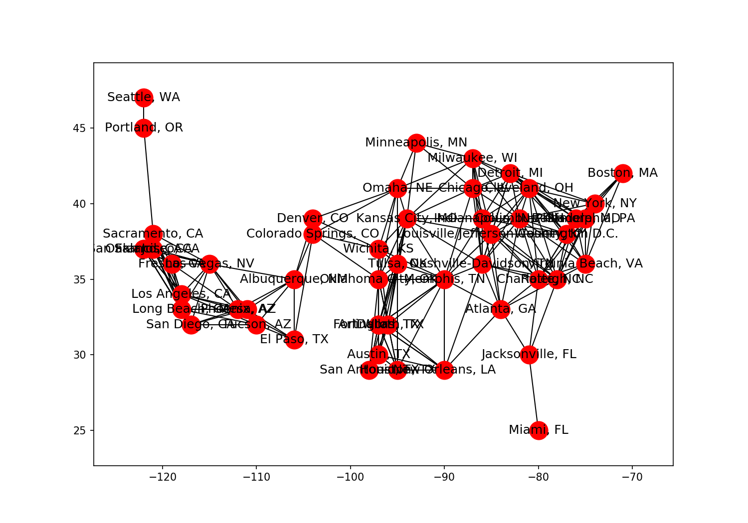
1 # Draw the graph using custom node positions
2 plt.figure(figsize=(10,7))
3
4 pos = nx.get_node_attributes(G, 'location')
5 nx.draw_networkx(G, pos)
1 # Draw the graph adding alpha, removing labels, and softening edge color
2 plt.figure(figsize=(10,7))
3
4 nx.draw_networkx(G, pos, alpha=0.7, with_labels=False, edge_color='.4')
5 #取消标注
6 plt.axis('off')
7 plt.tight_layout();

 1 # Draw graph with varying node color, node size, and edge width
 2 plt.figure(figsize=(10,7))
 3
 4 node_color = [G.degree(v) for v in G]
 5 node_size = [0.0005*nx.get_node_attributes(G, 'population')[v] for v in G]
 6 edge_width = [0.0015*G[u][v]['weight'] for u,v in G.edges()]
 7
 8 nx.draw_networkx(G, pos, node_size=node_size,
 9                  node_color=node_color, alpha=0.7, with_labels=False,
10                  width=edge_width, edge_color='.4', cmap=plt.cm.Blues)
11
12 plt.axis('off')
13 plt.tight_layout();

 1 # Draw specific edges and add labels to specific nodes
 2 plt.figure(figsize=(10,7))
 3
 4 node_color = [G.degree(v) for v in G]
 5 node_size = [0.0005*nx.get_node_attributes(G, 'population')[v] for v in G]
 6 edge_width = [0.0015*G[u][v]['weight'] for u,v in G.edges()]
 7
 8 nx.draw_networkx(G, pos, node_size=node_size,
 9                  node_color=node_color, alpha=0.7, with_labels=False,
10                  width=edge_width, edge_color='.4', cmap=plt.cm.Blues)
11
12
13 greater_than_770 = [x for x in G.edges(data=True) if x[2]['weight']>770]
14 nx.draw_networkx_edges(G, pos, edgelist=greater_than_770, edge_color='r', alpha=0.4, width=6)
15
16 nx.draw_networkx_labels(G, pos, labels={'Los Angeles, CA': 'LA', 'New York, NY': 'NYC'}, font_size=18, font_color='w')
17
18 plt.axis('off')
19 plt.tight_layout();
