1 import numpy as np
2 import pandas as pd
3 import matplotlib.pyplot as plt
4 import seaborn as sns
5
6 %matplotlib notebook
1 np.random.seed(1234)
2
3 v1 = pd.Series(np.random.normal(0,10,1000), name='v1')
4 v2 = pd.Series(2*v1 + np.random.normal(60,15,1000), name='v2')
1 plt.figure()
2 plt.hist(v1, alpha=0.7, bins=np.arange(-50,150,5), label='v1');
3 plt.hist(v2, alpha=0.7, bins=np.arange(-50,150,5), label='v2');
4 plt.legend();

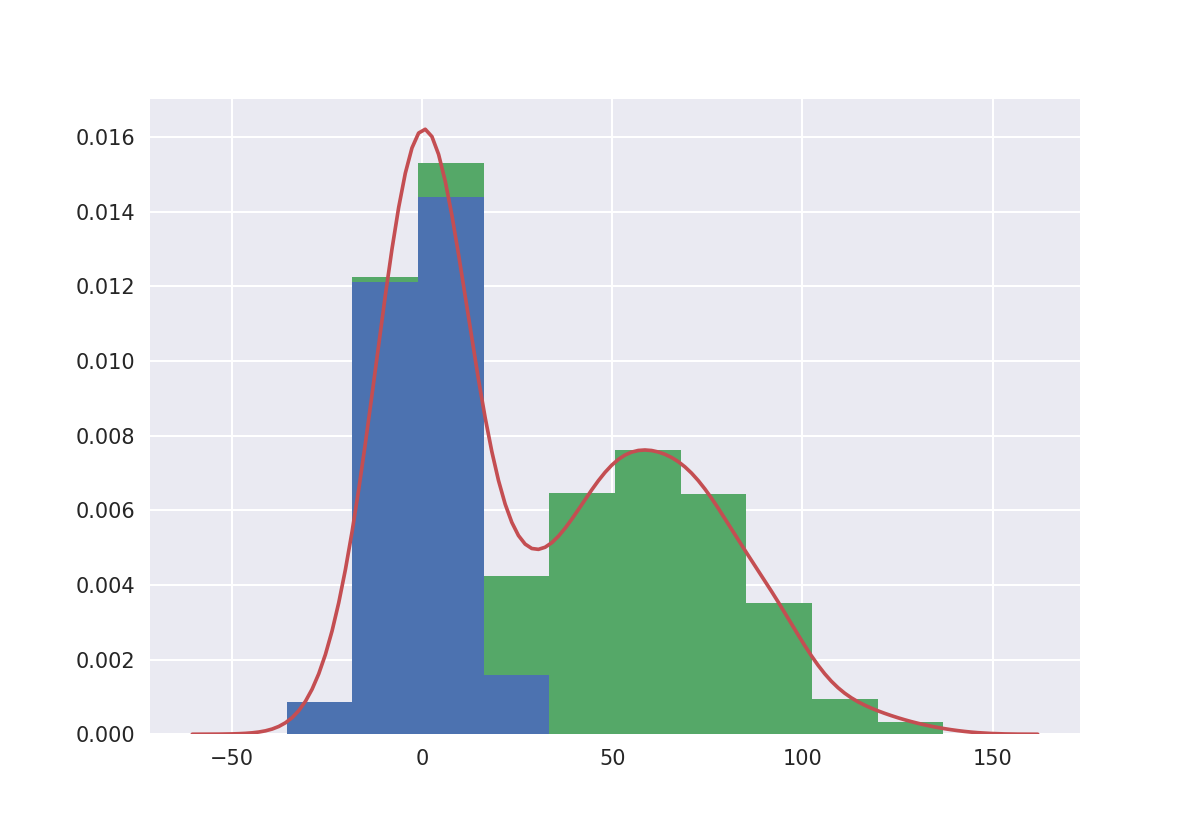
1 # plot a kernel density estimation over a stacked barchart
2 plt.figure()
3 plt.hist([v1, v2], histtype='barstacked', normed=True);
4 v3 = np.concatenate((v1,v2))
5 sns.kdeplot(v3);
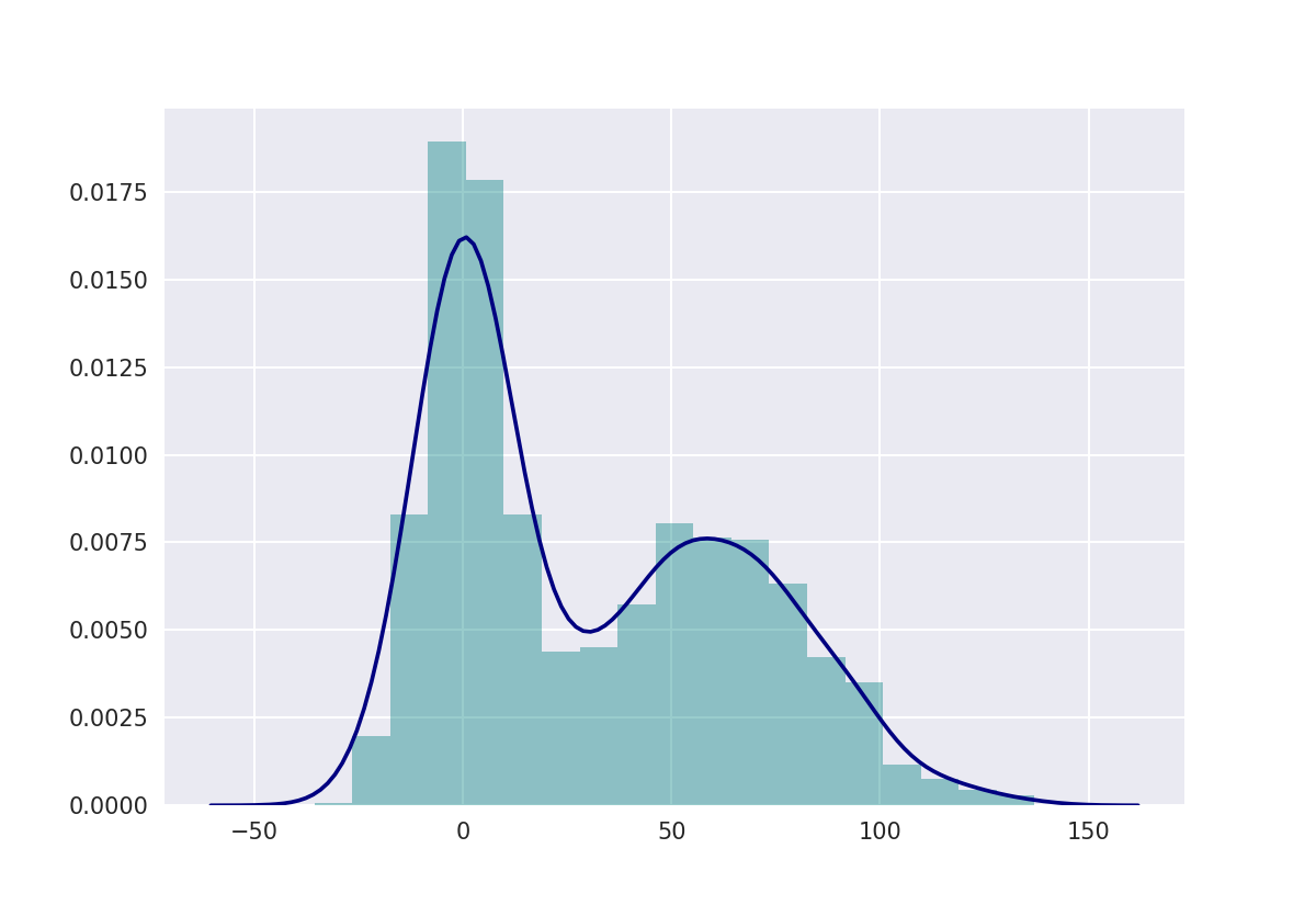
1 plt.figure()
2 # we can pass keyword arguments for each individual component of the plot
3 sns.distplot(v3, hist_kws={'color': 'Teal'}, kde_kws={'color': 'Navy'});
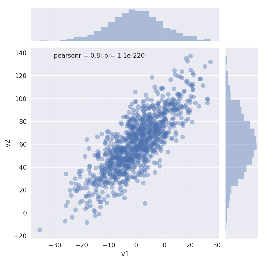
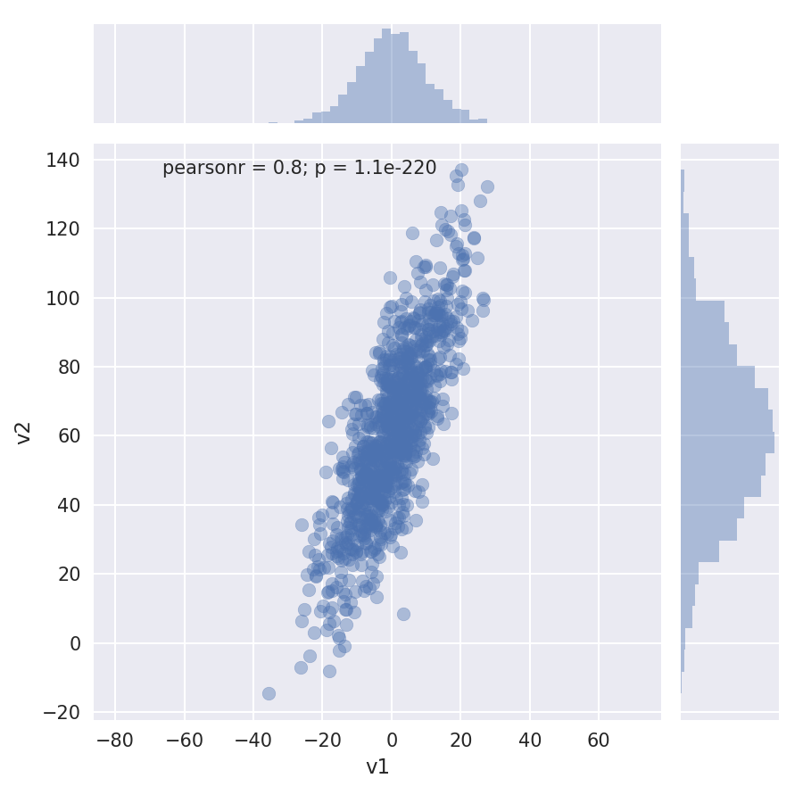
1 sns.jointplot(v1, v2, alpha=0.4);
1 grid = sns.jointplot(v1, v2, alpha=0.4);
2 grid.ax_joint.set_aspect('equal')
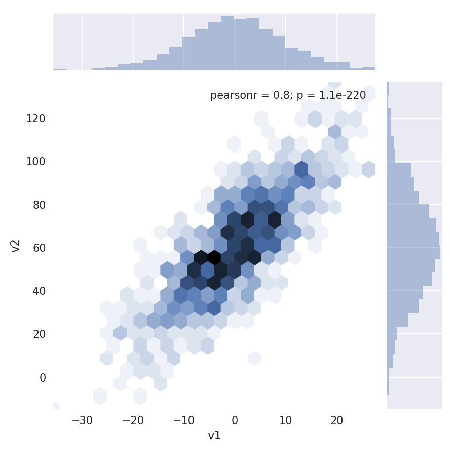
1 sns.jointplot(v1, v2, kind='hex');
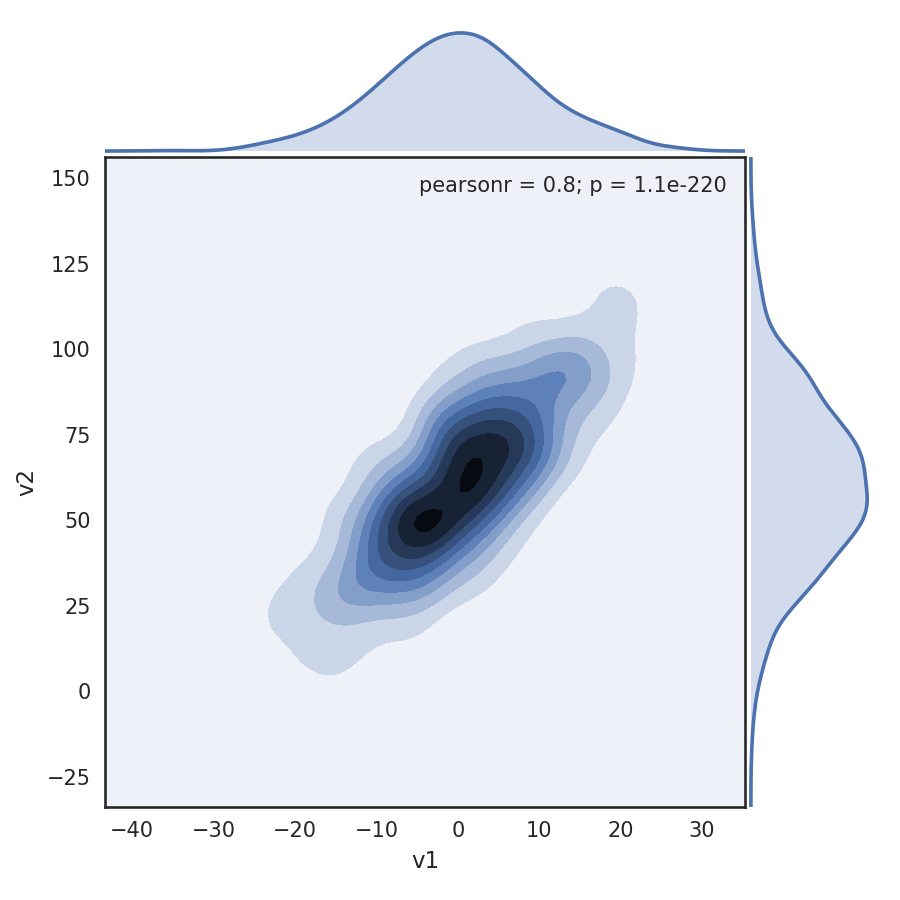
1 # set the seaborn style for all the following plots
2 sns.set_style('white')
3
4 sns.jointplot(v1, v2, kind='kde', space=0);
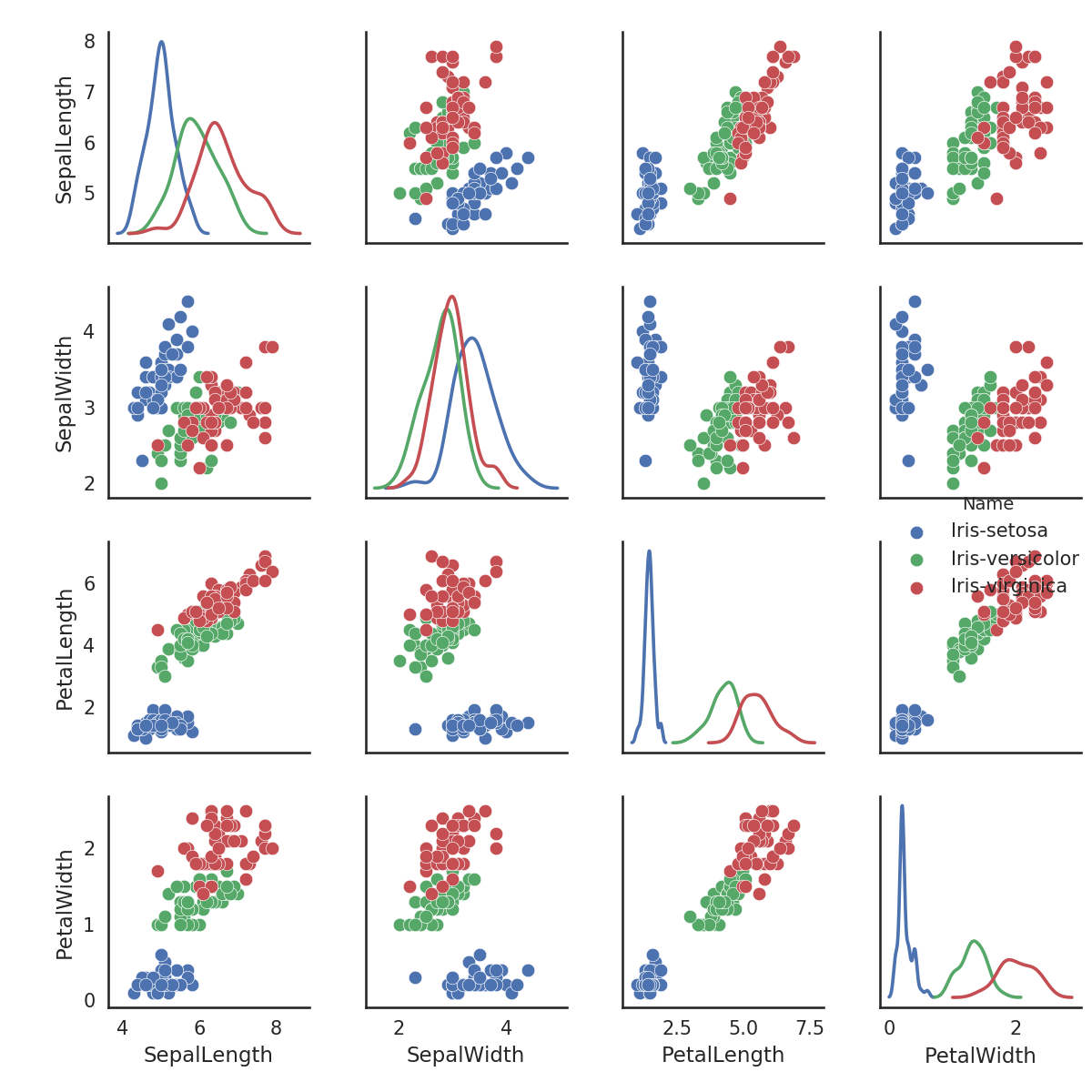
1 iris = pd.read_csv('iris.csv')
2 iris.head()

1 sns.pairplot(iris, hue='Name', diag_kind='kde', size=2);
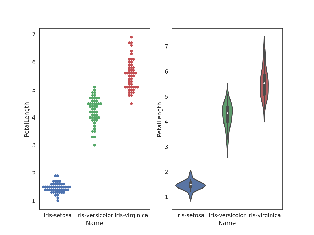
1 plt.figure(figsize=(8,6))
2 plt.subplot(121)
3 sns.swarmplot('Name', 'PetalLength', data=iris);
4 plt.subplot(122)
5 sns.violinplot('Name', 'PetalLength', data=iris);