1. 效果:
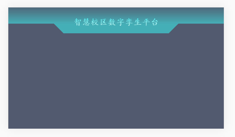
2. 代码:
<!DOCTYPE html>
<html lang="en">
  <head>
    <meta charset="UTF-8" />
    <meta name="viewport" content="width=device-width, initial-scale=1.0" />
    <meta http-equiv="X-UA-Compatible" content="ie=edge" />
    <title>刘海?</title>
    <style>
      :root {
        --bg--color: #ed4014;
      }
      body {
        background: var(--bg--color);
      }
      .top_bar_div {
        position: fixed;
        left: 0;
        top: 0;
        width: 100%;
        height: 50px;
        background: -webkit-linear-gradient(rgba(62, 231, 232,0.1),rgba(62, 231, 232,0.6));
      }
      .top_bar_title {
        position: absolute;
        left: 50%;
        top: 100%;
        transform: translate(-50%,0);
        height: 30px;
        padding: 0 30px;
      }
      .top_bar_title::before {
        content: "";
        display: block;
        width: 100%;
        height: 0px;
        transform: translate(-50%,0);
        background: transparent;
        border-left: 30px solid transparent;
        border-top: 30px solid rgba(62, 231, 232, 0.6);
        border-right: 30px solid transparent;
        border-bottom: 30px solid transparent;
        position: absolute;
        left: 50%;
        top: 0
      }
      .top_bar_title span {
        position: relative;
        top: -20px;
        left: 0;
        font-weight: bold;
        font-size: 26px;
        background-image:-webkit-linear-gradient(top ,#46fdfe,#ccf1ee);
        -webkit-background-clip:text;
        -webkit-text-fill-color:transparent;
        font-family: "楷体";
      }
    </style>
  </head>
  <body>
    <div class="top_bar_div">
      <div class="top_bar_title"><span>智慧校区数字孪生平台</span></div>
    </div>
    <script>
      let colorArr = ["#2db7f5","#19be6b","#ff9900","#ed4014","#515a6e"];
      let num = 0;
      setInterval(() => {
        document.querySelector("body").style.background = colorArr[num];
        num++;
        if(num === colorArr.length) {
          num = 0
        }
      }, 1000);
    </script>
  </body>
</html>
3. 好像没什么要说明的