WPF系统属性和常用控件
渐变的背景色
WPF中的前景色和背景色不同于传统Winform的设置,这些属性都是Brush类型的值。在XAML中,当为这些属性设置指定的颜色后将被转换为SolidColorBrush类的调用。所有的控件都提供了背景色和前景色。在WPF中可以设置背景色为线性渐变色。
<Window x:Class="WPFDemo.BurshDemo"
        xmlns="http://schemas.microsoft.com/winfx/2006/xaml/presentation"
        xmlns:x="http://schemas.microsoft.com/winfx/2006/xaml"
        xmlns:d="http://schemas.microsoft.com/expression/blend/2008"
        xmlns:mc="http://schemas.openxmlformats.org/markup-compatibility/2006"
        xmlns:local="clr-namespace:WPFDemo"
        mc:Ignorable="d"
        Title="BurshDemo" Height="300" Width="300">
    <Grid Name="grd" Background="LightGreen">
        <Grid.RowDefinitions>
            <RowDefinition />
            <RowDefinition />
            <RowDefinition />
            <RowDefinition />
        </Grid.RowDefinitions>
        <Button Margin="10" Grid.Row="0" Background="AliceBlue" Foreground="Red" Content="背景色是AliceBlue,前景色是Red!"></Button>
        <Button Margin="10" Grid.Row="1" Content="背景色为渐变颜色">
            <Button.Background>
                <LinearGradientBrush StartPoint="0,0" EndPoint="1,1">
                    <GradientStop Color="Yellow" Offset="0.0"></GradientStop>
                    <GradientStop Color="Blue" Offset="0.2"></GradientStop>
                    <GradientStop Color="Red" Offset="0.75"></GradientStop>
                    <GradientStop Color="LimeGreen" Offset="1"></GradientStop>
                </LinearGradientBrush>
            </Button.Background>
        </Button>
        <Button Name="btnOpacity" Margin="10" Grid.Row="3" Background="AliceBlue" Foreground="Red" Content="设置透明度!"></Button>
    </Grid>
</Window>
后台代码:
 public BurshDemo()
        {
            InitializeComponent();
            CreateButton();

            btnOpacity.Background = new SolidColorBrush(Color.FromArgb(0, 100, 100, 100));
        }

        public void CreateButton()
        {
            Button btn = new Button();
            btn.Content = "使用后台代码创建Button,并设置背景色和前景色为渐变";
            btn.Margin = new Thickness(10);
            Grid.SetRow(btn, 2);
            grd.Children.Add(btn);

            //创建按钮前景渐变色
            LinearGradientBrush foreGroundColor = new LinearGradientBrush();
            foreGroundColor.StartPoint = new Point(0.5, 0.5);
            foreGroundColor.EndPoint = new Point(1, 1);
            foreGroundColor.GradientStops.Add(
                new GradientStop(Colors.Aqua, 0)
                );
            foreGroundColor.GradientStops.Add(
               new GradientStop(Colors.Aqua, 0.5)
               );
            foreGroundColor.GradientStops.Add(
               new GradientStop(Colors.Aqua, 0.75)
               );
            foreGroundColor.GradientStops.Add(
               new GradientStop(Colors.Aqua, 1)
               );
            btn.Foreground = foreGroundColor;


            //创建按钮背景渐变颜色
            LinearGradientBrush backGroundColor = new LinearGradientBrush();
            backGroundColor.StartPoint = new Point(0.5, 0.5);
            backGroundColor.EndPoint = new Point(1, 1);
            backGroundColor.GradientStops.Add(
                new GradientStop(Colors.AliceBlue, 0)
                );
            backGroundColor.GradientStops.Add(
                new GradientStop(Colors.Red, 0.4)
                );
            backGroundColor.GradientStops.Add(
                new GradientStop(Colors.Black, 0.75)
                );
            backGroundColor.GradientStops.Add(
                new GradientStop(Colors.Blue, 1)
                );
            btn.Background = backGroundColor;
        }
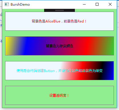
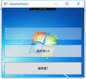
透明度设置
UIElement定义了Opacity属性,使用该属性可以为控件设置透明度。该属性的值在0.0 – 1.0 之间。默认为1.0表示完全不透明,值0.0则表示完全透明。
<Window x:Class="WPFDemo.OpacityDemo"
        xmlns="http://schemas.microsoft.com/winfx/2006/xaml/presentation"
        xmlns:x="http://schemas.microsoft.com/winfx/2006/xaml"
        xmlns:d="http://schemas.microsoft.com/expression/blend/2008"
        xmlns:mc="http://schemas.openxmlformats.org/markup-compatibility/2006"
        xmlns:local="clr-namespace:WPFDemo"
        mc:Ignorable="d"
        Title="OpacityDemo" Height="300" Width="300">
    <Window.Background>
        <ImageBrush Stretch="UniformToFill" ImageSource="Images/back.png"></ImageBrush>
    </Window.Background>
    <Grid >
        <Grid.RowDefinitions>
            <RowDefinition />
            <RowDefinition />
            <RowDefinition />
            <RowDefinition />
        </Grid.RowDefinitions>
        <Button Grid.Row="0" Opacity="0" Margin="10" Content="透明度0"></Button>
        <Button Grid.Row="1" Opacity="0.4" Margin="10" Content="透明度0.4"></Button>
        <Button Grid.Row="2" Opacity="0.8" Margin="10" Content="透明度0.8"></Button>
        <Button Grid.Row="3" Opacity="1" Margin="10" Content="透明度1"></Button>
    </Grid>
</Window>
更改鼠标光标
WPF在FrameworkElement中定义了一个Cursor属性,该属性是System.Windows.Input.Cursor类型的属性值,可以使用该属性来设置和获取鼠标的光标。
Cursor属性所有枚举光标类型:
<Window x:Class="WPFDemo.CursorDemo"
        xmlns="http://schemas.microsoft.com/winfx/2006/xaml/presentation"
        xmlns:x="http://schemas.microsoft.com/winfx/2006/xaml"
        xmlns:d="http://schemas.microsoft.com/expression/blend/2008"
        xmlns:mc="http://schemas.openxmlformats.org/markup-compatibility/2006"
        xmlns:local="clr-namespace:WPFDemo"
        mc:Ignorable="d"
        Title="CursorDemo" Height="300" Width="300">
    <DockPanel>
        <TextBlock DockPanel.Dock="Top" Background="LightBlue"  Foreground="Red" Margin="0,0,0,10" FontSize="20">常用鼠标光标符号</TextBlock>
        <UniformGrid Rows="3" Columns="10" >
            <Button Cursor="AppStarting" Content="AppStarting" Background="LightBlue" ></Button>
            <Button Cursor="Arrow" Content="Arrow" Background="LightGreen" ></Button>
            <Button Cursor="ArrowCD" Content="ArrowCD" Background="LightBlue" ></Button>
            <Button Cursor="Cross" Content="Cross" Background="LightGreen" ></Button>
            <Button Cursor="Hand" Content="Hand" Background="LightBlue" ></Button>
            <Button Cursor="Help" Content="Help" Background="LightGreen" ></Button>
            <Button Cursor="IBeam" Content="IBeam" Background="LightBlue" ></Button>
            <Button Cursor="No" Content="No" Background="LightGreen" ></Button>
            <Button Cursor="None" Content="None" Background="LightBlue" ></Button>
            <Button Cursor="Pen" Content="Pen" Background="LightGreen" ></Button>
            <Button Cursor="ScrollAll" Content="ScrollAll" Background="LightBlue" ></Button>
            <Button Cursor="ScrollE" Content="ScrollE" Background="LightGreen" ></Button>
            <Button Cursor="ScrollN" Content="ScrollN" Background="LightBlue" ></Button>
            <Button Cursor="ScrollNE" Content="ScrollNE" Background="LightGreen" ></Button>
            <Button Cursor="ScrollNS" Content="ScrollNS" Background="LightBlue" ></Button>
            <Button Cursor="ScrollNW" Content="ScrollNW" Background="LightGreen" ></Button>
            <Button Cursor="ScrollS" Content="ScrollS" Background="LightBlue" ></Button>
            <Button Cursor="ScrollSE" Content="ScrollSE" Background="LightGreen" ></Button>
            <Button Cursor="ScrollSW" Content="ScrollSW" Background="LightBlue" ></Button>
            <Button Cursor="ScrollW" Content="ScrollW" Background="LightGreen" ></Button>
            <Button Cursor="ScrollWE" Content="ScrollWE" Background="LightBlue" ></Button>
            <Button Cursor="SizeAll" Content="SizeAll" Background="LightGreen" ></Button>
            <Button Cursor="SizeNESW" Content="SizeNESW" Background="LightBlue" ></Button>
            <Button Cursor="SizeNS" Content="SizeNS" Background="LightGreen" ></Button>
            <Button Cursor="SizeNWSE" Content="SizeNWSE" Background="LightBlue" ></Button>
            <Button Cursor="SizeWE" Content="SizeWE" Background="LightGreen" ></Button>
            <Button Cursor="UpArrow" Content="UpArrow" Background="LightBlue" ></Button>
            <Button Cursor="Wait" Content="Wait" Background="LightGreen" ></Button>
        </UniformGrid>
    </DockPanel>
</Window>

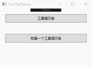
ToolTip提示控件
ToolTip控件又称工具提示控件,是指当素表悬停在某个工具按钮上,显示出来的黄色小窗口。
<Window x:Class="WPFDemo.ToolTipDemo"
        xmlns="http://schemas.microsoft.com/winfx/2006/xaml/presentation"
        xmlns:x="http://schemas.microsoft.com/winfx/2006/xaml"
        xmlns:d="http://schemas.microsoft.com/expression/blend/2008"
        xmlns:mc="http://schemas.openxmlformats.org/markup-compatibility/2006"
        xmlns:local="clr-namespace:WPFDemo"
        mc:Ignorable="d"
        Title="ToolTipDemo" Height="300" Width="300">
    <Grid>
        <Grid.RowDefinitions>
            <RowDefinition />
            <RowDefinition />
            <RowDefinition />
        </Grid.RowDefinitions>
        <Button Grid.Row="0" Content="工具提示条" Margin="20" ToolTip="我是一个简单的工具提示条"/>
        <Button Grid.Row="1"  Margin="20" Content="我是一个工具提示条">
            <Button.ToolTip>
                <StackPanel>
                    <Image Source="Images/toolTip.png" MaxWidth="50" MaxHeight="50"></Image>
                    <TextBlock Text="带图片的工具提示条窗口"></TextBlock>
                </StackPanel>
            </Button.ToolTip>
        </Button>
    </Grid>
</Window>
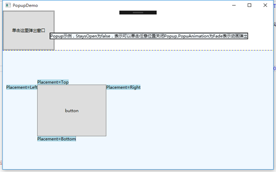
Popup控件
Popup控件使用效果和ToolTip类似,最大的区别在于Popup控件可以接收输入焦点,而ToolTip则不能。不同:
1、 Popup控件不会自动显示,必须设置IsOpen属性来使其显示。
2、 默认情况下,Popup.StaysOpen属性设置为true,因此Popup打开后并不会自动消失,除非开发人员将IsOpen属性设为false。如果设置StaysOpen为false,则用户可单击任何地方来关闭Popup控件。
3、 Popup提供了PopupAnimation属性让开发人员可以控制Popup如何打开,可选的值有None、Fade、Scroll和Slide。其中None代表默认值,不显示动画;Fade表示淡入效果;Scroll表示滚动效果;Slide表示滑动效果。为了让这些动画可以正常运行,必须设置AllowsTransparency属性值为true。
4、 Popup控件可以接收焦点,可以防止一些交互式控件到窗口中。
5、 Popup控件定义在System.Windows.Control.Primitives命名空间中。
<Window x:Class="WPFDemo.PopupDemo"
        xmlns="http://schemas.microsoft.com/winfx/2006/xaml/presentation"
        xmlns:x="http://schemas.microsoft.com/winfx/2006/xaml"
        xmlns:d="http://schemas.microsoft.com/expression/blend/2008"
        xmlns:mc="http://schemas.openxmlformats.org/markup-compatibility/2006"
        xmlns:local="clr-namespace:WPFDemo"
        mc:Ignorable="d"
        Title="PopupDemo" Height="500" Width="800">
    <Grid  ShowGridLines="True">
        <Grid.RowDefinitions>
            <RowDefinition />
            <RowDefinition Height="3*" />
        </Grid.RowDefinitions>

        <Button HorizontalAlignment="Left" Click="Button_Click" Width="150" Grid.Row="0">
            <StackPanel>
                <TextBlock>单击这里弹出窗口</TextBlock>
                <Popup Name="myPopup" MaxHeight="200" StaysOpen="False" Placement="Mouse" AllowsTransparency="True" PopupAnimation="Fade">
                    <Border BorderBrush="Black" BorderThickness="2" Background="AliceBlue">
                        <TextBlock Name="myPopupText" TextWrapping="Wrap">
                            Popup示例,StaysOpen为false,表示可以单击任意位置关闭Popup,PopuAnimation为Fade表示动画弹出
                        </TextBlock>
                    </Border>
                </Popup>
            </StackPanel>
        </Button>
        <Canvas  Background="AliceBlue" Grid.Row="1">
            <Button Name="btn1" Margin="100"  HorizontalAlignment="Right" VerticalAlignment="Center" Width="200" Height="150">button</Button>
            <Popup IsOpen="True" PlacementTarget="{Binding ElementName=btn1}"  Placement="Bottom">
                <TextBlock Background="LightBlue">Placement=Bottom</TextBlock>
            </Popup>
            <Popup IsOpen="True" PlacementTarget="{Binding ElementName=btn1}" Placement="Top">
                <TextBlock  Background="LightBlue">Placement=Top</TextBlock>
            </Popup>
            <Popup IsOpen="True" PlacementTarget="{Binding ElementName=btn1}" Placement="Left">
                <TextBlock  Background="LightBlue">Placement=Left</TextBlock>
            </Popup>
            <Popup IsOpen="True" PlacementTarget="{Binding ElementName=btn1}" Placement="Right">
                <TextBlock  Background="LightBlue">Placement=Right</TextBlock>
            </Popup>
        </Canvas>
    </Grid>
</Window>
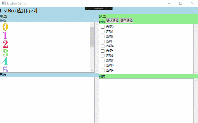
ListBox列表框控件
<Window x:Class="WPFDemo.ListBoxDemo"
        xmlns="http://schemas.microsoft.com/winfx/2006/xaml/presentation"
        xmlns:x="http://schemas.microsoft.com/winfx/2006/xaml"
        xmlns:d="http://schemas.microsoft.com/expression/blend/2008"
        xmlns:mc="http://schemas.openxmlformats.org/markup-compatibility/2006"
        xmlns:local="clr-namespace:WPFDemo"
        mc:Ignorable="d"
        Title="ListBoxDemo" Height="500" Width="800">
    <DockPanel>
        <StackPanel DockPanel.Dock="Top" Background="LightBlue">
            <TextBlock FontSize="20">
                ListBox应用示例
            </TextBlock>
        </StackPanel>
        <Grid DockPanel.Dock="Left">
            <Grid.ColumnDefinitions>
                <ColumnDefinition />
                <ColumnDefinition/>
            </Grid.ColumnDefinitions>

            <StackPanel Background="LightBlue" Grid.Column="0">
                <StackPanel>
                    <TextBlock FontSize="14">单选</TextBlock>
                </StackPanel>
                <StackPanel>
                    <TextBlock>待选</TextBlock>
                    <ScrollViewer MaxHeight="200" HorizontalScrollBarVisibility="Auto">
                        <ListBox Name="listBox1"  Height="200"   SelectionMode="Extended" SelectionChanged="listBox1_SelectionChanged">
                            <ListBoxItem>
                                <Image Source="Images/0.jpg" Width="30" Height="30"></Image>
                            </ListBoxItem>

                            <ListBoxItem>
                                <StackPanel>
                                    <Image Source="Images/1.jpg" Width="30" Height="30"></Image>
                                </StackPanel>
                            </ListBoxItem>

                            <ListBoxItem>
                                <StackPanel>
                                    <Image Source="Images/2.jpg" Width="30" Height="30"></Image>
                                </StackPanel>
                            </ListBoxItem>
                            <ListBoxItem>
                                <StackPanel>
                                    <Image Source="Images/3.jpg" Width="30" Height="30"></Image>
                                </StackPanel>
                            </ListBoxItem>

                            <ListBoxItem>
                                <StackPanel>
                                    <Image Source="Images/4.jpg" Width="30" Height="30"></Image>
                                </StackPanel>
                            </ListBoxItem>

                            <ListBoxItem>
                                <StackPanel>
                                    <Image Source="Images/5.jpg" Width="30" Height="30"></Image>
                                </StackPanel>
                            </ListBoxItem>

                            <ListBoxItem>
                                <StackPanel>
                                    <Image Source="Images/6.jpg" Width="30" Height="30"></Image>
                                </StackPanel>
                            </ListBoxItem>

                            <ListBoxItem>
                                <StackPanel>
                                    <Image Source="Images/7.jpg" Width="30" Height="30"></Image>
                                </StackPanel>
                            </ListBoxItem>

                            <ListBoxItem>
                                <StackPanel>
                                    <Image Source="Images/8.jpg" Width="30" Height="30"></Image>
                                </StackPanel>
                            </ListBoxItem>

                            <ListBoxItem>
                                <StackPanel>
                                    <Image Source="Images/9.jpg" Width="30" Height="30"></Image>
                                </StackPanel>
                            </ListBoxItem>
                        </ListBox>
                    </ScrollViewer>
                </StackPanel>
                <StackPanel>
                    <TextBlock>已选</TextBlock>
                    <ScrollViewer MaxHeight="200" HorizontalScrollBarVisibility="Auto">
                        <ListBox Name="listBox1_Selected" MaxHeight="200" Height="200"  SelectionChanged="listBox1_Selected_SelectionChanged">
                        </ListBox>
                    </ScrollViewer>
                </StackPanel>
            </StackPanel>

            <StackPanel Background="LightGreen" Grid.Column="1">
                <StackPanel>
                    <TextBlock FontSize="14">多选</TextBlock>
                    <TextBlock>待选 <Button Name="btnList2Ok" Click="btnList2Ok_Click">确认选择</Button>
                     <Button Name="btnList2Cancel" Click="btnList2Cancel_Click">清空选择</Button>
                    </TextBlock>
                    <ScrollViewer MaxHeight="200" Height="200" >
                        <ListBox Name="listbox2"  >
                            <ListBoxItem>
                                <CheckBox>选项0</CheckBox>
                            </ListBoxItem>
                            <ListBoxItem>
                                <CheckBox>选项1</CheckBox>
                            </ListBoxItem>
                            <ListBoxItem>
                                <CheckBox>选项2</CheckBox>
                            </ListBoxItem>
                            <ListBoxItem>
                                <CheckBox>选项3</CheckBox>
                            </ListBoxItem>
                            <ListBoxItem>
                                <CheckBox>选项4</CheckBox>
                            </ListBoxItem>
                            <ListBoxItem>
                                <CheckBox>选项5</CheckBox>
                            </ListBoxItem>
                            <ListBoxItem>
                                <CheckBox>选项6</CheckBox>
                            </ListBoxItem>
                            <ListBoxItem>
                                <CheckBox>选项7</CheckBox>
                            </ListBoxItem>
                            <ListBoxItem>
                                <CheckBox>选项8</CheckBox>
                            </ListBoxItem>
                            <ListBoxItem>
                                <CheckBox>选项9</CheckBox>
                            </ListBoxItem>
                        </ListBox>
                    </ScrollViewer>
                    <TextBlock>已选</TextBlock>
                    <ScrollViewer MaxHeight="200" Height="200">
                        <ListBox Name="listbox2_Selected">
                        </ListBox>
                    </ScrollViewer>
                </StackPanel>
            </StackPanel>
        </Grid>
    </DockPanel>
</Window>
后台代码:
     private void listBox1_SelectionChanged(object sender, SelectionChangedEventArgs e)
        {
            ListBoxItem item = (sender as ListBox).SelectedItem as ListBoxItem;
            listBox1.Items.Remove(item);
            listBox1_Selected.Items.Add(item);

        }
        private void listBox1_Selected_SelectionChanged(object sender, SelectionChangedEventArgs e)
        {
            ListBoxItem item = (sender as ListBox).SelectedItem as ListBoxItem;
            listBox1_Selected.Items.Remove(item);
            listBox1.Items.Add(item);
        }
        private void btnList2Ok_Click(object sender, RoutedEventArgs e)
        {
            foreach (ListBoxItem item in listbox2.Items)
            {
                if ((item.Content as CheckBox).IsChecked == true)
                {
                    listbox2_Selected.Items.Add((item.Content as CheckBox).Content);
                }

            }
        }
        private void btnList2Cancel_Click(object sender, RoutedEventArgs e)
        {
            listbox2_Selected.Items.Clear();
        }
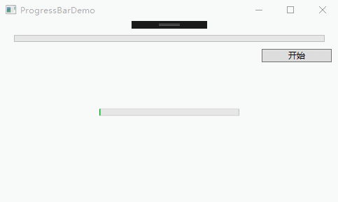
ProgressBar进度条控件
ProgressBar控件默认情况下Minimum属性为0,Maximum为100,Value值可以动态在在最小和最大值之间进行切换。
IsIndeterminate属性可以获取或设置ProgressBar是显示实际值还是显示连续进度动画,如果不知道进度具体的执行细节可以让ProgressBar显示连续的进度动画。
Orientaion属性可以设置ProgressBar的方向。Horizontal表示水平方向,Vertical表示垂直方向。
<Window x:Class="WPFDemo.ProgressBarDemo"
        xmlns="http://schemas.microsoft.com/winfx/2006/xaml/presentation"
        xmlns:x="http://schemas.microsoft.com/winfx/2006/xaml"
        xmlns:d="http://schemas.microsoft.com/expression/blend/2008"
        xmlns:mc="http://schemas.openxmlformats.org/markup-compatibility/2006"
        xmlns:local="clr-namespace:WPFDemo"
        mc:Ignorable="d"
        Title="ProgressBarDemo" Height="300" Width="500">
    <Grid>
        <ProgressBar Height="10" Width="200" IsIndeterminate="True"></ProgressBar>
        <StackPanel Grid.Row="1" Margin="10">
            <ProgressBar Height="10" Name="prog1" Margin="10"></ProgressBar>
            <Button Content="开始" Width="100" Click="Button_Click" HorizontalAlignment="Right"></Button>
        </StackPanel>
    </Grid>
</Window>
后台代码:
      private void Button_Click(object sender, RoutedEventArgs e)
        {
            Duration duration = new Duration(TimeSpan.FromMilliseconds(2000));
            DoubleAnimation doubleanimation = new DoubleAnimation(100.0, duration);
            prog1.BeginAnimation(ProgressBar.ValueProperty, doubleanimation);
        }
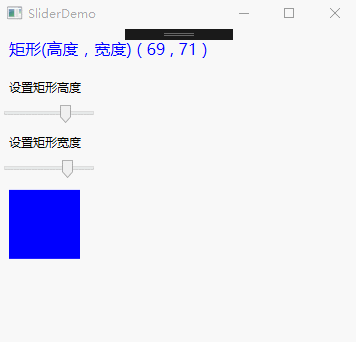
Slider滑动条控件
Slider滑动控件,可以与用户进行交互,允许用户拖动滑块来调整Value的值。
Slider控件属性:
|
属性名称 |
说明 |
|
Delay 和 Interval |
控制滑块的速度,以毫秒为单位。 |
|
TickPlacement |
决定刻度标记显示的显示位置。 |
|
TickFrequency |
获取或设置刻度线之间的间隔。 |
|
Ticks |
获取或设置Slider显示的刻度线的位置。 |
|
IsSnapToTickEnabled |
设置为True,当移动滑块时,将自动与刻度线进行捕捉,并跳转到最近的刻度线。默认为false |
|
IsSelectionRangeEnabled |
设置为true,用户能够在Slider上进行选择一个范围。使用SelectionStart和SelectionEnd方法来选择一个范围。 |
|
AutoToolPlacement |
获取或设置按下滑块时是否显示包含Slider的当前值的工具提示。 |
<Window x:Class="WPFDemo.SliderDemo"
        xmlns="http://schemas.microsoft.com/winfx/2006/xaml/presentation"
        xmlns:x="http://schemas.microsoft.com/winfx/2006/xaml"
        xmlns:d="http://schemas.microsoft.com/expression/blend/2008"
        xmlns:mc="http://schemas.openxmlformats.org/markup-compatibility/2006"
        xmlns:local="clr-namespace:WPFDemo"
        mc:Ignorable="d"
        Title="SliderDemo" Height="300" Width="300">
    <StackPanel>
        <TextBlock Margin="10" Foreground="Blue" FontSize="16">
           <TextBlock Text="矩形(高度,宽度)" />
            (
            <TextBlock Text="{Binding ElementName=RectangleHeight,Path=Value}"></TextBlock>
            ,
            <TextBlock Text="{Binding ElementName=RectangleWidth,Path=Value}"></TextBlock>
            )
        </TextBlock>
        <TextBlock Margin="10">
            设置矩形高度
        </TextBlock>
        <Slider Name="RectangleHeight" Width="100" Height="20" Value="30"   HorizontalAlignment="Left" IsSnapToTickEnabled="True" Minimum="1" Maximum="100" TickPlacement="BottomRight" TickFrequency="1" AutoToolTipPrecision="2" AutoToolTipPlacement="BottomRight" IsDirectionReversed="False" IsMoveToPointEnabled="False" ></Slider>
        <TextBlock Margin="10">
            设置矩形宽度
        </TextBlock>
        <Slider Name="RectangleWidth" Width="100" Height="20" Value="50"    HorizontalAlignment="Left" IsSnapToTickEnabled="True" Minimum="1" Maximum="100" TickPlacement="BottomRight" AutoToolTipPlacement="BottomRight" AutoToolTipPrecision="2"></Slider>

        <Rectangle Fill="Blue" HorizontalAlignment="Left" Margin="10"
                   Height="{Binding ElementName=RectangleHeight,Path=Value}"
                   Width="{Binding ElementName=RectangleWidth,Path=Value}">
        </Rectangle>
    </StackPanel>
</Window>