之前在几个CSS布局问题中,举了上下固定,中间自适应布局的例子,当时的例子父级元素的宽高都给定了,其实并不是个好例子,既然要自适应,父级元素就应该跟着页面大小变化,从而中间子元素也自适应。3种方法,其实是2种,因为是针对body,所以用fixed可以直接替换absolute来用。注意同时给html和body的height100%,只给一个不行。
<!DOCTYPE html>
<html lang="en">
<head>
    <meta charset="UTF-8">
    <title>Document</title>
</head>
<style type="text/css">
# {
  margin: 0;
  padding: 0;
}
html {
  height: 100%;
}
  body {
    width: 100%;
    height: 100%;
    margin: 0;
    font-size: 60px;
  }
  .class1 {
    height: 200px;
    width: 100%;
    background: #ccc;
    position: absolute;
    /*position: fixed;*/
    top: 0;
  }

  .class2 {
    width: 100%;
    background: #888;
    position: absolute;
    top: 200px;
    bottom: 200px;
  }

  .class3 {
    height: 200px;
    width: 100%;
    background: #333;
    position: absolute;
    /*position: fixed;*/
    bottom: 0;
  }
</style>
<body>
  <div class="class1">1111</div>
  <div class="class2">2222</div>
  <div class="class3">3333</div>
</body>
</html>
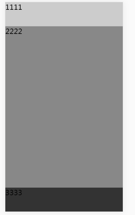
<!DOCTYPE html>
<html lang="en">
<head>
    <meta charset="UTF-8">
    <title>Document</title>
</head>
<style type="text/css">
# {
  margin: 0;
  padding: 0;
}
html {
  height: 100%;
}
  body {
    width: 100%;
    height: 100%;
    margin: 0;
    display: flex;
    flex-direction: column;
    font-size: 60px;
  }
  .class1 {
    height: 200px;
    width: 100%;
    background: #ccc;
  }

  .class2 {

    width: 100%;
    background: #888;
    flex: 1;
  }

  .class3 {
    height: 200px;
    width: 100%;
    background: #333;
  }
</style>
<body>
  <div class="class1">1111</div>
  <div class="class2">2222</div>
  <div class="class3">3333</div>
</body>
</html>
注意用flex的时候,所有的position布局的属性都要删掉。