CSS(Cascading Style Sheet):层叠样式表
新建css样式表:右键 -> new -> Stylesheet
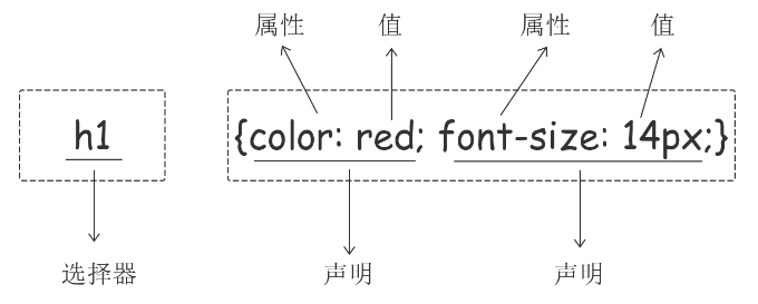
CSS组成部分:选择器和声明。声明又包括属性和属性值。每个声明之后用分号结束
注释:
   /*单行注释*/

     /*
     多行注释
     多行注释
      */
一、css引入方法
1.内部样式:将CSS样式集中写在网页的<head></head>标签对的<style></style>标签对中。格式如下:
    <style>
        p {
            color: green;
        }
    </style>
2.外部样式:link标签引入外部css文件
<link rel="stylesheet" href="index.css">
3.行内样式:直接在标签内通过style属性书写css样式
<p style="color: blue">海燕</p>
ps:注意页面css样式通常都应该写在单独的css文件中


<!DOCTYPE html>
<html lang="zh-CN">
<head>
    <meta charset="UTF-8">
    <title>CSS引入示例</title>
    <!--<style>-->
        <!--p {-->
            <!--color: green;-->
        <!--}-->
    <!--</style>-->
    <link rel="stylesheet" href="index.css">
</head>
<body>

<!--<p style="color: blue">海燕</p>-->

</body>
</html>
二、选择器
选择器 {样式1;样式2}
1.基本选择器
/*①标签选择器:所有的span都是红色,适用于批量的统一默认的样式*/
  span {color: red}

/*②id选择器:指定的id,适用于给特定标签设置特定样式*/
  <span id="s1">span</span>
  #s1 {font-size: 24px;}

/*③类选择器:div以及div里面的标签,适用于给某一些标签设置相同的样式*/
  <div class="y1">div
  .y1 {color: yellow;}
p {
    color: red;
    font-size: 18px
}
/*标签选择器*/
h1 {
    color: green;
}
/*ID选择器*/
#p2 {
    color: black;
}
/*类选择器*/
.c1 {
    color: yellow;
}
2.通用选择器:所有标签都会变
*{color: blue;}
3.组合选择器
①后代选择器
/*从id=d1的标签的后代里找到所有的p标签,改变它们的样式*/
#d1 p {
    color: red;
}
②儿子选择器:找的是直接子标签
/*选择所有父级是 <d1> 标签的 <p> 标签*/
#d1>p {
    color: green;
}
③毗邻选择器:找的是紧挨着的标签(同级标签,往下找)
/*选择所有紧接着<div>标签之后的<p>标签*/
div+p {
    color: yellow;
}
④弟弟选择器:找后面所有的同级标签,往下找
/*div后面所有的兄弟p标签*/
div~p{
    color: blue;
}
/*组合选择器示例的CSS文件*/


/*后代选择器*/
/*从id=d1的标签的后代里找到所有的p标签,改变它们的样式*/
/*#d1 p {*/
    /*color: red;*/
/*}*/

/*儿子选择器*/
/*选择所有父级是 <d1> 元素的 <p> 元素*/
/*#d1>p {*/
    /*color: green;*/
/*}*/

/*毗邻选择器*/
/*选择所有紧接着<div>元素之后的<p>元素*/
/*div+p {*/
    /*color: yellow;*/
/*}*/

/*弟弟选择器*/
/*div后面所有的兄弟p标签*/
div~p{
    color: blue;
}
4.属性选择器
/*①所有属性为xxx的标签*/
  [xxx] {color: red}

/*②选取属性为xxx值为'1'的标签*/
   [xxx='1'] {color: green}

/*③p里面的xxx='2'的标签*/
   p[xxx='2'] {color: yellow}
/*找到所有title属性以hello开头的元素*/
[title^="hello"] {
  color: red;
}

/*找到所有title属性以hello结尾的元素*/
[title$="hello"] {
  color: yellow;
}

/*找到所有title属性中包含(字符串包含)hello的元素*/
[title*="hello"] {
  color: red;
}

/*找到所有title属性(有多个值或值以空格分割)中有一个值为hello的元素:*/
[title~="hello"] {
  color: green;
}

不怎么常用的属性选择器
<!DOCTYPE html>
<html lang="zh-CN">
<head>
    <meta charset="UTF-8">
    <title>属性选择器补充示例</title>
    <style>
        /*[s9^="hao"] {*/
            /*color: red;*/
        /*}*/

        /*[s9$="d"] {*/
            /*color: red;*/
        /*}*/

        /*[s9*="ao"] {*/
            /*color: red;*/
        /*}*/

        [s9~="hao"] {
            color: red;
        }
    </style>
</head>
<body>

<p s9="hao" >我是一个p标签</p>
<p s9="haoma" >我是一个p标签</p>
<p s9="good">我也是一个p标签</p>
<p class="c1 c2">我是还是一个p标签</p>

</body>
</html>
5.分组和嵌套
①分组:当多个元素的样式相同的时候,我们没有必要重复地为每个元素都设置样式,
      我们可以通过在多个选择器之间使用逗号分隔的分组选择器来统一设置元素样式
div,p,span {color: yellow}
②嵌套:不同的选择器可以共用一个样式
div p,span {color: blue}
6.伪类选择器
一个标签可以具有不同的状态
把未点击的标签和点击过的标签设置成不同的颜色
/* 未访问的链接 */
a:link {
  color: #FF0000
}

/* 已访问的链接 */
a:visited {
  color: #00FF00
}

/* 鼠标移动到标签上会变颜色(*****) */
a:hover {
  color: #FF00FF
}

/* 鼠标点击标签时颜色会改变 */
a:active {
  color: #0000FF
}

/*input输入框获取焦点时样式--鼠标点击输入框时改变输入框的外框和背景颜色(***)*/
input:focus {
  outline: none;
  background-color: #eee;
}
<!DOCTYPE html>
<html lang="zh-CN">
<head>
    <meta charset="UTF-8">
    <title>伪类选择器示例</title>
    <style>
        /*连接没有被点击过*/
        a:link {
            color: burlywood;
        }
        /*连接被点击过*/
        a:visited {
            color: green;
        }
        /*鼠标移上去*/
        a:hover {
            color: blueviolet;
        }

        /*被选定*/
        a:active {
            color: deeppink;
        }

        #d1 {
            color: grey;
        }

        #d1:hover {
            color: green;
        }

        /*input获取光标时*/
        input:focus {
            outline: 0;
            background-color: deeppink;
        }

    </style>
</head>
<body>

<a href="http://www.sogo.com">搜狗</a>
<a href="http://www.sohu.com">搜狐</a>

<div id="d1">我是div标签</div>

<input type="text">
</body>
</html>
7.伪元素选择器
1.first-letter 常用的给首字母设置特殊样式:
p:first-letter {
  font-size: 48px;
  color: red;
}
2.before
/*在每个<p>元素之前插入内容*/
p:before {
  content:"*";
  color:red;
}
3.after
/*在每个<p>元素之后插入内容*/
p:after {
  content:"[?]";
  color:blue;
}
before和after多用于清除浮动。
<!DOCTYPE html>
<html lang="zh-CN">
<head>
    <meta charset="UTF-8">
    <title>伪元素选择器示例</title>
    <style>
        p:first-letter {
            font-size: 48px;
            color: red;
        }

        .c1:before {
            content: "*";
            color: red;
        }

        .c1:after {
            content: "[?]";
            color: blue;
        }

        p {
            font-size: 30px;
        }
    </style>
</head>
<body>

<p>
    在苍茫的大海上,狂风卷积着乌云.
    在苍茫的大海上,狂风卷积着乌云.
    在苍茫的大海上,狂风卷积着乌云.
    在苍茫的大海上,狂风卷积着乌云.
    在苍茫的大海上,狂风卷积着乌云.
    在苍茫的大海上,狂风卷积着乌云.在苍茫的大海上,狂风卷积着乌云.
</p>

<p class="c1">在苍茫的大海上,狂风卷积着乌云.</p>
<p class="c1">在苍茫的大海上,狂风卷积着乌云.</p>
<p class="c1">在苍茫的大海上,狂风卷积着乌云.</p>

</body>
</html>
三、样式文件优先级
1.内联样式(直接在标签里面写style) 优先级最高
<p style="color: yellow">我是一个p标签</p>
2.选择器都一样的情况下,谁靠近标签谁就生效
<!DOCTYPE html>
<html lang="zh-CN">
<head>
    <meta charset="UTF-8">
    <title>分组和嵌套示例</title>
    <link rel="stylesheet" href="index4.css">
    <link rel="stylesheet" href="index44.css">
</head>
<body>
<!--第二个link靠近p标签,以它的样式为准-->
<p>我是一个p标签</p>


</body>
</html>
3.选择器不同时 计算权重来判断
行内样式 > id选择器 > 类选择器 > 标签选择器
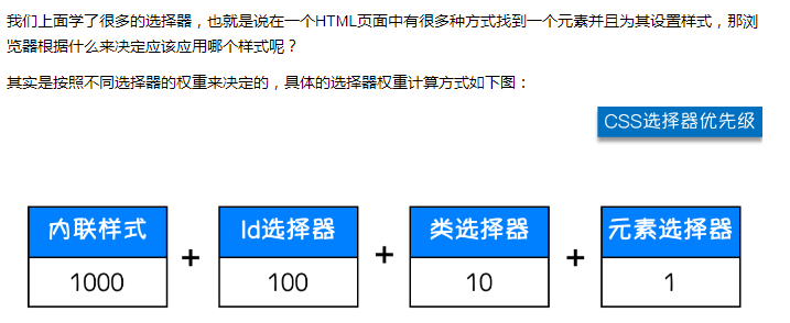
div#d1(101) div.c1(11)
除此之外还可以通过添加 !important方式来强制让样式生效,但并不推荐使用。因为如果过多的使用!important会使样式文件混乱不易维护。
万不得已可以使用!importan
四、css字体属性
width、height设置标签的宽度和高度
div {width: 400px; height: 100px}
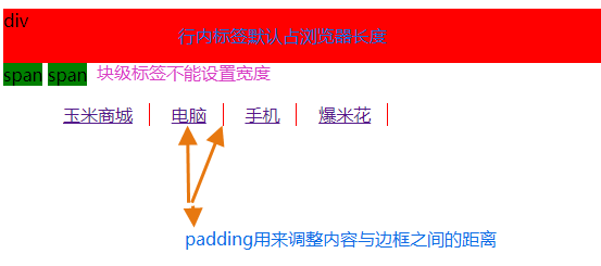
注:块级标签才能设置宽度,内联标签的宽度由内容来决定。
1.文字字体
font-family可以把多个字体名称作为一个“回退”系统来保存。如果浏览器不支持第一个字体,则会尝试下一个。浏览器会使用它可识别的第一个值。
body {font-family: "Microsoft Yahei", "微软雅黑", "Arial", sans-serif}
2.字体大小:font-size
p {font-size: 24px;}
3.字体粗细:font-weight
  normal    默认值,标准粗细
  bold      粗体
  bolder    更粗
  lighter   更细
  100~900   设置具体粗细,400等同于normal,而700等同于bold
  inherit   继承父元素字体的粗细值
p {font-weight: bolder}
4.文本颜色
①红色
   p {color: red;}

②一个RGB值:三个颜色选一个
   p {color: rgb(0,0,255)}

③颜色的标号:十六进制值
  p {color: #FF6700;}

④0.6指的是文本的透明度
   p {color: rgba(0,0,255,0.6);}
五、文本属性
1.文字对齐
text-align 属性规定元素中的文本的水平对齐方式,其值可设置为:

  left         左对齐(默认值)
  right         右对齐
  center       居中对齐
  justify      两端对齐
2.文字装饰
 text-decoration 属性用来给文字添加特殊效果,其值可设置为:
    none            默认,定义标准的文本。
    underline       定义文本下的一条线。
    overline        定义文本上的一条线。
    line-through    定义穿过文本下的一条线。
    inherit         继承父元素的text-decoration属性的值

常用的为去掉a标签默认的自划线:
a {text-decoration: none;}
3.首行缩进
首行缩进48像素:
p {text-indent: 48px}
<!DOCTYPE html>
<html lang="zh-CN">
<head>
    <meta charset="UTF-8">
    <title>字体属性测试</title>
    <link rel="stylesheet" href="test.css">
</head>
<body>

<h1>海燕</h1>
<p>在苍茫的大海上</p>

<p class="c0">默认的p</p>
<p class="c1">100 c1</p>
<p class="c2">900 c2</p>


<p class="c3">围城是钱钟书所著的长篇小说。第一版于1947年由上海晨光出版公司出版。故事主要写抗战初期知识分子的群相。《围城》是中国现代文学史上一部风格独特的讽刺小说。被誉为“新儒林外史”。从印度洋上驶来的法国邮船白拉日隆子爵号在上海靠了岸。</p>

<div class="c3">围城</div>


<a href="http://www.sogo.com">sogo</a>
</body>
</html>
/*
我这个文件是干啥的
小强
2018-03-07
*/


/*全局的样式*/
* {
    font-family: ".PingFang SC","微软雅黑", "Microsoft YaHei", "Arial";
    font-size: 14px;
}

.c1 {
    font-weight: 100;
}

.c2 {
    font-weight: 900;
    /*color: red;*/
    /*color: rgb(255,0,0);*/
    /*color: #b5282f;*/
    /*颜色加透明度*/
    color: rgba(255,0,0,0.3)
}

.c3 {
    /*text-align: center;*/
    /*text-align: right;*/
    text-align: justify;
    text-decoration: underline;
    text-indent: 28px;
}

/*去掉a标签的下划线*/
a {
    text-decoration: none;
}
六、背景属性
1.背景颜色
  background-color: red;
2.背景图片
  background-image: url('1.jpg');
3.背景重复
   repeat(默认):背景图片平铺排满整个网页
   repeat-x:背景图片只在水平方向上平铺
   repeat-y:背景图片只在垂直方向上平铺
   no-repeat:背景图片不平铺

  background-repeat: no-repeat;
4.背景位置
  background-position: right top;
  background-position: 200px 200px;
支持简写:
background:#ffffff url('1.png') no-repeat right top;
<!DOCTYPE html>
<html lang="zh-CN">
<head>
    <meta charset="UTF-8">
    <title>背景不动效果示例</title>
    <style>
        .c1 {
            height: 500px;
            background: red;

        }
        .c2 {
            height: 500px;
            background: url("https://www.luffycity.com/static/img/width-bank.1c9d1b0.png") no-repeat center;
            background-attachment: fixed;  /*把背景图固定*/
        }

        .c3 {
            height: 500px;
            background-color: green;
        }
    </style>
</head>
<body>


<div class="c1"></div>
<div class="c2"></div>
<div class="c3"></div>
</body>
</html>
使用背景图片的一个常见案例就是很多网站会把很多小图标放在一张图片上,然后根据位置去显示图片。减少频繁的图片请求。
七、边框
边框属性
border-width
border-style:
        none    无边框
          dotted    点状虚线边框。
          dashed    矩形虚线边框。
          solid     实线边框
border-color
#i1 {
  border-width: 2px;
  border-style: solid;
  border-color: red;
}
通常使用简写方式:
#i1 {
  border: 2px solid red;
}
除了可以统一设置边框外还可以单独为某一个边框设置样式,如下所示:
#i1 {
  border-top-style:dotted;
  border-top-color: red;
  border-right-style:solid;
  border-bottom-style:dotted;
  border-left-style:none;
}
<!DOCTYPE html>
<html lang="zh-CN">
<head>
    <meta charset="UTF-8">
    <title>边框示例</title>
    <style>
        div {
            height: 200px;
            width: 300px;
            background-color: red;
            /*border- 10px;*/
            /*border-color: green;*/
            /*border-style: solid;*/

            /*border: 10px solid green;*/
            border-right: 10px solid green;
            border-left: 10px dashed blue;

        }
    </style>
</head>
<body>

<div></div>
</body>
</html>
打印结果
八、display属性
用于控制HTML元素的显示效果。
    ①display: none
         可以隐藏某个元素,且隐藏的元素不会占用任何空间

    ②display: block(此时鼠标点击标签就可以选中,不用鼠标选中文字)
        默认占满整个页面宽度,如果设置了指定宽度,则会用margin填充剩下的部分。

    ③display: inline
        inline将块儿级标签变成行内标签。此时再设置元素的width、height、margin-top、margin-bottom和float属性都不会有什么影响。

    ④display: inline-block
        使元素同时具有行内元素和块级元素的特点。
display:"none"与visibility:hidden的区别:
visibility:hidden: 可以隐藏某个元素,但隐藏的元素仍需占用与未隐藏之前一样的空间。也就是说,该元素虽然被隐藏了,但仍然会影响布局。
display:none: 可以隐藏某个元素,且隐藏的元素不会占用任何空间。也就是说,该元素不但被隐藏了,而且该元素原本占用的空间也会从页面布局中消失。
九、css盒子模型(*****)

margin:用来调节盒子与盒子之间的距离(标签与标签之间距离)
border:盒子的包装厚度(边框)
padding:内部物体与盒子之间距离(文本与边框之间的距离)
content:物体大小(文本内容)
ps:有一些标签自带上面一个或多个属性值
   p标签自带margin上下16px
   ul标签自带margin上下16px,padding-left:40px
1.margin外边距
.margin-test {
  margin-top:5px;
  margin-right:10px;
  margin-bottom:15px;
  margin-left:20px;
}
推荐使用简写:
.margin-test {
  margin: 5px 10px 15px 20px;
}
顺序:上右下左
常见居中:
.mycenter {
  margin: 0 auto;
}
2.padding内填充
.padding-test {
  padding-top: 5px;
  padding-right: 10px;
  padding-bottom: 15px;
  padding-left: 20px;
}
推荐使用简写:
.padding-test {
  padding: 5px 10px 15px 20px;
}
顺序:上右下左
补充padding的常用简写方式:
- 提供一个,用于四边;
- 提供两个,第一个用于上-下,第二个用于左-右;
- 如果提供三个,第一个用于上,第二个用于左-右,第三个用于下;
- 提供四个参数值,将按上-右-下-左的顺序作用于四边;
<!DOCTYPE html>
<html lang="zh-CN">
<head>
    <meta charset="UTF-8">
    <title>display属性</title>
    <style>
        .c1 {
            background-color: red;
            /*display: none;*/
            /*visibility: hidden;*/
            height: 50px;
        }

        .c2 {
            background-color: green;
            /*display: block;*/
            width: 1000px;
        }

        ul {
            list-style-type: none;
        }

        li {
            display: inline;
            /*padding: 20px;*/
            /*border-right: 1px solid #666;*/
        }

        li.last {
            border-right: none;
        }

        li>a {
            border-right: 1px solid red;
            padding: 0 15px;
        }
    </style>
</head>
<body>

<div class="c1">div</div>
<span class="c2">span</span>
<span class="c2">span</span>

<ul>
    <li><a href="">玉米商城</a></li>
    <li><a href="">电脑</a></li>
    <li><a href="">手机</a></li>
    <li class="last"><a href="">爆米花</a></li>
</ul>


</body>
</html>
打印结果:
十、浮动float
div配合float 来做 页面的布局:
1. 顶部的导航条
2. 页面左右分栏 (博客页面:左边20%,右边80%)
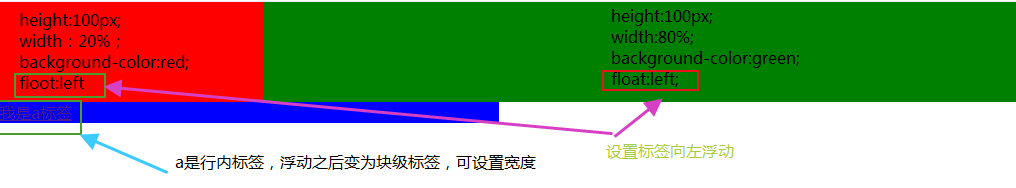
任何元素浮动之后都会变成块元素, a标签float之后就可以设置高和宽
关于浮动的两个特点:
- 浮动的框可以向左或向右移动,直到它的外边缘碰到包含框或另一个浮动框的边框为止。
- 由于浮动框不在文档的普通流中,所以文档的普通流中的块框表现得就像浮动框不存在一样。
三种取值:
left: 向左浮动
right:向右浮动
none: 默认值,不浮动
<!DOCTYPE html>
<html lang="zh-CN">
<head>
    <meta charset="UTF-8">
    <title>布局</title>

    <!--去浏览器默认边框样式-->
    <style>
        * {
            margin: 0;
            padding: 0;
        }
        .c1 {
            height: 1000px;
            width: 20%;
            background-color: red;
            float: left;
        }

        .c2 {
            height: 1000px;
            width: 90%;
            background-color: green;
            float: left;
        }

        /*任何元素浮动之后都会变成块元素,可以设置宽度*/
        a {
            float: left;
            width: 1000px;
        }
    </style>
</head>
<body>

<div class="c1"></div>
<div class="c2"></div>

<a href="">我是a标签</a>
</body>
</html>
打印结果:
十一、清除浮动clear
①浮动带来的影响:
        浮动的元素会脱离文档流,在html中不占有原来的位置,造成父标签塌陷

②clear:规定元素的哪一侧不允许其他浮动元素
    left     在左侧不允许浮动元素
    right    在右侧不允许浮动元素
    both     在左右两侧均不允许浮动元素
   none      默认值。允许浮动元素出现在两侧
 inherit

③解决浮动带来的影响:伪元素清除法clearfix:after
伪元素清除法(使用较多):
.clearfix:after {
  content: "";
  display: block;
  clear: both;
}
<!DOCTYPE html>
<html lang="zh-CN">
<head>
    <meta charset="UTF-8">
    <title>清除浮动示例</title>
    <style>
        #d1 {
            border: 1px solid black;
        }

        /*使用分组选择器统一设置c1和c2的样式,点表示类选择器*/
        .c1,
        .c2 {
            float: left;
            height: 100px;
            width: 100px;
        }

        /*设置固定高度解决浮动带来的影响*/
        /*.c3 {*/
            /*height: 100px;*/
        /*}*/

        /*解决浮动带来的影响:clear*/
        #d1:after {
            content: "";
            clear: left;

            /*设置添加的标签为块级标签*/
            display: block;
        }
    </style>
</head>
<body>

<div id="d1">
    <div class="c1">c1</div>
    <div class="c2">c2</div>
    <div class="c3"></div>

</div>
</body>
</html>

十二、overflow溢出属性
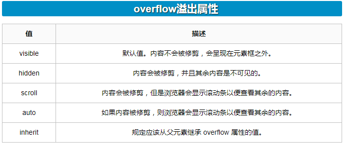
- overflow(水平和垂直均设置)
- overflow-x(设置水平方向)
- overflow-y(设置垂直方向)
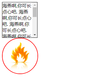
<!DOCTYPE html>
<html lang="zh-CN">
<head>
    <meta charset="UTF-8">
    <title>overflow示例</title>
    <style>
        .c1 {
            width: 120px;
            height: 120px;
            border: 1px solid black;
            overflow: auto;
        }
        .header-img {
            width: 120px;
            height: 120px;
            border: 2px solid red;
            border-radius: 100%;

            /*当内容超过父标签溢出时,设置隐藏溢出的部分 */
            overflow: hidden;
        }

        /*当图片比边框大时,设置图片最大要和父标签一样大:图片宽度最大占父标签的百分百*/
        img {
            max-width: 100%;
        }
    </style>
</head>
<body>

<div class="c1">
    海燕啊,你可长点心吧.
    海燕啊,你可长点心吧.
    海燕啊,你可长点心吧.
    海燕啊,你可长点心吧.海燕啊,你可长点心吧.海燕啊,你可长点心吧.海燕啊,你可长点心吧.海燕啊,你可长点心吧.海燕啊,你可长点心吧.
</div>

<div class="header-img">
    <img src="http://pic99.nipic.com/file/20160525/21798889_093103162989_2.jpg" alt="">
</div>
</body>
</html>
打印结果:
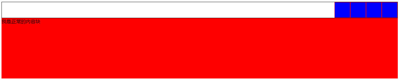
<!DOCTYPE html>
<html lang="zh-CN">
<head>
    <meta charset="UTF-8">
    <title>float下午版</title>
    <style>
        #d1 {
            border: 1px solid black;
        }
        .c1 {
            height: 50px;
            width: 50px;
            background-color: blue;
            border: 1px solid red;

            /*通过浮动的方式让块级标签处在同一排上*/
            float: right;
        }
        .c2 {
            /*height: 50px;*/
            clear: right;
            background-color: deeppink;
        }

        .c3 {
            height: 200px;
            background-color: red;
        }

        /*清除浮动的副作用*/
        /*#d1:after {*/
            /*content: "";*/
            /*clear: both;*/
            /*display: block;*/
        /*}*/

        /*清除浮动通用版:再要清除浮动的父标签内加一个类,然后调用*/
        .clearfix:after {
            content: "";
            clear: both;
            display: block;
        }
    </style>
</head>
<body>

<div id="d1" class="clearfix">
    <div class="c1"></div>
    <div class="c1"></div>
    <div class="c1"></div>
    <div class="c1"></div>

</div>

<div class="c3">我是正常的内容块</div>

</body>
</html>
 总结:
    display:inline喝浮动都可以让两个div标签按一排显示,方便界面设置,但前者只能设置靠左边排一排,后者可以设置浮动的方向,并且浮动之后行内标签变为块级标签,
可设置宽度。
十三、定位
①position:定位
    static: 无定位,默认值。不能调整top、left、right,bottom
    relative 相对定位:相对于标签本身原来的位置
    absolute 绝对定位:相对于最近一个已经被定位过的父标签:如果一直往上还没找到被定位过的父标签,就按照body标签定位,即按照左上角定位,相当于static
    fixed    固定定位:相对于浏览器窗口固定在窗口某一个位置,不随文档上下滑动而变动(回到顶部)

②是否脱离文档流:
  脱离文档流:
        浮动
        绝对定位
        固定定位
  不脱离文档流:
        相对定位
<!DOCTYPE html>
<html lang="zh-CN">
<head>
    <meta charset="UTF-8">
    <title>定位示例</title>
    <style>
        * {
            margin: 0;
            padding: 0;
        }

        .c1,
        .c2,
        .c3,
        .c4,
        .c4-father{
            height: 50px;
            width: 50px;
        }

        .c1 {
            background-color: red;
        }
        .c2 {
            background-color: green;

            /*相对定位*/
            position: relative;
            left: 250px;
            top: 50px;
        }
        .c3 {
            background-color: blue;
        }
        .c4 {
            background-color: deeppink;

            /*绝对定位:一直往上找,直到找到一定被定位过的父标签c4-father,相对父标签开始定位*/
            position: absolute;
            top: 100px;
            left: 100px;
        }
        .c4-father {
            background-color: grey;
            position: relative;
            left: 150px;

        }

        /*固定定位*/
        .fixed-test {
            position: fixed;
            right: 20px;
            bottom: 20px;
            background-color: grey;
        }
    </style>
</head>
<body>

<div class="c1">c1</div>
<div class="c2">c2</div>
<!--<div>阿诗丹顿多多多多多多多多多多多多多多多多多多多多多多多多多多多多多多多多多多多多</div>-->
<div class="c3">c3</div>
<div class="c4-father">c4-father
    <div class="c4">c4</div>
</div>

<div class="fixed-test">返回顶部</div>
</body>
</html>

十四、其它
1、脱离文档流三种方式:
float
absolute
fixed
<!DOCTYPE html>
<html lang="zh-CN">
<head>
    <meta charset="UTF-8">
    <title>脱离文档流的情况</title>
    <style>
        * {
            margin: 0;
            padding: 0;
        }
        .c1 {
            height: 100px;
            width: 100px;
            background-color: red;
        }

        .c2 {
            height: 150px;
            width: 150px;
            background-color: green;
            /*浮动脱离文档流*/
            /*float: right;*/

            /*相对定位不会脱离文档流*/
            /*position: relative;*/
            /*left: 400px;*/
            /*left: 400px;*/

           /*绝对定位脱离文档流*/
            /*position: absolute;*/
            /*left: 400px;*/

            /*固定定位脱离文档流*/
            position: fixed;
            right: 100px;
            top: 100px;
        }
        .c3 {
            height: 200px;
            width: 200px;
            background-color: blue;
        }
    </style>
</head>
<body>

<div class="c1"></div>
<div class="c2"></div>
<div class="c3"></div>
</body>
</html>
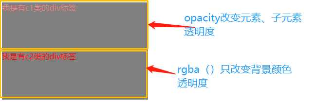
2、opacity (不透明度)
1. 取值0~1
2. 和rgba()的区别:
1. opacity改变元素子元素的透明度效果
2. rgba()只改变背景颜色的透明度效果
<!DOCTYPE html>
<html lang="zh-CN">
<head>
    <meta charset="UTF-8">
    <title>透明度示例</title>
    <style>
        .c1,
        .c2{
            height: 100px;
            width: 300px;
            color: red;
        }

        .c1 {
            background-color: black;
            opacity: 0.5;
        }
        .c2 {
            background-color: rgba(0,0,0,0.5);
        }

    </style>
</head>
<body>

<div class="c1">我是有c1类的div标签</div>
<div class="c2">我是有c2类的div标签</div>
</body>
</html>
3、z-index:z轴
#i2 {
  z-index: 999;
}
设置对象的层叠顺序。
- z-index 值表示谁压着谁,数值大的压盖住数值小的,
- 只有定位了的元素,才能有z-index,也就是说,不管相对定位,绝对定位,固定定位,都可以使用z-index,而浮动元素不能使用z-index
- z-index值没有单位,就是一个正整数,默认的z-index值为0如果大家都没有z-index值,或者z-index值一样,那么谁写在HTML后面,谁在上面压着别人,定位了元素,永远压住没有定位的元素。
- 从父现象:父亲怂了,儿子再牛逼也没用
<!DOCTYPE html>
<html lang="zh-CN">
<head>
    <meta charset="UTF-8">
    <title>z-index示例</title>
    <style>
        * {
            margin: 0;
            padding: 0;
        }
        .c1 {
           height: 150px;
            width: 150px;
            background-color: red;
            /*直接写一个relative位置不会改变,但只有变成定位过得元素之后才能使用z-index
            ,这样写后被c2盖住的标签又会显示我们面前*/
            position: relative;
            z-index: 2;
        }
        .c2 {
            height: 200px;
            width: 200px;
            background-color: green;
            /*使用相对定位盖住c1标签*/
            position: relative;
            top: -150px;
        }
    </style>
</head>
<body>

<div class="c1"></div>
<div class="c2"></div>
</body>
</html>

<!DOCTYPE html>
<html lang="zh-CN">
<head>
    <meta charset="UTF-8">
    <title>青春版模态框示例</title>
    <style>
        .cover {

            /*铺满整个屏幕*/
            position: absolute;
            top: 0;
            right: 0;
            bottom: 0;
            left: 0;
            background-color: rgba(0,0,0,0.5);

            z-index: 999;
        }
        .modal {
            width: 600px;
            height: 400px;
            background-color: white;

            /*把位置固定在屏幕中间*/
            position: fixed;
            top: 50%;
            left: 50%;
            margin-top: -200px;
            margin-left: -300px;

            /*盖住上面的背景*/
            z-index: 1000;
        }
    </style>
</head>
<body>

<div class="cover"></div>
<div class="modal"></div>

</body>
</html>

十五、Blog页面简单设计
<!DOCTYPE html>
<html lang="zh-CN">
<head>
    <meta charset="UTF-8">
    <title>Blog页面示例</title>
    <link rel="stylesheet" href="blog.css">
</head>
<body>

<!-- 左边栏 开始-->
<div class="left">
    <!--头像 开始-->
    <div class="header-img">
        <img src="http://pic166.nipic.com/file/20180510/27075709_133036601191_2.jpg" alt="">
    </div>
    <!--头像结束-->

    <div class="blog-name">Ghui_Z</div>

    <div class="blog-info">志当存高远.</div>

    <!-- 连接区 开始-->
    <div class="blog-links">

        <!--可通过ul<li*3<a快速生成-->
        <ul>
            <li><a href="">微博</a></li>
            <li><a href="">微信</a></li>
            <li><a href="">电子邮箱</a></li>
        </ul>
    </div>
    <!--连接区 结束-->

    <!-- 文章分类 开始-->
    <div class="blog-tags">

        <ul>
            <li><a href="">JS</a></li>
            <li><a href="">CSS</a></li>
            <li><a href="">HTML</a></li>
        </ul>
    </div>
    <!--文章分类 结束-->
</div>
<!-- 左边栏 结束-->

<!--右边栏 开始-->
<div class="right">
    <div class="article-list">
        <div class="article">
            <div class="article-title">
                <h1 class="article-name">海燕</h1>
                <span class="article-date">2020-04-07</span>
            </div>
            <div class="article-info">
                在苍茫的大海上,狂风卷积着乌云.在乌云和大海之间,海燕像黑色的闪电,在高傲的飞翔.
            </div>
            <div class="article-tag">
                #HTML #CSS
            </div>
        </div>
        <div class="article">
            <div class="article-title">
                <h1 class="article-name">小石潭记</h1>
                <span class="article-date">2020-04-07</span>
            </div>
            <div class="article-info">
                从小丘西行百二十步,隔篁竹,闻水声,如鸣佩环,心悦之,伐竹取道,下见小潭,水尤清冽。
            </div>
            <div class="article-tag">
                #HTML #CSS
            </div>
        </div>
    </div>
</div>
<!--右边栏 结束-->
</body>
</html>
/* Blog页面相关样式*/


/*公用样式*/

* {
    font-family: ".PingFang SC", "Microsoft YaHei";
    font-size: 14px;
    margin: 0;
    padding: 0;
}

/*去掉a标签的下划线*/
a {
    text-decoration: none;
}


/*左边栏 样式*/
.left {
    width: 20%;
    background-color: rgb(76,77,76);
    height: 100%;
    position: fixed;
    left: 0;
    top: 0;

}
/*头像样式*/
.header-img {
    height: 128px;
    width: 128px;
    border: 5px solid white;

    /*设置border为圆形边框*/
    border-radius: 50%;
    /*隐藏图片溢出的部分*/
    overflow: hidden;
    /*居中*/
    margin: 0 auto;
    /*设置外边距--距离顶端*/
    margin-top: 20px;
}
/*设置图片最大的宽度为父标签的宽度*/
.header-img>img {
    max-width: 100%;
}

/*Blog 名称*/
.blog-name {
    color: white;
    font-size: 24px;
    /*设置字体粗细*/
    font-weight: bold;
    /*设置文本对齐方式:居中*/
    text-align: center;
    margin-top: 15px;
}

/*Blog介绍*/
.blog-info {
    color: white;
    text-align: center;
    /*加边框*/
    border: 2px solid white;
    /*设置外边距:上下5、左右15*/
    margin: 5px 15px;
}


/*连接组和标签组*/
.blog-links,
.blog-tags {
    text-align: center;
    margin-top: 20px;
}

/*从类为blog-links、blog-tags的标签的后代里找到所有的a标签,改变它们的样式*/
.blog-links a,
.blog-tags a {
    color: #eee;
}
/*伪元素选择器*/
.blog-tags a:before {
    content: "#";
}

/*右边栏 样式*/
.right {
    width: 80%;
    background-color: rgb(238,237,237);
    /*设置标签高度*/
    height: 1000px;
    float: right;
}

.article-list {
    设置外边距
    margin-left: 30px;
    margin-top: 30px;
    margin-right: 5%;    /* 10% 是父标签的百分之十*/
}
.article {
    background-color: white;
    /*调节盒子与盒子之间的距离*/
    margin-bottom: 15px;
}

.article-name {
    /*使元素同时具有行内元素和块级元素的特点*/
    display: inline-block;
}

.article-title {
        /*设置内填充:文本与边框的距离*/
        padding: 15px;
       /*设置左边框的格式*/
        border-left: 3px solid red;
        background: antiquewhite;
}

.article-info {
    padding: 15px;
    background: cadetblue;
}

.article-tag {
    /*内填充:上下15,左右0*/
    padding: 15px 0;
    /*设置外边距:盒子与盒子之间距离*/
    margin: 15px;
    /*上边框格式*/
    border-top: 1px solid #eeeeee;
    background: coral;
}
/*文章发布时间*/
.article-date {
    float: right;
}

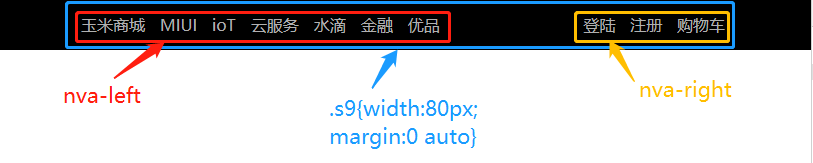
float在导航栏中的应用:
<!DOCTYPE html>
<html lang="en">
<head>
    <meta charset="UTF-8">
    <title>li标签的float示例</title>
      <style>
    /*清除浏览器默认外边距和内填充*/
    * {
      margin: 0;
      padding: 0;
    }
    a {
      text-decoration: none; /*去除a标签默认的下划线*/
    }
    ul {
      list-style-type: none; /*删除列表默认的圆点样式*/
      margin: 0; /*删除列表默认的外边距*/
      padding: 0; /*删除列表默认的内填充*/
    }
    .nav{
         background-color: black;
         padding: 5px 0;
           }
    /*li元素向左浮动*/
    .nav-left li{
        float: left;
        padding-right: 15px;
    }

    .nav-right{
        float: right;

    }
    /*设置nav-right标签中a标签之间的距离*/
    .nav-right a{
        margin:0 5px;
    }


    .s9 {
        /*让s9这个标签占父标签的百分之八十*/
        width: 80%;
        /*居中*/
        margin:0 auto;
    }

    a {
      color: #b0b0b0; /*设置字体颜色*/
      line-height: 40px; /*设置行高*/
    }
    /*鼠标移上去颜色变白*/
    a:hover {
      color: #fff;
    }

    /*清除浮动 解决父级塌陷问题*/
    .clearfix:after,
    .clearfix:before{
      content: "";
      display: block;
      clear: both;
    }
  </style>
</head>
<!-- 顶部导航栏 开始 -->
<div class="nav">
    <div class="s9  clearfix">
        <div class="nav-left">
        <ul>
            <li><a href="">玉米商城</a></li>
            <li><a href="">MIUI</a></li>
            <li><a href="">ioT</a></li>
            <li><a href="">云服务</a></li>
            <li><a href="">水滴</a></li>
            <li><a href="">金融</a></li>
            <li><a href="">优品</a></li>
        </ul>
    </div>
        <div class="nav-right">
        <a href="">登陆</a>
        <a href="">注册</a>
        <a href="">购物车</a>
    </div>
    </div>

</div>


<!-- 顶部导航栏 结束 -->
<body>

</body>
</html>