1.margin:auto ;让元素居中,需要确定元素的宽度,并且需要是块元素
eg: div {
200px;
height:200px;
background:#222;
margin:0 auto;
}
2. div > p 两者都是块元素
div {
200px;
height:200px;
background:#eee;
margin:auto;
}
div>p {
60%;
margin:auto;
font-size:14px/1.5 Arial,sans-serif;
}

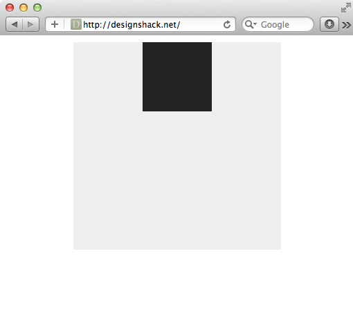
3.
.container {
  height: 300px;
   300px;
  background: #eee;
  margin: 10px auto;
  position: relative;
}

.box {
  height: 100px;
   100px;
  background: #222;
  position: absolute;
  left: 100px; 100 = (300 - 100)/2
}
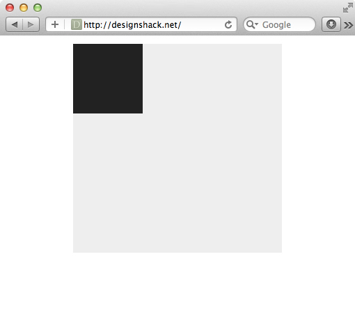
4.
.container {
  height: 300px;
   300px;
  background: #eee;
  margin: 10px auto;
  position: relative;
}

.box {
  height: 100px;
   100px;
  background: #222;
  position: absolute;
}
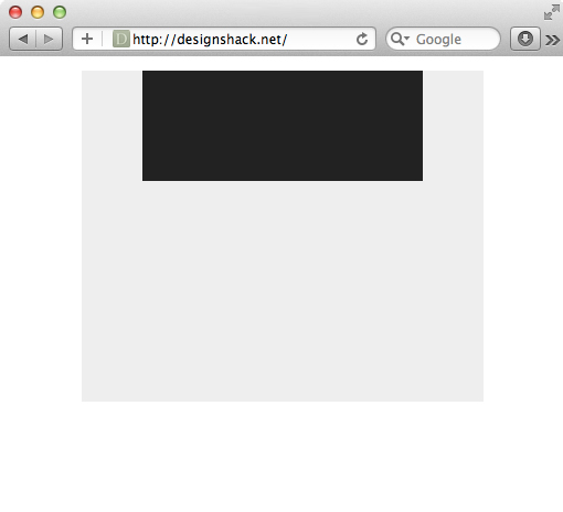
5.
.container {
  height: 300px;
   70%;
  background: #eee;
  margin: 10px auto;
  position: relative;
}

.box {
  height: 100px;
   100px;
  background: #222;
  position: absolute;

  /*Centering Method 2*/
  margin: 0px 0 0 -50px;
  left: 50%;
}

6.
.container {
  height: 300px;
   70%;
  background: #eee;
  margin: 10px auto;
  position: relative;
}

.box {
  height: 100px;
   70%;
  background: #222;
  position: absolute;

  /*Centering Method 2*/
  margin: 0px 0 0 -35%; /* Half of 70% /*
  left: 50%;
}
7.
.container {
  height: 300px;
   300px;
  background: #eee;
  position: absolute;

  margin: -150px 0 0 -150px;
  left: 50%;
  top: 50%;
}

.box {
  height: 100px;
   100px;
  background: #222;
  position: absolute;

  /*Centering Method 2*/
  margin: -50px 0 0 -50px;
  left: 50%;
  top: 50%;
}

8.
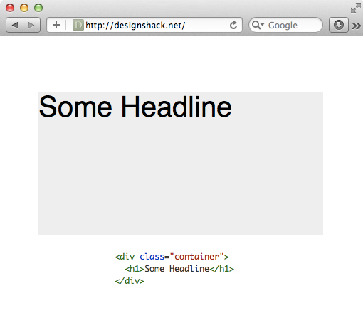
9.
.container {
  height: 400px;
   400px;
  background: #eee;
  margin: 50px auto;
}

h1 {
  font: 40px/1 Helvetica, sans-serif;
  text-align: center;
}

10.
.container {
  height: 200px; /*Set line-height to this value*/
   400px;
  background: #eee;
  margin: 150px auto;
}
h1 {
  font: 40px/200px Helvetica, sans-serif;
  text-align: center;
}
11.
.container {
  height: 300px;
   300px;
  margin: 150px auto;
  background: #eee url(http://lorempixum.com/100/100/nature/4) no-repeat;
  background-position: top center;

}
12.
.container {
  height: 300px;
   300px;
  margin: 150px auto;
  background: #eee url(http://lorempixum.com/100/100/nature/4) no-repeat center;
}

1. 重要: 先对元素 设置高度
2. 运用以下规则
    position: absolute;
    margin: auto;
    top: 0; left: 0; right: 0; bottom: 0;
    overflow: auto;
考虑多浏览器兼容性的话 display: table or display: inline-block;
3.宽度高度不固定DIV水平居中
html部分
     <div class="container">
     <div class="center"><a href="#">1</a><a href="#">2</a><a href="#">3</a>
     <div style="clear:both"></div></div>
css部分
     .container{500px;height:80px;background:#C2300B;margin-left:50px;padding-top:10px;text-align:center;}
     .center{display:inline-block;border:2px solid #fff;}
     .center{_display:inline;} /*针对ie6 hack*/
     .center a{float:left;border:1px solid #fff;padding:5px 10px;margin:10px;color:#fff;text-decoration:none;}
代码要点:
- 父容器container加css属性 text-align:center;
- 子容器center加css属性display:inline-block;
- .center{_display:inline;} 为针对ie6的hack
3.宽度高度不固定DIV垂直居中
html部分
     <div id="vc"><div id="vci"><div id="content">
     我们垂直居中了,我们水平居中了
     </div></div></div>
css部分
     #vc { display:table; background-color:#C2300B; 500px; height:200px; overflow:hidden; margin-left:50px; _position:relative; }
     #vci { vertical-align:middle; display:table-cell; text-align:center; _position:absolute; _top:50%; _left:50%; }
     #content { color:#fff; border:1px solid #fff; display:inline-block; _position:relative; _top:-50%; _left:-50%; }
代码要点:
- 父容器vc的css属性 display:table;overflow:hidden;
- 子容器vci的css属性 vertical-align:middle;display:table-cell;
- 针对ie6的hack,vci容器的 _position:absolute;_top:50%; 和content容器的 _position:relative; _top:-50%;
- 如果不需要水平居中的话,需要注释掉vci容器的text-align:center;_left:50%;以及content的display:inline-block;_left:-50%;
4.宽度高度固定水平垂直居中
html部分
<div class="guding"><div class="gd">居中了</div></div>
css部分
    .guding{500px;height:200px;background:#c2300b;margin-left:50px;position:relative;}
    .gd{50px;height:20px;background:#fff;position:absolute;top:50%;left:50%;margin-top:-10px;margin-left:-25px;}
代码要点:
- 父容器要用相对定位position:relative;否则的话子元素会相对于浏览器窗口进行绝对定位。
- 子容器绝对定位,top:50%;left:50%;margin-top,margin-left的值取该容器高度,宽度的一半的负值。
5. 然后CSS3来了,使用flexbox布局
抛开兼容性,我想这是一个完美的居中,不需要考虑宽度和高度值。
<div id="parent">
    <div id="item">test</div>
</div>
#parent {
    display: flex;
     400px; /* 宽度值,随便啦 */
    height: 400px;  /* 高度值,随便啦 */
    background-color: yellow;
}

#item {
     100px;/* 宽度值,随便啦 */
    height: 20px;/* 高度值,随便啦 */
    margin: auto;
    background-color: red; /* Magic! */
}