Seaborn是Python的一个制图工具库,在Matplotlib上构建,支持numpy和pandas的数据结构可视化。
Seaborn还是比较简单的,看看文档基本就可以写了。
bins : argument for matplotlib hist(), or None, optional #设置矩形图数量 Specification of hist bins, or None to use Freedman-Diaconis rule.
hist : bool, optional #控制是否显示条形图 Whether to plot a (normed) histogram.
kde : bool, optional #控制是否显示核密度估计图 Whether to plot a gaussian kernel density estimate.
rug : bool, optional #控制是否显示观测的小细条(边际毛毯)Whether to draw a rugplot on the support axis.
fit : random variable object, optional #控制拟合的参数分布图形 An object with fit method, returning a tuple that can be passed to a pdf method a positional arguments following an grid of values to evaluate the pdf on.
{hist, kde, rug, fit}_kws : dictionaries, optional Keyword arguments for underlying plotting functions.
vertical : bool, optional #显示正交控制 If True, oberved values are on y-axis.
单变量分布
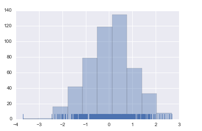
import numpy as np
import seaborn as sns

x1 = np.random.normal(size=500)
# 直方图
sns.distplot(x1, bins=20, kde=False, rug=True)
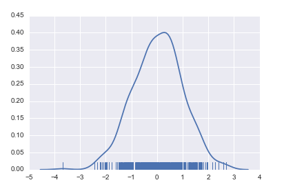
# 核密度估计
sns.distplot(x1, hist=False, rug=True)
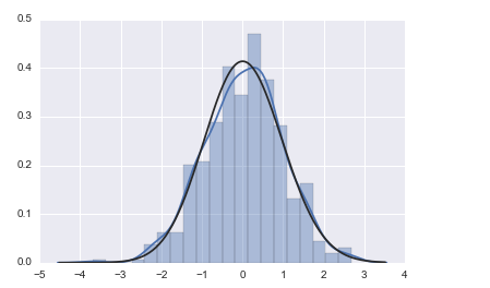
# 拟合参数分布
sns.distplot(x1, kde=True, fit=stats.gamma)
双变量分布
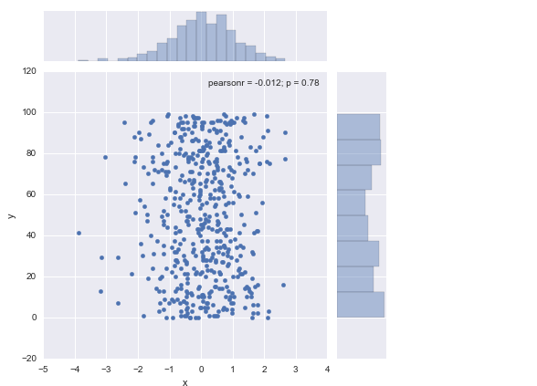
df_obj2 = pd.DataFrame({"x": np.random.randn(500),"y": np.random.randint(0, 100, 500)})
# 散布图
sns.jointplot(x="x", y="y", data=df_obj2)
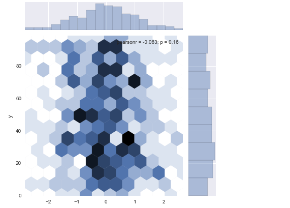
# 二维直方图
sns.jointplot(x="x", y="y", data=df_obj2, kind="hex");
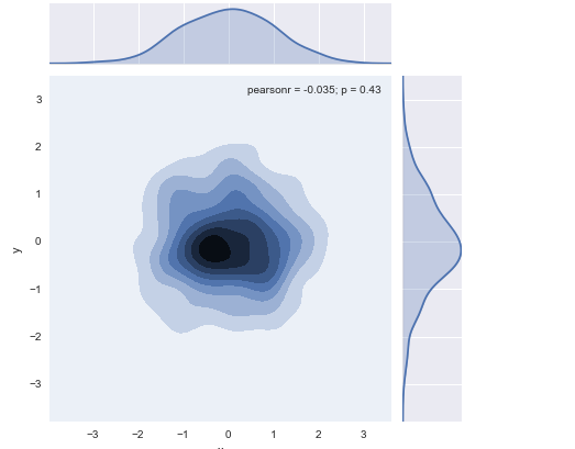
# 核密度估计
sns.jointplot(x="x", y="y", data=df_obj1, kind="kde");
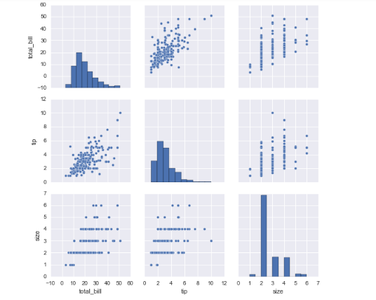
# 数据集中变量间关系可视化
dataset = sns.load_dataset("tips")
#dataset = sns.load_dataset("iris")
sns.pairplot(dataset);
类别数据可视化
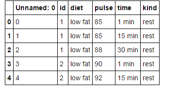
exercise = sns.load_dataset('exercise')
exercise.head(5)
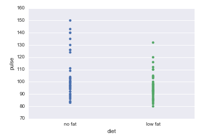
sns.stripplot(x="diet", y="pulse", data=exercise)
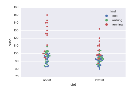
sns.swarmplot(x="diet", y="pulse", data=exercise, hue='kind') #hue按照组类别
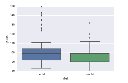
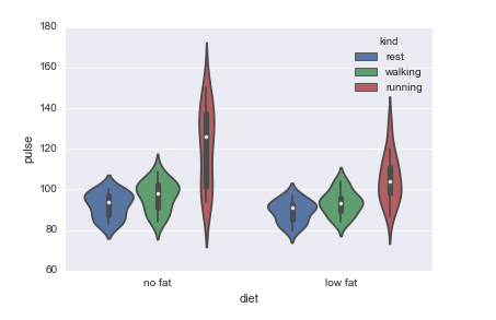
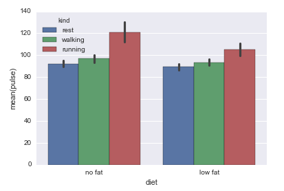
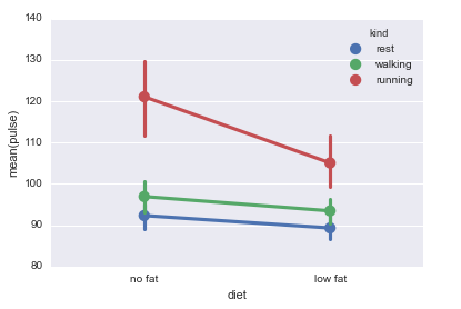
# 盒子图
sns.boxplot(x="diet", y="pulse", data=exercise)
#sns.boxplot(x="diet", y="pulse", data=exercise, hue='kind')
# 小提琴图
#sns.violinplot(x="diet", y="pulse", data=exercise)
sns.violinplot(x="diet", y="pulse", data=exercise, hue='kind')
# 柱状图
sns.barplot(x="diet", y="pulse", data=exercise, hue='kind')
# 点图
sns.pointplot(x="diet", y="pulse", data=exercise, hue='kind')