一创建一个 options.js
代码为:
export const option1 = {
bar: {
title: {
text: '珠海猪场' // 指定图表标题
},
credits: {
enabled: false
},
chart: {
backgroundColor: 'black',
type: 'bar'
},
plotOptions: {
column: {
colorByPoint: true
},
line: {
dataLabels: {
// 开启数据标签
enabled: true
}
// 关闭鼠标跟踪,对应的提示框、点击事件会失效
// enableMouseTracking: false
}
},
xAxis: {
categories: ['今日已入场', '已交易单次', '已交易数量', '已缴费'] // 指定x轴分组
},
series: [{
colorByPoint: true,
data: [500, 235, 809, 5000],
dataLabels: {
enabled: true
}
}]
}
}
export const option2 = {
bar: {
chart: {
backgroundColor: 'black',
type: 'column', // 指定图表的类型,默认是折线图(line)
enabled: true
},
credits: {
enabled: false
},
title: {
text: '珠海猪场' // 指定图表标题
},
colors: ['#058DC7', '#50B432', '#ED561B', '#DDDF00', '#24CBE5', '#50B432', '#ED561B', '#DDDF00', '#24CBE5'],
xAxis: {
categories: ['今日已入场', '屠宰进度', '已交易单次', '分切进度', '已交易数量', '冷链车', '已交易额', '生产效率比', '已缴费'] // 指定x轴分组
},
yAxis: {
title: {
text: '最近七天' // 指定y轴的标题
},
credits: {
enabled: false
}
},
plotOptions: {
column: {
colorByPoint: true
// enabled: true
}
},
series: [
{ // 指定数据列
name: '珠海猪场信息',
dataLabels: {
enabled: true
},
data: [
{
y: 1000,
color: 'red'
}, 5000, 4000, 5000, 2000, 5000, 4000, 5000, 2000], // 数据
enabled: true
}
]
}
}
export const option3 = {// id => 类似<div id="HighChartid"></div>
chart: {
backgroundColor: 'black',
plotBackgroundColor: null,
plotBorderWidth: null,
plotShadow: false
},
title: {
text: ''
},
tooltip: {
pointFormat: '{series.name}: <b>{point.percentage:.1f}%</b>'
},
credits: {
enabled: false
},
plotOptions: {
credits: {
enabled: false
},
pie: {
allowPointSelect: true,
cursor: 'pointer',
dataLabels: {
enabled: true,
format: '{point.percentage:.1f} %',
style: {
color: 'black' // (Highcharts.theme && Highcharts.theme.contrastTextColor) || 'black'
}
},
colors: [
'#21c393', // 不合格
'#4879df', // 合格
'#fad567', // 良好
'#f44a36' // 优秀
]
}
},
series: [{
type: 'pie',
name: '售数量',
data: [{
name: ' 今日已入场',
y: 61.41,
sliced: true,
selected: true
}, {
name: ' 屠宰进度',
y: 11.84
}, {
name: '已交易单次',
y: 10.85
}, {
name: '分切进度',
y: 4.67
}, {
name: '已交易数量',
y: 4.18
}, {
name: '冷链车',
y: 1.64
}, {
name: '已交易额',
y: 1.6
}, {
name: '生产率',
y: 1.2
}, {
name: '已缴费',
y: 2.61
}] // 为要处理的格式,对应官网api的格式填写即可
}]
}
export const option4 = {
chart: {
backgroundColor: 'black',
plotBackgroundColor: null,
plotBorderWidth: null,
plotShadow: false,
type: 'pie',
height: 300
},
// 隐藏logo
credits: {
enabled: false
},
title: {
text: ' 珠海猪场大数据'
},
tooltip: {
pointFormat: '{series.name} : <b>{point.percentage:.1f}%</b>'
},
plotOptions: {
tooltip: {
valueSuffix: '%'
},
dataLabels: {
enabled: true,
format: '<b>{point.name}</b>: {point.percentage:.1f} %'
},
pie: {
allowPointSelect: true,
enabled: true,
cursor: 'pointer',
dataLabels: {
enabled: true,
format: '<b>{point.name}</b>: {point.percentage:.1f} %',
style: {
color: 'black'
}
},
showInLegend: true
}
},
series: [{
type: 'pie',
// enabled: true,
// allowPointSelect: true,
keys: ['name', 'y', 'selected', 'sliced'],
data: [
// ['Apples', 29.9, false],
// ['Pears', 71.5, false],
// ['Oranges', 106.4, false],
// ['Plums', 129.2, false],
['分切进度', 144.0, false],
['屠宰进度', 176.0, false],
['生产率', 135.6, true, true],
['已交易额', 148.5, false]
]
// enabled: true
}]
}
export const option5 = {
chart: {
backgroundColor: 'black',
type: 'line',
watch: 100,
height: 300
},
credits: {
enabled: false
},
title: {
text: '中珠牧业月销售'
},
subtitle: {
text: null
},
xAxis: {
categories: ['一日', '二日', '三日', '四日', '五日', '六日', '七日', '八日', '九日', '十日', '十一日', '十二日', '十三日', '十四日', '十五日', '十六日', '十七日', '十八日', '十九日', '二十日', '二十一日', '二十二日', '二十三日', '二十三日', '二十四日', '二十五日', '二十六日', '二十一七日', '二十八日', '二十九日', '三十日']
},
yAxis: {
title: {
text: '销售 (数量)'
}
},
plotOptions: {
line: {
dataLabels: {
// 开启数据标签
enabled: true
}
// 关闭鼠标跟踪,对应的提示框、点击事件会失效
}
},
series: [{
name: '今日已入场',
data: [7.0, 6.9, 9.5, 14.5, 18.4, 21.5, 25.2, 26.5, 23.3, 18.3, 13.9, 9.6, 7.0, 6.9, 9.5, 14.5, 18.4, 21.5, 25.2, 26.5, 23.3, 18.3, 13.9, 9.6, 7.0, 6.9, 9.5, 14.5, 18.4, 21.5, 25.2]
}, {
name: '已缴费',
data: [3.9, 4.2, 5.7, 8.5, 11.9, 15.2, 17.0, 16.6, 14.2, 10.3, 6.6, 4.8, 3.9, 4.2, 5.7, 8.5, 11.9, 15.2, 17.0, 16.6, 14.2, 10.3, 6.6, 4.8, 3.9, 4.2, 5.7, 8.5, 11.9, 15.2, 17.0]
}]
}
export const option6 = {
chart: {
backgroundColor: 'black',
type: 'column'
},
credits: {
enabled: false
},
title: {
text: '猪场效率优化数据分析图',
color: 'MediumSpringGreen'
},
xAxis: {
categories: [
'前天数量',
'昨天数量',
'今天数量'
]
},
yAxis: [{
min: 0,
title: {
text: '入场猪与屠宰'
}
}, {
title: {
text: '已交易数利润'
},
opposite: true
}],
legend: {
shadow: false
},
tooltip: {
shared: true
},
plotOptions: {
column: {
grouping: false,
shadow: false,
borderWidth: 0
}
},
series: [{
name: '猪入场数',
color: 'rgba(165,170,217,1)',
data: [150, 73, 20],
pointPadding: 0.3, // 通过 pointPadding 和 pointPlacement 控制柱子位置
pointPlacement: -0.2
}, {
name: '屠宰数',
color: 'rgba(126,86,134,.9)',
data: [140, 90, 40],
pointPadding: 0.4,
pointPlacement: -0.2
}, {
name: '已交易数',
color: 'rgba(248,161,63,1)',
data: [183.6, 178.8, 198.5],
tooltip: { // 为当前数据列指定特定的 tooltip 选项
valuePrefix: '$',
valueSuffix: ' M'
},
pointPadding: 0.3,
pointPlacement: 0.2,
yAxis: 1 // 指定数据列所在的 yAxis
}, {
name: '已缴费数',
color: 'rgba(186,60,61,.9)',
data: [203.6, 198.8, 208.5],
tooltip: {
valuePrefix: '$',
valueSuffix: ' M'
},
pointPadding: 0.4,
pointPlacement: 0.2,
yAxis: 1
}]
}
export const option7 = {
chart: {
marginTop: 40
},
title: {
text: '2017 年公司运营情况'
},
xAxis: {
categories: ['<span class="hc-cat-title">营收</span><br/> 千美元']
},
yAxis: {
plotBands: [{
from: 0,
to: 150,
color: '#666'
}, {
from: 150,
to: 225,
color: '#999'
}, {
from: 225,
to: 9e9,
color: '#bbb'
}],
title: null
},
series: [{
data: [{
y: 275,
target: 250
}]
}],
tooltip: {
pointFormat: '<b>{point.y}</b> (目标值 {point.target})'
}
}
export const option8 = {
}
2.然后创建一个index.vue文件

代码为:
<template>
<div class="dsj">
<div id="Container">
<div id="header" style="font-size:3.5vw; color: PowderBlue; text-align: center; padding-top:2vw;">中珠牧业生产实时测试系统
<img src="../../assets/bb.png" alt="" style="position:absolute;left:2vw;top:0.5vw">
</div>
<div id="cc" style="font-size:1.7vw; color:#CDB38B; text-align: center;padding-top:1.5vw"><span>{{ now | dateformat('YYYY-MM-DD') }}</span><br>
<span style="font-size:1.5vw; color: #CDB38B; text-align: center;">{{ now | dateformat('HH:mm:ss') }}</span>
</div>
<div style="100%;height:28vw;">
<!-- 左边 -->
<div style="30%;height:100%;float:left">
<div style="24vw;height:10vw;margin:1vw auto 0">
<table style="461px;height:193px" class="define-table">
<tr>
<td style="font-size:1vw; color: PowderBlue;">今日入场 :<span style="font-size:1.5vw; color: PowderBlue;">1000</span></td>
<td style="font-size:1vw; color: PowderBlue;">已交易数 :<span style="font-size:1.5vw; color: PowderBlue;">1000</span></td>
</tr>
<tr>
<td style="font-size:1vw; color: PowderBlue;">交易单次 :<span style="font-size:1.5vw; color: PowderBlue;">1000</span></td>
<td style="font-size:1vw; color: PowderBlue;">冷 链 车 :<span style="font-size:1.5vw; color: PowderBlue;">1000</span></td>
</tr>
<tr>
<td style="font-size:1vw; color: PowderBlue;">已 缴 费 :<span style="font-size:1.5vw; color: PowderBlue;">1000</span></td>
<td style="font-size:1vw; color: PowderBlue;">今日交易额 :<span style="font-size:1.5vw; color: PowderBlue;">1000</span></td>
</tr>
</table>
</div>
<div style="28vw;height:15vw;margin:1vw auto 0">
<x-chart :id="test4" :option="option4" ></x-chart>
</div>
</div>
<!-- 中间 -->
<div style="40%;height:100%;float:left">
<!-- 中上 -->
<div style="30vw; height:3vw; margin:1vw auto 0; font-size:1.5vw;text-align:center; color: PowderBlue; ">今日交易金额(元):<span style="font-size:2.5vw; ">10000</span></div>
<!-- 中下 -->
<div style="39vw;height:22.5vw;margin:1vw auto 0">
<div id="highmaps" class="container"></div>
</div>
</div>
<!-- 右边 -->
<div style="30%;height:100%;float:left">
<div style="26vw;height:30vw;margin:1vw auto 0">
<div style="margin:1vw auto 0; font-size:1.2vw;text-align:center; color: PowderBlue;">实时交易数</div>
<ul style="list-style-type:none">
<div style="24vw;height:10vw;margin:1vw auto 0">
<table style="461px;height:193px" class="define-table">
<tr>
<td style="font-size:1vw; color: PowderBlue;">批发商 :<span style="font-size:1.5vw; color: PowderBlue;">1000</span></td>
<td style="font-size:1vw; color: PowderBlue;">经销商 :<span style="font-size:1.5vw; color: PowderBlue;">1000</span></td>
</tr>
<tr>
<td style="font-size:1vw; color: PowderBlue;">头 数 :<span style="font-size:1.5vw; color: PowderBlue;">1000</span></td>
<td style="font-size:1vw; color: PowderBlue;">金 额 :<span style="font-size:1.5vw; color: PowderBlue;">1000</span></td>
</tr>
</table>
</div>
</ul>
<div>
<x-chart :id="test1" ref="option1" :option="option1" ></x-chart>
</div>
</div>
<!-- <div style="28vw;height:15vw;margin:1vw auto 0"> -->
<!-- <div style="margin-left:7vw;">
<el-progress title="这是紫色" type="circle" :percentage="data1" color="rgba(142, 113, 199, 0.7)"></el-progress>
<el-progress type="circle" :percentage="data2" color="rgba(140, 1001, 51, 0.7)"></el-progress>
</div> -->
<div style="margin-left:7vw;margin-top:1.5vw">
<el-progress type="circle" :percentage="data4" color="rgba(43, 113, 19, 155)"></el-progress>
<el-progress type="circle" :percentage="data5" color="rgba(142, 11, 33, 0.7)"></el-progress>
</div>
<div></div>
</div>
</div>
</div>
<div style="height:15vw;margin-top:1vw;">>
<x-chart :id="test5" :option="option5" class="ff"></x-chart>
</div>
</div>
</template>
<script>
// 导入chart组件
import XChart from './chart.vue'
import HighCharts from 'highcharts'
import img_404 from '@/assets/bg.jpg'
import Highcharts from 'highcharts/highstock'
import HighchartsMore from 'highcharts/highcharts-more'
import HighchartsDrilldown from 'highcharts/modules/drilldown'
import Highcharts3D from 'highcharts/highcharts-3d'
import Highmaps from 'highcharts/modules/map'
import $ from 'jquery'
import HighchartsComponent from './HighchartsComponent.vue'
HighchartsMore(Highcharts)
HighchartsDrilldown(Highcharts)
Highcharts3D(Highcharts)
Highmaps(Highcharts)
// 导入chart组件模拟数据
import { option1, option2, option3, option4, option5, option6, option7, option8 } from '@/chart-options/options'
import { pay } from '@/api/car'
import moment from 'moment'
export default {
name: 'app',
data() {
return {
chart: null,
img_404,
test1: 'test1',
test2: 'test2',
test3: 'test3',
test4: 'test4',
test5: 'test5',
test6: 'test6',
test7: 'test7',
option1: option1.bar,
option2: option2.bar,
option3: option3,
option4: option4,
option5: option5,
option6: option6,
option7: option7,
now: moment(),
data1: 0,
data2: 0,
data3: 0,
data4: 0,
data5: 0,
data6: 0,
data7: 0,
payMoney: null
}
},
components: {
XChart,
HighchartsComponent
},
filters: {
dateformat(dataStr, pattern = 'YYYY-MM-DD HH:mm:ss') {
return moment(dataStr).format(pattern)
}
},
created() {
this.option1.series[0].data[0]
console.log(this.$refs.option1)
new HighCharts.Map('map', option8)
},
mounted() {
this.createChart()
this.highmaps()
setInterval(() => {
this.now = moment()
}, 100)
setInterval(() => {
if (this.data1 === 100) {
this.data1 = 0
}
if (this.data2 === 100) {
this.data2 = 0
}
if (this.data3 === 100) {
this.data3 = 0
}
if (this.data4 === 100) {
this.data4 = 0
}
if (this.data5 === 100) {
this.data5 = 0
}
if (this.option5 === 100) {
this.option5 = 0
}
this.data1 = Math.floor(Math.random() * 100)
this.data2 = Math.floor(Math.random() * 100)
this.data3 = Math.floor(Math.random() * 100)
this.data4 = Math.floor(Math.random() * 100)
this.data5 = Math.floor(Math.random() * 100)
this.option5 = Math.floor(Math.random() * 100)
pay().then((res) => {
this.payMoney = res.data
})
}, 1000)
},
methods: {
createChart() {
Highcharts.setOptions({
lang: {
rangeSelectorZoom: ''
}
})
},
highmaps() {
Highcharts.setOptions({
lang: {
drillUpText: '< 返回 "{series.name}"'
}
})
var map = null
var geochina = 'https://data.jianshukeji.com/jsonp?filename=geochina/'
$.getJSON(geochina + 'china.json&callback=?', function(mapdata) {
var data = []
// 随机数据
Highcharts.each(mapdata.features, function(md, index) {
var tmp = {
name: md.properties.name,
value: Math.floor((Math.random() * 100) + 1) // 生成 1 ~ 100 随机值
}
if (md.properties.drilldown) {
tmp.drilldown = md.properties.drilldown
}
data.push(tmp)
})
map = new Highcharts.Map('highmaps', {
chart: {
backgroundColor: 'black',
marginBottom: -0,
// borderWidth: 50,
plotBorderWidth: -0,
height: 430,
800,
marginTop: 0,
// 1000,
// borderWidth: 1,
events: {
drilldown: function(e) {
console.log(e)
// 异步下钻
// if (e.point.drilldown) {
// var pointName = e.point.properties.fullname
// // 获取二级行政地区数据并更新图表
// $.getJSON(geochina + e.point.drilldown + '.json&callback=?', function(data) {
// data = Highcharts.geojson(data)
// Highcharts.each(data, function(d) {
// if (d.properties.drilldown) {
// d.drilldown = d.properties.drilldown
// }
// d.value = Math.floor((Math.random() * 100) + 1) // 生成 1 ~ 100 随机值
// })
// map.hideLoading()
// map.addSeriesAsDrilldown(e.point, {
// name: e.point.name,
// data: data,
// dataLabels: {
// enabled: true,
// format: '{point.name}'
// }
// })
// map.setTitle({
// text: pointName
// })
// })
// }
},
drillup: function() {
map.setTitle({
text: '中国'
})
}
}
},
title: {
text: null
},
legend: {
// layout: 'vertical',
// align: 'right',
// verticalAlign: 'top',
// y: 50,
padding: 5
// itemMarginTop: 5,
// itemMarginBottom: 50,
// itemStyle: {
// lineHeight: '14px'
// }
},
credits: {
enabled: false
},
mapNavigation: {
// enabled: true,
buttonOptions: {
// 显示地图放大的标签+与-
// verticalAlign: 'bottom'
}
},
tooltip: {
useHTML: true,
headerFormat: '<table><tr><td>{point.name}</td></tr>',
pointFormat: '<tr><td>全称</td><td>{point.properties.fullname}</td></tr>' +
'<tr><td>行政编号</td><td>{point.properties.areacode}</td></tr>' +
'<tr><td>父级</td><td>{point.properties.parent}</td></tr>' +
'<tr><td>经纬度</td><td>{point.properties.longitude},{point.properties.latitude}</td></tr>',
footerFormat: '</table>'
},
// 这里时让地图更多的颜色也显示导航栏
// colorAxis: {
// min: 0,
// minColor: '#fff',
// maxColor: '#006cee',
// labels: {
// style: {
// 'color': 'red', 'fontWeight': 'bold'
// }
// }
// },
series: [{
data: data,
mapData: mapdata,
joinBy: 'name',
name: '中国地图',
states: {
hover: {
color: '#a4edba'
}
}
}]
})
})
}
}
}
</script>
<style>
.dsj{
100%;
height:100%;
background-color:#000000;
}
/*顶部面板样式*/
#header {
100%;
height:8vw;
}
/* 上中间右上边的DIV */
#cc{
16vw;
float:right;
margin: -7vw 1vw 0 0;
}
svg{
height:100% !important;
100% !important;
}
.define-table{
border-collapse:collapse;
border-spacing:0;
border-left:1px solid #888;
border-top:1px solid #888;
}
.define-table th,.define-table td{
border-right:1px solid #888;
border-bottom:1px solid #888;
padding:5px 15px;
}
.define-table th{
font-weight:bold;background:#ccc;
}
</style>
3.创建一个 chart.vue
代码为:
<template>
<div class="x-bar">
<div :id="id" :option="option"></div>
</div>
</template>
<script>
import HighCharts from 'highcharts'
export default {
// 验证类型
props: {
id: {
type: String
},
option: {
type: Object
}
},
data() {
return {
chart: null
}
},
mounted() {
this.chart = HighCharts.chart(this.id, this.option)
}
}
</script>
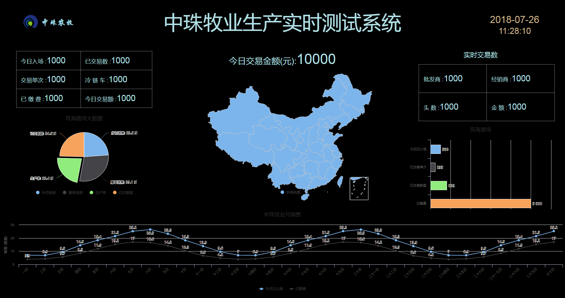
实现的效果为下: