http://www.fawwheel.com/shahramLu/p/6477731.html
webstorm下的sass自动编译和移动端自适应实践
1、安装Ruby
2、安装sass
3、webstorm配置file watcher
4、移动端自适应
1、安装Ruby
安装Ruby,有多种方式,打开官网下载
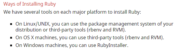
因为,使用的是window选择RubyInstall,下载地址
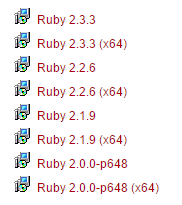
选择对应系统的版本,下载完成,安装
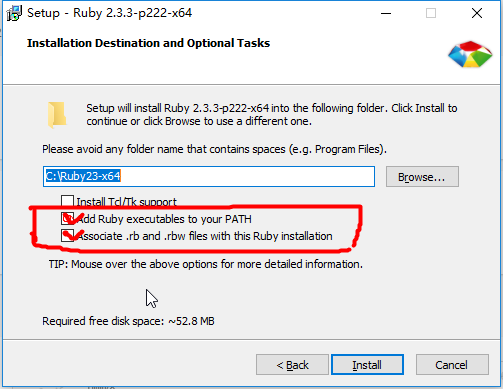
添加到path,建议勾上,安装完成后,打开开始面板,会有一个Start Command Prompt with Ruby,命令行工具。
2、安装sass
个人偏好sass,也可以选择less或stylus,打开上一步安装的Ruby命令行

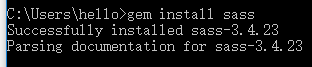
输入gem list 看一下安装了那些包,接着gem install sass
3、webstorm配置file watcher
打开webstorm,File -> settings -> Tools -> File Watchers
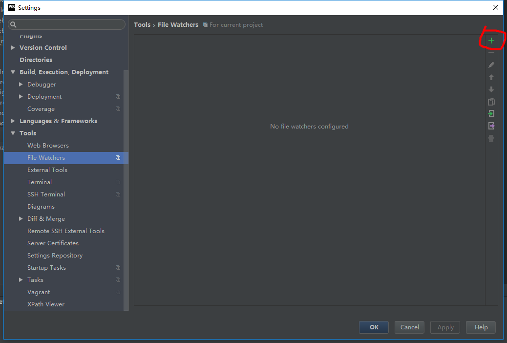
选择+号,新建scss
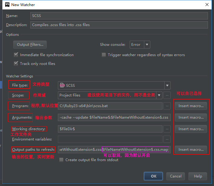
在输出参数位置,一般会加上--style *;展开格式nested,expanded,compact,compressed,最传统的选择--style expanded,括号上下换行
工作文件夹和输出位置,可以根据项目来选择,放在同级目录,或者父级,点击insert macros
常见的有文件路径,父文件路径等等,可以自己尝试下,加深理解
4、移动端自适应
最后,来个实战,基于单页面,做到了大多数手机屏幕很好的适应,包括DPI为2 和 DPI为3的都可以适应
选择淘宝的开源库lib-flexible,参考airen大神写的文章
因为内容较少,只是宣传页面,所以没有选择vue这类框架
直接HTML走起,因为使用了淘宝开源库,就不需要常用的
<meta name="viewport" content="width=device-width, initial-scale=1, maximum-scale=1">
直接在head下引入阿里云的cdn
<script src="http://g.tbcdn.cn/mtb/lib-flexible/0.3.4/??flexible_css.js,flexible.js"></script>
搭配sass的mixin效果很棒
 1 @mixin font-dpr($font-size) {
 2   font-size: $font-size;
 3
 4   [data-dpr="2"] & {
 5     font-size: $font-size * 2;
 6   }
 7
 8   [data-dpr="3"] & {
 9     font-size: $font-size * 3;
10   }
11 }
12
13 $baseFontSize: 75;
14 $FontSize: 16;
15 @mixin px2rem($name, $px1){
16   #{$name}: ($px1 / $baseFontSize) * 1rem;
17 }
18
19 @mixin bg-image($url) {
20   background-image: url($url + "@2x.png");
21   @media (-webkit-min-device-pixel-ratio: 3), (min-device-pixel-ratio: 3) {
22     background-image: url($url + "@3x.png");
23   }
24 }
对于font-size,需要使用px, 因为rem会导致,出现15.55px奇葩尺寸,中文点阵一般常用是12、14、16px
bg-image是用来自动识别DPI然后添加@2x或@3x后缀
@include px2rem(padding, 25);  // 生成
padding: 0.33333rem;

@include bg-image('bubble');  // 生成
.wrapper .bubble {
  background-image: url("bubble@2x.png");
}
@media (-webkit-min-device-pixel-ratio: 3), (min-device-pixel-ratio: 3) {
  .wrapper .bubble {
    background-image: url("bubble@3x.png");
  }
}

@include font-dpr(18px);  // 生成
.content {
  font-size: 18px;
}
[data-dpr="2"] .content {
  font-size: 36px;
}
[data-dpr="3"] .content {
  font-size: 54px;
}
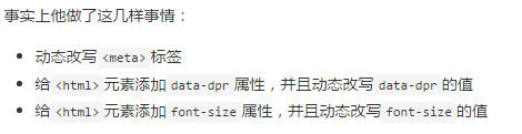
其中data-dpr是屏幕的DPI,详细代码查看GitHub