代码如下:
<!DOCTYPE html>
<html lang="zh">
  <head>
    <meta charset="UTF-8" />
    <meta http-equiv="X-UA-Compatible" content="IE=edge" />
    <meta name="viewport" content="width=device-width, initial-scale=1.0" />
    <title>Document</title>
    <style>
      .bg {
        background-color: #6b6b83;
        padding-top: 100px;
      }
      .wrap {
         600px;
        height: 100px;
        position: relative;
        mix-blend-mode: screen;
      }
      .color {
        position: absolute;
         600px;
        height: 20px;
        background: linear-gradient(to right, #aa4b6b, #6b6b83, #3b8d99);
      }
      .dashed {
        position: absolute;
         600px;
        height: 20px;
        background: linear-gradient(
          to right,
          #000000,
          #000000 4px,
          transparent 4px,
          transparent
        );
        background-size: 8px 100%;
        z-index: 2;
      }
    </style>
  </head>
  <body>
    <div class="bg">
      <div class="wrap">
        <div class="color"></div>
        <div class="dashed"></div>
      </div>
    </div>
  </body>
</html>
效果如下
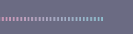
实现思路:利用两次颜色渐变,设置覆盖渐变的z-index,最后mix-blend-mode: screen;滤色实现