本文主要介绍折线图、柱状图的自定义样式相关配置。
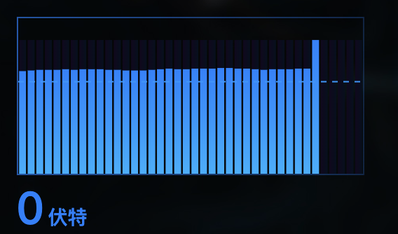
1、柱状图实现背景柱子
代码实现如下:
series: [
        {
          type: 'bar',
          tooltip: {
            show: false,
          },
          itemStyle: {
            //背景渐变
            normal: {
              color: {
                type: 'linear',
                colorStops: [
                  { offset: 0, color: 'rgba(18,7,30,1)' },
                  { offset: 1, color: 'rgba(5, 16, 30, 1)' },
                ],
              },
            },
          },
          silent: true,
          //柱子做背景的时候有用
          barGap: '-100%',
          //高度可根据自己的实际情况制定
          data:[],
        },
        {
          name: 'title',
          type: 'bar',
          itemStyle: {
           //柱图渐变
            normal: {
              color: new echarts.graphic.LinearGradient(0, 0, 0, 1, [
                { offset: 0, color: '#1580ff' },
                { offset: 0.5, color: '#1596ff' },
                { offset: 1, color: '#15afff' },
              ]),
            },
          },
          //自己的真是数据
          data:[],
        },
      ],
2、自定义标线
| 名称 | 效果 |
| symbol | 标线两端的标记类型 |
| label | 标线的文本 |
| lineStyle | 标线的样式:颜色、类型、宽度等设置 |
| data | 标线的数据,具体可查看官网 |
  markLine: {
          silent: true,
          data: [
          //数据的平均值作为基线
            {
              type: 'average',
            },
          ],
         //标线的两端不设置标志
         symbol: ['none', 'none'],
  },
注意:如果加入配置后未出现标线,检查一下是否引入 标线的配置!!
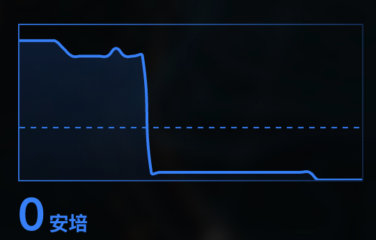
3、折线图渐变
| 名称 | 效果 |
|---|---|
| itemStyle | 图形样式(3.0内部必须加入normal) |
| areaStyle | 区域填充样式。 |
实现代码如下:
series: [
        {
          name: 'XXX',
          //默认颜色
          color: ['#157dff'],
          //数据自定义,我这里只是变量
          data:values,
          type: 'line',
         //不加标记点
          symbol: 'none',
          //曲线平滑
          smooth: true,
          //区域渐变
          areaStyle: {
            normal: {
              color: new echarts.graphic.LinearGradient(0, 0, 0, 1, [
                {
                  offset: 0,
                  color: 'rgba(0,104,210,0.3)',
                },
                {
                  offset: 1,
                  color: 'rgba(0,104,210,0.1)',
                },
              ]),
            },
          },
        },
      ],
4、图标充满整个容器,加上好看的边框(如:上图)。
//容器
<div  className={styles['chart-left-one']} ref={this.chartLeftOneRef}/><div>
//图表铺满整个容器
grid: {
  left: '0',
  right: '0',
  top: '0',
  bottom: '0',
  height: 'auto',
},
xAxis: {
  type: 'category',
  boundaryGap: false,
  //不显示X轴
  show: false,
  data: keys,
},
yAxis: {
  type: 'value',
  //不显示Y轴
  show: false,
},
 .chart-left-one {
          width: 100%;
          height: 70%;//容器宽高自定义
          //容器加边框
          border: 1px solid;
          //边框样式
          border-image: linear-gradient(
              -90deg,
              rgba(21, 125, 255, 0.2),
              rgba(21, 125, 255, 0.9)
            )
            30 30;
  }
(完)