1.折线统计图
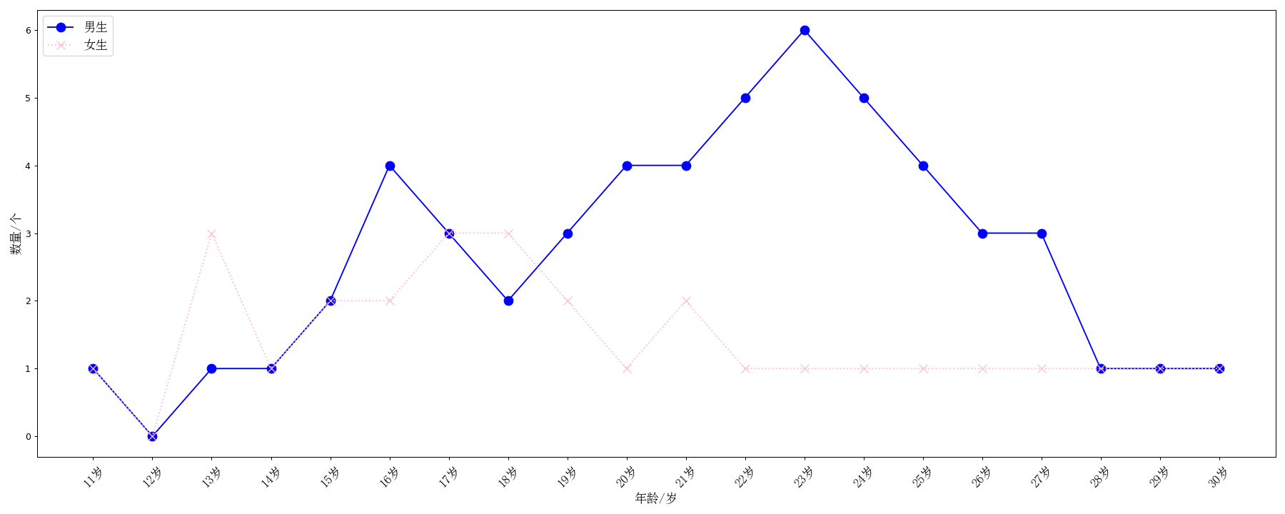
# 绘制你和你同桌11岁到30岁之间所交的男女朋友数量折线图,并进行比较,得出走势分析
from matplotlib import pyplot as plt
from matplotlib import font_manager

myfont = font_manager.FontProperties(fname="C:\WINDOWS\Fonts\simsun.ttc", size=14)

# 数据准备
x = range(20)
y1 = [1, 0, 1, 1, 2, 4, 3, 2, 3, 4, 4, 5, 6, 5, 4, 3, 3, 1, 1, 1]
y2 = [1, 0, 3, 1, 2, 2, 3, 3, 2, 1, 2, 1, 1, 1, 1, 1, 1, 1, 1, 1]

plt.figure(figsize=(20, 8), dpi=90)
# 绘图
# 表明每条线代表什么,加上Label,color表示线条颜色,linestyle表示线条风格,可以是--也可以是-.marker表示对点的形状标记,ms设置其大小
plt.plot(x, y1, color="blue", label="男生", linestyle="-", marker="o", ms=10)
plt.plot(x, y2, color="pink", label="女生", linestyle=":", marker="x", ms=10)

# 坐标轴设置
_x_label = ["{}岁".format(i) for i in range(11, 31)]
plt.xticks(x, _x_label, rotation=45, fontproperties=myfont)
plt.ylabel("数量/个", fontproperties=myfont)
plt.xlabel("年龄/岁", fontproperties=myfont)

# 图例设置,字体设置要用prop
plt.legend(prop=myfont, loc="upper left")
plt.show()
2.直方图
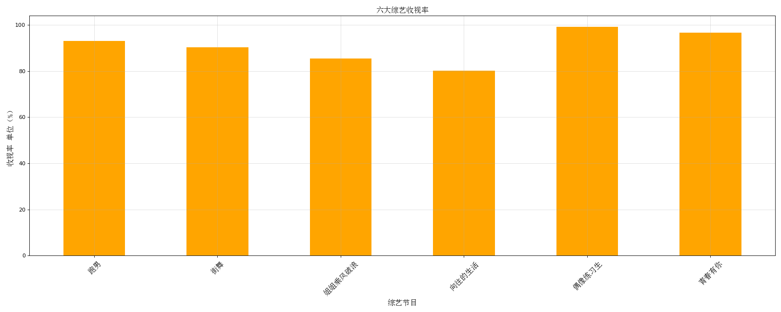
# 横着的直方图
from matplotlib import pyplot as plt
import random
from matplotlib import font_manager

myfont = font_manager.FontProperties(fname="C:\WINDOWS\Fonts\simsun.ttc", size=14)
a = ["跑男", "街舞", "姐姐乘风破浪", "向往的生活", "偶像练习生", "青春有你"]
b = [93.1, 90.3, 85.4, 80.1, 99.1, 96.5]

plt.figure(figsize=(20, 8), dpi=80)
# 直方图用 bar
plt.bar(range(len(a)), b, width=0.5, color="orange")

plt.xticks(range(len(a)), a, rotation=45, fontproperties=myfont)
plt.xlabel("综艺节目", fontproperties=myfont)
plt.ylabel("收视率 单位(%)", fontproperties=myfont)
plt.title("六大综艺收视率", fontproperties=myfont)
# 添加网格
plt.grid(alpha=0.4)
# 展示
plt.show()
3.条形图
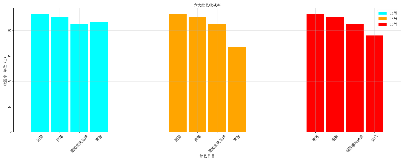
# 14、15、16号这三天每一天这四部综艺的收视率对比 绘制多个条形图
from matplotlib import font_manager
from matplotlib import pyplot as plt

myfont= font_manager.FontProperties(fname=r"C:\WINDOWS\Fonts\simsun.ttc", size=14)

a=["跑男","街舞","姐姐乘风破浪","青你"]
b_14=[93.1,90.3,85.4,87]
b_15=[93.1,90.3,85.4,67]
b_16=[93.1,90.3,85.4,76]

#水平轴的范围
x_1=range(len(a))
x_2=range((len(a)+3),(len(a)+len(a)+3))
x_3=range((len(a)+len(a)+6),(len(a)+len(a)+6+len(a)))

plt.figure(figsize=(20,8),dpi=80)
plt.bar(x_1,b_14,width=0.9 ,label="14号",color="cyan")
plt.bar(x_2,b_15,width=0.9 ,label="15号",color="orange")
plt.bar(x_3,b_16,width=0.9 ,label="16号",color="red")

plt.legend(prop=myfont)

#坐标设置
_x=list(x_1)+list(x_2)+list(x_3)
for i in range(len(a)-1):
    a+=a;
    print(a)
plt.xticks(_x,a,rotation=45,fontproperties=myfont)
plt.xlabel("综艺节目", fontproperties=myfont)
plt.ylabel("收视率 单位(%)", fontproperties=myfont)
plt.title("六大综艺收视率", fontproperties=myfont)
#添加网格
plt.grid(alpha =0.4)
#展示
plt.show()
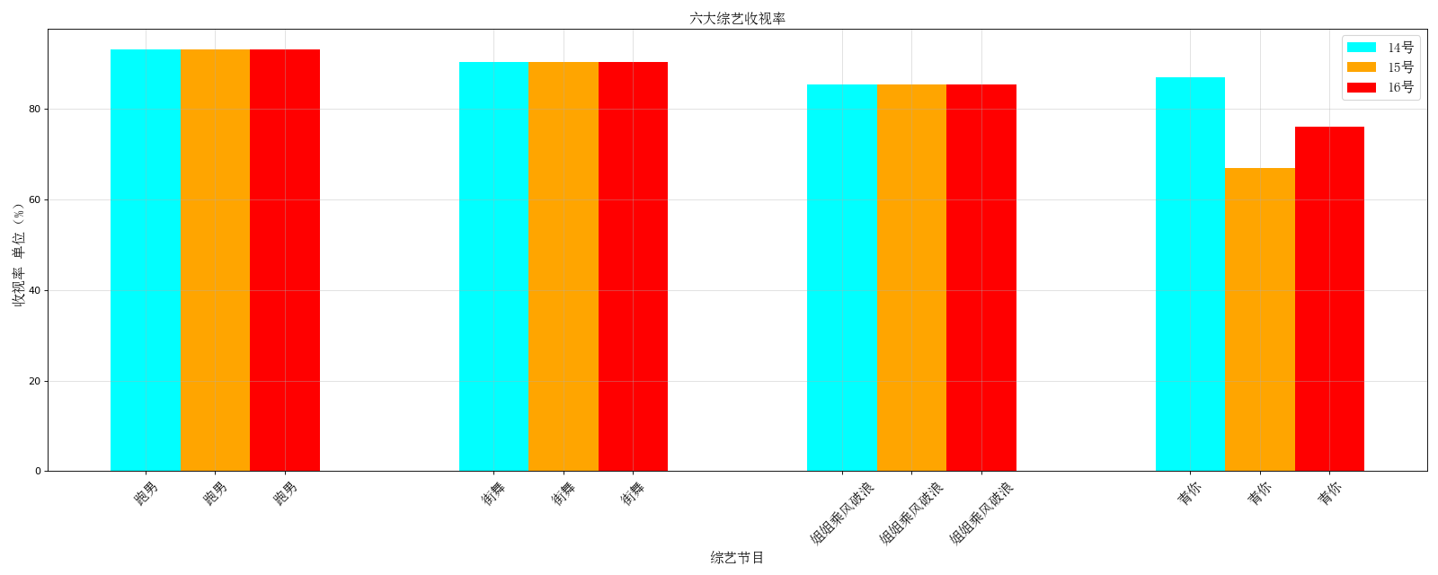
# 14、15、16号这三天每一天这四部综艺的收视率对比 绘制多个条形图
from matplotlib import font_manager
from matplotlib import pyplot as plt

myfont= font_manager.FontProperties(fname=r"C:\WINDOWS\Fonts\simsun.ttc", size=14)

a=["跑男","街舞","姐姐乘风破浪","青你"]
b_14=[93.1,90.3,85.4,87]
b_15=[93.1,90.3,85.4,67]
b_16=[93.1,90.3,85.4,76]

#水平轴的范围
barwidth = 0.2
x_1= range(len(a))
x_2= [i+barwidth for i in x_1]
x_3= [i+barwidth for i in x_2]


plt.figure(figsize=(20,8),dpi=80)
plt.bar(x_1,b_14,width=barwidth ,label="14号",color="cyan")
plt.bar(x_2,b_15,width=barwidth ,label="15号",color="orange")
plt.bar(x_3,b_16,width=barwidth ,label="16号",color="red")

plt.legend(prop=myfont)

#坐标设置
_x=list(x_1)+list(x_2)+list(x_3)

plt.xticks(x_2,a,rotation=45,fontproperties=myfont)
plt.xlabel("综艺节目", fontproperties=myfont)
plt.ylabel("收视率 单位(%)", fontproperties=myfont)
plt.title("六大综艺收视率", fontproperties=myfont)
#添加网格
plt.grid(alpha =0.4)
#展示
plt.show()
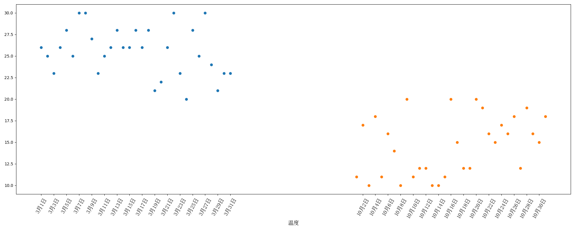
# 绘制三月份和十月份的温度变化情况
from matplotlib import pyplot as plt
from matplotlib import font_manager
import random

myfont = font_manager.FontProperties(fname="C:\WINDOWS\Fonts\simsun.ttc", size=14)
x_3=range(1,32)
x_10=range(51,82)
#随机生成31个数据代表温度
y_3=[random.randint(20,30) for i in range(31)]
y_10=[random.randint(10,20) for i in range(31)]

plt.figure(figsize=(20,8),dpi=100)
plt.scatter(x_3,y_3,label="三月份")
plt.scatter(x_10,y_10,label="十月份")

_x_label=["3月{}日".format(i) for i in range(1,32)]

_x_label+=["10月{}日".format(i-50) for i in range(51,82)]

#TypeError: unsupported operand type(s) for +: 'range' and 'range'

x=list(x_3)+list(x_10)

plt.xticks(x[::2],_x_label[::2],rotation=60,fontproperties=myfont)

plt.xlabel("时间",fontproperties=myfont)
plt.xlabel("温度",fontproperties=myfont)
plt.grid(alpha=0.4)
plt.show()
4.散点图