版权声明:本文为博主原创文章,转载请注明出处
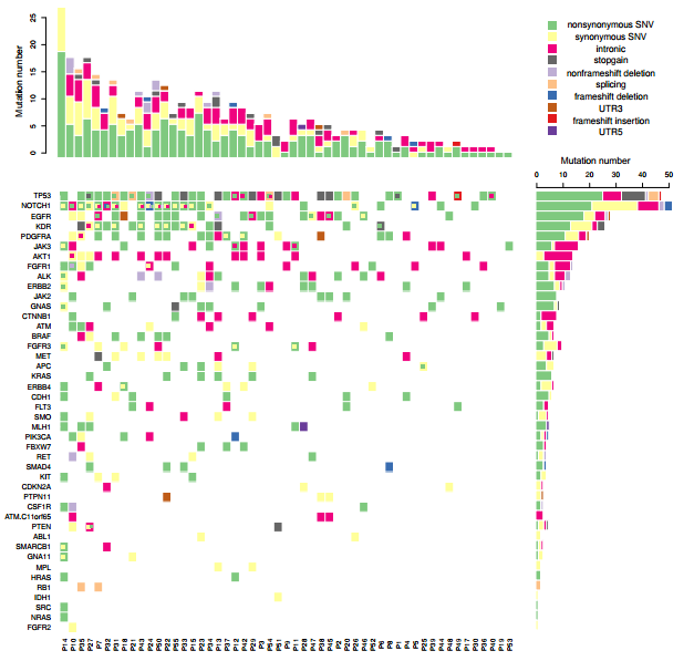
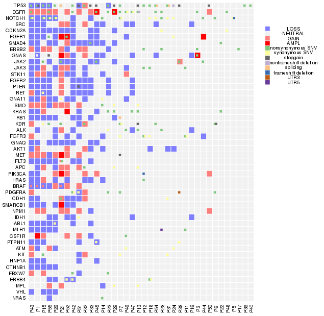

我们平常多见的基因突变热图是一个基因一个格子,一种突变类型,但实际上在同一个病人中,同一个基因往往具有多种突变类型,因此传统的热图绘制工具并不能满足我们绘图的需要。应研究需要,本人自己写了一个热图绘制函数,内部调用image 进行热图的绘制, barplot进行直方图绘制, 用data.table进行数据处理。对于一个基因内多种突变类型如何表现出来的问题, 这个函数先采用image将初步的热图绘制出来,再使用points,以方块形式将第二种突变,第三种突变依次添加, 在添加的同时方块位置稍为移动并且伴随着大小的略微缩小,以实现更好的显示效果,最多能在一个热图格子上表示四种突变。
函数如下, 需要安装并加载data.table 1.10.4, 加载RColorBrewer
my_heatmap <- function(vr, pal = c("#F2F2F2",colorRampPalette(c("blue", "white", "red"))(5)[c(1,2)],"#F2F2F2",colorRampPalette(c("blue", "white", "red"))(5)[c(4,5)],brewer.pal(n = 8, name ="Accent")[c(1,4,6,8,2,3,5,7)],"#E31A1C","#6A3D9A"),type = c("DEL","LOSS","NEUTRAL","GAIN","AMPL","nonsynonymous SNV","synonymous SNV","intronic","stopgain","nonframeshift deletion","splicing", "frameshift deletion","UTR3","frameshift insertion","UTR5"),order_gene = T, order_patient = T, hist_plot = T, legend_dist = 0.4, col_text_cex = 1, row_text_cex = 1, sub_gene= NULL,heatmap_mar = c(5,17,1,2), heatmap_oma=c(0.2,0.2,0.2,0.2),heatmap_mex=0.5, legend_mar = c(1,0,4,1),xlab_adj=1, order_omit=c("NEUTRAL"), annotation_col=NULL, annotation_colors = NULL, heatmap_height = 3, heatmap_width = 3, anno_height=NULL)
{
  if((length(pal) - length(type)) !=1 ){stop("Pal must be one longer than type, because first one pal is col for no mutation")}
  if(!is.null(sub_gene)){
    pal_dt <- data.table(pal, type=c("NoMut",type))
    vr <- vr[Gene %in% sub_gene,]
    type <- pal_dt[type %in% unique(vr$Type),type]
    pal <- c(pal[1],pal_dt[type, on="type"][,pal])
  }else{
    pal_dt <- data.table(pal, type=c("NoMut",type))
    type <- pal_dt[type %in% unique(vr$Type),type]
    pal <- c(pal[1],pal_dt[type, on="type"][,pal])
  }
  dt <- unique(vr[,.(Gene,Type,Patient)])
  dt$Type <- factor(dt$Type, levels = type)
  if(order_gene){gene <- dt[!Type %in% order_omit,.(N=length(unique(Patient))),by=Gene][order(N),Gene]}else{gene <- unique(dt[!Type %in% order_omit, Gene])}
  dt$Gene <- factor(dt$Gene, levels = gene)
  if(order_patient){patient <- data.table(table(vr[!Type %in% order_omit,]$Patient))[order(-N),V1]}else{patient <- unique(dt[!Type %in% order_omit, Patient])}
  dt$Patient <- factor(dt$Patient, levels = c(patient, setdiff(unique(dt$Patient),patient)))

  setkey(dt, "Type")

  n <- length(unique(dt$Type))

  dt$Gene_Patients <- paste(dt$Gene, dt$Patient)
  dt_inf <- dt[,.N,by=.(Gene, Patient)]
  max_mut_num <- max(dt_inf$N)
  dt[,Mut_num:=seq_len(.N),by=.(Patient,Gene)]
  #main plot

  dt1 <- copy(dt)
  dt1[Mut_num !=1, Type:=NA]
  dc <- data.frame(dcast(dt1, Patient ~ Gene, value.var = "Type", fun.aggregate = function(x)(x[!is.na(x)][1])))
  rownames(dc)<- dc[,1]
  data_matrix<-data.matrix(dc[,-1])
  data_matrix[is.na(data_matrix)] <- 0
  pal=pal
  breaks<-seq(-1,10,1)
  if(!hist_plot & is.null(annotation_col)){
    layout(matrix(data=c(1,2), nrow=1, ncol=2), widths=c(8,2), heights=c(1,1))
    par(mar=heatmap_mar, oma=heatmap_oma, mex=heatmap_mex)
  }else if(hist_plot & is.null(annotation_col)){
    layout(matrix(c(2,4,1,3),2,2,byrow=TRUE), widths=c(heatmap_width,1),
           heights=c(1,heatmap_height), TRUE)
    par(mar=heatmap_mar)
  }else if(hist_plot & !is.null(annotation_col)){
    if(is.null(anno_height)){anno_height <- 0.02 * ncol(annotation_col)}
    layout(matrix(data=c(3,5,2,5,1,4), nrow=3, ncol=2, byrow=TRUE), widths=c(heatmap_width,1), heights=c(1, anno_height, heatmap_height))
    par(mar=heatmap_mar, oma=heatmap_oma, mex=heatmap_mex)
  }else if(!hist_plot & !is.null(annotation_col)){
    if(is.null(anno_height)){anno_height <- 0.02 * ncol(annotation_col)}
    layout(matrix(data=c(2,4,1,3), nrow=2, ncol=2, byrow=TRUE), widths=c(8,2), heights=c(anno_height,1))
    par(mar=heatmap_mar, oma=heatmap_oma, mex=heatmap_mex)
  }


  image(x=1:nrow(data_matrix),y=1:ncol(data_matrix),
        z=data_matrix,xlab="",ylab="",breaks=breaks,
        col=pal[1:11],axes=FALSE)


  #sub plot
  add_plot <- function(dt, i){
    dt1 <- copy(dt)
    dt1[Mut_num != i, Type:=NA]
    dc <- data.frame(dcast(dt1, Patient ~ Gene, value.var = "Type", fun.aggregate = function(x){ifelse(length(x) >1,x[!is.na(x)][1],factor(NA))}))
    rownames(dc)<- dc[,1]
    data_matrix <- data.matrix(dc[,-1])
    xy <- which(data_matrix !=0, arr.ind = T)
    #apply(xy, 1, function(x)points(x[1], x[2],pch=15, cex=2.5 -0.5*i, col=pal[data_matrix[x[1],x[2]]+1]))
    apply(xy, 1, function(x)points(x[1]-0.6+i*0.25, x[2],pch=15, cex=1.2 - i*0.08, col=pal[data_matrix[x[1],x[2]]+1]))
  }

  ploti <- data.frame(i=2:max_mut_num)
  apply(ploti, 1, function(i){print(add_plot(dt, i))})

  text(x=1:nrow(data_matrix)+0.1, y=par("usr")[1] - xlab_adj,
       srt = 90, adj = 0.5, labels = rownames(data_matrix),
       xpd = TRUE, cex=col_text_cex)
  axis(2,at=1:ncol(data_matrix),labels=colnames(data_matrix),
       col="white",las=1, cex.lab=0.1, cex.axis=row_text_cex)
  abline(h=c(1:ncol(data_matrix))+0.5,v=c(1:nrow(data_matrix))+0.5,
         col="white",lwd=2,xpd=F)

  #add annotation plot
  if(!is.null(annotation_col)){
    change_factor <- function(x){as.numeric(factor(x, labels = 1:length(levels(x))))} #change infomation to numeric
    colname_tmp <- colnames(annotation_col)
    annotation_col_mt <- as.matrix(apply(annotation_col, 2, change_factor))
    rownames(annotation_col_mt) <- rownames(annotation_col)
    colnames(annotation_col_mt) <- colname_tmp
    annotation_col_mt <- annotation_col_mt[rownames(data_matrix),]
    ## change infomation numric to unique number
    cumsum <- 0
    if(!is.null(dim(annotation_col_mt))){#if more than one column, cummulate info numeric
      for(i in 1:ncol(as.data.frame(annotation_col_mt))){
        annotation_col_mt[,i] <- cumsum + annotation_col_mt[,i]
        cumsum <- max(annotation_col_mt[,i])
      }
    }
    ## get color according to infomation
    get_color <- function(anno){return(annotation_colors[[anno]][levels(annotation_col[,anno])])}
    palAnn <- NULL
    if(is.null(dim(annotation_col_mt))){
      rowname_tmp <- rownames(annotation_col_mt)
      annotation_col_mt <- as.matrix(annotation_col_mt, nrow=1)
      rownames(annotation_col_mt) <- rowname_tmp
      colnames(annotation_col_mt) <- colname_tmp
    }
    for(anno in colnames(annotation_col_mt)){
      palAnn <- c(palAnn, get_color(anno))
    }
    par(mar=c(0,heatmap_mar[2], 0,  heatmap_mar[4]))
    image(x=1:nrow(annotation_col_mt), y=1:ncol(annotation_col_mt), z= annotation_col_mt, col=palAnn, xlab="",ylab="",
          axes=FALSE)
    axis(2,at=1:ncol(annotation_col_mt),labels=colnames(annotation_col_mt),
         col="white",las=1, cex.lab=0.1, cex.axis=row_text_cex)
    abline(h=c(1:ncol(annotation_col_mt))+0.5,v=c(1:nrow(annotation_col_mt))+0.5,
           col="white",lwd=2,xpd=F)
  }
  if(hist_plot){
    #hist
    par(mar=c(0,2+0.5,3,heatmap_mar[4]-0.9))
    patient_dt <- dt[,.N,by=.(Patient,Type)]
    mt <- data.frame(dcast(patient_dt, Type ~ Patient, value.var = "N"))
    data_matrix <- data.matrix(mt[,-1])
    rownames(data_matrix) <- mt[,1]
    tryCatch(data_matrix <- data_matrix[setdiff(type, order_omit), patient], error = function(e){print("type argument or your patient name format(include "-" and so on )")})
    data_matrix[is.na(data_matrix)] <- 0
    omit_idx <- NULL
    for(i in order_omit){omit_idx <- c(omit_idx,1+which(type == i))}
    barplot(data_matrix, col=pal[-c(1,omit_idx)],space=0,border = "white",axes=T,xlab="",ann=F, xaxt="n")

    par(mar=c( heatmap_mar[1]-2 , 0.8, heatmap_mar[3]+2.2, 3),las=1)
    gene_dt <- dt[,.N,by=.(Gene,Type)]
    mt <- data.frame(dcast(gene_dt, Type ~ Gene, value.var = "N"))
    data_matrix <- data.matrix(mt[,-1])
    rownames(data_matrix) <- mt[,1]
    gene <- gsub("ATM,", "ATM.", gene)
    tryCatch(data_matrix <- data_matrix[setdiff(type, order_omit), gene], error = function(e){print("type argument or check your gene name format(please not include "-" and so on)")})
    data_matrix[is.na(data_matrix)] <- 0
    barplot(data_matrix, col=pal[-c(1,omit_idx)],space=0,border = "white",axes=T,xlab="", ann=F, horiz = T, yaxt="n")

  }

  #add legend
  par(mar=legend_mar)
  plot(3, 8,  axes=F, ann=F, type="n")
  if(is.null(annotation_col)){
    ploti <- data.frame(i=1:length(type))
  }else{
    #add annotation legend
    ploti <- data.frame(i=1:(length(type) + max(annotation_col_mt)))
    pal <- c("NULL", palAnn, pal[-1])
    anno_label <- NULL
    for (anno in colnames(annotation_col)){
      anno_label <- c(anno_label, levels(annotation_col[[anno]]))
    }
    type <- c(anno_label,type)
  }
  if(!hist_plot){
    tmp <- apply(ploti, 1, function(i){print(points(2, 10+(length(type)-i)*legend_dist, pch=15, cex=2, col=pal[i+1]))})
    tmp <- apply(ploti, 1, function(i){print(text(3, 10+(length(type)-i)*legend_dist, labels = type[i],pch=15, cex=1, col="black"))})
  }
  if(hist_plot){
    tmp <- apply(ploti, 1, function(i){print(points(2, 5+(length(type)-i)*legend_dist, pch=15, cex=0.9, col=pal[i+1]))})
    tmp <- apply(ploti, 1, function(i){print(text(2.8, 5+(length(type)-i)*legend_dist, labels = type[i],pch=15, cex=0.9, col="black"))})
  }

}
描述:
绘制一个基因可以同时显示多种突变类型的热图,输入三列的data table数据框, 列名分别是Gene,Type和 Patient,输出热图, 还可以在热图上方和右方添加突变的直方图。
用法:
my_heatmap(vr, pal = c("#F2F2F2",colorRampPalette(c("blue", "white", "red"))(5)[c(1,2)],"#F2F2F2",colorRampPalette(c("blue", "white", "red"))(5)[c(4,5)],brewer.pal(n = 8, name ="Accent")[c(1,4,6,8,2,3,5,7)],"#E31A1C","#6A3D9A"),type = c("DEL","LOSS","NEUTRAL","GAIN","AMPL","nonsynonymous SNV","synonymous SNV","intronic","stopgain","nonframeshift deletion","splicing", "frameshift deletion","UTR3","frameshift insertion","UTR5"),order_gene = T, order_patient = T, hist_plot = T, legend_dist = 0.4, col_text_cex = 1, row_text_cex = 1, sub_gene= NULL,heatmap_mar = c(5,17,1,2), heatmap_oma=c(0.2,0.2,0.2,0.2),heatmap_mex=0.5, legend_mar = c(1,0,4,1),xlab_adj=1, order_omit=c("NEUTRAL"), annotation_col=NULL, annotation_colors = NULL, heatmap_height = 3, heatmap_width = 3, anno_height=NULL)
参数:
vr: 含有变异数据的数据框,共三列,列名分别是Gene, Type, Patient;
pal: 色板,向量,需要根据数据框中突变类型的数量进行自定义,需要比突变类型多一种颜色作为背景色,背景色放在第一位;
type:色板相对应的突变类型,向量,type必须等于或者多于数据中所出现的所有类型;默认使用拷贝数的四种突变类型加上拷贝数中性再加上annovar中所有突变类型;自定义设置时长度要比色板少1;
order_gene: 默认T, 对基因按照突变的病人数目进行排序;
order_patient:默认T,对病人按照突变的基因数目进行排序;
hist_plot:默认T,在上方和右方加上对应的直方图;
legend_dist:默认0.4,调整图例之间相互的距离,一般需要自行调整;
col_text_cex:调整病人名称的大小,默认1;
row_text_cex:调节基因名称的大小,默认1;
xlab_adj:调整病人名称与热图之间的距离;
sub_gene:只选择部分基因进行画图,需要给基因名的向量,并且基因需要在数据中存在,默认NULL;
heatmap_mar:mar参数,调整热图前后左右的边缘长度,默认c(5,17,1,2);
heatmap_oma:oma参数,调整热图前后左右的外边缘长度,默认c(0.2,0.2,0.2,0.2);
mex:调整热图的mex参数,用于描绘绘图边缘的坐标,默认0.5;
legend_mar:legend的mar参数,调整图例的位置,默认c(1,0,4,1);
order_omit:排序时忽略的变异类型,这些突变类型在直方图中也会被过滤,默认c("NEUTRAL"),如果不存在"NEUTRAL"这种突变类型,也可以保持默认参数;
heatmap_height:热图的高度,对于基因数目非常多的情况,在设置pdf长度的基础上,可以设置heatmap覆盖在画布的高度来让格子;
heatmap_width:热图的宽度,对于病人数目非常多的情况,可以设置加长热图的长度。
annotation_col:对病人进行注释的信息,一个data frame,行名为病人,列名为不同的病理信息,数据必须是因子,例子如下(在代码例子中我简略了SmokingInfo为Smoking,OldInfo 为Old)
       SmokingInfo   OldInfo
P1     Smoking   Old
P2  NonSmoking Unold
P3  NonSmoking Unold
P4  NonSmoking   Old
P5     Smoking Unold
P6  NonSmoking Unold
annotation_colors:对病理信息匹配不同的颜色, 例子如下, 需要跟annotation_col中的列名和因子匹配
$SmokingInfo
   Smoking NonSmoking
 "#FDB462"  "#80B1D3"

$OldInfo
      Old     Unold
"#FB8072" "#8DD3C7"
anno_height:设置注释的高度,默认会自动调节。
细节:
- 运行前需要加载data.table1.10.4, RColorBrewer;
- 如果要绘制带有直方图的热图,因为图片尺寸过大,因此要使用pdf函数并要给足够大的宽度和长度;
- 默认使用的是annovar注释的突变类型;
- 因为绘制时影响热图和直方图对齐的因素太多,很难通过调节相应的mar,mex,oma参数达到较好的效果,因此推荐快速画出个大概后,再使用inkscape或adobe进行排版对齐
- 如果热图中突变类型的点过小,可以减小pdf文件的宽度和长度。
使用例子:
#without hist plot
pdf("~/project/PE/fromws02/PE/cnv_plot/heatmap_cnv_mut.pdf", height=12, width = 12)
my_heatmap(vr, heatmap_mar = c(17,17,1,2),hist_plot = F, legend_dist=0.1, xlab_adj = 1.2, order_patient = T, order_gene = T)
dev.off()

#with hist plot
pdf("~/project/PE/fromws02/PE/cnv_plot/heatmap_hist_cnv_mut.pdf", height=12, width = 12)
my_heatmap(vr, heatmap_mar = c(17,7,1,2),hist_plot = T, legend_dist=0.3, xlab_adj = 1.2, order_patient = T, order_gene = T)
dev.off()

#only a few gene
pdf("~/project/PE/fromws02/PE/cnv_plot/Assoc_CN1.pdf", height=2,width = 14)
my_heatmap(vr, heatmap_mar = c(7,17,1,2), sub_gene = c("CDKN2A", "GNAQ", "NOTCH1", "RB1", "SMAD4", "ABL1"),hist_plot = F,legend_dist=0.2, xlab_adj = 0.9, order_omit = "NEUTRAL")
dev.off()

#with annotation and hist
annotation_col <- data.frame(Smoking = factor(sample(c("Smoking", "NonSmoking"), length(unique(vr$Patient)), replace = T)), Old=factor(sample(c("Old", "Unold"), 53, replace = T)))
rownames(annotation_col) <- unique(vr$Patient)
annotation_colors <- list(Smoking =c(Smoking = "#FDB462", NonSmoking = "#80B1D3"), Old=c(Old = "#FB8072", Unold = "#8DD3C7"))

pdf("~/project/PE/fromws02/PE/cnv_plot/heatmap_hist_cnv_mut.pdf", height=15, width = 12)
my_heatmap(vr, heatmap_mar = c(15,10,1,2), legend_mar = c(1,0,1,1), hist_plot = T, legend_dist=0.2, xlab_adj = 1.2, order_patient = T, order_gene = T, annotation_col=annotation_col, annotation_colors=annotation_colors)
dev.off()

#with annotation and without hist
pdf("~/project/PE/fromws02/PE/cnv_plot/heatmap_hist_cnv_mut.pdf", height=12, width = 12)
my_heatmap(vr, heatmap_mar = c(17,10,1,2),hist_plot = F, legend_dist=0.1, xlab_adj = 1.2, order_patient = T, order_gene = T, annotation_col=annotation_col, annotation_colors=annotation_colors)
dev.off()