step0 输入和配置python库文件
import pandas as pd
pd.plotting.register_matplotlib_converters()
import matplotlib.pyplot as plt
%matplotlib inline
import seaborn as sns
设置代码核查
import os
if not os.path.exists("../input/candy.csv"):
    os.symlink("../input/data-for-datavis/candy.csv", "../input/candy.csv")
from learntools.core import binder
binder.bind(globals())
from learntools.data_viz_to_coder.ex4 import *
step1 载入数据
# Path of the file to read
candy_filepath = "../input/candy.csv"

# Fill in the line below to read the file into a variable candy_data
candy_data = pd.read_csv(candy_filepath,index_col="id")

# Run the line below with no changes to check that you've loaded the data correctly
step_1.check()
step2 review数据
打印前五行数据
candy_data.head()
| competitorname | chocolate | fruity | caramel | peanutyalmondy | nougat | crispedricewafer | hard | bar | pluribus | sugarpercent | pricepercent | winpercent | |
|---|---|---|---|---|---|---|---|---|---|---|---|---|---|
| id | |||||||||||||
| 0 | 100 Grand | Yes | No | Yes | No | No | Yes | No | Yes | No | 0.732 | 0.860 | 66.971725 |
| 1 | 3 Musketeers | Yes | No | No | No | Yes | No | No | Yes | No | 0.604 | 0.511 | 67.602936 |
| 2 | Air Heads | No | Yes | No | No | No | No | No | No | No | 0.906 | 0.511 | 52.341465 |
| 3 | Almond Joy | Yes | No | No | Yes | No | No | No | Yes | No | 0.465 | 0.767 | 50.347546 |
| 4 | Baby Ruth | Yes | No | Yes | Yes | Yes | No | No | Yes | No | 0.604 | 0.767 | 56.914547 |
# Fill in the line below: Which candy was more popular with survey respondents:
# '3 Musketeers' or 'Almond Joy'?  (Please enclose your answer in single quotes.)
more_popular = '3 Musketeers'

# Fill in the line below: Which candy has higher sugar content: 'Air Heads'
# or 'Baby Ruth'? (Please enclose your answer in single quotes.)
more_sugar = "Air Heads"

# Check your answers
step_2.check()
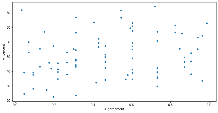
Step3 The role of sugar
绘制sugarpercent和winpercent之间的散点图
# Scatter plot showing the relationship between 'sugarpercent' and 'winpercent'
plt.figure(figsize=(12,6))
sns.scatterplot(x=candy_data["sugarpercent"],y=candy_data["winpercent"])

# Check your answer
step_3.a.check()
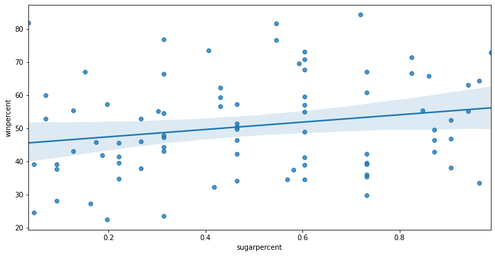
step4 绘制回归曲线
sns.regplot()
# Scatter plot w/ regression line showing the relationship between 'sugarpercent' and 'winpercent'
plt.figure(figsize=(12,6)) # Your code here
sns.regplot(x=candy_data["sugarpercent"],y=candy_data["winpercent"])

# Check your answer
step_4.a.check()
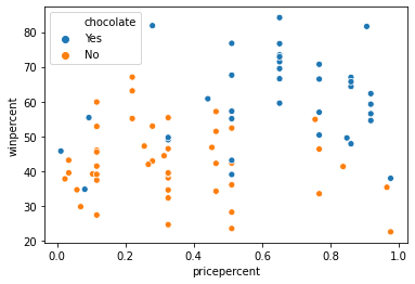
step5 chocolate
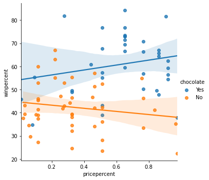
# Scatter plot showing the relationship between 'pricepercent', 'winpercent', and 'chocolate'
sns.scatterplot(x=candy_data["pricepercent"],y=candy_data["winpercent"],hue=candy_data["chocolate"])

# Check your answer
step_5.check()
step6 investigate chocolate
创建带有两行回归行的散点图
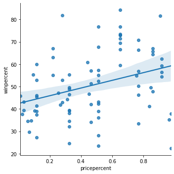
# Color-coded scatter plot w/ regression lines
sns.lmplot(x="pricepercent",y="winpercent",hue="chocolate",data=candy_data)
sns.lmplot(x="pricepercent",y="winpercent",data=candy_data)
# Check your answer
step_6.a.check()
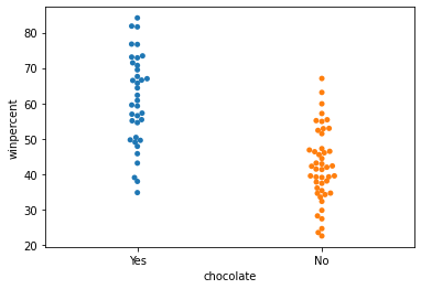
Step 7: Everybody loves chocolate
创建有类型的散点图去强调chocolate与winpercent之间的关系。把chocolate放在水平轴上,把winpercent放在y轴上。
# Scatter plot showing the relationship between 'chocolate' and 'winpercent'
sns.swarmplot(x=candy_data["chocolate"],y=candy_data["winpercent"])

# Check your answer
step_7.a.check()