基本概念
Box 是 CSS 布局的对象和基本单位, 直观点来说,就是一个页面是由很多个Box 组成的。元素的类型和 display 属性,决定了这个 Box 的类型。 不同类型的 Box, 会参与不同的 Formatting Context(一个决定如何渲染文档的容器),因此Box内的元素会以不同的方式渲染。让我们看看有哪些盒子:
- block-level box:display 属性为 block, list-item, table 的元素,会生成 block-levelbox。并且参与 block fomatting context;
- inline-level box:display 属性为 inline, inline-block, inline-table 的元素,会生成inline-level box。并且参与 inline formatting context;
- Formatting context 是 W3C CSS2.1 规范中的一个概念。它是页面中的一块渲染区域,并且有一套渲染规则,它决定了其子元素将如何定位,以及和其他元素的关系和相互作用。最常见的 Formatting context 有 Block fomattingcontext (简称BFC)和 Inline formatting context (简称IFC)。
常见的会生成BFC的元素:
- 根元素
- float不为none
- position为absolute或fixed
-
display为inline-block, table-cell, table-caption, flex,inline-flex
-
overflow不为visible
BFC的使用
1,自适应两栏布局
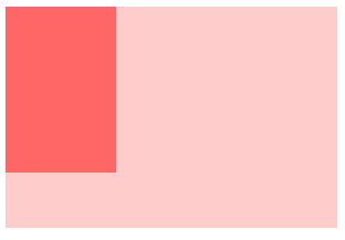
<!DOCTYPE html>
<html lang="en">
<head>
    <meta charset="UTF-8">
    <meta name="viewport" content="width=device-width, initial-scale=1.0">
    <meta http-equiv="X-UA-Compatible" content="ie=edge">
    <title>Document</title>
</head>
<style>
    body {
        width: 300px;
        position: relative;
    }
    .aside {
        width: 100px;
        height: 150px;
        float: left;
        background: #f66;
    }
    .main {
        height: 200px;
        background: #fcc;
    }
   </style>
   <body>
        <div class="aside"></div>
        <div class="main"></div>
   </body>
</html>
根据BFC布局规则:每个元素的margin box的左边, 与包含块border box的左边相接触(对于从左往右的格式化,否则相反)。即使存在浮动也是如此。 因此,上面的代码会产生下面的效果:
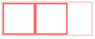
由于BFC的区域不会与float box重叠。此时,如果想要两个元素不再重叠,只需要让第二个元素形成BFC就可以了:
.main {
        height: 200px;
        background: #fcc;
        overflow: hidden;
    }

2,清除内部浮动
<!DOCTYPE html>
<html lang="en">
<head>
    <meta charset="UTF-8">
    <meta name="viewport" content="width=device-width, initial-scale=1.0">
    <meta http-equiv="X-UA-Compatible" content="ie=edge">
    <title>Document</title>
</head>
    <style>
        .par {
            border: 5px solid #fcc;
            width: 300px;
        }
        .child {
            border: 5px solid #f66;
            width:100px;
            height: 100px;
            float: left;
        }
       </style>
       <body>
            <div class="par">
                <div class="child"></div>
                <div class="child"></div>
            </div>
       </body>
</html>
由于内部元素产生了浮动,所以父级元素会高度丢失,产生下面的效果:

由于计算BFC的高度时,浮动元素也参与计算,为达到清除内部浮动,我们可以触发par生成BFC,那么par在计算高度时,par内部的浮动元素child也会参与计算。
.par {
            border: 5px solid #fcc;
             300px;
            overflow: hidden;
        }
当然,除了overflow以外,还可以使用float等方法触发par生成BFC
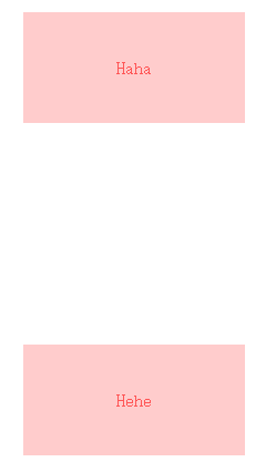
3,防止垂直 margin 重叠
<!DOCTYPE html>
<html lang="en">
<head>
    <meta charset="UTF-8">
    <meta name="viewport" content="width=device-width, initial-scale=1.0">
    <meta http-equiv="X-UA-Compatible" content="ie=edge">
    <title>Document</title>
</head>
<style>
    p {
        color: #f55;
        background: #fcc;
        width: 200px;
        line-height: 100px;
        text-align:center;
        margin: 100px;
     }
    </style>
    <body>
        <p>Haha</p>
        <p>Hehe</p>
    </body>
</html>
Box垂直方向的距离由margin决定。由于属于同一个BFC的两个相邻Box的margin会发生重叠,因此,上面的两个p元素就会产生margin重叠。

为了避免这种margin重叠,我们可以在p外面包裹一层容器,并触发该容器生成一个BFC。那么两个P便不属于同一个BFC,就不会发生margin重叠了。
<!DOCTYPE html>
<html lang="en">
<head>
    <meta charset="UTF-8">
    <meta name="viewport" content="width=device-width, initial-scale=1.0">
    <meta http-equiv="X-UA-Compatible" content="ie=edge">
    <title>Document</title>
</head>
<style>
    .wrap {
        overflow: hidden;
    }
    p {
        color: #f55;
        background: #fcc;
        width: 200px;
        line-height: 100px;
        text-align:center;
        margin: 100px;
    }
</style>
    <body>
        <p>Haha</p>
        <div class="wrap"><p>Hehe</p></div>
    </body>
</html>
IFC
IFC(Inline Formatting Contexts)直译为"内联格式化上下文",IFC的linebox(线框)高度由其包含行内元素中最高的实际高度计算而来(不受到竖直方向的padding/margin影响)
FFC
FFC(Flex Formatting Contexts)直译为"自适应格式化上下文",display值为flex或者inline-flex的元素将会生成自适应容器(flex container)。
GFC
GFC(GridLayout Formatting Contexts)直译为"网格布局格式化上下文",当为一个元素设置display值为grid的时候,此元素将会获得一个独立的渲染区域,我们可以通过在网格容器(grid container)上定义网格定义行(grid definition rows)和网格定义列(grid definition columns)属性各在网格项目(grid item)上定义网格行(grid row)和网格列(grid columns)为每一个网格项目(grid item)定义位置和空间。