一、晴天特效实现
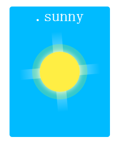


 <!DOCTYPE html>
 2 <html lang="en">
 3 <head>
 4    <meta charset="utf-8">
 5     <meta name="viewport" content="width=device-width, initial-scale=1, maximum-scale=1.0,minimum-scale=1.0,user-scalable=no"/>
 6     <meta http-equiv="X-UA-Compatible" content="IE=edge,chrome=1" /><!--优先使用 IE 最新版本和 Chrome-->
 7     <meta name="renderer" content="webkit"><!--360使用极速模式,使用这条时最好与上一句同时使用-->
 8     <meta name="format-detection" content="telphone=no, email=no" /><!-- 忽略页面中的数字识别为电话,忽略email识别 -->
 9     <meta name="applicable-device" content="mobile"/>
10     <meta name="apple-mobile-web-app-title" content="标题"> <!-- 添加到主屏后的标题(iOS 6 新增) -->
11     <meta name="apple-mobile-web-app-capable" content="yes" /> <!-- 是否启用 WebApp 全屏模式 -->
12     <meta name="HandheldFriendly" content="true"><!-- 针对手持设备优化,主要是针对一些老的不识别viewport的浏览器,比如黑莓 -->
13     <meta name="keywords" content="利用线性渐变阴影旋转实现晴天效果">
14     <meta name="description" content="利用线性渐变阴影旋转实现晴天效果">
15     <meta name="author" content="zjf">
16     <title>利用线性渐变阴影旋转实现晴天效果</title>
17     <style type="text/css">
18         .sun {
19             position: absolute;
20             left: 50%; top: 50%;
21             width: 200px;height: 260px;
22             -webkit-transform: translate(-50%, -50%);
23                -moz-transform: translate(-50%, -50%);
24                 -ms-transform: translate(-50%, -50%);
25                  -o-transform: translate(-50%, -50%);
26                     transform: translate(-50%, -50%);
27             text-align: center;
28             font-size: 200%;
29             color: #fff;
30             background-color: #0bf;
31             border-radius: 5px;
32         }
33         .sun:before {
34             content: "";
35             position: absolute;
36             width: 80px;
37             height: 80px;
38             left: 50%;
39             top: 50%;
40              -webkit-transform: translate(-50%, -50%);
41                -moz-transform: translate(-50%, -50%);
42                 -ms-transform: translate(-50%, -50%);
43                  -o-transform: translate(-50%, -50%);
44                     transform: translate(-50%, -50%);
45             border-radius: 50%;
46             background-color: rgba(255,238,68,1);
47             box-shadow: 0 0 0 15px rgba(255,255,0,0.2), 0 0 15px #fff;
48             z-index: -10;
49         }
50         .sun:after {
51             content: "";
52             position: absolute;
53             top: 50%; left: 50%;
54             height: 160px;
55             width: 160px;
56             -webkit-transform:translate(-50%,-50%) rotate(30deg);
57                -moz-transform:translate(-50%,-50%) rotate(30deg);
58                 -ms-transform:translate(-50%,-50%) rotate(30deg);
59                  -o-transform:translate(-50%,-50%) rotate(30deg);
60                     transform:translate(-50%,-50%) rotate(30deg);
61
62             z-index: -100;
63             background-image:
64             -webkit-linear-gradient(top, rgba(255,255,255,0) 0%,rgba(255,255,255,0.8) 50%,
65                 rgba(255,255,255,0) 100%),
66             -webkit-linear-gradient(left, rgba(255,255,255,0) 0%,rgba(255,255,255,0.8) 50%,
67                 rgba(255,255,255,0) 100%);
68             background-size: 20px 100%, 100% 20px;
69             background-repeat: no-repeat;
70             background-position: center center, center center;
71             animation:sunRotate 10s linear infinite;
72         }
73         @keyframes sunRotate {
74             0% {
75                 -webkit-transform: translate(-50%, -50%) rotate(30deg);
76                    -moz-transform: translate(-50%, -50%) rotate(30deg);
77                     -ms-transform: translate(-50%, -50%) rotate(30deg);
78                      -o-transform: translate(-50%, -50%) rotate(30deg);
79                         transform: translate(-50%, -50%) rotate(30deg);
80             }
81             100% {
82                 -webkit-transform: translate(-50%, -50%) rotate(390deg);
83                    -moz-transform: translate(-50%, -50%) rotate(390deg);
84                     -ms-transform: translate(-50%, -50%) rotate(390deg);
85                      -o-transform: translate(-50%, -50%) rotate(390deg);
86                         transform: translate(-50%, -50%) rotate(390deg);
87             }
88         }
89     </style>
90 </head>
91 <body>
92     <div class="sun">.sunny</div>
93 </body>
94 </html>
二、多云特效实现
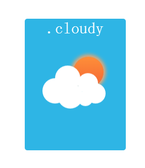
html+css
<!DOCTYPE html>
 2 <html>
 3     <head>
 4         <meta charset="UTF-8">
 5         <title>利用线性渐变/阴影/缩放实现多云效果</title>
 6         <style>
 7             .cloudy {
 8                 position: absolute;
 9                 top: 50%; left: 50%;
10                 width: 200px;
11                 height: 260px;
12                 transform: translate(-50%, -50%);
13                 text-align: center;
14                 font-size: 200%;
15                 color: #fff;
16                 background-color: #2EB5E5;
17                 border-radius: 5px;
18             }
19             .cloudy:before {
20                 content: "";
21                 text-indent: 23px;
22                 font-size: 22px;
23                 line-height: 40px;
24                 color: #333;
25                 position: absolute;
26                 height: 50px;width: 50px;
27                 background-color: #FFF;
28                 left: 30%; top: 55%;
29                 transform: translate(-50%,-50%);
30                 border-radius: 50%;
31                 z-index: 100;
32                 box-shadow:
33                 #FFFFFF 65px -15px 0 -5px,
34                 #FFFFFF 25px  -25px,
35                 #FFFFFF 30px  10px,
36                 #FFFFFF 60px 15px 0 -10px,
37                 #FFFFFF 80px  5px 0 -5px;
38                 animation: cloudy 5s ease-in-out infinite;
39             }
40             .cloudy:after {
41                 content: "";
42                 position: absolute;
43                 top: 45%;left:63%;
44                 height: 60px;
45                 width: 60px;
46                 z-index: 10;
47                 background: linear-gradient(180deg, #FE8F38 0%, #F46635 100%);
48                 border-radius: 50%;
49                 transform: translate(-50%,-50%);
50                 box-shadow: 0 0 10px 4px #FFa563;
51                 animation: cloudy 10s ease-in-out infinite;
52             }
53             @keyframes cloudy{
54                 50%{
55                     transform: translate(-50%,-70%);
56                 }
57                 100%{
58                     transform: translate(-50%,-50%);
59                 }
60             }
61         </style>
62     </head>
63     <body>
64         <div class="cloudy">
65             .cloudy
66         </div>
67     </body>
68 </html>