原理
css盒模型
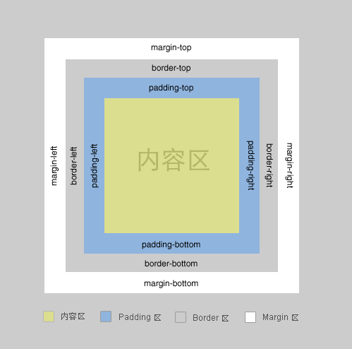
一个盒子包括: margin+border+padding+content– 上下左右边框交界处出呈现平滑的斜线.
利用这个特点, 通过设置不同的上下左右边框宽度或者颜色可以得到小三角, 小梯形等.– 调整宽度大小可以调节三角形形状.
示例1
一般情况下, 我们设置盒子的宽高度, 及上下左右边框, 会呈现如下图·

#test1 {
    height:20px;
    width:20px;
    border-color:#FF9600 #3366ff #12ad2a #f0eb7a;
    border-style:solid;
    border-width:20px;
}
示例2
在上面基础上, 我们把宽高度都设为0时, 会呈现上述的边界斜线.·

#test2 {
    height:0;
    width:0;
    overflow: hidden; /* 这里设置overflow, font-size, line-height */
    font-size: 0;     /*是因为, 虽然宽高度为0, 但在IE6下会具有默认的 */
    line-height: 0;  /* 字体大小和行高, 导致盒子呈现被撑开的长矩形 */
    border-color:#FF9600 #3366ff #12ad2a #f0eb7a;
    border-style:solid;
    border-width:20px;
}
宽高为0,边框大小不一样的盒子,例如
/**不等边框的盒子**/
.box3{
    width:0;
    height:0;
    overflow:hidden;
    font-size: 0;     /*是因为, 虽然宽高度为0, 但在IE6下会具有默认的 */
    line-height: 0;  /* 字体大小和行高, 导致盒子呈现被撑开的长矩形 */
    border-width:20px 10px 0 0;
    border-style:solid;
    border-color:orange blue transparent transparent;
}
这时, 其实我们已经看到有上下左右四个三角形了..如果, 我们把4种颜色, 只保留一种颜色, 余下3种颜色设置为透明(或者设置为和背景色相同的颜色), 那不就出现一个小三角了么·
示例3
只保留上面的橙色, 看看

#test3 {
    height:0;
    width:0;
    overflow: hidden;
    font-size: 0;
    line-height: 0;
    border-color:#FF9600 transparent transparent transparent;
    border-style:solid;
    border-width:20px;
}
可是, IE6下不支持透明啊~~~, 会出现下图的样子

找到一个在IE6下边框透明的文章中找到解决办法, 如下例
IE6下, 设置余下三条边的border-style为dashed,,,即可达到透明的效果~ 具体原因可以见参考资料3

#test4 {
    height:0;
    width:0;
    overflow: hidden;
    font-size: 0;
    line-height: 0;
    border-color:#FF9600 transparent transparent transparent;
    border-style:solid dashed dashed dashed;
    border-width:20px;
}
当然, 在IE6下, 不设置透明, 将其颜色设置为背景色, 使其看不出来也是可以的.
示例5
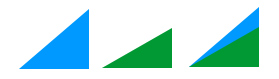
上面我们画的小三角的斜边都是依靠原来盒子的边, 还有另外一种形式的小三角, 就是斜边在盒子的对角线上·

#test5 {
    height:0;
    width:0;
    overflow: hidden;
    font-size: 0;
    line-height: 0;
    border-color:#FF9600 #3366ff transparent transparent;
    border-style:solid solid dashed dashed;
    border-width:40px 40px 0 0 ;
}
保留其中一种颜色, 就可以得到斜边在对角线上的三角形了…多个这样的三角形, 通过设置边框大小, 颜色, 拼凑起来可以形成任意形状的三角形.

像这种不规则的三角形, 延伸一下, 放在气泡框上, 就可以省去拼背景图片的麻烦了.

上面所说的都为实体无边的三角形,那么带有边框的三角形如何实现呢 ,这种就相当于两个绝对定位的无边框三角形叠加在一起,外三角边框比里三角小1px,并且外三角定位比里三角靠外1px。
为了代码简洁在非ie6下采用:before和after伪类,ie6下用样式名来实现,代码
<div class="box sanjiao_border">
    <!--ie6下需用,非ie6无需-->
    <i class="before"></i><i class="after"></i>
</div>
.sanjiao_border:before,.sanjiao_border .before{/*.before为ie6下用到*/
    content: ''; /*伪类下的属性*/
    display:block;
    position:absolute;
    top:0px;
    left:150px;
    width:0;
    height:0;
    overflow:hidden;
    font-size: 0;     /*是因为, 虽然宽高度为0, 但在IE6下会具有默认的 */
    line-height: 0;  /* 字体大小和行高, 导致盒子呈现被撑开的长矩形 */
    border:10px;
    border-style:dashed dashed solid dashed;
    border-color:transparent transparent #f30 transparent;
}
.sanjiao_border:after,.sanjiao_border .after{/*.after为ie6下用到*/
    content: '';/*伪类下的属性*/
    display:block;
    width:0;
    height:0;
    overflow:hidden;
    font-size: 0;     /*是因为, 虽然宽高度为0, 但在IE6下会具有默认的 */
    line-height: 0;  /* 字体大小和行高, 导致盒子呈现被撑开的长矩形 */
    border:9px;
    border-style:dashed dashed solid dashed;
    border-color:transparent transparent #fff transparent;
    position:absolute;
    left:151px;
    top:2px;
}
2、字符法
原理:采用菱形的字符◆,然后决定定位把多余的部分溢出掉,该种方法只适合三角和拼接板块颜色一致。
<div class="mod_sanjiao">
    <span>◆</span>
</div>
/*字符法*/
.mod_sanjiao{width:200px; height:30px; background:#fff;margin:30px; position:relative;}
.mod_sanjiao span{
    position:absolute;
    top:-10px;
    left:45%;
    font-size:20px;/*控制该菱形的大小*/
    color:#fff;/*控制该菱形的颜色*/
}
气泡框:
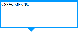
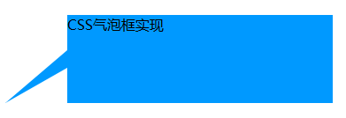
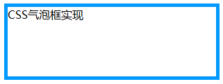
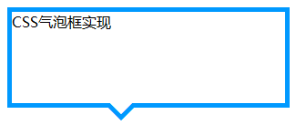
到这一步我们已经成功的模拟出了一个小三角,下一步我们把这个小三角同矩形框结合起来。先设置一个矩形框,然后把小三角定位到矩形框上。先来写出HTML结构:
<div class="tag">
      <em></em>
      CSS气泡框实现
</div>
.tag{
 width:300px;
 height:100px;
border:5px solid #09F;
 position:relative;}
.tag em{
display:block;
 border-width:20px;
 position:absolute;
bottom:-40px;
 left:100px;
border-style:solid dashed dashed;
border-color:#09F transparent transparent;
font-size:0;
line-height:0;
}
效果如下:
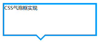
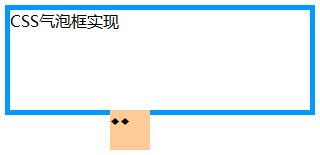
现在指示方向的三角形箭头是实心的,而我们想要的是镂空的效果,这里我们再叠加一个同气泡框背景颜色一样的小三角,然后把这个叠加的小三角移动一下位置就能达到了。
首先需要对HTML结构进行调整,如下:
<div class="tag">
      <em></em>
      <span></span>
      CSS气泡框实现
</div>
.tag{
width:300px;
 height:100px;
border:5px solid #09F;
 position:relative;
background-color:#FFF;
}
.tag em{
display:block;
 border-width:20px;
 position:absolute;
 bottom:-40px;
 left:100px;
border-style:solid dashed dashed;
border-color:#09F transparent transparent;
font-size:0;
line-height:0;
}
.tag span{
display:block;
border-width:20px;
position:absolute;
bottom:-33px;
left:100px;
border-style:solid dashed dashed;
 border-color:#FFF transparent transparent;
font-size:0;
line-height:0;
}
最终效果如下所示:
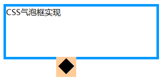
注意:叠加的小三角span的bottom值并不是border-width的值,两个小三角bottom的差值理论上应该是2(border-width)2的平方根
最后来把代码优化一下,以便在后期更容易维护,完整的HTML结构:
<div class="tag">
 <div class="arrow">
     <em></em><span></span>
    </div>
    CSS气泡框实现
</div>
.tag{
width:300px;
height:100px;
border:5px solid #09F;
position:relative;
background-color:#FFF;
}
.arrow{
position:absolute;
width:40px;
height:40px;
bottom:-40px;
left:100px; }
.arrow *{
 display:block;
border-width:20px;
position:absolute;
border-style:solid dashed dashed dashed;
 font-size:0;
line-height:0;
 }
.arrow em
{
border-color:#09F transparent transparent;
}
.arrow span
{
border-color:#FFF transparent transparent;
 top:-7px;}

举一反三:不规则三角箭头的气泡框又如何实现?

HTML结构同前面一样:
<div class="tag">
 <div class="arrow">
     <em></em><span></span>
    </div>
    CSS气泡框实现
</div>
矩形框CSS样式稍微改动一下:
.tag{ 300px; height:100px;position:relative; background-color:#09F;}
重新定位一下三角箭头:
.arrow{ position:absolute; width:70px; height:60px; left:-70px; bottom:10px;}
元素相邻的两边border-style值设为solid(显示),另两边设为transparent(不会显示)
.arrow *{ display:block; position:absolute; border-style:dashed solid solid dashed; font-size:0; line-height:0; }
首先模拟一个直角三角形,把一个元素的相邻两边color设为相同的值,另外两边颜色设为透明,即可得到一个直角:
.arrow em{border-color:transparent #09F #09F transparent; border-width:30px 35px;}
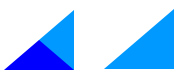
把两个直角三角形重叠在一起就可以得到一个不规则三角形
.arrow span{ border-width:20px 35px;border-color:transparent #FFF #FFF transparent; bottom:0;}
至此,不规则三角箭头的气泡框效果已经实现。
除了通过设置元素的border来模拟小三角之外,还可以用特殊字符来模拟,用特殊字符模拟小三角同样需要用到定位和重叠覆盖,只不过不需要调整border属性了。
先来看一个菱形“◆” ,它在页面中的代码是“◆”,需要注意的是页面编码需要设置为utf-8,在网页中可以把◆当作文字处理,可以通过调整font-size来它的大小、通过color来设置它的颜色。
HTML结构依然用前面的,不同的是在em、span标签中加入了 ◆
<div class="tag">
 <div class="arrow">
     <em>◆</em><span>◆</span>
    </div>
    CSS气泡框实现
</div>
先来设置最外层div的样式,得到一个矩形框:
.tag{ width:300px; height:100px;position:relative; border:5px solid #09F;}
接着定位箭头最外层容器div,便于观察可以先设置一个背景色 :
.arrow{ position:absolute; width:40px; height:40px; left:100px; bottom:-40px; overflow:hidden;}
再对◆设置样式:
.arrow *
{
display:block;
 position:absolute;
font-size:40px;
 line-height:40px;
width:40px;
 font-family:SimSun;
 font-style:normal;
font-weight:normal;
 text-align:center;
 vertical-align:middle;
}
注意:为了◆主流浏览器中显示一致,需要清除浏览器的默认字体样式,特别注意这里字体的设置
再分别修改em、span标签的字体颜色,并对这两个标签定位:
.arrow em{ color:#09F; top:-15px;}
.arrow span{ color:#FFF; top:-22px;}
|
2
|
.arrow em{ color:#09F; top:-15px;}.arrow span{ color:#FFF; top:-22px;} |
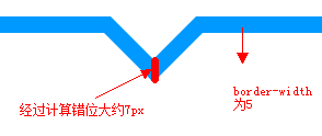
注意:该例子中em和span两个元素垂直方向相差约7px,原来同上面提到的一样,差值理论上应该是2(border-width)2的平方根
完整CSS样式:
.tag{ width:300px; height:100px;position:relative; border:5px solid #09F;}
.arrow{ position:absolute; width:40px; height:40px; left:100px; bottom:-40px; overflow:hidden;}
.arrow *{ display:block; position:absolute; font-size:40px; line-height:40px; width:40px;font-family:SimSun; font-style:normal; font-weight:normal;text-align:center; vertical-align:middle;}
.arrow em{ color:#09F; top:-15px;}
.arrow span{ color:#FFF; top:-22px;}
最终效果如下:

HTML特殊字符查询:http://ikwebdesigner.com/special-characters/
补充:以上方式实现小三角的过程中不可避免的增加了多余的标签,如果不要求所有浏览器中显示一致的话, 我们可以利用css3来实现这个小三角
HTML结构:
<div class="tag">
    css3气泡框
</div>
.tag{
    width:300px;
    height:100px;
    border:5px solid #09F;
    position:relative;
    background-color:#FFF;
}
.tag:before,.tag:after{
    content:"";display:block;
    border-width:20px;
    position:absolute; bottom:-40px;
    left:100px;
    border-style:solid dashed dashed;
    border-color:#09F transparent transparent;
    font-size:0;
    line-height:0;
}
.tag:after{
    bottom:-33px;
    border-color:#FFF transparent transparent;
}
效果同上。