/*怎么创建less文件呢?
有怎么使用less.css呢?
今天介绍一下目前最流行的less.css
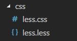
首先创建一个.less文件,(在哪里引用css,就在那里创建.less文件)
如果你是用 Visual Studio Code 编辑器的话 你可以下载 扩展 Easy LESS
然后创建一个同目录同名的 .css文件 这样在.less文件中写的样式,就会自动编译到.css文件中
而你可以直接在html中引入 .css文件即可

如果你没有使用 这个编辑器 也可以使用“考拉Koala”软件进行转换,
具体步骤呢可以看慕课网的教学视频
https://www.imooc.com/video/4825
Koala的基本使用
不过很遗憾的是我下载”Koala“后并没用使用成功
如果大家有什么好的less编译成css的方法 评论中留言,大家一起学习
下面直接看代码,非常简单^_^
*/
@charset "utf-8";
body{
// background: red;
//如果没有样式 会以波浪线 提醒不要为空 且也不会编译出 css
}
//设置变量
@test_300px;
.box{
@test_width;
height: @test_width;
background: yellow;
.border;
}
//混合
.border{
border: solid 5px pink;
}
.box2{
.box;
margin-left:100px;
}
//混合 - 可带参数
.border_02(@border_width){
border:solid yellow @border_width;
}
.test_hunhe{
.border_02(30px);
}
//混合 - 默认带值
.border_03(@border_10px){
border: solid green @border_width;
}
.test_hunhe_03{
.border_03();
}
.test_hunhe_04{
.border_03(50px);
}
//匹配模式
.triangle(top,@w:5px,@c:#ccc){
border- @w;
border-color: transparent transparent @c transparent;
border-style: dashed dashed solid dashed;
}
.triangle(right,@w:5px,@c:#ccc){
border- @w;
border-color: transparent @c transparent transparent;
border-style: dashed solid dashed dashed;
}
.triangle(bottom,@w:5px,@c:#ccc){
border- @w;
border-color: @c transparent transparent transparent;
border-style: solid dashed dashed dashed;
}
.triangle(left,@w:5px,@c:#ccc){
border- @w;
border-color: transparent transparent transparent @c;
border-style: dashed dashed dashed solid;
}
//进一步优化
.triangle(@_,@w:50px,@c:#ccc){
0;
height: 0;
overflow: hidden;
//@_ 表示为:无论选择上面的那一项,都要带上这一项,
//这样就剩下了 0;height: 0;overflow: hidden;代码
}
.sanjiao{
// 0;
// height: 0;
// overflow: hidden;
.triangle(right);//此时省略了 边框的宽度 匹配模式中是 5px 但是在进一步优化中的边框是 50px
//此时 .sanjiao 的边框到底是多少呢? 答案是: 5px 说明优化的代码只是站位,并不能起到改变样式的作用
//要想改变样式 还是需要 在.sanjiao 里面编辑具体样式 .triangle(right,100px);
}
//匹配模式 - 定位
//匹配模式在实际网页工作中用处还是不少的 比如 定位,边框,内外边距等等
.position(r){position: relative}
.position(a){position: absolute}
.position(f){position: fixed}
.sanjiao {
.triangle(top,100px);
.position(f);
top: 50%;
left: 50%;
}
//算法
@test_01:300px;
.box2{
// @test_01 + 20; //300+20=320px
// @test_01 - 20 * 5; //300-100=200px
// (@test_01 - 20) * 5; //(300-20)*5=1400px
//注:width 后面两个数值(一个是变量,一个是具体数值),
//其中有一个带有单位(px等),就可以被正常编辑,提醒大家最好是写完整 不要像我这么懒
// @test_01 - 20px * 5; //300px - 100px - 200px
@test_01 - 20px * 5px; //300px - 100px - 200px
color:#ccc - 10; //color:#c2c2c2;
//注:颜色也是可以使用算法,但是不建议使用,还是写好具体样式比较好,数学不是很好的就不好嘚瑟了。
}
//嵌套
/*html结构
<ul>
<li>
<a></a>
<span><span>
</li>
</ul>*/
ul{
li{
}
&:hover{
//&表示上一层选择器 此处是 ul
}
a{
//注:虽然a标签在li里面,但是为了节省浏览器加载,在这种情况下可以使a和li为兄弟关系。
&:hover{
//&表示上一层选择器 此处是 a
}
}
span{
}
li:nth-child(2){
color:blue;
//less里面也是支持 nth-child
}
}
//arguments
.border_arg(@w:30px,@c:yellow,@xx:solid){
border: @arguments;
}
.test_arguments{
50px;
height: 50px;
background: black;
// .border_arg(10px); 只修改第一项时,可以省略@c,@xx
// .border_arg(50px,blue); //如果修改第二项,第一项不可以为空.border_arg(blue);编译成css为 border: blue red solid;
.border_arg();//不修改全部默认
}
//避免编译
.test_03{
background-color: #000000;
height: calc(300px - 30px);//编译后的css calc(270px); 直接计算结果
// ~'calc(300px - 30px);'//编译后的css height: calc(300px-30); 使用 ~ 就不会计算结果
//注:
//~'calc(300px-30px);'浏览器不识别 原因是 "减号"运算 没有被识别 所以需要空格隔开
//~'calc(300px - 30px);'浏览器识别
~'calc(300px - 30px);'
}
//important 样式等级最高 适用于“调试”时 不建议多用
@back-color:red;//定义一个全局变量颜色
.one{
@50px;//定义一个局部尺寸 在其他样式中不可调用
@height:100px;
@width; //可以调用自己的局部变量
height: @height;
background: @back-color;
}
.two{
// @width;
// height: @height; 调用不到 .one中定义的变量
@test_width; //可以调用全局的变量
height: @test_width; //可以调用全局的变量
background: @back-color; //可以调用全局的变量
}
对应的css
@charset "utf-8";
.box {
300px;
height: 300px;
background: yellow;
border: solid 5px pink;
}
.border {
border: solid 5px pink;
}
.box2 {
300px;
height: 300px;
background: yellow;
border: solid 5px pink;
margin-left: 100px;
}
.test_hunhe {
border: solid yellow 30px;
}
.test_hunhe_03 {
border: solid green 10px;
}
.test_hunhe_04 {
border: solid green 50px;
}
.sanjiao {
border- 5px;
border-color: transparent #ccc transparent transparent;
border-style: dashed solid dashed dashed;
0;
height: 0;
overflow: hidden;
}
.sanjiao {
border- 100px;
border-color: transparent transparent #ccc transparent;
border-style: dashed dashed solid dashed;
0;
height: 0;
overflow: hidden;
position: fixed;
top: 50%;
left: 50%;
}
.box2 {
200px;
color: #c2c2c2;
}
/*html结构
<ul>
<li>
<a></a>
<span><span>
</li>
</ul>*/
ul li:nth-child(2) {
color: blue;
}
.test_arguments {
50px;
height: 50px;
background: black;
border: 30px yellow solid;
}
.test_03 {
background-color: #000000;
height: calc(270px);
calc(300px - 30px);;
}
.one {
50px;
height: 100px;
background: red;
}
.two {
300px;
height: 300px;
background: red;
}
对应的 html
<!DOCTYPE html>
<html>
<head>
<meta charset="utf-8" />
<title></title>
<link rel="stylesheet" href="css/less.css" type="text/css">
</head>
<body>
<div class="box2 boeder"></div>
<ul>
<li>
<a href=""></a>
<span></span>
</li>
<li>
<a href=""></a>
<span></span>
</li>
</ul>
<div class="sanjiao"></div>
<div class="test_arguments"></div>
<div class="test_03"></div>
<div class="one"></div>
<div class="two"></div>
</body>
</html>