第八章:图案和渐变
要使用图案,首先要定义一个水平或者垂直方向重复的图形对象,然后用它填充另一个对象或者作为笔画使用。这个图形对象呗称作tile(瓷砖)。
下面可以把SVG绘制的二次曲线作为图案。
  <!-- 图案的路径 -->
        <path d="M 0 0 Q 5 20 10 10 T 20 20" style="stroke: black;fill:none;" />
        <path d="M 0 0 h20 v20 h-20 z" style="stroke:gray;fill:none;">
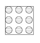
图案:
8.1.1 patternUnits
要创建一个图案,必须使用<pattern>元素包裹描述图案的<path>元素。然后确定一些事情。
第一个需要确定的是希望如何排列图案,这一点提现在patternUnits属性上。是想让每个团填充对象的一定百分比,还是想以相同大小的图案平铺,而无论填充对象的尺寸多大。
如果希望图案的尺寸基于对象的大小计算,需要指定图案左上角的x和y坐标,以及其width和height(百分比或者0到1之间的小数)。然后设置patternUnits属性为objectBoundingBox(边界框)。对象的边界框是一个完全包裹图形对象的最小矩形。它会在它所填充的对象中水平和垂直方向各重复5次。
<!-- 设置patternUnits为objectBoundingBox -->
    <svg width="400px" height="400px" viewBox="0 0 400 400">
        <defs>
        <pattern id="tile" x="0" y="0" width="20%" height="20%" patternUnits="objectBoundingBox">
            <!-- 图案的路径 -->
            <path d="M 0 0 Q 5 20 10 10 T 20 20" style="stroke: black;fill:none;" />
            <path d="M 0 0 h20 v20 h-20 z" style="stroke:gray;fill:none;" />
        </pattern>
        </defs>

        <rect x="20" y="20" width="100" height="100" style="fill:url(#tile);stroke: black;" />
        <rect x="135" y="20" width="70" height="80" style="fill:url(#tile);stroke: black;" />
        <rect x="220" y="20" width="150" height="130" style="fill:url(#tile);stroke: black;" />
    </svg>
效果图:
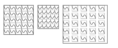
上图中,左侧矩形的宽高为100用户单位,正好容纳5个宽高为20用户单位的图案。中间矩形的宽高不够完全展示任意一个图案,因此它们被截断了。右侧的矩形中,产生了额外的间隙,因为其宽高超过一个图案所需空间的5倍,由于图案设置了x和y值为0,因此在上面的例子中都恰好为矩形的左上角。
标准的图形编辑程序会在画布上将图案一个接一个地放置,而不管尺寸多少。这些图案之间不会有额外的间隙。并且只在所填充对象的边缘进行裁剪。这样的标准则必须设置patternUnits属性值为userSpaceonUse,还要指定x和y坐标,以及按用户单位指定图案的width和height:
在线:http://oreillymedia.github.io/svg-essentials-examples/ch08/patternunits.html
<!-- 设置patternUnits为userSpaceOnUse -->
    <svg width="400px" height="400px" viewBox="0 0 400 400">
        <defs>
        <pattern id="tile" x="0" y="0" width="20" height="20" patternUnits="userSpaceOnUse">
            <!-- 图案的路径 -->
            <path d="M 0 0 Q 5 20 10 10 T 20 20" style="stroke: black;fill:none;" />
            <path d="M 0 0 h20 v20 h-20 z" style="stroke:gray;fill:none;" />
        </pattern>
        </defs>

        <rect x="20" y="20" width="100" height="100" style="fill:url(#tile);stroke: black;" />
        <rect x="135" y="20" width="70" height="80" style="fill:url(#tile);stroke: black;" />
        <rect x="220" y="20" width="150" height="130" style="fill:url(#tile);stroke: black;" />
    </svg>
效果图:
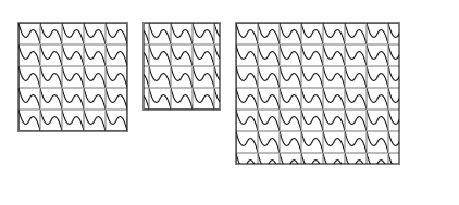
三个矩形中的图案尺寸都是固定的。但是它们的对齐方式取决于所在的坐标系统。例如,中间矩形的x坐标并不是20的倍数,因此矩形的左上角不能与图案的左上角重合(但是顶部是对齐的,因为三个矩形的y坐标都是特意选择的,都是20的倍数。)
如果没有指定patternUnits的值,则默认为objectBoundingBox。
8.1.2 patternContentUnits
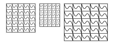
默认情况下,patternContentUnits属性值为userSpaceOnUse。如果设置属性值为objectBoundingBox,则路径本身的数据点会基于被填充的对象来确定。
如果patternContentUnits使用userSpaceOnUse,那么图案的边界框左上角应该在原点(0,0)位置。
如果使用objectBoundingBox,则需要在图案中减小stroke-width的值。图案的宽度也会以被填充对象的边界框作为参考,而不会使用用户单位,因此stroke-width为1会覆盖整个图案。在这个例子中,笔画宽度被设置为0.01,也就是被填充对象边界框宽度和高度均值的1%。
<!-- 设置patternContenUnits为objectBoundingBox -->
    <svg width="400px" height="400px" viewBox="0 0 400 400">
        <defs>
            <pattern id="tile" patternUnits="objectBoundingBox" patternContentUnits="objectBoundingBox" x="0" y="0" width=".2" height=".2">
                <path d="M 0 0 Q .05 .20 .10 .10 T .20 .20" style="stroke: black;fill:none;stroke-0.01;" />
                <path d="M 0 0 h 0.2 v 0.2 h-0.2z" style="stroke: black;fill:none;stroke-0.01;" />
            </pattern>
        </defs>
        <g transform="translate(20,20)">
            <rect x="0" y="0" width="100" height="100" style="fill:url(#tile);stroke:black;" />
        </g>

        <g transform="translate(135,20)">
            <rect x="0" y="0" width="70" height="80" style="fill:url(#tile);stroke:black;" />
        </g>

        <g transform="translate(220,20)">
            <rect x="0" y="0" width="150" height="130" style="fill:url(#tile);stroke:black;" />
        </g>
    </svg>
效果图:
如果想搜小现在的图形对象当做图像,则使用viewBox属性来缩放更容易。指定viewBox会覆盖任何patternContentUnits信息。另一种的设置preserveAspectRatio属性。
下例使用了三次贝塞尔曲线的缩小版作为图案。stroke-width被设置为5;否则当缩小SVG时,将看不到图案。
<!-- 使用viewBox缩放图案 -->
    <svg width="400px" height="400px" viewBox="0 0 400 400">
        <defs>
            <pattern id="tile" patternUnits="userSpaceOnUse" x="0" y="0" width="20" height="20" viewBox="0 0 150 150">
                <path d="M30 100 C 50 50,70 20,100 100,110,130,45,150,65,100" style="stroke: black;stroke-5;fill:none;" />
            </pattern>
        </defs>
        <rect x="20" y="20" width="100" height="100" style="fill:url(#tile);stroke:black;" />
    </svg>
效果图:
8.1.3图案嵌套
下例创建利率一个使用圆填充的矩形,这些圆都使用横向条纹填充。
<!-- 图案嵌套 -->
    <svg width="400px" height="400px" viewBox="0 0 400 400">
        <defs>
            <pattern id="stripe" patternUnits="userSpaceOnUse" x="0" y="0" width="6" height="6">
                <path d="M 0 0 6 0" style="stroke:black;fill:none;" />
            </pattern>
            <pattern id="polkadot" patternUnits="userSpaceOnUse" x="0" y="0" width="36" height="36">
                <circle cx="12" cy="12" r="12" style="fill:url(#stripe);stroke:black;" />
            </pattern>
        </defs>
        <rect x="36" y="36" width="100" height="100" style="fill:url(#polkadot);stroke:black;" />
    </svg>
效果图:
8.2渐变
我们可以使用渐变填充对象,也就是从一个颜色平滑地过渡到另一个,而不是使用纯色填充对象。
渐变可以是线性的,即颜色沿着直线过渡;也可以是径向的,即颜色从中心点向外辐射(发散过渡)。
8.2.1 linearGradient元素
线性渐变就是一系列颜色沿着一条直线过渡,在特定的位置指定想要的颜色,被称作渐变点(gradient stop)。渐变点是渐变结构的一部分,颜色是表现的一部分。
下例SVG展示了一个由金黄色平滑过渡到青色的渐变填充的矩形。
在线:http://oreillymedia.github.io/svg-essentials-examples/ch08/linear_gradient.html
<!-- 简单的双色渐变 -->
    <svg width="400px" height="400px" viewBox="0 0 400 400">
        <defs>
            <linearGradient id="two_hues">
                <stop offset="0%" style="stop-color:#ffcc00;" />
                <stop offset="100%" style="stop-color:#0099cc;" />
            </linearGradient>
        </defs>
        <rect x="20" y="20" width="200" height="100" style="fill:url(#two_hues);stroke:black;" />
    </svg>
效果图:
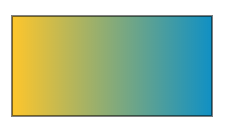
①stop元素:它有两个必要属性:offset和stop-color。offset用于确定线上哪个点的颜色应该等于stop-color。offset的值使用0到100%之间的百分比或者0到1.0之间的小数表示。虽然在0%和100%位置设置渐变点并不是必须的,但是通常我们都会这么做。这里的stop-color被指定在style中,但是也可以指定它为独立属性。
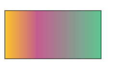
下例中0%位置颜色为金黄色,33.3%位置的颜色为紫红色,100%位置的颜色为淡绿色:
三色渐变:http://oreillymedia.github.io/svg-essentials-examples/ch08/three_stop_gradient.html
<!-- 三色渐变 -->
    <svg width="400px" height="400px" viewBox="0 0 400 400">
        <defs>
            <linearGradient id="three_stops">
                <stop offset="0%" style="stop-color:#ffcc00;" />
                <stop offset="33.3%" style="stop-color:#cc6699;" />
                <stop offset="100%" style="stop-color:#66cc99;" />
            </linearGradient>
        </defs>
        <rect x="20" y="20" width="200" height="100" style="fill:url(#three_stops);stroke: black;" />
    </svg>
效果图:
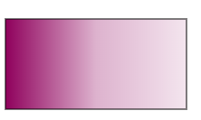
指定渐变点颜色的时候还可以使用stop-opacity属性,值为1表示完全不透明,为0表示完全透明。
下例创建一个快速淡出到中点位置,然后向终点褪色的渐变。
opacity渐变:http://oreillymedia.github.io/svg-essentials-examples/ch08/stop_opacity.html
<!-- 带有三个opacity的渐变 -->
    <svg width="400px" height="400px" viewBox="0 0 400 400">
        <defs>
            <linearGradient id="three_opacity_stops">
                <stop offset="0%" style="stop-color:#906;stop-opacity:1.0"; />
                <stop offset="50%" style="stop-color:#906;stop-opacity:0.3" />
                <stop offset="100%" style="stop-color:#906;stop-opacity:0.10" />
            </linearGradient>
        </defs>
        <rect x="20" y="20" width="200" height="100" style="fill:url(#three_opacity_stops);stroke: black;" />
    </svg>
效果图:
②定义线性渐变的方向
线性渐变的默认行为是沿着水平线从对象的左侧向右侧过渡。如果想要颜色沿着竖线或者有角度的线条过渡,就必须使用x1和y1以及x2和y2属性指定渐变的起点和终点。默认情况下,它们也使用0%到100%的百分比或者0到1的小数表示。
下例用相同的渐变点建立了一个水平渐变、垂直渐变和对角(线)渐变。这个例子使用xlink:href属性引用原始的从左到右的渐变,而不是将渐变点复制给每个<linearGradient>元素。这样渐变点会被继承。但是x坐标和y坐标会被每个独立的渐变重写。
htttp://oreillymedia.github.io/svg-essentials-examples/ch08/transition_line.html
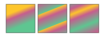
<!-- 定义线性渐变的方向 -->
    <svg width="400px" height="400px" viewBox="0 0 400 400">
        <defs>
            <linearGradient id="three_stops">
                <stop offset="0%" style="stop-color:#ffcc00;";/>
                <stop offset="33.3%" style="stop-color:#cc6699;" />
                <stop offset="100%" style="stop-color:#66cc99;" />
            </linearGradient>
            <linearGradient id="right_to_left" xlink:href="#three_stops" x1="100%" y1="0%" x2="0%" y2="0%" />
            <linearGradient id="down" xlink:href="#three_stops" x1="0%" y1="0%" x2="0%" y2="100%" />
            <linearGradient id="up" xlink:href="#three_stops" x1="0%" y1="100%" x2="0%" y2="0%" />
            <linearGradient id="diagonal" xlink:href="#three_stops" x1="0%" y1="0%" x2="100%" y2="100%" />

        </defs>
        <rect x="40" y="20" width="200" height="40" style="fill:url(#three_stops);stroke: black;" />
        <rect x="40" y="70" width="200" height="40" style="fill:url(#right_to_left);stroke: black;" />
        <rect x="250" y="20" width="40" height="200" style="fill:url(#down);stroke: black;" />
        <rect x="300" y="20" width="40" height="200" style="fill:url(#up);stroke: black;" />
        <rect x="40" y="120" width="200" height="100" style="fill:url(#diagonal);stroke: black;" />
    </svg>
效果图:

如果想要使用用户坐标空间而不是百分比指定渐变方向,设置gradientUnits为userSpaceOnUse而不是默认值objectBoundingBox即可。
③spreadMethod属性。
指定过渡方向时并不一定要从对象的一角到另一角。如果我们指定从(20%,30%)到(40%,80%)会发生什么?对象中在指定范围之外的部分会发生什么?可以设置spredMethod属性为下列值之一。
* pad 起始和结束渐变点会扩展到对象的边缘。
* repeat 渐变会重复起点到终点的过程,直到填充满对象。
* reflect 渐变会按终点到起点、起点到终点的排列重复,直到填充满整个对象。
下例中左侧正方形展示了pad效果,中间的正方形展示了repeat效果,右侧正方形是展示了reflect效果。
在线演示:http://oreillymedia.github.io/svg-essentials-examples/ch08/spread_method.html
<!-- spreadMethod值的线性渐变效果 -->
    <svg width="400px" height="400px" viewBox="0 0 400 400">
        <defs>
            <linearGradient id="partial" x1="20%" y1="30%" x2="40%" y2="80%">
                <stop offset="0%" style="stop-color:#ffcc00;" />
                <stop offset="33.3%" style="stop-color:#cc6699;" />
                <stop offset="100%" style="stop-color:#66cc99;" />
            </linearGradient>
            <linearGradient id="padded" xlink:href="#partial" spreadMethod="pad"></linearGradient>
            <linearGradient id="repeated" xlink:href="#partial" spreadMethod="repeat"></linearGradient>
            <linearGradient id="reflected" xlink:href="#partial" spreadMethod="reflect"></linearGradient>
            <!-- <line id="show-line" x1="20" y1="30" x2="40" y2="80" style="stroke: white;" /> -->
        </defs>

        <rect x="20" y="20" width="100" height="100" style="fill:url(#padded);stroke:black;" />
        <!-- <use xlink:href="#show-line" transform="tramslate(20,20)" /> -->

        <rect x="130" y="20" width="100" height="100" style="fill:url(#repeated);stroke:black;" />
        <!-- <use xlink:href="#show-line" transform="tramslate(130,20)" /> -->

        <rect x="240" y="20" width="100" height="100" style="fill:url(#reflected);stroke:black;" />
        <!-- <use xlink:href="#show-line" transform="tramslate(240,20)" /> -->
    </svg>
效果图
8.2.2 radialGradient元素
另一种渐变类型是径向渐变,每个渐变点表示一个圆形路径,从中心点向外扩散。它的设置方式和线性渐变大致相同。
三色径向渐变:http://oreillymedia.github.io/svg-examples/ch08/three_stop_radial.html
<!-- 三色径向渐变 -->
    <svg width="400px" height="400px" viewBox="0 0 400 400">
        <defs>
            <radialGradient id="three_stops">
                <stop offset="0%" style="stop-color:#f96;" />
                <stop offset="50%" style="stop-color:#9c9;" />
                <stop offset="100%" style="stop-color:#906;" />
            </radialGradient>
        </defs>
        <rect x="20" y="20" width="100" height="100" style="fill:url(#three_stops);stroke:black;" />
    </svg>
效果图
①定义径向渐变的范围
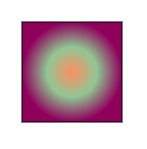
径向渐变是由圆形确定,其中中心点为0%,外圆周定义了点100%。我们使用cx(中心点x坐标)、cy(中心点y坐标)以及r(半径)属性定义外圆。所有这些属性值都是对象外边框的百分比,默认值都为50%。
下例绘制了一个径向渐变的正方形,中心点在正方形的左上角,外边缘在右下方。
http://oreillymedia.github.io/svg-essentials-examples/ch08/radial_limits.html
<!-- 为径向渐变设置范围 -->
    <svg width="400px" height="400px" viewBox="0 0 400 400">
        <defs>
            <radialGradient id="center_origin" cx="0%" cy="0%" r="141%">
                <stop offset="0%" style="stop-color:#f96;" />
                <stop offset="50%" style="stop-color:#9c9;" />
                <stop offset="100%" style="stop-color:#906;" />
            </radialGradient>
        </defs>
        <rect x="20" y="20" width="100" height="100" style="fill:url(#center_origin);stroke:black;">
    </svg>
效果图:

上例中,radialGradient的r被设置为141%,而不是100%。这是因为用来测量半径的单位是对象边界框宽度和高度的平均值,而不是框的对角线。正方形对角线与边长的比例是2的平方根,即为1.41。
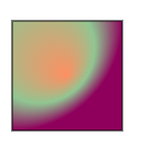
0%点也被称作焦点,默认为100%处渐变点所在圆的圆心。如果希望点0%在其他地方而不是圆心,必须改变fx和fy的属性。圆的焦点应该建立在100%处渐变点所在圆的内部,如果不是,SVG阅读器会自动把焦点移到该圆的焦点。
下例中,圆的中心点在原点位置,半径为100%,但是焦点在(50%,50%)位置,这产生一种移动中心点的视觉效果。
设置径向渐变的焦点:http://oreillymedia.github.io/svg-essentials-examples/ch08/radial_focus.html
<!-- 设置径向渐变的焦点 -->
    <svg width="400px" height="400px" viewBox="0 0 400 400">
        <defs>
            <radialGradient id="focal_set" cx="0%" cy="0%" fx="50%" fy="50%" r="100%">
                <stop offset="0%" style="stop-color:#f96;" />
                <stop offset="50%" style="stop-color:#9c9;" />
                <stop offset="100%" style="stop-color:#906;" />
            </radialGradient>
        </defs>
        <rect x="20" y="20" width="100" height="100" style="fill:url(#focal_set);stroke:black;" />
    </svg>
效果图:
<radialGradient>的范围设置属性的默认值如下:
| 属性 | 默认值 |
|---|---|
| cx | 50%(对象边界框的水平中心点) |
| cy | 50%(对象边界框的垂直中心点) |
| r | 50%(对象边界框宽度/高度的一半) |
| fx | 和cx一样 |
| fy | 和cy一样 |
如果想用用户控件坐标而不是百分比确定圆的范围,要设置gradientUnits为userSpaceOnUse,而不是默认值objectBoundingBox。
②径向渐变spreadMethod属性。
如果绘制的范围没有到达对象的边缘,可以设置spreadMethod属性为pad、repeat或者reflect三个值之一,来按照期望的方式填补剩下的空白。
http://oreillymedia.github.io/svg-essentials-examples/ch08/radial_spread_method.html
<!-- 径向渐变spreadMethod的效果演示 -->
    <svg width="400px" height="400px" viewBox="0 0 400 400">
        <defs>
            <radialGradient id="three_stops" cx="0%" cy="0%" r="70%">
                <stop offset="0%" style="stop-color:#f96;" />
                <stop offset="50%" style="stop-color:#9c9;" />
                <stop offset="100%" style="stop-color:#906;" />
            </radialGradient>
            <radialGradient id="padded" xlink:href="#three_stops" spreadMethod="pad"></radialGradient>
            <radialGradient id="repeated" xlink:href="#three_stops" spreadMethod="repeat"></radialGradient>
            <radialGradient id="reflected" xlink:href="#three_stops" spreadMethod="reflect"></radialGradient>
        </defs>
        <rect x="20" y="20" width="100" height="100" style="fill:url(#padded);stroke:black;" />
        <rect x="130" y="20" width="100" height="100" style="fill:url(#repeated);stroke:black;" />
        <rect x="240" y="20" width="100" height="100" style="fill:url(#reflected);stroke:black;" />
    </svg>
效果图:

8.2.3渐变总结
线性渐变和径向渐变描述了使用平滑过渡的颜色填充对象。我们所讨论的对象都有一个边界框,它们被定义为完全包含对象的最小矩形。<linearGradient>和<radialGradient>元素都是一些列<stop>元素的容器。每个<stop>元素都指定stop-color、offset和可选的stop-opacity,对于线性渐变,偏移就是渐变线性方向的距离的百分比。对于径向渐变,偏移就是渐变半径的百分比。
线性渐变中,方向的起点(拥有0%渐变点)由属性x1和y1定义,终点(拥有100%渐变点)由属性x2和y2定义。
对于径向渐变,焦点(拥有0%渐变点)由属性fx和fy定义,拥有100%渐变点的圆由中心点坐标cx、cy和半径r定义。
如果gradientUnits属性值为objectBoundingBox,则把边界框尺寸的百分比(默认行为)作为坐标。如果设置为userSpaceOnUse,则采用填充对象的坐标系统。
如果线性渐变或者径向渐变的方向没有达到填充对象的边界,剩余空间的着色由spreaMethod属性值确定:默认值pad将以起点和终点颜色扩展到边界,repeat会重复起点到终点的渐变知道到达边界。reflect以终点到起点,起点到终点的形式重复渐变,直到达到对象边界。
8.3 变换图案和渐变。
有的时候可能需要斜切、拉伸或者旋转图案或者渐变。此时无需变换填充的对象,而是变换用来填充对象的图案或者渐变。可以用gradientTransfoem和patternTransform属性来实现。
变换图案和渐变:http://oreillymedia.github.io/svg-essentials-examples/ch08/pattern_gradient_transform.html
<!-- 变换图案和渐变 -->
    <svg width="400px" height="400px" viewBox="0 0 400 400">
        <defs>
            <pattern id="tile" x="0" y="0" width="20%" height="20%" patternUnits="objectBoundingBox">
                <path d="M 0 0 Q 5 20 10 10 T 20 20" style="stroke:black;fill:none;" />
                <path d="M 0 0 h 20 v 20 h -20 z" style="stroke:gray;fill:none;" />
            </pattern>

            <pattern id="skewed-tile" patternTransform="skewY(15)" xlink:href="#tile"/>

            <linearGradient id="plain">
                <stop offset="0%" style="stop-color:#ffcc00;" />
                <stop offset="33.3%" style="stop-color:#cc6699;" />
                <stop offset="100%" style="stop-color:#66cc99;" />
            </linearGradient>

            <linearGradient id="skewed-gradient" gradientTransform="skewX(10)" xlink:href="#plain" />
            </linearGradient>
        </defs>

        <rect x="20" y="10" width="100" height="100" style="fill:url(#tile);stroke: black;" />
        <rect x="135" y="10" width="100" height="100" style="fill:url(#skewed-tile);stroke:black;"/>
        <rect x="20" y="120" width="200" height="50" style="fill:url(#plain);stroke:black;" />
        <rect x="20" y="190" width="200" height="50" style="fill:url(#skewed-gradient);stroke:black;"/>
    </svg>
效果图:

尽管上述例子都只将它们应用于形状的填充区域,但其实它们还可以用于stroke。这样就可以为对象生成彩色或图案描边。为了让这种效果更清晰可见,通常要设置stroke-width为大于1的数字。
在添加stroke的时候,大小是基于objectBoundingBox来计算的。因为水平线和垂直线的边界框的宽度或高度默认为0,所以当图案和渐变作用于这些线条的时候,使用objectBoundingBox单位的渐变或者图案会被忽略,这意味着它们完全不会被绘制出来,除非在样式(style)中指定备选笔画值。比如stroke:url(#rainbow) red
如果团或渐变定义在独立的文件中,设置备用填充和笔画选项是个好主意,以防文件不能加载或者SVG阅读器不支持外部引用