css已经越来越强大了 ,可以使用它来绘制各种简单的形状,用于代替图片显示,这次的分享主要用到画圆,扇形,三角形等知识点,由于IE9以上才支持圆角,暂时不考虑兼容问题
css实现圆形
<div class="circle"></div>
<style>
.circle {
  border-radius: 50%;
   80px;
  height: 80px;
  background: #666;
}
</style>
效果如下:
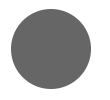
border-radius圆角的四个值按顺序取值分别为:左上、右上、右下、左下。这里只设置一个值,代表四个角的取值都为为50%
原理:
border-radius: 50% 弯曲元素的边框以创建圆。
由于圆在任何给定点具有相同的半径,故宽和高都需要保证一样的值,不同的值将创建椭圆。
css实现扇形
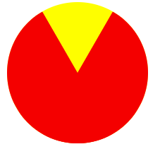
1、利用border-radius,实现90度角的扇形:
<div class="sector"></div>
<style>
.sector{
  border-radius:80px 0 0;
   80px;
  height: 80px;
  background: #666;
}
</style>
效果如下:

原理:
左上角是圆角,其余三个角都是直角:左上角的值为宽和高一样的值,其他三个角的值不变(等于0)。
新片场https://www.wode007.com/sites/73286.html 傲视网https://www.wode007.com/sites/73285.html
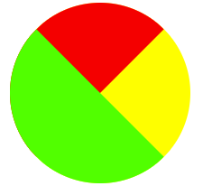
2、绘制任意角度的扇形
<div class="shanxing shanxing1">
<div class="sx1"></div>
<div class="sx2"></div>
</div>
<!--*绘制一个85度扇形*/--p>
<div class="shanxing shanxing2">
<div class="sx1"></div>
<div class="sx2"></div>
</div>
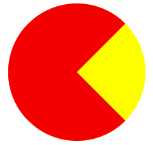
<!--*绘制一个向右扇形,90度扇形*-->
<div class="shanxing shanxing3">
<div class="sx1"></div>
<div class="sx2"></div>
</div>
<!--*绘制一个颜色扇形 */--p>
<div class="shanxing shanxing4">
<div class="sx1"></div>
<div class="sx2"></div>
</div>
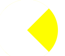
<!--/*绘制一个不同颜色半圆夹角 */-->
<div class="shanxing shanxing5">
<div class="sx1"></div>
<div class="sx2"></div>
</div>
<style>
.shanxing{
position: relative;
200px;
height: 200px;
border-radius: 100px;
background-color: yellow;
}
.sx1{
position: absolute;
200px;
height: 200px;
transform: rotate(0deg);
clip: rect(0px,100px,200px,0px); /*这个clip属性用来绘制半圆,在clip的rect范围内的内容显示出来,使用clip属性,元素必须是absolute的 */
border-radius: 100px;
background-color: #f00;
/*-webkit-animation: an1 2s infinite linear; */
}
.sx2{
position: absolute;
200px;
height: 200px;
transform: rotate(0deg);
clip: rect(0px,100px,200px,0px);
border-radius: 100px;
background-color: #f00;
/*-webkit-animation: an2 2s infinite linear;*/
}
/*绘制一个60度扇形*/
.shanxing1 .sx1{transform: rotate(-30deg);} .shanxing1 .sx2{transform: rotate(-150deg);}
/*绘制一个85度扇形*/
.shanxing2 .sx1{transform: rotate(-45deg);} .shanxing2 .sx2{transform: rotate(-140deg);}
/*绘制一个向右扇形,90度扇形*/
.shanxing3 .sx1{transform: rotate(45deg);} .shanxing3 .sx2{transform: rotate(-45deg);}
/*绘制一个颜色扇形 */
.shanxing4 .sx1{transform: rotate(45deg);background-color: #fff;} .shanxing4 .sx2{transform: rotate(-45deg);background-color: #fff;}
/*绘制一个不同颜色半圆夹角 */
.shanxing5 .sx1{transform: rotate(45deg);background-color: #f00;} .shanxing5 .sx2{transform: rotate(-45deg);background-color: #0f0; </style>
效果如下:
/*绘制一个60度扇形*/
/*绘制一个85度扇形*/
/*绘制一个向右扇形,90度扇形*/
/*绘制一个颜色扇形 */
/*绘制一个不同颜色半圆夹角 */