前言
Bootbox.js是一个小型的JavaScript库,基于 Twitter 的 Bootstrap 开发,旨在使使用Bootstrap modals更容易!
可以自定义alert/confirm/prompt/dialog弹出框
下载与使用
bootbox的所有版本都是在Bootstrap和jQuery的基础之上的,因此bootstrap,jQuery和bootbox的版本要对应
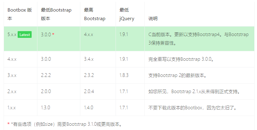
如果您使用的是Bootstrap 4,则还必须包含Popper.js。如果您愿意,Bootstrap当前还会在预编译版本中包含bootstrap.bundle.min.js文件,该文件将Popper.js与bootstrap.js源文件结合在一起。
我这里用的Bootstrap3,下载bootbox.js 和 bootbox.locales.js两个文件
bootbox.js 下载地址https://github.com/makeusabrew/bootbox/releases/download/v5.3.2/bootbox.js
bootbox.locales.js 下载地址https://github.com/makeusabrew/bootbox/releases/download/v5.3.2/bootbox.locales.js
引入bootbox相关2个js文件
<head>
    <link href="/static/bootstarp/css/bootstrap.min.css" rel="stylesheet">
    <script src="/static/bootstarp/jquery/jquery3.2.1.js"></script>
    <script src="/static/bootstarp/js/bootstrap.min.js"></script>
    <!-- 引入bootbox相关 js -->
    <script src="/static/boot-box/bootbox.min.js"></script>
    <script src="/static/boot-box/bootbox.locales.min.js"></script>
</head>
脚本使用
alert 警告框
bootbox.alert("This is the default alert!")

Confirm 确认框
bootbox.confirm("This is the default confirm!",
            function(result){
                console.log('This was logged in the callback: ' + result);
            });
prompt 提示框
bootbox.prompt("This is the default prompt!", function(result){
            console.log(result);
        });

dialog 自定义对话框
    var dialog = bootbox.dialog({
        message: '<p class="text-center mb-0"><i class="fa fa-spin fa-cog"></i> Please wait while we do something...</p>',
        closeButton: false
    });

    // do something in the background
    dialog.modal('hide');
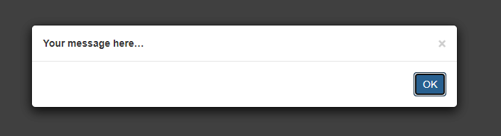
alert使用
message 内容可以是一段文字也可以是html代码
  // alert 基本的用法
    bootbox.alert("Your message here…");
    // alert message消息可以带HTML
    bootbox.alert("<b>Your message here…</b>")
size设置警告框大小,title设置标题,callback是点ok后回调代码
bootbox.alert({
    size: "small",
    title: "Your Title",
    message: "Your message here…",
    callback: function(){ /* your callback code */ }
})

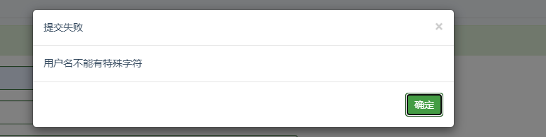
自定义alert 框title ,message 和ok 按钮
bootbox.alert({
                        title: '提交失败',
                        message: '用户名不能有特殊字符',
                        buttons: {
                            ok:{
                                label: '确定',
                                className:'btn-success'
                            }
                        }
                    })
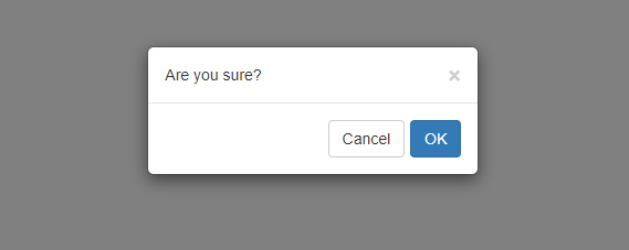
confirm 使用
确认对话框,callback回调通过result判断,result是布尔值
bootbox.confirm({
    size: "small",
    message: "Are you sure?",
    callback: function(result){
        /* result is a boolean; true = OK, false = Cancel*/
        if (result) {
            /* 点ok执行这里 */
            console.log("点ok后执行这里")
        }
        else {
            /* Cancel执行这里*/
        }
    }
})
设置buttons 按钮文字和颜色
bootbox.confirm({
    size: "small",
    title: "操作提示",
    message: "删除后不可恢复,确定删除?",
    buttons: {
        confirm: {
            label: '确定',
            className: 'btn-success'
        },
        cancel: {
            label: '取消',
            className: 'btn-danger'
        }
    },
    callback: function(result){
        /* result is a boolean; true = OK, false = Cancel*/
        if (result) {
            /* 点ok执行这里 */
            console.log("点ok后执行这里")
        }
        else {
            /* Cancel执行这里*/
        }
    }
})

Prompt 使用
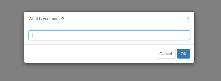
prompt()对话框 的最简单用法需要您希望显示的消息文本和用于处理用户输入的回调。如果用户取消或关闭对话框,则输入的值将为null;否则,将传递文本输入的值。
bootbox.prompt("What is your name?", function(result){
    /* your callback code */
})
value是输入框初始值,inputType是设置输入框类型,默认text文本类似
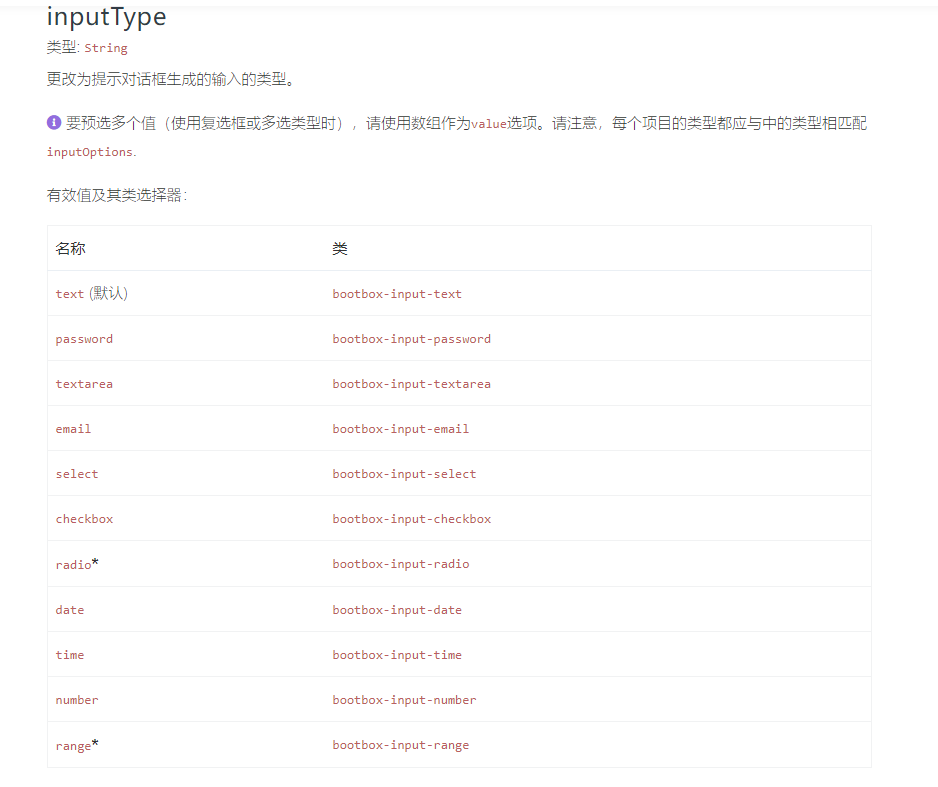
    bootbox.prompt({
        size: "small",
        title: "输入用户名",
        value: "yoyo",  // 初始值
        inputType: "text",  //默认text
        buttons: {
            confirm: {
                label: '确定',
                className: 'btn-success'
            },
            cancel: {
                    label: '取消',
                    className: 'btn-danger'
                }
            },
        callback: function(result) {
                /* result is a boolean; true = OK, false = Cancel*/
                if (result) {
                    /* 点ok执行这里 */
                    console.log("点ok后执行这里")
                }
                else {
                    /* Cancel执行这里*/
                }
            }

    })

dialog 自定义
dialog 自定义对话框
bootbox.dialog({
    title: 'Custom Dialog Example',
    message: '<p>This dialog demonstrates many of the options available when using the Bootbox library</p>',
    size: 'large',
    onEscape: true,
    backdrop: true,


    buttons: {
        fee: {
            label: 'Fee',
            className: 'btn-primary',
            callback: function(){

            }
        },
        fi: {
            label: 'Fi',
            className: 'btn-info',
            callback: function(){

            }
        },
        fo: {
            label: 'Fo',
            className: 'btn-success',
            callback: function(){

            }
        },
        fum: {
            label: 'Fum',
            className: 'btn-danger',
            callback: function(){

            }
        }
    }
})

options选项参数
message:警报,确认和自定义对话框所必需
类型: String | Element
文字(或标记) 显示在对话框中
title:设置标题
类型: String | Element
在对话框中添加标题并放置此文本(或标记)中的
元素。
callback:确认和提示所需,不要求自定义对话框
类型: Function
警报回调不应提供参数。如果这样做,它将被忽略
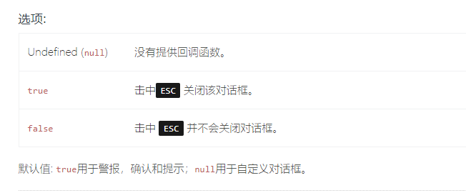
onEscape
类型: Boolean | Function
允许用户点击来关闭对话框ESC,这将调用此功能。
show
类型: Boolean
是否应立即显示对话框。
默认: true
backdrop
类型: Boolean
对话框是否应该有背景。还确定在背景上单击是否消除模态。

closeButton
类型: Boolean
对话框是否应具有关闭按钮(x) 或不。
默认: true
animate
类型: Boolean
对对话框进行动画处理(需要支持CSS动画的浏览器)。
默认: true
className
类型: String
应用于对话框包装的附加类。
默认: null
size
类型: String
将相关的Bootstrap模态大小类添加到对话框包装器。有效值为:small('sm'),large(lg),extra-large('xl')
需要Bootstrap 3.1.0或更高版本。特大号需要Bootstrap 4.2.0或更高版本。
locale*
类型: String
设置每个对话框要使用的语言环境-此选项不会覆盖默认语言环境。其他对话框仍将使用默认语言环境。
语言环境设置用于转换三个标准按钮标签: OK, CONFIRM, CANCEL
buttons
类型: Object
按钮定义为JavaScript对象。
按钮对象的完整定义是:
buttonName : {
    label: 'Your button text',
    className: 'some-class',
    callback: function() {
    }
}
swapButtonOrder*
类型: Boolean
默认: false
centerVertical*
类型: Boolean
如果为true, the ,则以模式对话框为中心的 类将添加到对话框包装器中。
需要Bootstrap 4.1.0或更高版本。.
默认: false
scrollable
类型: Boolean
如果为true,则modal-dialog-scrollable 类将添加到对话框包装器中。启用此选项可使长模态的内容自动滚动。
需要Bootstrap 4.3.0或更高版本。.
默认: false