睡了13个小时,发烧终于退了,持续2周的感冒看起来终于好了点,这一周一直在看perspective的一些资料,写一个3D跑马灯的效果。

个人感觉主要就是理解视角的概念,也就是perspective和perspective-origin这2个 属性,其他都比较简单。
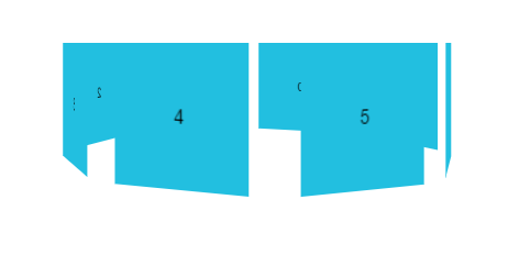
<!doctype html>
<html>
<head>
<meta charset="utf-8">
<title>3D跑马灯</title>
<meta name="viewport" content="width=device-width, initial-scale=1.0, minimum-scale=1.0, maximum-scale=1.0, user-scalable=no">
<meta name="format-detection" content="telephone=no">
<meta name="apple-mobile-web-app-capable" content="yes">
<meta name="apple-mobile-web-app-status-bar-style" content="black">
<style>
/*css reset*/
html{font-family:"Helvetica Neue",Helvetica,STHeiTi,sans-serif;-webkit-text-size-adjust:100%;-moz-text-size-adjust:100%;-ms-text-size-adjust:100%;}
body{-webkit-overflow-scrolling:touch;margin:0;}
ul{margin:0;padding:0;list-style:none;outline:none;}
dl,dd{margin:0;}
a{display:inline-block;margin:0;padding:0;text-decoration:none;background:transparent;outline:none;color:#000;}
a:link,a:visited,a:hover,a:active{text-decoration:none;color:currentColor;}
a,dt,dd{-webkit-touch-callout:none;-webkit-tap-highlight-color:transparent;}
img{border:0;}
p{margin:0;}
input,button,select,textarea{margin:0;padding:0;border:0;outline:0;background-color:transparent;}

/*css*/
body {
    height: 100vh;
    text-align: center;
}
.stage {
    position: relative;
    display: inline-block;
    margin: 0 auto;
    padding: 40px 0;
    max-width: 750px;
    perspective: 600px;
}
.stage .container {
    position: absolute;
    width: 100px;
    height: 100px;
    transform-style: preserve-3d;
}

.stage .container .list {
    position: absolute;
    width: 100px;
    height: 100px;
    font-size: 14px;
    text-align: center;
    line-height: 100px;
    /*backface-visibility:hidden;*/
    background-color: #22bfe0;
}
</style>
</head>
<body>
<div class="stage">
    <ul id="container" class="container">
    </ul>
</div>
<script>
    var doc = document,
        fragment = doc.createDocumentFragment(),
        $ = function(node) {
            return doc.querySelector(node);
        };

    var listArr = [0, 1, 2, 3, 4, 5, 6, 7],
        length = listArr.length,
        averRotate = 360 / length,
        averTransZ = 60 / Math.tan((averRotate / 2 / 180) * Math.PI);

    listArr.forEach(function(i) {
        var node = doc.createElement('li');
        node.setAttribute('id', 'list' + i);
        node.setAttribute('class', 'list');
        node.innerHTML = i;
        fragment.appendChild(node);
    });
    $('.container').appendChild(fragment);

    listArr.forEach(function(i) {
        $('#list' + i).style.transform = 'rotateY(' + i * averRotate + 'deg) translateZ(' + (averTransZ + 20) +'px)';
    });

    var index = 0;
    setInterval(function() {
        $('#container').style.transform = 'rotateY(' + ++index + 'deg)';
    }, 1000 / 60)
</script>
</body>
</html>