随手练习了几个loading样式,以后看到有意思的loading样式也会补充上。样式的兼容性建议还是去w3c上看下属性的兼容性,至少我习惯这么多,当然,w3c中文网貌似很久很久没更新过了,可能更好的还是去google下。
我给出的代码一般会把浏览器前缀样式给省略,因为像动画的关键帧这样的需要前缀的属性会使贴出来的代码很长。
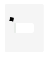
下面给出示意图和代码:
(1)两个小球:


 1 <!doctype html>
 2 <head>
 3 <title>两个小球</title>
 4 <style>
 5     .loading-area {
 6         position: fixed;
 7         top: 50%;
 8         left: 50%;
 9         margin: -50px 0 0 -40px;
10         width: 80px;
11         height: 100px;
12         text-align: center;
13         border-radius: 4px;
14         background-color: rgba(0, 0, 0, .04);
15     }
16
17     .icon-ball:before, .icon-ball:after {
18         content: '';
19         position: absolute;
20         display: inline-block;
21         top: 20px;
22         left: 50%;
23         margin-left: -7px;
24         width: 14px;
25         height: 14px;
26         border: 1px solid #999;
27         border-radius: 50%;
28         box-sizing: border-box;
29         background-color: #999;
30         /*-webkit-animation: loading 1.8s linear alternate infinite;*/
31         animation: loading 1.8s linear alternate infinite;
32     }
33
34     .icon-ball:after {
35         top: 70px;
36         animation-name: another-loading;
37         border-color: rgba(0, 0, 0, .04);
38         background-color: rgba(0, 0, 0, .08);
39     }
40
41     @keyframes loading {
42         0% {top: 20px;}
43         100% {top: 70px;}
44     }
45
46     @keyframes another-loading {
47         0% {top: 70px;}
48         100% {top: 20px;}
49     }
50 </style>
51 </head>
52 <body>
53 <div class="loading-area icon-ball">
54 </div>
55 </body>
56 </html>
(2)时钟:


<!doctype html>
<head>
<title>时钟</title>
<style>
    .loading-area {
        position: fixed;
        top: 50%;
        left: 50%;
        margin: -50px 0 0 -40px;
        width: 80px;
        height: 100px;
        border-radius: 4px;
        background-color: rgba(0, 0, 0, .04);
    }

    .icon-timer {
        position: absolute;
        top: 50%;
        left: 50%;
        margin: -15px 0 0 -15px;
        width: 30px;
        height: 30px;
        border-radius: 50%;
        background-color: #fff;
    }

    .icon-timer:before, .icon-timer:after {
        content: '';
        display: inline-block;
        position: absolute;
        bottom: 50%;
        left: 50%;
        margin-left: -1px;
        width: 2px;
        height: 8px;
        background-color: #333;
        -webkit-transform-origin: 50% 100%;
        -ms-transform-origin: 50% 100%;
        transform-origin: 50% 100%;
        /*transform-origin: center bottom;*/
    }
    .icon-timer:before {
        /*-webkit-animation: hourhand 24s linear infinite;*/
        animation: hourhand 24s linear infinite;
    }

    .icon-timer:after {
        height: 12px;
        /*-webkit-animation: minutehand 2s linear infinite;*/
        animation: minutehand 2s linear infinite;
    }

    @keyframes hourhand {
        0% {transform: rotate(0deg)}
        100% {transform: rotate(360deg);}
    }

    @keyframes minutehand {
        0% {transform: rotate(0deg)}
        100% {transform: rotate(360deg);}
    }
</style>
</head>
<body>
<div class="loading-area">
    <i class="icon-timer"></i>
</div>
</body>
</html>
(3)、充电
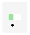
<!doctype html>
<head>
<title>充电</title>
<style>
    .loading-area {
        position: fixed;
        top: 50%;
        left: 50%;
        margin: -50px 0 0 -40px;
        width: 80px;
        height: 100px;
        border-radius: 4px;
        background-color: rgba(0, 0, 0, .04);
    }

    .icon-charge {
        position: absolute;
        top: 50%;
        left: 50%;
        margin: -10px 0 0 -20px;
        width: 40px;
        height: 20px;
        /*border: 1px solid #333;*/
        border-radius: 4px;
        background-color: #fff;
    }

    .icon-charge:after {
        content: '';
        display: inline-block;
        position: absolute;
        top: 0;
        left: 0;
        width: 0;
        height: 20px;
        border-radius: 4px;
        background-color: #ddd;
        /*-webkit-animation: charge 2s linear alternate infinite;*/
        animation: charge 2s linear alternate infinite;
    }

    @keyframes charge {
        0% {width: 0;}
        100% {width: 40px; background-color: #3dec3a;}
    }

    .icon-charge:before {
        content: '';
        position: absolute;
        top: -12px;
        left: -12px;
        width: 8px;
        height: 8px;
        background-color: #000;
        animation: move 8s ease infinite;
    }

    @keyframes move {
        0% {top: -12px; left: -12px; transform: rotate(0deg); border-radius: 0;}
        25% {top: -12px; left: 52px; transform: rotate(360deg); border-radius: 50%;}
        50% {top: 32px; left: 52px; transform: rotate(0deg); border-radius: 0;}
        75% {top: 32px; left: -12px; transform: rotate(360deg); border-radius: 50%;}
        100% {top: -12px; left: -12px; transform: rotate(0deg); border-radius: 0;}
    }
</style>
</head>
<body>
<div class="loading-area">
    <i class="icon-charge"></i>
</div>
</body>
</html>