一、css概述
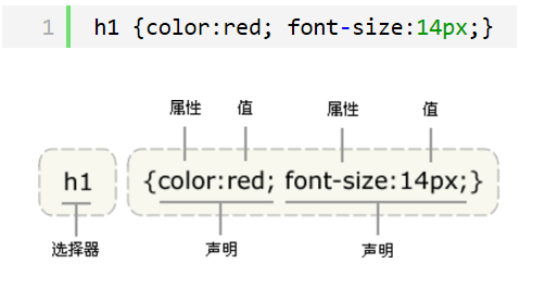
CSS是Cascading Style Sheets的简称,中文称为层叠样式表,对html标签的渲染和布局
CSS 规则由两个主要的部分构成:选择器,以及一条或多条声明。
二、css的四种引入方式
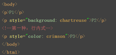
1.行内式
行内式是在标记的style属性中设定CSS样式。这种方式没有体现出CSS的优势,不推荐使用。
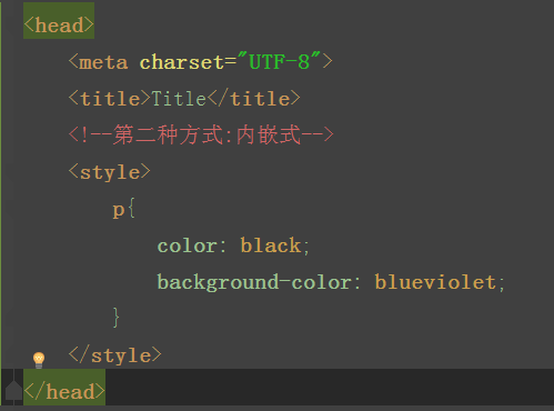
2.内嵌式
嵌入式是将CSS样式集中写在网页的<head></head>标签对的<style></style>标签对中。格式如下:
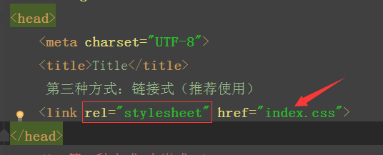
3.链接式
建一个index.css的文件,存放样式
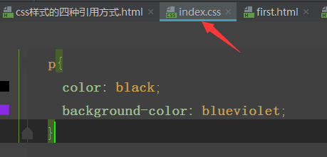
在主页面中吧index.css引入
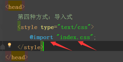
4.导入式
将一个独立的.css文件引入HTML文件中,导入式使用CSS规则引入外部CSS文件,<style>标记也是写在<head>标记中,使用的语法如下:
注意啦:
导入式会在整个网页装载完后再装载CSS文件,因此这就导致了一个问题,如果网页比较大则会儿出现先显示无样式的页面,闪烁一下之后,再出现网页的样式。这是导入式固有的一个缺陷。使用链接式时与导入式不同的是它会以网页文件主体装载前装载CSS文件,因此显示出来的网页从一开始就是带样式的效果的,它不会像导入式那样先显示无样式的网页,然后再显示有样式的网页,这是链接式的优点。
所以还是推荐用链接式。。。。。。。。。。。
三、css的选择器
注意嵌套规则:
- 块级元素可以包含内联元素或某些块级元素,但内联元素不能包含块级元素,它只能包含其它内联元素。
- 有几个特殊的块级元素只能包含内联元素,不能包含块级元素。如h1,h2,h3,h4,h5,h6,p,dt
- li内可以包含div
- 块级元素与块级元素并列、内联元素与内联元素并列。
1、基础选择器

实例:
注意:可以对块级标签设置长宽,不可以对内联标签设长宽(它只会根据他的文字大小来变)
2、组合选择器
- 后代选择器 (不分层级,只让p标签变色) .c2 p{color:red}
- 子代选择器(只在儿子层找) .c2>p{color:red}
- 多元素选择器:同时匹配所有指定的元素 div,p{color:red} 或.c2,.c3,.c4{color: red}
3、属性选择器
E[att] 匹配所有具有att属性的E元素,不考虑它的值。(注意:E在此处可以省略。比如“[cheacked]”。以下同。) p[title] { color:#f00; }
E[att=val] 匹配所有att属性等于“val”的E元素 div[class=”error”] { color:#f00; }
E[att~=val] 匹配所有att属性具有多个空格分隔的值、其中一个值等于“val”的E元素td[class~=”name”] { color:#f00; }
E[attr^=val] 匹配属性值以指定值开头的每个元素 div[class^="test"]{background:#ffff00;}
E[attr$=val] 匹配属性值以指定值结尾的每个元素 div[class$="test"]{background:#ffff00;}
E[attr*=val] 匹配属性值中包含指定值的每个元素 div[class*="test"]{background:#ffff00;}
/*1.匹配所有YL属性的,并且只是在div标签的*/
div[YL]{
    color: yellowgreen;
}


/*2.匹配所有YL=wawa的并且只是在div标签的*/
div[YL=wawa]{
        color: aqua;
    }


/*2.上面的优先级和下面的优先级本应该是一样的*/
/*应该显示下面的,但是,由于上面查找的范围比下面的范围广,所以它会把上面的也显示了。*/


/*3.匹配所有属性为YL,并且具有多个空格分割的值,*/
/*其中一个只等于wawa的*/
 div[YL~=wawa]{
            color: blueviolet;
        }

 /*4.匹配属性值以指定值开头的每个元素,并且是在div标签里的*/
div[YL^=w]{
            background-color: aquamarine;
        }


/*5.匹配属性值以指定值结尾的每个元素  */
div[YL$=a]{
            background-color: blueviolet;
        }

/*6.匹配属性值中包含指定值的每个元素 */
div[YL*=a]{
            background-color: blueviolet;
        }
4、伪类选择器
anchor 伪类:专用于控制链接的显示效果
伪类指的是标签的不同状态:
a:link {color: #FF0000} /* 未访问的链接 */ (没有接触过的链接),用于定义了链接的常规状态。
a:visited {color: #00FF00} /* 已访问的链接 */ (访问过的链接),用于阅读文章,能清楚的判断已经访问过的链接。
a:hover {color: #FF00FF} /* 鼠标移动到链接上 */ (鼠标放在链接上的状态),用于产生视觉效果。
a:active {color: #0000FF} /* 选定的链接 */ (在链接上按下鼠标时的状态),用于表现鼠标按下时的链接状态。
格式: 标签:伪类名称{ css代码; }
注意: a:hover 必须在 a:link 和 a:visited 之后,需要严格按顺序才能看到效果。
注意: a:active 必须在 a:hover 之后。
before after 伪类
:before p:before 在每个<p>元素之前插入内容
:after p:after 在每个<p>元素之后插入内容
例:p:before{content:"hello";color:red;display: block;}
优先级:
1. ID选择器 属性选择器 class选择器 标签选择器
2. 相同选择器:后来者居上
3. !important(最高)
三、css之属性操作
1、文本颜色
颜色属性被用来设置文字的颜色。
颜色是通过CSS最经常的指定:
- 十六进制值 - 如: #FF0000
- 一个RGB值 - 如: RGB(255,0,0)
- 颜色的名称 - 如: red
2、水平对齐方式
text-align 属性规定元素中的文本的水平对齐方式。
- left 把文本排列到左边。默认值:由浏览器决定。
- right 把文本排列到右边。
- center 把文本排列到中间。
- justify 实现两端对齐文本效果。
3、文本其他操作
- font-size: 10px;
- line-height: 200px; 文本行高 通俗的讲,文字高度加上文字上下的空白区域的高度 50%:基于字体大小的百分比
- vertical-align:-4px 设置元素内容的垂直对齐方式 ,只对行内元素有效,对块级元素无效
- text-decoration:none text-decoration 属性用来设置或删除文本的装饰。主要是用来删除链接的下划线
- font-family: 'Lucida Bright' 设置字体
- font-weight: lighter/bold/border/
- font-style: oblique
- text-indent: 150px; 首行缩进150px
- letter-spacing: 10px; 字母间距
- word-spacing: 20px; 单词间距
- text-transform: capitalize/uppercase/lowercase ; 文本转换,用于所有字句变成大写或小写字母,或每个单词的首字母大写
4、背景属性
- background-color
- background-image
- background-repeat
- background-position
background-color: cornflowerblue

background-image: url('1.jpg');

background-repeat: no-repeat;(repeat:平铺满)

background-position: right top(20px 20px);
6、外边距(margin)和内边距(padding)
- margin: 用于控制元素与元素之间的距离;margin的最基本用途就是控制元素周围空间的间隔,从视觉角度上达到相互隔开的目的。
- padding: 用于控制内容与边框之间的距离;
- Border(边框): 围绕在内边距和内容外的边框。
- Content(内容): 盒子的内容,显示文本和图像。
margin(外边距):
- margin-top:100px;
- margin-bottom:100px;
- margin-right:50px;
- margin-left:50px;
margin:10px 20px 20px 10px;
        上边距为10px
        右边距为20px
        下边距为20px
        左边距为10px


margin:10px 20px 10px;
        上边距为10px
        左右边距为20px
        下边距为10px


margin:10px 20px;
        上下边距为10px
        左右边距为20px


margin:25px;
        所有的4个边距都是25px
居中属性:margin: 0 auto;
padding(内边距):
单独使用填充属性可以改变上下左右的填充。缩写填充属性也可以使用,一旦改变一切都改变。
设置同margine;
思考1:body的外边距
边框在默认情况下会定位于浏览器窗口的左上角,但是并没有紧贴着浏览器的窗口的边框,这是因为body本身也是一个盒子(外层还有html),在默认情况下, body距离html会有若干像素的margin,具体数值因各个浏览器不尽相同,所以body中的盒子不会紧贴浏览器窗口的边框了,为了验证这一点,加上:
body{
    border: 1px solid;
    background-color: cadetblue;
}
解决:
body{
    margin: 0;
}
7、float属性
布局关键点:如何能够让可以调节长度的元素(标签)在一行显示
如果上一个是浮动的,那么就紧贴这
如果上一个不是浮动的,那么就保持垂直距离不变
基本浮动规则:
先来了解一下block元素和inline元素在文档流中的排列方式。
block元素通常被现实为独立的一块,独占一行,多个block元素会各自新起一行,默认block元素宽度自动填满其父元素宽度。block元素可以设置width、height、margin、padding属性;
inline元素不会独占一行,多个相邻的行内元素会排列在同一行里,直到一行排列不下,才会新换一行,其宽度随元素的内容而变化。inline元素设置width、height属性无效
- 常见的块级元素有 div、form、table、p、pre、h1~h5、dl、ol、ul 等。
- 常见的内联元素有span、a、strong、em、label、input、select、textarea、img、br等
所谓的文档流,指的是元素排版布局过程中,元素会自动从左往右,从上往下的流式排列。
脱离文档流,也就是将元素从普通的布局排版中拿走,其他盒子在定位的时候,会当做脱离文档流的元素不存在而进行定位。
假如某个div元素A是浮动的,如果A元素上一个元素也是浮动的,那么A元素会跟随在上一个元素的后边(如果一行放不下这两个元素,那么A元素会被挤到下一行);如果A元素上一个元素是标准流中的元素,那么A的相对垂直位置不会改变,也就是说A的顶部总是和上一个元素的底部对齐。此外,浮动的框之后的block元素元素会认为这个框不存在,但其中的文本依然会为这个元素让出位置。 浮动的框之后的inline元素,会为这个框空出位置,然后按顺序排列。
8、边框属性
border :1px soild red;
deshed:虚线
只加有一个方向的:border-right :1px soild red;
9、列表属性
去掉列表前面的标志:ul li{list-style:none;}
去掉列表前面的空格:ul{padding:0}
上面两行也可写成下面一行
去掉盒子上面的间隙:*{margin:0; padding :0;}
<!DOCTYPE html>
<html lang="en">
<head>
    <meta charset="UTF-8">
    <title>Title</title>
    <style>
        ul li{
            font-family: 华文中宋;
            list-style: none; //去掉点
            /*list-style: circle;//空心圆*/
            /*list-style: disc;//实心圆(默认也是实心圆)*/  square实心小方块
        }
        ul{
            padding: 0; //把字体移到前面

        }
    </style>
</head>
<body>
<div>
    <ul>
        <li>第一章</li>
        <li>第二章</li>
        <li>第三章</li>
        <li>第四章</li>
    </ul>
</div>
</body>
</html>
10、display属性
属性:
1、将块级标签设置成内联标签:disply:inline;
2、将内联标签设置成块级标签:disply:block;
3、内联块级标签:像块级一样可设长宽,也可像内联一样在一行显示:display:inline-block;
4、display:none; 把不想让用户看到的给隐藏了(很重要的一个属性)
5、visibility :hidden; 也是隐藏
注意与visibility:hidden的区别:
visibility:hidden:可以隐藏某个元素,但隐藏的元素仍需占用与未隐藏之前一样的空间。也就是说,该元素虽然被隐藏了,但仍然会影响布局。
display:none:可以隐藏某个元素,且隐藏的元素不会占用任何空间。也就是说,该元素不但被隐藏了,而且该元素原本占用的空间也会从页面布局中消失
<!DOCTYPE html>
<html lang="en">
<head>
    <meta charset="UTF-8">
    <title>Title</title>
    <style>
        .c1{
            width: 100px;
            height:100px;
            background-color: rebeccapurple;
        }
        .c2{
            width: 100px;
            height:100px;
            background-color: burlywood;
        }
        .c3{
            width: 100px;
            height:100px;
            background-color: crimson;
            display: inline;
        }
        .c4{
            width: 100px;
            height:100px;
            background-color: gray;
        }
        .s1{
             display: block;
            width: 200px;
            height: 200px;
            background-color: royalblue;
            /*visibility: hidden;*/  //隐藏了其他的不会顶上去
            display:none; //隐藏了其他的会顶上去

        }
    </style>
</head>
<body>
<div class="c4">div</div>
<span class="s1">span</span>
<div class="c1">年后</div>
<div class="c2">年后</div>
<div class="c3">年后</div>
</body>
</html>
11、边距的塌陷问题
a、兄弟div:
上面div的margin-bottom和下面div的margin-top会塌陷,也就是会取上下两者margin里最大值作为显示值
b、父子div:
如果父级div中没有border,padding,inline content,子级div的margin会一直向上找,直到找到某个标签包括border,padding,inline content中的其中一个,然后按此div 进行margin;
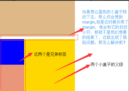
解决方法:
这两种会改变结构
1.加上padding
2.加上border
不改变结构
3.overflow:hidden
栗子:
<!DOCTYPE html>
<html lang="en">
<head>
    <meta charset="UTF-8">
    <title>Title</title>
    <style>
        body{
            margin: 0;
        }
        .outer{
            background-color: gold;
            width: 300px;
            height: 300px;
            /*第一种解决方法:但是改变了结构padding: 10px;*/
            /*第二种方法:加个border*/ /*border: 1px solid;*/
           /*第三种方法*/
            overflow: hidden;
        }
        .box1{
            width: 100px;
            height: 100px;
            background-color: blue;
             /*如果父级标签什么都没有,那么就会找叔叔的*/
            margin-top:10px;

        }
        .box2{
            width: 100px;
            height: 100px;
            background-color: darksalmon;
            /*如果这样的话就合适呢,对着就下去了*/
            margin-top: 10px;
        }

    </style>
</head>
<body>
<div style="background-color: burlywood; 300px; height
:300px"></div>
<div class="outer">
    <div class="box1"></div>
    <div class="box2"></div>
</div>
</body>
</html>
效果图:

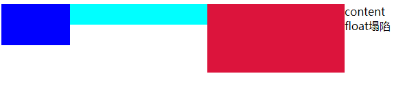
12、float父级的塌陷问题
clear语法:
clear:none | left | right | both
1.clear:left 清除的是左边的浮动
2.clear:both :保证左右两边都没有浮动
注意:
排序的时候是一个标签一个标签的排
如果上一个是浮动的,就紧贴个上一个
如果上一个不是浮动的,就和上一个保持垂直不变
float它不是完全脱离,它是半脱离的。像是文字环绕的就是用float实现的。float是不覆盖文字的半脱离的,吧文字给挤过去了。
#float 塌陷
<!DOCTYPE html>
<html lang="en">
<head>
    <meta charset="UTF-8">
    <title>Title</title>
    <style>
        .c1{
            width: 100px;
            height: 60px;
            background-color: blue;
            float: left;
        }
        .c2{
            width: 200px;
            height: 30px;
            background-color: aqua;
            float: left;
        }
         .c3{
            width: 200px;
            height: 100px;
            background-color: crimson;
             float: left;
        }

    </style>
</head>
<body>
<div class="c1"></div>
<div class="c2"></div>
<div class="c3"></div>

<div class="content">
    content
</div>
</body>
</html>
解决方案:
1.<div style='clear:both'></div>也可以不加div
2.用after
.header:after{
content:""; #内容为空
display:block; #块级标签
clear:both; #清楚浮动的功能
}
约定的名字:clearfix
.clearfix:after{
content:""; #内容为空
display:block; #块级标签
clear:both; #清除浮动的功能(可以做到一个自动切换的功能)
}
#解决
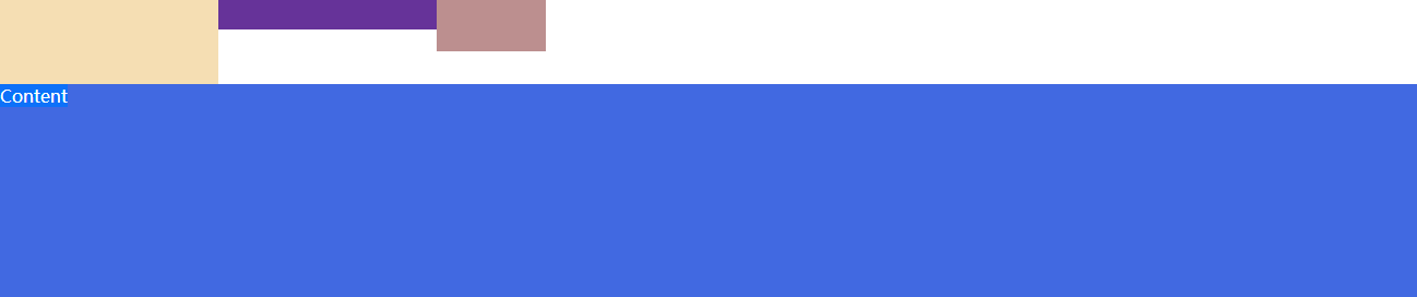
<!DOCTYPE html> <html lang="en"> <head> <meta charset="UTF-8"> <title>Title</title> <style> *{ margin: 0; padding: 0; } .box1{ width: 200px; height: 80px; background-color: wheat; float: left; } .box2{ width: 200px; height: 30px; background-color: rebeccapurple; float: left; } .box3{ width: 100px; height: 50px; background-color: rosybrown; float: left; } .content{ width: 100%; height: 200px; background-color: royalblue; } .clearfix:after{ content: ""; display: block; clear: both; } </style> </head> <body> <div class="clearfix"> <div class="box1"></div> <div class="box2"></div> <div class="box3"></div> </div> <div class="content"> Content </div> </body> </html>
效果图:
13、position属性
position的四种属性
1.static:默认位置
2.fixed:完全脱离文档流,固定定位(以可视窗口为参照物)
3.relative:相对定位(参照的是自己本身的位置),没有脱离文档流,没有顶上去,会保持自己的位置不动。可以使用top left 进行定位
4.absolute:绝对定位:脱离了文档流(参照的是按已定位的父级标签定位,如果找不到会按body的去找)
注意:将定位标签设置为absolute,将他的父级标签设置为定位标签 (relative)
field举例(做一个返回顶部的样式。不管你拉不拉滚动条,他都会固定位置不变给它加一个)
#固定位置:返回顶部按钮

<!DOCTYPE html>
<html lang="en">
<head>
    <meta charset="UTF-8">
    <title>固定位置</title>

    <style>
        .c1{
            background-color: limegreen;
            width:100%;
            height: 1500px;
        }
        .returntop{
            width: 100px;
            height: 40px;
            background-color: gray;
            /*透明度*/
            /*opacity: 0.4;*/
            color: white;
            text-align: center;
            line-height: 40px;
            position: fixed;
            bottom:50px;
            right: 20px;
        }
    </style>
</head>
<body>
<div class="c1"></div>
<div class="returntop">返回顶部>></div>


</body>
</html>
相对位置与绝对位置的栗子:
===============
一开始父级没有定位、
<!DOCTYPE html>
<html lang="en">
<head>
    <meta charset="UTF-8">
    <title>绝对定位</title>
    <style>
        *{
            margin: 0;
        }
        .box1 ,.box2,.box3{
            width: 200px;
            height: 200px;
        }
        .box1{
            background-color: blueviolet;  position: relative;

        }
        .box2{
            background-color: darksalmon;
            position: relative;
            /*position: absolute;*/
            left: 200px;
            /*right: 200px;*/
            top: 200px;
        }
        .box3{
            background-color: lime;
        }
    </style>
</head>
<body>
<div class="box1">1</div>
<div class="box2">2</div>
<div class="box3">3</div>
</body>
</html>
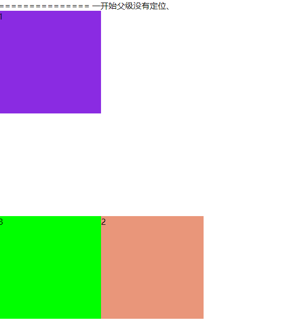
<!--父级有了定位-->
<!--================-->
<!DOCTYPE html>
<html lang="en">
<head>
    <meta charset="UTF-8">
    <title>绝对定位</title>
    <style>
        .father{
            position: relative;
        }

        .box1 ,.box2,.box3{
            width: 200px;
            height: 200px;
        }
        .box1{
            background-color: blueviolet;  position: relative;

        }
        .box2{
            background-color: darksalmon;
            /*position: relative;*/
            position: absolute;
            left: 200px;
            /*right: 200px;*/
            top: 200px;
        }
        .box3{
            background-color: lime;
            position: absolute;
        }
    </style>
</head>
<body>
  <div class="box1">1</div>
  <div class="father">
     <div class="box2">2</div>
  </div>
  <div class="box3">3</div>
</body>
</html>

float和position的区别:
float:半脱离文档流
position:全脱离文档流
14、z-index 属性
设置元素的堆叠顺序。拥有更高堆叠顺序的元素总是会处于堆叠顺序较低的元素的前面。