<style>
.child{800px;height:300px; margin: 0 auto;
background-color: red}
</style>
<div class="child">222</div>
浮动布局:
dom文档
<div class="container">
        <div class="wrap clearfix">
            <div class="box1"></div>
            <div class="box2"></div>
        </div>
 </div>
1:
固定布局:
实现如图
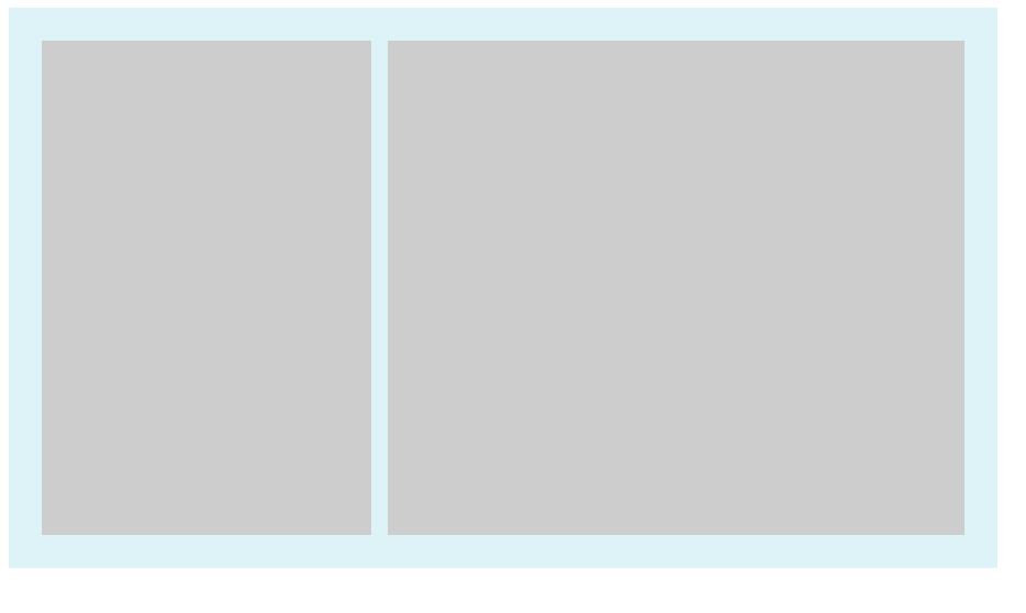
样式:
<style>
.container{
    width: 600px;
    background-color: #DDF3F7;
}
.wrap{
    padding:20px;
    overflow: hidden;
}
.box1{
     float: left;
     width: 200px;
     height:300px;
     background-color: #ccc;
}
.box2{
     float: right;
     width: 350px;
     height:300px;
     background-color: #ccc;
}

.clearfix:after{
    clear: both;
    display:table;

}
</style>
关键点:box1 和box2设置固定width,浮动,
2:流体布局
<style>
.container{
    width: 600px;
    background-color: #DDF3F7;
}
.wrap{
    padding:20px;
    overflow: hidden;
}
.box1{
     float: left;
     width: 200px;
     height:300px;
     background-color: #ccc;
}
.box2{

     margin-left:220px;
     height:300px;
     background-color: #ccc;
}

.clearfix:after{
    clear: both;
    display:table;

}
 .clearfix{
     *zoom:1;
 }

</style>
和固定布局对比:
box1 float left 设置width
box2: marign-left 为box1.width (效果和固定效果一样,不截图了)
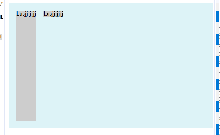
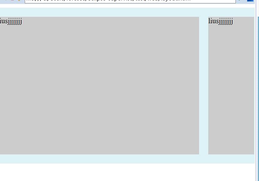
3:浮动与两侧皆自适应的流体布局
样式
<style>
.container{
    width: 600px;
    background-color: #DDF3F7;
}
.wrap{
    padding:20px;
    overflow: hidden;
}
.box1{
     float: left;
     margin-right:20px;
     height:300px;
     background-color: #ccc;
}
.box2{
     display:table-cell;
     width:auto;
     height:300px;
     background-color: #ccc;
}

.clearfix:after{
    content:'';
    clear: both;
    display:table;

}
 .clearfix{
     *zoom:1;
 }

</style>
注意点:1、box1 float left
2、margin-right:某px;
box2 width auto, display:table-cell;
3、 box1和box2 必须有内容。
效果如图
4.右浮动,改变dom位置的流体布局:
样式:
<style>
.container{
    width: 600px;
    background-color: #DDF3F7;
}
.wrap{
    padding:20px;
    overflow: hidden;
}
.box1{
     float: right;
     width:100px;
     height:300px;
     background-color: #ccc;
}
.box2{
     margin-right:120px;
     height:300px;
     background-color: #ccc;
}

.clearfix:after{
    content:'';
    clear: both;
    display:table;

}
 .clearfix{
     *zoom:1;
 }

</style>
box1设置width float right
box2 margin-right:box1.width;
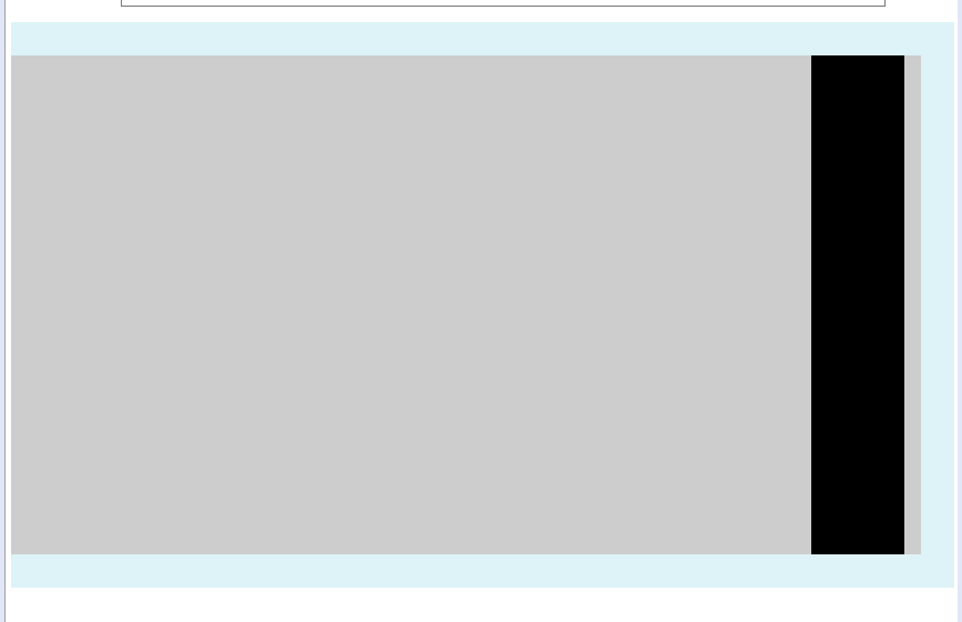
5.左浮动,不改变dom位置的流体布局写法
样式
<style>
.container{
    width: 600px;
    background-color: #DDF3F7;
}
.wrap{
    padding:20px;
    overflow: hidden;
}
.box1{

     width: 100%;
     float:left;
     height: 300px;
     background-color: #ccc;
}
.box2{

     width: 56px;
     float:left;
     margin-left:-56px;
     height:300px;
     background-color: #000;
}

.clearfix:after{
    content:'';
    clear: both;
    display:table;

}
 .clearfix{
     *zoom:1;
 }

</style>
关键点:box1 width 100% float left
box2 float left width 某px margin-leftf 某px
如下图
弹性布局
对于下面html
<div>
        <p>榴莲披萨榴莲披萨榴莲披萨榴莲披萨榴莲披萨榴莲披萨榴莲披萨榴莲披萨榴莲披萨榴莲披萨榴莲披萨榴莲披萨</p>
        <p>榴莲披萨榴莲披萨榴莲披萨榴莲披萨榴莲披萨榴莲披萨榴莲披萨榴莲披萨榴莲披萨榴莲披萨榴莲披萨榴莲披萨</p>
        <p>榴莲披萨榴莲披萨榴莲披萨榴莲披萨榴莲披萨榴莲披萨榴莲披萨榴莲披萨榴莲披萨榴莲披萨榴莲披萨榴莲披萨</p>
</div>
一个div 加三个p的块级元素
加些基本样式
p{
    150px;
    border:3px solid lightblue;
    background:lightgreen;
    padding:5px;
    margin:5px;
}
显示如下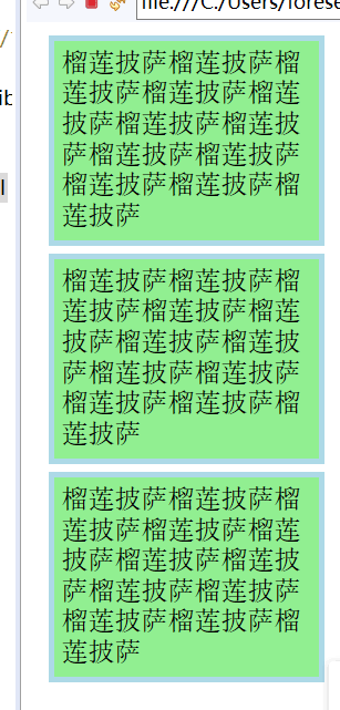
给外层div加个样式就变成
div{
    display:-webkit-box;
    display:flex;
}

现在每一个p元素都变成一个box了
这种弹性布局还能
justify-content:flex-end 类似的 对齐方式样式 不详述。
补充:
使用flex九宫格布局:
<div class="parent">
	<div class="row">
	    <div class="item"></div>
	    <div class="item"></div>
	    <div class="item"></div>
	</div>
	<div class="row">
	    <div class="item"></div>
	    <div class="item"></div>
	    <div class="item"></div>
	</div>
	<div class="row">
	    <div class="item"></div>
	    <div class="item"></div>
	    <div class="item"></div>
	</div>
</div>
样式:
.parent{display: flex; flex-direction: column; 300px;}
.row{height: 100px; display: flex;border: 1px solid red;}
.item{ 100px; background-color: #ccc;border: 1px solid red;}
使用table九宫格布局:
样式
.parent{display: table; table-layout: fixed;  100%;}
.row{display: table-row;}
.item{display: table-cell;  33.3%; height: 200px; border: 1px solid red;}
结果截图

提供一种更加有效的方式来对一个容器中的条目进行排列、对齐和分配空白空间。
响应式布局:
布局特点:每个屏幕分辨率下面会有一个布局样式,即元素位置和大小都会变
设计方法:媒体查询加流式布局
通常使用 @media 媒体查询 和网格系统 (Grid System) 配合相对布局单位进行布局,实际上就是综合响应式、流动等上述技术通过 CSS 给单一网页不同设备返回不同样式的技术统称。
单列布局:(最常见的布局)
<style>
.child{800px;height:300px; margin: 0 auto;
background-color: red}
</style>
<div class="child">222</div>
下面用四种方法实现水平居中
1、
使用margin:0 auto来实现
.child{800px; margin: 0 auto;}
优势是 兼容性好,但是需要设置宽度。
2、
.child{display: table; margin: 0 auto;}
优势:不需要父容器parent,只需要对自身进行设置
3.
<style>
.child{width:800px;
       display: inline-block;
        background-color: red
      }
.parent{background-color: green;
        text-align: center;

       }
</style>
<div class="parent">2222
    <div class="child">22222222</div>
</div>
兼容性好,但是需要设置父子容器
4、利用绝对定位
<style>
.child{
        background-color: red;
        position: absolute;
        left: 50%;

      }
.parent{background-color: green;
       position: relative;

       }
</style>
<div class="parent">2222
    <div class="child">22222222</div>
</div>
5 flex布局也有两种方法 水平居中
a.父容器
display: flex; justify-content: center;
b.
 父容器display: flex
子容器中使用margin: 0 auto
<style>
.parent{background-color: green;
      display: flex; justify-content: center;
       }
.child{
        background-color: red;
        position: absolute;
        left: 50%;
        transform: translateX(-50%);}
      }

</style>
<div class="parent">2222
    <div class="child">22222222</div>
</div>
垂直居中
这里说的是子容器相对于父容器的上下垂直居中。
1 利用table table-cell实现
<style>
 .parent{display: table-cell;
         background-color: green;
         vertical-align: middle;
         height: 400px;

       }
.child{
        background-color: red;
       }

</style>
<div class="parent">2222
    <div class="child">22222222</div>
</div>
2 flex来实现
<style>
 .parent{
       background-color: green;
       display: flex;
       align-items: center;
       height: 50px;

       }
.child{
        background-color: red;
        }

</style>
<div class="parent">
    <div class="child">22222222</div>
</div>
3 绝对定位来实现
<style>
 .parent{
       background-color: green;
       position: relative;
       height:50px;

       }
.child{
        background-color: red;
        position: absolute;
        top: 50%;
        transform: translateY(-50%);
       }

</style>
<div class="parent">
    <div class="child">22222222</div>
</div>
多列等分布局
1、 flex实现
<style>
 .parent{
       background-color: green;
       display: flex;
       height: 80px;
       width: 160px;

       }
.column{
        background-color: red;
        flex: 1;
        }
 .column + .column{
   margin-left:15px;
 }

</style>
<div class="parent">
    <div class="column">1</div>
    <div class="column">2</div>
    <div class="column">3</div>
    <div class="column">4</div>
</div>
2、table实现
.parent{display: table; table-layout: fixed;  100%;}
.column{display: table-cell; padding-left: 20px;}
例子(padding间距没了?有点问题)
<style>
 .parent{
       background-color: green;
       display: table;
       table-layout:fixed;
       width: 100%;

       }
.column{
        background-color: red;
        display: table-cell;
        padding-left:20px;

        }

</style>
<div class="parent">
    <div class="column">1</div>
    <div class="column">2</div>
    <div class="column">3</div>
    <div class="column">4</div>
</div>
3、float + table
<style>
 .parent{
       background-color: green;
       height: 70px;
       width: 290px;

       }
.column{
        background-color: red;
        float: left;
        width: 25%;
        padding-left: 20px;
        box-sizing: border-box;

        }
</style>
<div class="parent">
    <div class="column">1</div>
    <div class="column">2</div>
    <div class="column">3</div>
    <div class="column">4</div>
</div>
水平且垂直居中
1.inline-block配合text-align加上table-cell配合vertical-align
<style>
.parent{
    background-color: green;
    display: table-cell;
    vertical-align:middle;
    text-align:center;
    width: 80px;
    height: 150px;
}
.child{
    display: inline-block;
    background-color: red;

}
</style>
<div class="parent">
     <div class="child">22222222</div>
</div>
2.absolute 配合 transform
<style>
.parent{
    background-color: green;
    position: relative;
    width: 80px;
    height: 150px;
}
.child{
    background-color: red;
    position: absolute;
    left: 50%;
    top: 50%;
    transform: translate(-50%,-50%);
}
</style>
<div class="parent">
     <div class="child">22222222</div>
</div>
全屏布局
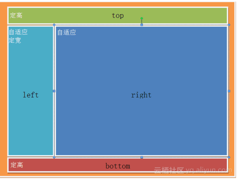
利用绝对定位实现
<style>
     html,body,.parent{height: 100%; overflow: hidden;}
    .top{position: absolute; top: 0; left: 0; right: 0; height: 0; background-color: black; height: 100px;}
    .left{position: absolute; top: 100px; left: 0;bottom: 50px; width: 200px; background-color: orange;}
    .right{position: absolute; top: 100px; left: 200px; right: 0; bottom: 50px; background-color: grey; overflow: hidden;}
    .bottom{position: absolute; left: 0; right: 0; bottom: 0; height: 50px; background-color: pink;}
</style>
<div class="top"></div>
<div class="left"></div>
<div class="right"></div>
<div class="bottom"></div>
用flex布局实现圣杯布局,左右两栏固定宽度,中间部分自适应。

<style>
 * {
         padding: 0;
         margin: 0;
     }
     html,body{
        width:100%;
        height:100%;
        overflow: hidden;
     }
     body{
        display: flex;
        flex-flow: column wrap;   /*排版方式从上到下排列。换行 */
     }
     header {
        background: red;
        /* 头、脚尺寸固定,不放大、不缩小 */
        flex:0 0 50px;
     }
     section {
        display: flex;
        flex-flow: row wrap;  /*排版方式从左到右排列。 换行 */
        flex: 1;
        background: green;
     }
     article {
        flex: 1;   /*flex:1指的是:中部区域自由伸缩*/
        order: 2;
        background: blue;
     }
     aside{
        order: 3;
        align-items: stretch; /*元素被拉伸以适应容器*/
        background:yellow;
     }
     footer {
        /* 头、脚尺寸固定,不放大、不缩小 */
        flex:0 0 50px;
        background: darkgoldenrod;
     }
</style>
<html>
    <body>
        <header>我是页眉</header>
        <section>
            <article>我是主内容</article>
            <nav>我是侧边栏</nav>
            <aside>我是右边栏</aside>
        </section>

        <footer>我是页脚</footer>
    </body>
</html>
差不多都在这了 ~ ^_^