前端常问的面试题,题目:假设高度一定,请写出三栏布局,左右宽度300px,中间自适应。
看到这里我希望你能停下来思考几分钟,
1分钟~2分钟~3分钟~4分钟~5分钟!
好了,那么你想出了几种答案呢?
下面提供这道题的五种解决方案:
首先要写好整个页面的布局(初始化等)
<style>
        html * {
            padding: 0;
            margin: 0;
        }

        .layout {
            margin-top: 20px;
        }

        .layout article div {
            min-height: 100px;
        }
    </style>
1.浮动的解决方案
<!-- 浮动布局解决方案 -->
    <section class="layout float">
        <style>
            .layout.float .left {
                float: left;
                width: 300px;
                background: red;
            }

            .layout.float .right {
                float: right;
                width: 300px;
                background: blue;
            }

            .layout.float .center {
                background: yellow;
            }
        </style>
        <article class="left-center-right">
            <div class="left"></div>
            <div class="right"></div>
            <div class="center">
                <h1>浮动解决方案</h1>
                <p>1.这是布局的中间部分</p>
                <p>2.这是布局的中间部分</p>
            </div>
        </article>
    </section>
2.绝对定位的解决方案
<!-- 绝对定位的解决方案 -->
    <section class="layout absolute">
        <style>
            .layout.absolute .left-center-right>div {
                position: absolute;
            }

            .layout.absolute .left {
                left: 0;
                width: 300px;
                background: red;
            }

            .layout.absolute .center {
                left: 300px;
                right: 300px;
                background: yellow;
            }

            .layout.absolute .right {
                right: 0;
                width: 300px;
                background: blue;
            }
        </style>
        <article class="left-center-right">
            <div class="left"></div>
            <div class="center">
                <h1>绝对定位的解决方案</h1>
                <p>1.这是布局的中间部分</p>
                <p>2.这是布局的中间部分</p>
            </div>
            <div class="right"></div>
        </article>
    </section>
3.flexbox的解决方案
<!-- flexbox解决方案 -->
    <section class="layout flexbox">
        <style>
            .layout.flexbox {
                margin-top: 140px;
            }

            .layout.flexbox .left-center-right {
                display: flex;
            }

            .layout.flexbox .left {
                width: 300px;
                background: red;
            }

            .layout.flexbox .center {
                flex: 1;
                background: yellow;
            }

            .layout.flexbox .right {
                width: 300px;
                background: blue;
            }
        </style>
        <article class="left-center-right">
            <div class="left"></div>
            <div class="center">
                <h1>flexbox的解决方案</h1>
                <p>1.这是布局的中间部分</p>
                <p>2.这是布局的中间部分</p>
            </div>
            <div class="right"></div>
        </article>
    <section/>
4.表格布局的解决方案
<!-- 表格布局的解决方案 -->
    <section class="layout table">
        <style>
            .layout.table .left-center-right {
                width: 100%;
                display: table;
                height: 100px;
            }

            .layout.table .left-center-right>div {
                display: table-cell;
            }

            .layout.table .left {
                width: 300px;
                background: red;
            }

            .layout.table .center {
                background: yellow;
            }

            .layout.table .right {
                width: 300px;
                background: blue;
            }
        </style>
        <article class="left-center-right">
            <div class="left"></div>
            <div class="center">
                <h1>表格布局的解决方案</h1>
                <p>1.这是布局的中间部分</p>
                <p>2.这是布局的中间部分</p>
            </div>
            <div class="right"></div>
        </article>
    </section>
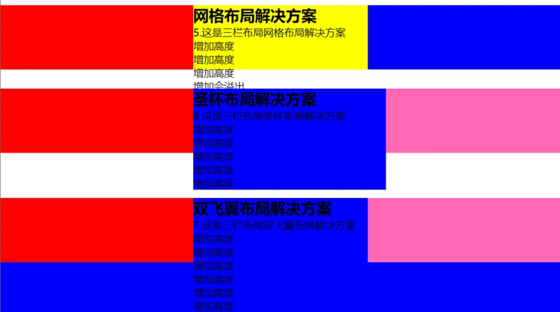
5.网格布局的解决方案
<!-- 网格布局的解决方案     -->
    <section class="layout grid">
        <style>
            .layout.grid .left-center-right {
                display: grid;
                width: 100%;
                grid-template-rows: 100px;
                grid-template-columns: 300px auto 300px;
            }

            .layout.grid .left {
                background: red;
            }

            .layout.grid .center {
                background: yellow;
            }

            .layout.grid .right {
                background: blue;
            }
        </style>
        <article class="left-center-right">
            <div class="left"></div>
            <div class="center">
                <h1>网格布局的解决方案</h1>
                <p>1.这是布局的中间部分</p>
                <p>2.这是布局的中间部分</p>
            </div>
            <div class="right"></div>
        </article>
    </section>
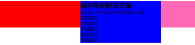
6.圣杯布局
<!-- 圣杯布局解决方案 -->
<section class="layout shengbei">
    <style>
        .layout.shengbei .left-center-right{
            padding:0px 300px 0px 300px;
        }
        /* 三个div都设置float: left,为了把left和right定位到左右部分 */
        .layout.shengbei .left-center-right>div{
            float: left;
            position: relative;
        }
        /*左边栏*/
        .layout.shengbei .left{
            left: -300px;
            width: 300px;
            margin-left: -100%;
            background-color:red;
        }
        /*中间栏*/
        .layout.shengbei .center{
            width: 100%;
            background-color: blue;
        }
        /*右边栏*/
        .layout.shengbei .right{
            right:-300px;
            width:300px;
            margin-left: -300px;
            background-color: #ff69b4;
        }
    </style>
    <article class="left-center-right">
        <div class="center">
            <h2>圣杯布局解决方案</h2>
            6.这是三栏布局圣杯布局解决方案
            <p>增加高度</p>
            <p>增加高度</p>
            <p>增加高度</p>
            <p>增加高度</p>
            <p>增加高度</p>
        </div>
        <div class="left"></div>
        <div class="right"></div>
    </article>
</section>

1.首先定义出整个布局的DOM结构,主体部分是由left-center-right包裹的center,left,right三列,其中center定义在最前面。
2.左侧和右侧的固定宽度为300px,则首先在.left-center-right上设置padding-left和padding-right,为左右两列预留出相应的空间。
3.随后分别为三列设置宽度、浮动和定位(position),其中浮动和定位可设置为三列的通用样式。根据浮动的特性,由于center的宽度为100%,即占据了第一行的所有空间,所以left和right被“挤”到了第二行。
4.接下来的工作是将left放置到之前预留出的位置上,这里使用负外边距(nagetive margin)
5.这里利用相对定位relative,使用left: -300px和margin-left: -100%将left的位置在原有位置基础上左移300px,以完成left的放置;使用right: -300px和margin-left: -300px将right的位置在原有位置基础上右移300px,以完成right的放置。
6.布局已完成,不过还需要考虑最后一步,那就是页面的最小宽度:要想保证该布局效果正常显示,由于两侧都具有固定的宽度,所以需要给定页面一个最小的宽度,但这并不只是简单的300+300=600px。回想之前left使用了position: relative,所以就意味着在center开始的区域,还存在着一个left的宽度。所以页面的最小宽度min-width应该设置为300+300+300=900px。
注意: 在#center中,包含了一条声明 100%,这是中间栏能够做到自适应的关键。可能会有朋友认为不需要设置这条声明,因为觉得center在不设置宽度的情况下会默认将宽度设置为父元素(container)的100%宽度。但需要注意到,center是浮动元素,由于浮动具有包裹性,在不显式设置宽度的情况下会自动“收缩”到内容的尺寸大小。如果去掉 100%,则当中间栏不包含或者包含较少内容时,整个布局会“崩掉”,而达不到这样的效果-圣杯布局。
原理:借助其他非主要元素覆盖了其父元素的padding值(内边距)所占据的宽度,同一个杯子,非主要元素只是占据了全部容器的padding值部分;
优点:结构简单,没有多余的DOM层。
缺点:当center部分的宽小于left部分时就会发生布局混乱。(center<left即会变形)
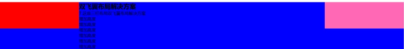
7、双飞翼布局
<!-- 双飞翼布局解决方案 -->
<section class="layout shuangfeiyi">
    <style>
        /* 与前一个布局保持距离 */
        .layout.layout.shuangfeiyi{
            margin-top: 200px;
        }
        /* 把left和right定位到左右部分 */
        .layout.shuangfeiyi .left-center-right>div{
            float: left;
        }
        .layout.shuangfeiyi .left{
            width: 300px;
            left: -300px;
            margin-left: -100%;
            background-color:red;
        }
        /*中间栏*/
        .layout.shuangfeiyi .center{
            width: 100%;
            background-color: blue;
        }
        /*在中间栏嵌套一个div*/
        .layout.shuangfeiyi .center .content{
            margin:0 300px 0 300px;
        }
        /*右边栏*/
        .layout.shuangfeiyi .right{
            right:-300px;
            width:300px;
            margin-left: -300px;
            background-color: #ff69b4;
        }

    </style>
    <article class="left-center-right">
        <div class="center">
            <div class="content">
                <h2>双飞翼布局解决方案</h2>
                7.这是三栏布局双飞翼布局解决方案
                <p>增加高度</p>
                <p>增加高度</p>
                <p>增加高度</p>
                <p>增加高度</p>
                <p>增加高度</p>
                <p>增加高度</p>
            </div>
        </div>
        <div class="left"></div>
        <div class="right"></div>
    </article>
</section>
1.首先定义DOM结构,用center包裹住content,另外left、center、right仍都在同一层。
2.按照与圣杯布局类似的思路,首先设置各列的宽度与浮动,将center、left、right设置为float: left,而在center内部,content由于没有设置浮动,所以其宽度默认为center的100%宽度。
3.左侧和右侧的固定宽度为300px,不同的是圣杯通过改变center的内边距,这里是改变在center包裹下的content的外边距margin-left和margin-right。
4.和圣杯布局一样,使用left: -300px和margin-left: -100%将left的位置在原有位置基础上左移300px,以完成left的放置;使用right: -300px和margin-left: -300px将right的位置在原有位置基础上右移300px,以完成right的放置。
5.最后计算最小页面宽度:由于双飞翼布局没有用到position:relative进行定位,所以最小页面宽度应该为300+300=600px。但是当页面宽度缩小到600px附近时,会挤占中间栏的宽度,使得其内容被右侧栏覆盖,如下所示:
原理:给主要部分content添加一个外层元素center,其他非主要元素所占据的空间是主要部分content的margin空间(外边距),像鸟的两个翅膀,与主要部分center脱离(content和center是上面双飞翼布局的元素类名)。
优点:支持各种宽高变化,通用性强。
缺点:DOM结构多一层,增加渲染树生成的计算量。
个人总结:
- 圣杯布局一定要考虑最小宽度的问题,注意center宽度比left小的情况。
- flex布局比较实用但是要注意兼容性问题。
- 不同的布局方式根据自己的业务场景具体使用即可
最终的效果图:

优点:兼容性较好;代码简单;清除浮动处理好的前提下一般没有其他问题。

优点:很快捷,配合js使用很方便。

优点:该方案可以解决上述两种方案的不足,是比较完美的一个;目前移动端的布局也都是用flexbox。

优点:实现容易;兼容性好,IE8不支持flex但是支持table。

优点:将复杂的事情简单化;CSS3新出的标准(追求热点的你怎能错过?)
<!-- 圣杯布局解决方案 --><section class="layout shengbei"> <style> .layout.shengbei .left-center-right{ padding:0px 300px 0px 300px; } /* 三个div都设置float: left,为了把left和right定位到左右部分 */ .layout.shengbei .left-center-right>div{ float: left; position: relative; } /*左边栏*/ .layout.shengbei .left{ left: -300px; 300px; margin-left: -100%; background-color:red; } /*中间栏*/ .layout.shengbei .center{ 100%; background-color: blue; } /*右边栏*/ .layout.shengbei .right{ right:-300px; 300px; margin-left: -300px; background-color: #ff69b4; } </style> <article class="left-center-right"> <div class="center"> <h2>圣杯布局解决方案</h2> 6.这是三栏布局圣杯布局解决方案 <p>增加高度</p> <p>增加高度</p> <p>增加高度</p> <p>增加高度</p> <p>增加高度</p> </div> <div class="left"></div> <div class="right"></div> </article></section>