vue项目中制作图表
一、开始引入依赖
npm install --save echarts
二、失败的情况安装echarts(成功跳过这步):

查看npm是否安装没有问题
npm -v
查看npm源
npm get registry
切换淘宝源
npm config set registry http://registry.npm.taobao.org
查看源确认切换完成
npm get registry
切换官方源 npm config set registry http://www.npmjs.org
三、安装成功项目引入echsrts
这样引入会出现失败
import echarts from 'echarts';
“export ‘default‘ (imported as ‘echarts‘) was not found in ‘echarts‘
正常引入方式
import * as echarts from 'echarts';
四、html页面代码
<div ref="indexChart" :style="{ '100%', height: '300px' }"></div>
五、js代码
// 基于准备好的dom,初始化echarts实例
let myChart = echarts.init(this.$refs.indexChart);
// 绘制图表
myChart.setOption({})
1.曲线图:series: type: 'line',
myChart.setOption({
  // 提示框组件
    tooltip: {
        trigger: 'axis' // 坐标轴触发,主要在柱状图,折线图等会使用类目轴的图表中使用
    },
  // 系列 ,顶部展示的分类
    legend: {
        data: ['近七日收益','月收益']
    },
  // 直角坐标系内绘图网格
    grid: {
        left: '3%',
        right: '4%',
        bottom: '3%',
        containLabel: true
    },
  //
    toolbox: {
        feature: {
            saveAsImage: {}
        }
    },
  // x轴样式
    xAxis: {
        type: 'category',
        boundaryGap: false,
            data: ["1","2","3","4","5"]

    },
  // y轴样式
    yAxis: {
        type: 'value'
    },
  // 图形样式配置
    series: [{
        name: '近七日收益',
        type: 'line',
        stack: '总量',
        data: this.opinionData
    }]
})
2.柱状图 series: type: 'bar',
myChart.setOption({
     // 标题组件
        title: { text: "在Vue中使用echarts" },
     // 提示框组件
        tooltip: {},
     // x轴配置
        xAxis: {
          data: ["衬衫", "羊毛衫", "雪纺衫", "裤子", "高跟鞋", "袜子"]
        },
     // y轴配置
        yAxis: {},
     // 图形样式配置
        series: [
          {
            name: "销量",
            type: "bar",
            data: [5, 20, 36, 10, 10, 20]
          }
        ]
});

3、扇形图series: type: 'pie',
myChart.setOption({
    // 标题
    title: {
        text: '客户贡献', //标题
        x: 'center'    // 位置
    },
    //
    tooltip: {
        trigger: 'item',
        formatter: "{a} <br/>{b}: {c} ({d}%)"
    },
    // 模块颜色
    color: ['#31b0d5', 'pink', 'green', 'purple', 'yellow'],
    //
    legend: {
        type: 'scroll',
        orient: 'vertical',
        right:0,
        top: 20,
        bottom: 20,
        data: ['大米','百度','红龙','七哈','凑数']
    },
    // 图形样式配置
    series: [{
        name: '客户贡献',
        type: 'pie',
        radius: '55%', // 大小
        itemStyle: {
                normal: {
                label: {
                    show: true,
                    formatter: "{b}:  ({d}%)", //显示标签
                },
                labelLine: {
                    show: true, //显示标签线
                    // length:10
                },
                borderWidth: 2, //设置border的宽度有多大
                borderColor: '#fff',
            },
        },
        // 数据数量和名称
        data: [
             {value: 5,name: '大米'},
             {value: 5,name: '百度'},
             {value: 5,name: '红龙'},
             {value: 5,name: '七哈'},
             {value: 5,name: '凑数'}
         ]
    }]
});

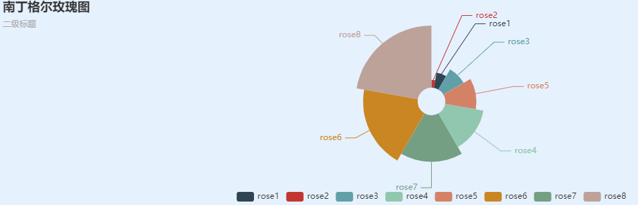
4.南丁格尔图series: type: 'pie',
let data = [
        { value: 10, name: "rose1" },
        { value: 5, name: "rose2" },
        { value: 15, name: "rose3" },
        { value: 25, name: "rose4" },
        { value: 20, name: "rose5" },
        { value: 35, name: "rose6" },
        { value: 30, name: "rose7" },
        { value: 40, name: "rose8" },
      ].sort((a, b) => {
        return a.value - b.value;
      });
      let myChart = echarts.init(this.$refs.indexChart3);
      myChart.setOption({
        backgroundColor: "#E6F1FE",

        title: {
          text: "南丁格尔玫瑰图",
          subtext: "二级标题",
          x: "left",
        },
        tooltip: {
          trigger: "item",
          formatter: "{a} <br/>{b} :<br/> {c} ({d}%)",
          backgroundColor: "rgba(255, 255, 255, 0.5)",
          extraCssText:
            "box-shadow: 10px 10px 10px 0 rgba(0,0,0,0.20); padding: 10px 14px;border-radius: 4px;",
          textStyle: {
            color: "#3c3c3c",
          },
        },
        legend: {
          x: "center",
          y: "bottom",
          data: [
            "rose1",
            "rose2",
            "rose3",
            "rose4",
            "rose5",
            "rose6",
            "rose7",
            "rose8",
          ],
        },
        toolbox: {
          show: true,
          feature: {
            mark: { show: true },
            dataView: { show: true, readOnly: false },
            magicType: {
              show: true,
              type: ["pie", "funnel"],
            },
            restore: { show: true },
            saveAsImage: { show: true },
          },
        },
        // 是否显示拖拽用的手柄(手柄能拖拽调整选中范围)
        calculable: true,
        series: [
          {
            name: "半径模式",
            type: "pie",
            radius: [20, 110],
            center: ["50%", "50%"],
            // 是否展示成南丁格尔图
            roseType: "radius",
            // 是否启用防止标签重叠策略
            avoidLabelOverlap: true,
            label: {
              fontSize: 12,
              normal: {
                show: true,
              },
              emphasis: {
                show: true,
              },
            },
            lableLine: {
              normal: {
                show: false,
              },
              emphasis: {
                show: true,
              },
            },
            data: data,
          },
        ],
      });
5.水球图series: type: 'liquidFill',
加载水球图需要安装依赖echarts-liquidfill
npm i echarts-liquidfill
如果直接安装上面的代码可能回运行不起来,因为直接安装版本是3.0.0的版本,需要2.6的版本才能运行起来
npm update echarts-liquidfill@2.0.6
使用方法
// 绘制图表
      myChart.setOption({
          // 图表主标题
          title: {
            show:false,
            text: "槽使用情况",
            // x 设置水平安放位置,默认左对齐,可选值:'center' ¦ 'left' ¦ 'right' ¦ {number}(x坐标,单位px)
            x: "10px",
            // y 设置垂直安放位置,默认全图顶端,可选值:'top' ¦ 'bottom' ¦ 'center' ¦ {number}(y坐标,单位px)
            y: "0px",
            // itemGap设置主副标题纵向间隔,单位px,默认为10,
            itemGap: 30,
            backgroundColor: "#fff",

            // 主标题文本样式设置
            textStyle: {
              fontSize: 16,
              fontWeight: "500",
              color: "#fff"
            }
            // 副标题文本样式设置
          },
          // 提示框组件
          tooltip: {
            trigger: "item", // 触发类型, 数据项图形触发,主要在散点图,饼图等无类目轴的图表中使用。
            textStyle: {
              color: "#fff" // 文字颜色
            },
            // 提示框浮层内容格式器,支持字符串模板和回调函数两种形式
            // 水球图: {a}(系列名称),{b}(无),{c}(数值)
            // 使用函数模板   传入的数据值 -> value: number|Array,
            formatter: function(value) {
              return value.seriesName + ": " + value.data * 100 + "%";
            }
          },
          series: [
            {
              type: "liquidFill",
              name: "已用槽", // 系列名称,用于tooltip的显示,legend 的图例筛选
              radius: "89%", // 水球图的半径
              center: ["52%", "55%"], // 水球图的中心(圆心)坐标,数组的第一项是横坐标,第二项是纵坐标
              // 水填充图的形状 circle 默认圆形  rect 圆角矩形  triangle 三角形
              // diamond 菱形  pin 水滴状 arrow 箭头状  还可以是svg的path
              shape: "circle",
              phase: 0, // 波的相位弧度 不设置  默认自动
              direction: "right", // 波浪移动的速度  两个参数  left 从右往左 right 从左往右
              outline: {
                show: true,
                borderDistance: 0, // 边框线与图表的距离 数字
                itemStyle: {
                  opacity: 0.9, // 边框的透明度   默认为 1
                  borderWidth: 2, // 边框的宽度
                  shadowBlur: 14, // 边框的阴影范围 一旦设置了内外都有阴影
                  shadowColor: "#fff", // 边框的阴影颜色,
                  borderColor: '#FE916F' // 边框颜色
                }
              },
              // 图形样式鼠标移上效果
              // itemStyle: {
              //   color: '#FE900F', // 水球显示的背景颜色
              //   opacity: 0.4, // 波浪的透明度
              //   shadowBlur: 10 // 波浪的阴影范围
              // },
              backgroundStyle: {
                color: "#fff" // 水球未到的背景颜色
              },
              // 图形的高亮样式
              emphasis: {
                itemStyle: {
                  opacity: 1 // 鼠标经过波浪颜色的透明度
                }
              },
              // 图形上的文本标签
              label: {
                fontSize: 26,
                fontWeight: 400,
                color: '#FE916F'
              },
              color: [
                {
                  type: "linear",
                  x: 0,
                  y: 1,
                  x2: 0,
                  y2: 0,
                  colorStops: [
                    {
                      offset: 1,
                      color: ["rgba(249, 146, 113, 0.8)"] // 0% 处的颜色
                    },
                    {
                      offset: 0,
                      color: ["rgba(255, 255, 255, 1)"] // 100% 处的颜色
                    }
                  ],
                  global: false // 缺省为 false
                }
              ],
              data: [0.6] // 系列中的数据内容数组
            }
          ]

      });
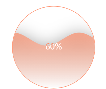
水球图支持非常高度定制化的需求,包括颜色(color)、大小(radius)、波的振幅(amplitude)、波长(waveLength)、相位(phase)、周期(period)、移动方向(direction)、形状(shape)、动画(waveAnimation)等等,完整的配置项参数参见水球图 API。文档有针对每个配置项的详细说明
6.漏斗图series: type: 'funnel',
// 绘制图表
      myChart.setOption({
          title: {
              text: '漏斗图',
              subtext: '纯属虚构'
          },
          tooltip: {
              trigger: 'item',
              formatter: "{a} <br/>{b} : {c}%"
          },
          // 控制左上角的功能组件
          // toolbox: {
          //     feature: {
          //         dataView: {readOnly: false},
          //         restore: {},
          //         saveAsImage: {}
          //     }
          // },
          legend: {
              data: ['展现','点击','访问','咨询','订单']
          },

          series: [
              {
                  name:'漏斗图',
                  type:'funnel',
                  left: '10%',
                  top: 60,
                  bottom: 60,
                   '80%',
                  min: 0,
                  max: 100,
                  minSize: '0%',
                  maxSize: '100%',
                  gap: 2,
                  label: {
                      show: true,
                      position: 'inside'
                  },
                  labelLine: {
                      length: 10,
                      lineStyle: {
                           1,
                          type: 'solid'
                      }
                  },
                  itemStyle: {
                      borderColor: '#fff',
                      borderWidth: 1
                  },
                  emphasis: {
                      label: {
                          fontSize: 20
                      }
                  },
                  data: [
                      {value: 60, name: '访问'},
                      {value: 40, name: '咨询'},
                      {value: 20, name: '订单'},
                      {value: 80, name: '点击'},
                      {value: 100, name: '展现'}
                  ]
              }
          ]
      });

7.U型环series: type: 'bar',
// 绘制图表
      myChart.setOption({
          angleAxis: {
            max: 100, // 满分
            clockwise: false, // 逆时针
            // 隐藏刻度线
          axisLine: {
            show: false
          },
          axisTick: {
            show: false
          },
          axisLabel: {
            show: false
          },
          splitLine: {
            show: false
          },
          // 旋转角度
          startAngle: 180
        },
        radiusAxis: {
          type: 'category',
            // 隐藏刻度线
          axisLine: {
              show: false
            },
            axisTick: {
              show: false
            },
            axisLabel: {
              show: false
            },
            splitLine: {
              show: false
            }
          },
        polar: {
          center: ['50%', '30%'],
          radius: '220%' //图形大小
        },
        series: [{
          type: 'bar',
          data: [{
            name: '进度值',
            value: 10,
            itemStyle: {
              normal: {
                color: { // 完成的圆环的颜色
                  colorStops: [{
                    offset: 0,
                    color: '#48FFFF' // 0% 处的颜色
                  }, {
                    offset: 1,
                    color: '#48FFFF' // 100% 处的颜色
                  }]
                }
              }
            },
          }],
          coordinateSystem: 'polar',
          roundCap: true,
          barWidth: 18,
          barGap: '-100%', // 两环重叠
          radius: ['49%', '52%'],
          z: 2,
        },{ // 灰色环外部容积盒子
          type: 'bar',
          data: [{
          value: 50,
          itemStyle: {
            color: '#3B4068',
          }
          }],
          coordinateSystem: 'polar',
          roundCap: true,
          barWidth: 26,
          barGap: '-123%', // 两环重叠
          radius: ['48%', '53%'],
          z: 1
        },
        // {
        //   name: '圆点',
        //   type: 'scatter',
        //   hoverAnimation: false,
        //   data: [20],
        //   symbolSize: 34,
        //   coordinateSystem: 'polar',
        //   roundCap: true,
        //   barGap: '-80%', // 两环重叠
        //   radius: ['48%', '53%'],
        //   z: 2,
        //   itemStyle: {
        //     normal: {
        //         color: '#48FFFF',
        //         opacity: 1,
        //     }
        //   }
        // }
        ]
      });

更多图案选取
https://echarts.apache.org/examples/zh/index.html
六、正常运行代码:
mounted() {
      this.drawLine();
},
methods: {
    drawLine() {
      // 基于准备好的dom,初始化echarts实例
      let myChart = echarts.init(this.$refs.indexChart);
      // 绘制图表
      myChart.setOption({
       ....
      })
    }
  }
七、运行的时候出现问题:
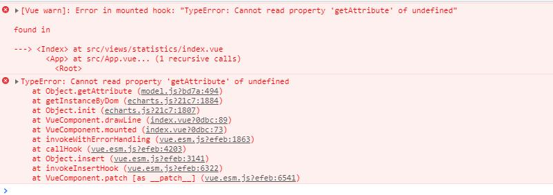
百度了下,说是dom没有加载完的问题,要放在this.$nextTick改成
  mounted() {
    this.$nextTick(() => {
      this.drawLine();
    });
  }
这样可以了。
后来测试 了下,用vif控制 隐藏与显示也是报这样的错。。vshow不会。
原理还是一样吧,vif是dom不加载 的。vshow只是把dom display:none,还是加载了