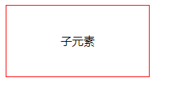
1.文字居中
<html>
<head>
<title>我的第一个 HTML 页面</title>
</head>
<body>
   <div id="father">
       <span id="child">
           子元素
       </span>
   </div>
</body>
 <style type="text/css">
    #father{
       width:200px;
       height:100px;
       border:1px solid red;
       text-align:center;
    }
    #child{
       line-height:100px;
    }
 </style>
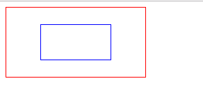
2. div居中
<html>
<head>
<title>我的第一个 HTML 页面</title>
</head>
<body>
   <div id="father">
       <div id="child">

       </div>
   </div>
</body>
 <style type="text/css">
    #father{
       width:200px;
       height:100px;
       border:1px solid red;
       display: flex;
       justify-content:center;
       align-items: center;
    }
    #child{
       width:50%;
       height:50%;
       border:1px solid blue;
    }
 </style>
</html>
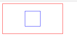
3. div居中
<html>
<head>
<title>我的第一个 HTML 页面</title>
</head>
<body>
   <div id="father">
       <div id="child">

       </div>
   </div>
</body>
 <style type="text/css">
    #father{
       width:200px;
       height:100px;
       border:1px solid red;
       position:relative;
    }
    #child{
       width:50px;
       height:50px;
       border:1px solid blue;
       top:50%;
       left:50%;
       transform:translate(-50%,-50%);
       position:absolute;
    }
 </style>
</html>
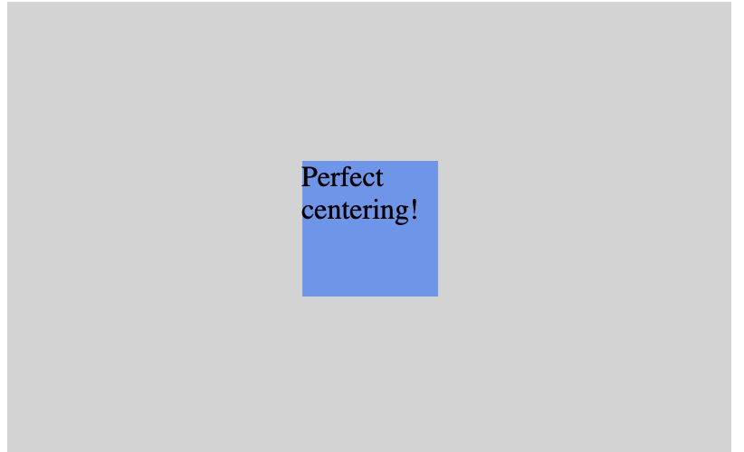
4.div
使用弹性盒子,居中变的很简单,只想要设置 margin: auto; 可以使得弹性子元素在两上轴方向上完全居中
<!DOCTYPE html>
<html>
<head>
<meta charset="utf-8">
<title>菜鸟教程(runoob.com)</title>
<style>
.flex-container {
    display: -webkit-flex;
    display: flex;
     400px;
    height: 250px;
    background-color: lightgrey;
}

.flex-item {
    background-color: cornflowerblue;
     75px;
    height: 75px;
    margin: auto;
}
</style>
</head>
<body>