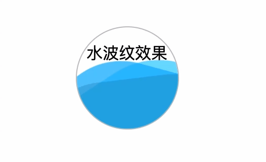
<div class="wave">
    水波纹效果
    <div class="wave1"></div>
    <div class="wave2"></div>
    <div class="wave3"></div>
</div>
css
    .wave{
            position: relative;
            border: 1px solid silver;
            width: 100px;
            height: 100px;
            border-radius: 50%;
            line-height: 50px;
            margin: 0 auto;
            font-size: 14px;
            text-align: center;
            overflow: hidden;
            animation: water-wave linear infinite;
        }
        .wave1{
            position: absolute;
            top: 40%;
            left: -25%;
            background: #33cfff;
            opacity: .7;
            width: 200%;
            height: 200%;
            border-radius: 40%;
            animation: inherit;
            animation-duration: 5s;
        }
        .wave2{
            position: absolute;
            top: 40%;
            left: -35%;
            background: #0eaffe;
            opacity: .7;
            width: 200%;
            height: 200%;
            border-radius: 35%;
            animation: inherit;
            animation-duration: 7s;
        }
        .wave3{
            position: absolute;
            top: 50%;
            left: -35%;
            background: #0f7ea4;
            opacity: .3;
            width: 200%;
            height: 200%;
            border-radius: 33%;
            animation: inherit;
            animation-duration: 11s;
        }
        @keyframes  water-wave{
            0% {transform: rotate(0deg);}
            100% {transform: rotate(360deg);}
        }
效果图