圣杯布局
特点:
1、按照中间部分、左部分、右部分的顺序排列;
2、容器的子元素都是浮动布局 float: left;
3、容器设置padding为两侧腾出空间;
4、中间部分宽度为100%;
5、两侧都是相对定位,左部分margin: -100%, left: 负自身宽度, 右部分margin: 负自身宽度, right: 负自身宽度。
eg:


<!DOCTYPE html>
<html>
    <head>
        <meta charset="UTF-8">
        <title>圣杯</title>
        <style type="text/css">
            .bd {
                height: 300px;
                padding: 0 100px;
            }
            .bd >*{
                height: 300px;
                float: left;
            }
            .main {
                width: 100%;
                background: red;
            }
            .left {
                width: 100px;
                background: yellow;
                margin-left: -100%;
                left: -100px;
                position: relative;
            }
            .right {
                width: 100px;
                background: blue;
                margin-left: -100px;
                right: -100px;
                position: relative;
            }
        </style>
    </head>
    <body>
        <div class="bd">
            <div class="main"></div>
            <div class="left"></div>
            <div class="right"></div>
        </div>
    </body>
</html>
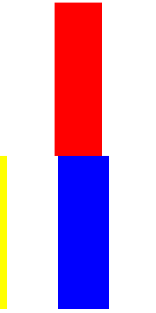
效果如下:

但这种布局有一个重要的缺陷,就是当main小于两侧时,会发生崩坏
--------------------------------------------------------------------------------------------------------------------------------------------------------------------------------------------------
2.双飞翼布局
双飞翼布局算是对圣杯布局的一种改进
特点: (灰白色为不需要的特性)
1、按照中间部分、左部分、右部分的顺序排列;
2、容器的子元素都是浮动布局 float: left;
3、容器设置padding为两侧腾出空间;
4、中间部分宽度为100%;
5、两侧都是相对定位,左部分margin: -100%, left: 负自身宽度, 右部分margin: 负自身宽度, left: 负自身宽度;
6.中间部分添加子元素,这是内容区域。
eg:
<!DOCTYPE html>
<html>
    <head>
        <meta charset="UTF-8">
        <title>双飞翼</title>
        <style type="text/css">
            .bd {
                height: 300px;
            }
            .bd >*{
                height: 300px;
                float: left;
            }
            .main {
                width: 100%;
                background: red;
            }
            .content {
                margin: 0 100px;
                height: 100%;
            }
            .left {
                width: 100px;
                background: yellow;
                margin-left: -100%;
            }
            .right {
                width: 100px;
                background: blue;
                margin-left: -100px;
            }
        </style>
    </head>
    <body>
        <div class="bd">
            <div class="main">
                <div class="content"></div>
            </div>
            <div class="left"></div>
            <div class="right"></div>
        </div>
    </body>
</html>
这样就不会发生崩坏问题,而且布局更为简单。