1.使用clusterProfiler包进行GO富集分析
使用clusterProfiler的enrichGO函数来获取GO分析
gene_id<-read.csv("SFTSV_24vscontrol_DE_mRNA.csv",header=T,stringsAsFactors = F)[,2]
library(clusterProfiler)
library(org.Hs.eg.db)
GO<-enrichGO(gene=gene_id,OrgDb = "org.Hs.eg.db",keyType = "ENSEMBL",ont="ALL",qvalueCutoff = 0.05,readable = T) #gene就是差异基因对应的向量,keyType指定基因ID的类型,默认为ENTREZID,  该参数的取值可以参考keytypes(org.Hs.eg.db)的结果, 建议采用ENTREZID, OrgDb指定该物种对应的org包的名字,ont代表GO的3大类别,BP, CC, MF,也可以选择ALL;  pAdjustMethod指定多重假设检验矫正的方法,这里默认pAdjustMethod="BH",所以这里没有写出来,cutoff指定对应的阈值,readable=TRUE代表将基因ID转换为gene  symbol。
go<-as.data.frame(GO)
View(go)
table(go[,1]) #查看BP,CC,MF的统计数目
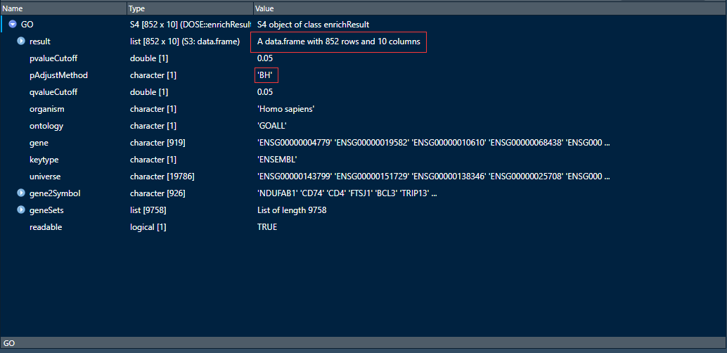


可以看到GO富集分析条目一共有769条属于BP,51条属于CC,32条属于MF
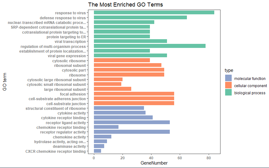
2.ggplot2绘制GO分析条目图
1.按照qvalue升序排序,分别选出前10个BP,CC,MF的条目,由于enrichGO函数生成的数据框默认是按照qvalue升序排序,所以这里我们只用选取前十个就行了
go_MF<-go[go$ONTOLOGY=="MF",][1:10,]
go_CC<-go[go$ONTOLOGY=="CC",][1:10,]
go_BP<-go[go$ONTOLOGY=="BP",][1:10,]
go_enrich_df<-data.frame(ID=c(go_BP$ID, go_CC$ID, go_MF$ID),
                         Description=c(go_BP$Description, go_CC$Description, go_MF$Description),
                         GeneNumber=c(go_BP$Count, go_CC$Count, go_MF$Count),
                         type=factor(c(rep("biological process", 10), rep("cellular component", 10),rep("molecular function",10)),levels=c("molecular function", "cellular component", "biological process")))
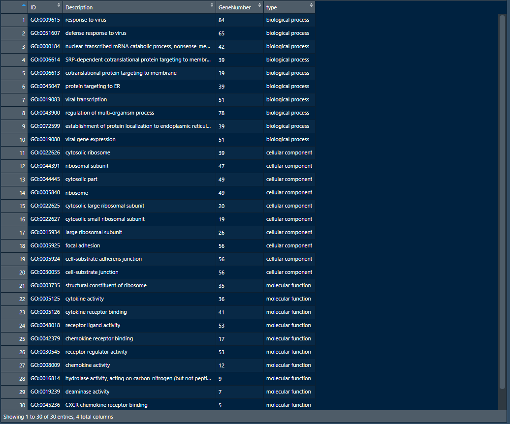
如上图为数据框go_enrich_df
2.ggplot2画图
## numbers as data on x axis
go_enrich_df$number <- factor(rev(1:nrow(go_enrich_df)))
## shorten the names of GO terms
shorten_names <- function(x, n_word=4, n_char=40){
  if (length(strsplit(x, " ")[[1]]) > n_word || (nchar(x) > 40))
  {
    if (nchar(x) > 40) x <- substr(x, 1, 40)
    x <- paste(paste(strsplit(x, " ")[[1]][1:min(length(strsplit(x," ")[[1]]), n_word)],
                       collapse=" "), "...", sep="")
    return(x)
  }
  else
  {
    return(x)
  }
}

labels=(sapply(
  levels(go_enrich_df$Description)[as.numeric(go_enrich_df$Description)],
  shorten_names))
names(labels) = rev(1:nrow(go_enrich_df))

## colors for bar // green, blue, orange
CPCOLS <- c("#8DA1CB", "#FD8D62", "#66C3A5")
library(ggplot2)
p <- ggplot(data=go_enrich_df, aes(x=number, y=GeneNumber, fill=type)) +
  geom_bar(stat="identity", width=0.8) + coord_flip() +
  scale_fill_manual(values = CPCOLS) + theme_test() +
  scale_x_discrete(labels=labels) +
  xlab("GO term") +
  theme(axis.text=element_text(face = "bold", color="gray50")) +
  labs(title = "The Most Enriched GO Terms")
#coord_flip(...)横向转换坐标:把x轴和y轴互换,没有特殊参数