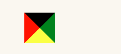
###1 使用伪类画三角形
.div{
  margin-top: 100px;
  margin-left: 100px;
}
.div:after{
  content: '';
  display:inline-block;
  0;
  height: 0;
  border-left:solid 50px red;
  border-top:solid 50px black;
  border-right:solid 50px green;
  border-bottom:solid 50px yellow;
}
效果:
.div{
  margin-top: 100px;
  margin-left: 100px;
  position: relative;
}
.div:after{
  content: '';
  display:inline-block;
  0;
  height: 0;
  border:solid 8px transparent;
  border-top:solid 8px #ccc;
  position: absolute;
  top: 6px;
}
效果:
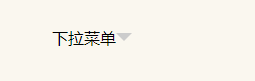
###2 使用伪类画tooltip悬浮框
   .test-div{
        position: relative;
        150px;
        height: 36px;
        border: solid 1px #CCC;
        border-radius:5px;
        background: rgba(245,245,245,1)
    }
    .test-div:before,.test-div:after{
        content: "";
        display: block;
        position: absolute;
        top:8px;
         0;
        height: 0;
        border:6px solid transparent;
    }
    .test-div:before{
        left:-11px;
        border-right-color: rgba(245,245,245,1);
        z-index:1
    }
    .test-div:after{
        left:-12px;
        border-right-color: #CCC;
        z-index: 0
    }
<div class="test-div"></div>
效果:
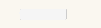
###3 分割线 不同分辨率,因border粗细会不同,为了保持永远是一个像素的高,根据设备不同,进行缩放
html.pixel-ratio-2 .line-tip:before {
  -webkit-transform: scaleY(0.5);
      -ms-transform: scaleY(0.5);
          transform: scaleY(0.5);
}
html.pixel-ratio-3 .line-tip:before {
  -webkit-transform: scaleY(0.33);
      -ms-transform: scaleY(0.33);
          transform: scaleY(0.33);
}
.line-tip .line-tip-inner {
  padding: 0 10px;
  background-color: #FAF7EF;
  display: inline-block;
  position: relative;
}

.line-tip {
  margin-left: 30px;
  margin-right: 30px;
  padding-top: 10px;
  padding-bottom: 10px;
  font-size: 12px;
  line-height: 12px;
  color: #999;
  position: relative;
  text-align: center;
}

.line-tip.line-tip-small {
  margin-left: 75px;
  margin-right: 75px;
}

.line-tip:before {
  height: 1px;
  content: '';
  background-color: #ccc;
  position: absolute;
   100%;
  left: 0;
  top: 50%;
}
<div class="line-tip">
    <div class="line-tip-inner">
        分割线
    </div>
</div>
效果:
