import numpy as np
import matplotlib.pyplot as plt
import pandas as pd
from numpy.random import randn
path=r'J:论文图集论文数据/玉米重采样1nm数据.xlsx'
data=pd.read_excel(path)
data.iloc[0].head()
WaveLength    qxym4301_000_resamp
338                        0.0206
339                          0.02
340                        0.0194
341                        0.0188
Name: 0, dtype: object
data.head()
| WaveLength | 338 | 339 | 340 | 341 | 342 | 343 | 344 | 345 | 346 | ... | 2504 | 2505 | 2506 | 2507 | 2508 | 2509 | 2510 | 2511 | 2512 | 2513 | |
|---|---|---|---|---|---|---|---|---|---|---|---|---|---|---|---|---|---|---|---|---|---|
| 0 | qxym4301_000_resamp | 0.0206 | 0.0200 | 0.0194 | 0.0188 | 0.0182 | 0.0179 | 0.0176 | 0.0173 | 0.0175 | ... | 0.1515 | 0.2020 | 0.2752 | 0.3958 | 0.4624 | 0.3620 | 0.2885 | 0.2958 | 0.2914 | 0.2556 |
| 1 | qxym4301_002_resamp | 0.0162 | 0.0158 | 0.0153 | 0.0150 | 0.0151 | 0.0152 | 0.0154 | 0.0156 | 0.0156 | ... | 0.1900 | 0.3139 | 0.3830 | 0.3787 | 0.4345 | 0.5935 | 0.6917 | 0.6336 | 0.5829 | 0.5112 |
| 2 | qxym4302_000_resamp | 0.0281 | 0.0270 | 0.0261 | 0.0258 | 0.0252 | 0.0247 | 0.0244 | 0.0243 | 0.0244 | ... | 0.3306 | 0.3650 | 0.3830 | 0.3787 | 0.3343 | 0.2255 | 0.1739 | 0.2538 | 0.3295 | 0.4529 |
| 3 | qxym4302_001_resamp | 0.0291 | 0.0278 | 0.0269 | 0.0266 | 0.0257 | 0.0249 | 0.0242 | 0.0239 | 0.0241 | ... | 0.2645 | 0.2920 | 0.2569 | 0.1191 | 0.0501 | 0.1840 | 0.2688 | 0.2252 | 0.1753 | 0.0718 |
| 4 | qxym4401_002_resamp | 0.0309 | 0.0301 | 0.0293 | 0.0290 | 0.0276 | 0.0269 | 0.0268 | 0.0266 | 0.0263 | ... | 0.0502 | 0.0184 | 0.0216 | 0.0732 | 0.1273 | 0.1618 | 0.1926 | 0.2259 | 0.2174 | 0.0571 |
5 rows × 2177 columns
data.columns
Index(['WaveLength',          338,          339,          340,          341,
                342,          343,          344,          345,          346,
       ...
               2504,         2505,         2506,         2507,         2508,
               2509,         2510,         2511,         2512,         2513],
      dtype='object', length=2177)
indexes=data.columns[1:]
new_data=data.T.iloc[1:]
new_data.head()
| 0 | 1 | 2 | 3 | 4 | 5 | 6 | 7 | 8 | 9 | ... | 150 | 151 | 152 | 153 | 154 | 155 | 156 | 157 | 158 | 159 | |
|---|---|---|---|---|---|---|---|---|---|---|---|---|---|---|---|---|---|---|---|---|---|
| 338 | 0.0206 | 0.0162 | 0.0281 | 0.0291 | 0.0309 | 0.0292 | 0.0688 | 0.0198 | 0.0178 | 0.0384 | ... | 0.0298 | 0.0367 | 0.0355 | 0.0312 | 0.0324 | 0.0329 | 0.0333 | 0.0256 | 0.0272 | 0.0255 |
| 339 | 0.02 | 0.0158 | 0.027 | 0.0278 | 0.0301 | 0.0294 | 0.0673 | 0.0197 | 0.0171 | 0.0375 | ... | 0.0287 | 0.0356 | 0.0345 | 0.0299 | 0.0312 | 0.032 | 0.0322 | 0.0249 | 0.0266 | 0.0247 |
| 340 | 0.0194 | 0.0153 | 0.0261 | 0.0269 | 0.0293 | 0.0289 | 0.066 | 0.0196 | 0.0168 | 0.0367 | ... | 0.0278 | 0.0349 | 0.0337 | 0.0289 | 0.0302 | 0.031 | 0.0311 | 0.0243 | 0.0261 | 0.0241 |
| 341 | 0.0188 | 0.015 | 0.0258 | 0.0266 | 0.029 | 0.0277 | 0.0651 | 0.0193 | 0.0171 | 0.0365 | ... | 0.0275 | 0.0348 | 0.0332 | 0.0284 | 0.0296 | 0.03 | 0.0303 | 0.0239 | 0.0259 | 0.024 |
| 342 | 0.0182 | 0.0151 | 0.0252 | 0.0257 | 0.0276 | 0.0272 | 0.0645 | 0.0191 | 0.0172 | 0.0357 | ... | 0.0276 | 0.0344 | 0.0332 | 0.0282 | 0.0291 | 0.0296 | 0.0299 | 0.0238 | 0.0257 | 0.0243 |
5 rows × 160 columns
new_data.index
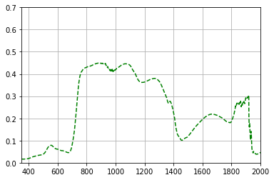
plt.plot(new_data.T.iloc[0],'g--')
plt.grid()
plt.xlim(350,2000)
plt.ylim(0,0.7)
(0, 0.7)
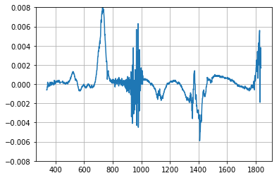
diff_data=pd.Series(np.diff(new_data[0]).T,index=indexes[:-1])
diff_data[:1500].plot(grid='on',ylim=(-0.008,0.008))
<matplotlib.axes._subplots.AxesSubplot at 0x1c24bd7fac8>
import seaborn as sns
sns.set(style="white")

# Generate a random correlated bivariate dataset
rs = np.random.RandomState(5)
mean = [0, 0]
cov = [(1, .5), (.5, 1)]
x1, x2 = rs.multivariate_normal(mean, cov, 500).T
x1 = pd.Series(x1, name="$X_1$")
x2 = pd.Series(x2, name="$X_2$")

# Show the joint distribution using kernel density estimation
g = sns.jointplot(x1, x2, kind="kde")
